In 'An Open Letter To The FOMC' John Hussman lays out in detail the true state of the world that asset-gatherers and Fed members alike seem blinded to. The intent of his letter is not to criticize, but hopefully to increase the mindfulness of the FOMC as to historical evidence, the strength of various financial and economic relationships, and the potentially grave consequences of further extreme and experimental monetary policy. Crucially, as we have heard numerous times in the last few weeks, the Fed sees no bubble, and so, a courtesy to both the investing public and the gamblers at the Fed, Hussman explains the reason that the Fed does not see an “obvious” stock market bubble (to use a word regularly used by Governor Bullard, as if to imply that misvaluations cannot exist unless they smack their observers with a two-by-four).
Excerpted from John Hussman's "Open Letter To The FOMC",
…
The reason that the Fed does not see an “obvious” stock market bubble (to use a word regularly used by Governor Bullard, as if to imply that misvaluations cannot exist unless they smack their observers with a two-by-four) is because while price/earnings multiples appear only moderately elevated, those multiples themselves reflect earnings that embed record profit margins that stand about 70% above their historical norms.
We can demonstrate in a century of evidence that a) profit margins are mean-reverting and inversely related to subsequent earnings growth, b) margin fluctuations are largely driven by cyclical variations in the combined savings of households and government, and importantly, c) valuation measures that normalize or otherwise dampen cyclical variation in profit margins are dramatically better correlated with actual subsequent outcomes in the equity markets.
[ZH: READ THAT AGAIN!!]
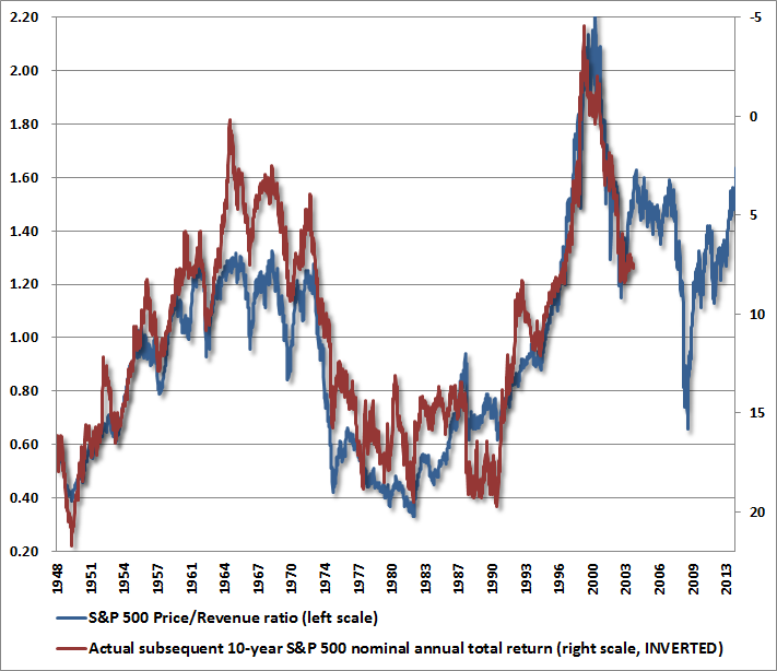
A few additional charts will drive this point home. The chart below shows the S&P 500 price/revenue ratio (left scale) versus the actual subsequent 10-year nominal total return of the S&P 500 over the following decade (right scale, inverted). Market valuations on this measure are well above any point prior to the late-1990’s market bubble. Indeed, if one examines the stocks in the S&P 500 individually, the median price/revenue multiple is actually higher today than it was in 2000 (smaller stocks were more reasonably valued in 2000, compared with the present). This is a dangerous situation. In this context, the dismissive view of FOMC officials regarding equity overvaluation appears misplaced, and seems likely to be followed by disruptive financial adjustments.
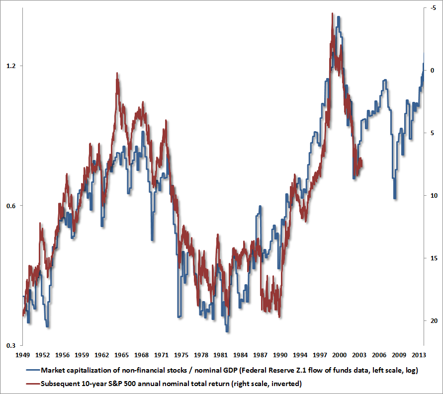
One obtains a similar view, with equal historical reliability, from the ratio of nonfinancial equity capitalization to nominal GDP, using Federal Reserve Z.1 Flow of Funds data. On this measure, equities are already beyond their 2007 peak valuations, and are approaching the 2000 extreme. The associated 10-year expected nominal total return for the S&P 500 is negative.
The unfortunate situation is that while the required financial adjustment may or may not be as brutal for investors as in 2007-2009, or 2000-2002, or 1972-1974, when the stock market lost half of its value from similar or lesser extremes, the consequences of extremely rich valuation cannot be undone by wise monetary policy. The Fed has done enough, and perhaps dangerously more than enough. The prospect of dismal investment returns in equities is an outcome that is largely baked-in-the-cake. The only question is how much worse the outcomes will be as a result of Fed policy that has few economic mechanisms other than to encourage speculative behavior.
And of course this speculative behavior ends with only one feature – bubble risk…
A discussion of bubble risk would be incomplete without defining the term itself. From an economist’s point of view, a bubble is defined in terms of differential equations and a violation of “transversality.” In simpler language, a bubble is a speculative advance where prices rise on the expectation of future advances and become largely detached from properly discounted fundamentals. Put another way, a bubble reflects a widening gap between the increasingly extrapolative expectations of market participants and the prospective returns that can be estimated through present-value relationships linking prices and likely cash flows.
As economist Didier Sornette observed in Why Markets Crash, numerous bubbles in securities and other asset markets can be shown to follow a “log periodic” pattern where the general advance becomes increasingly steep, while corrections become both increasingly frequent and gradually shallower. I’ve described this dynamic in terms of investor behavior that reflects increasingly immediate impulses to buy the dip.
Along with this pattern, which has emerged with striking fidelity since 2010, we observe a variety of other features typically associated with dangerous extremes:
- unusually rich valuations on a wide variety of metrics that actually have a reliable correlation with subsequent market returns; margin debt at the highest level in history and representing 2.2% of GDP (eclipsed only briefly at the 2000 and 2007 market extremes);
- a blistering pace of initial public offerings – back to volumes last seen at the 2000 peak – featuring “shooters” that double on the first day of issue;
- confidence in the narrative that “this time is different” (in this case, the presumption of a fail-safe speculative backstop or “put option” from the Federal Reserve); lopsided bullish sentiment as the number of bearish advisors has plunged to just 15% and bulls rush to one side of the boat;
- record issuance of covenant-lite debt in the leveraged loan market (which is now spreading to Europe);
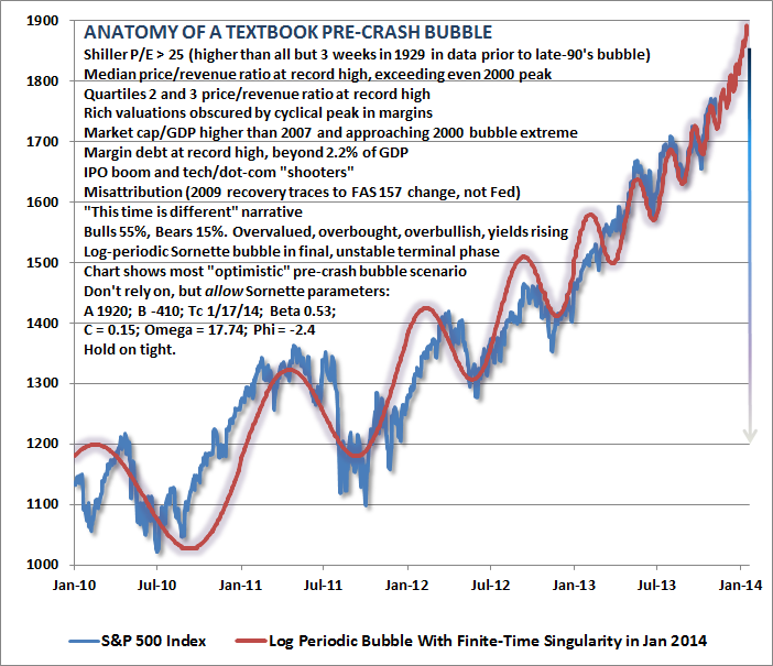
- and a well-defined syndrome of “overvalued, overbought, overbullish, rising-yield” conditions that has appeared exclusively at speculative market peaks – including (exhaustively) 1929, 1972, 1987, 2000, 2007, 2011 (before a market loss of nearly 20% that was truncated by investor faith in a new round of monetary easing), and at three points in 2013: February, May, and today (see A Textbook Pre-Crash Bubble).
Many of us in the financial world know these to be classic features of speculative peaks, but there is career risk in responding to them, so even those who view the situation with revulsion can't seem to tear themselves away.
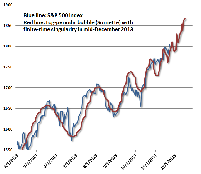
While I have no belief that markets follow any mathematical trajectory, the log-periodic pattern is interesting because it coincides with a kind of “signature” of increasing speculative urgency, seen in other market bubbles across history. The chart above spans the period from 2010 to the present. What’s equally unsettling is that this speculative behavior is beginning to appear “fractal” – that is, self-similar at diminishing time-scales. The chart below spans from April 2013 to the present. On this shorter time-scale, Sornette’s “finite time singularity” pulls a bit closer – to December 2013 rather than January 2014, but the fidelity to this pattern is almost creepy. The point of this exercise is emphatically not to lay out an explicit time path for prices, but rather to demonstrate the pattern of increasingly urgent speculation – the willingness to aggressively buy every dip in prices – that the Federal Reserve has provoked.
![]()
     |
via Zero Hedge http://feedproxy.google.com/~r/zerohedge/feed/~3/lrIbnXsG6tE/story01.htm Tyler Durden