With equities suddenly suffering from a case of vertigo, traders are wondering if the post-quad witch swoon predicted previously by Nomura’s Charlie McElligott and subsequently by Goldman Sachs, is starting to play out. As a reminder, the historical trading pattern is one of a “dealer gamma”-driven ramp into OpEx, followed by a notable decline in the week that follows.
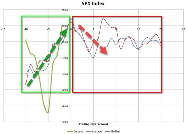
Furthermore, the “Freaky Friday” as the quarterly date has become known, took place during major market inflection points in the prior two quarters: the 21st Sep print of 2940 preceded a three month equity selloff of almost 20%, followed by a 21st Dec print of 2458, or 16% below current spot.
To be sure, besides just opex, there are several other factors that bear noting as traders position for market performance over the next few weeks: as McElligott notes today, the risk of a ‘tip-over’ through the end of March is the result of a convergence of a number of idiosyncratic phenomena:
- the post Op-Ex seasonal ‘pullback’ (as dealer delta hedging of overwriter roll- outs ‘ceases’), into
- the corp buyback blackout commencement and
- the potential that Systematic Trend CTA models see their “sell triggers” pulled mechanically HIGHER looking out 1.5-3 weeks on account of days dropping-out of the ‘1Y ago’ window—similar to what markets experienced on that BLAST of selling seen last week in US Equities futures
Yet while we await to see if McElligott’s latest prediction about a “mid-March Surprise” will bear out, the Nomura strategist points out something else that may offset any interim weakness heading into the rest of 2019.
As readers are aware, one of the charts we have repeatedly trotted out in recent weeks has been the striking divergence between the sinking 10Y yield and the soaring S&P, an “alligator jaws” formation which was last seen ahead of previous QE episodes.
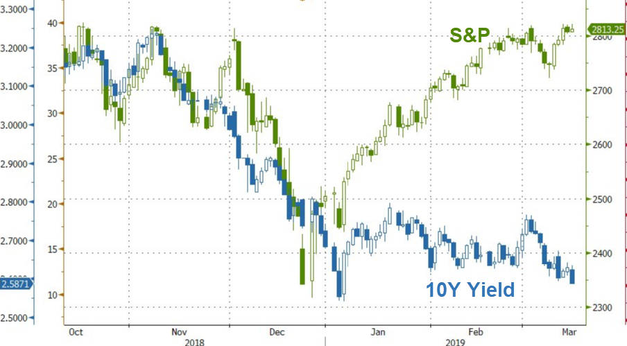
All else equal, one look at the chart above would suggest that traders are already bracing not so much for the coming rate cuts (and recession, which has followed the start of the last three easing cycles within 3 months), but the next QE.
Following up on this, in his latest note this morning, McElligott finds a similar confirmation in the market, that the Fed’s “de-facto easing has already begun.” To McElligott this is clearly visible when looking at the ongoing collapse in real rates, to wit:
U.S. ‘real rates’ continue to collapse, with 5Y TIPS yields printing fresh 11 month lows yesterday—which is a pure reflection of the market’s perception that we’ve reversed last year’s paradigm (the macro regime shift “from QE to QT” = the catalyst behind my “Financial Conditions Tightening Tantrum” Phase 2 in 2H2018 from my “Two Speed Year” 2018 thesis) and that the Fed have instead already “de facto EASED”
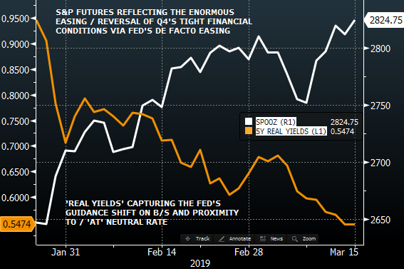
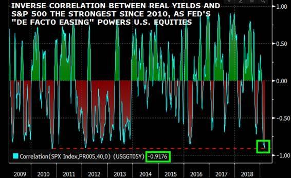
As readers may recall over the past year and a half, the Nomura strategist used “real yields” to reflect (what previously had been) “tighter” U.S. financial conditions throughout 2018… but since late 2018, we’ve instead witnessed a “one way” trade which represents said “de facto easing” being-priced by U.S. Equities, “and which is picked-up by the incredible inverse correlation between SPX and 5Y TIPS yields at a staggering -92%.”
Indeed, as the chart below shows, the inverse correlation between real yields and the S&P is now a “stunning” -92%, levels last seen during QE1.
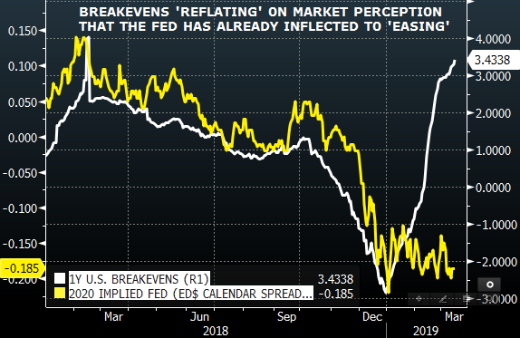
Of course, with the Fed still in “pause” mode, and balance sheet rolloff still taking place, the question is “how have we already eased?”, to which Nomura’s answer is “Via the Fed’s guidance shift to reset prior market expectations on balance-sheet (size and timing) and neutral rate proximity (now ‘at’), as the “end-of-cycle” approaches and the Central Bank pivots “dovish” into the slowdown.” One can see this in the recent jump in 1Y breakevens, while the market prices the odds of an almost full 2020 rate cut.
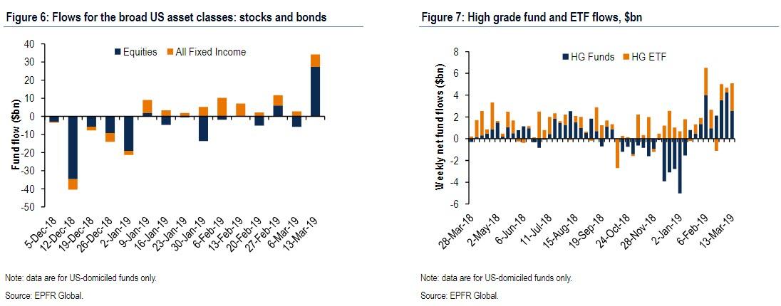
There is a second place where the QE trade is also emerging, namely in institutional fund flows. As we discussed earlier, showing not only the 2nd biggest equity inflow on record, but also the continued allocation to fixed income funds, McElligott summarizes this action as “they’re coming for it,” and similarly writes that last night’s EPFR flows shows that the remarkable prior redemption trend out OF risk assets — despite the massive YTD rally — has now forced a developing capitulation back into both risk-assets and U.S. Treasuries—as the takeaway looks to be that the market is already “trading QE.”
For those who missed our earlier post on bear flow capitulation, here are the key takeaways from the latest cross-asset flow summary piece by Nomura’s George Goncalves’
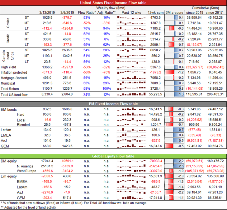
- US Govie fund outflows reversed this week, with ST Govie funds seeing sizable inflows for the first time in four weeks ($1.0bn, 3M z-score of +0.4)
- Meanwhile, US ST Generic bond funds continued to see solid inflows ($1.8bn, 3m z-score of +0.7). This marks the 7th consecutive week of inflows (weekly avg. of $1.5bn).
- US Inflation-protected bond funds saw significant outflows (-$0.6bn, 3m z-score of -1.2). This is the largest net outflow recorded since December 2018, and marks the third consecutive week of net outflows.
- US HY bond funds saw the largest inflow since early February (+$1.4bn, 3m z-score of 0.4).
- Municipal bond funds saw sizable inflows (+$1.2bn, 3m z-score of 0.9), marking the 10th consecutive week of steady inflows (weekly avg. of +$0.8bn).
- North American Equity funds saw a massive inflow, up over $25bn for the week, registering a 2.6 z-score like move.
And visually:
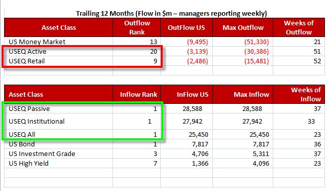
Digging down further into the “spectacular” equity inflows, again reveal evidence of “mounting capitulation” into the market breakout:
- US Equities Passive inflow was the largest 1w flow of the past 12m
- US Equities Institutional inflow was the largest 1w flow of the past 12m
- US Equities overall inflow was the largest 1w flow of the past 12m
However, most painfully for the industry, McElligott also notes that outflows continued for US Equities active and US Equities retail:
- US Equities Active outflow was the 20th largest 1w outflow of the past 12m
- US Equities Retail outflow was the 9th largest 1w outflow of the past 12m
Nomura’s bottom line: in addition to the ongoing meltdown in real rates, “flows felt QE-like (and bad news is good news for all assets)” as US govt fund saw inflows on the back of weaker US data (Feb NFP & core CPI).
Finally, between the bearish capitulation and the risk of a post opex-market meltdown on one hand, and the pricing in of a QE (which according to MS may not come for years, as the bank recently forecast 4 more rates hike in the next 8 months, one in December 2019 and three more in 2020), there is one more risk for the ongoing market meltup: namely the continued yield curve steepening, which as we have shown before is a substantial negative for cross-asset wide “momentum” strategies.
Taking another victory lap on his steepener trade reco, McElligott highlights that his curve steepener expression-of-choice (via 5s30s curve caps) continued to work, printing new 16m highs (62bps) yesterday. The reason, as explained above, is that the market continues to remove Fed hikes from prior expectations, with Nomura’s Lew Alexander adjusting his call yday into the Fed meeting next week (along with JPM as well), removing prior ‘one hike’ view and shifting to 1) extended pause with no hikes through 2020 and a view that 2) balance-sheet runoff to end in October

Yet in isolation, this move is bearish for risk, as the US yield curve steepening rationalizes the poor performance of “Momentum” strategies across asset classes. And as a reminder, without momentum leading the broader market, as it has for the past decade, the probability of a sustained rally, one that pushes the S&P above its all time Sept 2018 highs, remains very slim.
via ZeroHedge News https://ift.tt/2UBsW2o Tyler Durden