How do you spend your hard-earned money?
Whether you are extremely frugal, or you’re known to indulge in the finer things in life, how you allocate your spending is partially a function of how much cash you have coming in the door.
Simply put, as Visual Capitalist’s Jeff Desjardins writes, the more income a household generates, the higher the portion that can be spent on items other than the usual necessities (housing, food, clothing, etc), and the more that can be saved or invested for the future.
Earning and Spending, by Income Group
Today’s visuals come to us from Engaging Data, and they use Sankey diagrams to display data from the Bureau of Labor Statistics (BLS) that helps to paint a picture of how different household income groups make and spend their money.
We’ll show you three charts below for the following income groups:
-
The Average American
-
The Lowest Income Quintile (Bottom 20%)
-
The Highest Income Quintile (Highest 20%)
Let’s start by taking a look at the flows of the average American household:
The Average American Household – $53,708 in spending (73% of total income)
The average U.S. household has 2.5 people (1.3 income earners, 0.6 children, and 0.4 seniors)
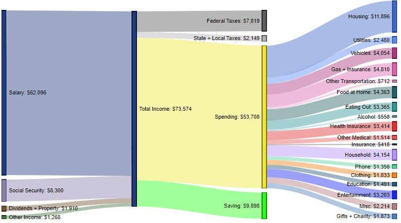
As you can see above the average household generates $73,574 of total inflows, with 84.4% of that coming from salary, and smaller portions coming from social security (11.3%), dividends and property (2.6%), and other income (1.7%).
In terms of money going out, the highest allocation goes to housing (22.1% of spending), while gas and insurance (9.0%), household (7.7%), and vehicles (7.5%) make up the next largest categories.
Interestingly, the average U.S. household also says it is saving just short of $10,000 per year.
The Bottom 20% – $25,525 in spending (100% of total income)
These contain an average of 1.6 people (0.5 income earners, 0.3 children, and 0.4 seniors)
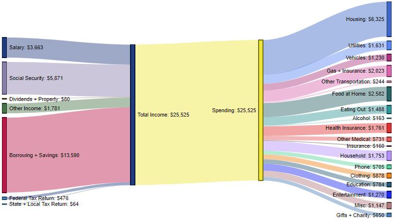
How do the inflows and outflows of the average American household compare to the lowest income quintile?
Here, the top-level statistic tells much of the story, as the poorest income group in America must spend 100% of money coming in to make ends meet. Further, cash comes in from many different sources, showing that there are fewer dependable sources of income for families to rely on.
For expenditures, this group spends the most on housing (24.8% of spending), while other top costs of living include food at home (10.1%), gas and insurance (7.9%), health insurance (6.9%), and household costs (6.9%).
The Highest 20% – $99,639 in spending (53% of total income)
These contain an average of 3.1 people (2.1 income earners, 0.8 children, and 0.2 seniors)

The wealthiest household segment brings in $188,102 in total income on average, with salaries (92.1%) being the top source of inflows.
This group spends just over half of its income, with top expenses being housing (21.6%), vehicles (8.3%), household costs (8.2%), gas and insurance (8.2%), and entertainment (6.9%).
The highest quintile pays just short of $40,000 in federal, state, and local taxes per year, and is also able to contribute roughly $50,000 to savings each year.
Spending Over Time
For a fascinating look at how household spending has changed over time, don’t forget to check out our previous post that charts 75 years of data on how Americans spend money.
via ZeroHedge News https://ift.tt/2JpP7Yb Tyler Durden