The “muzzle” on reported inflation has policymakers and analysts perplexed.
As Joseph Carson, former director of economic research at Alliance Bernstein writes in his follow up to a “New Working Theory on Inflation“, numerous economic explanations and theories have been offered, and policymakers are considering making changes to their operating price-targeting framework. Yet, before any decisions are made policymakers should consider all of the factors that could be keeping a “muzzle” on published inflation.
Here are two:
First, a little more than 20 years ago the Bureau of Labor Statistics (BLS) introduced a number of new measurement techniques in the estimation of consumer inflation (see Boskin Commission). So the current business cycle, which started in 2009, is the second consecutive cycle in which these new procedures have been employed.
Statistical changes have been made to account for product substitution, a greater degree of quality changes in products and services and faster introduction of new outlets or ways in which people shop. The introduction of new variables in the estimation of inflation alters the pattern and at various times the rate of change as well.
Prior to their implementation, analysts and government statisticians estimated that the potential reduction in core inflation from all of these statistical changes would range from one-half to a full percentage point. Yet, all of those estimates were looking backwards and there is no guidance from the statistical agencies of the scale of the reduction in reported inflation after implementation.
Odds are high that the impact on reported inflation varies year to year, with some years at the upper end of range of estimate and others at the lower end. Nonetheless, to overlook the impact from changes in measurement would be shortsighted, especially since changes in consumer price of a few tenths of a percent or more do matter a lot when inflation is low, and readings below the 2% target could be misconstrued as a failure of monetary policy, which in turn “forces” the Fed to maintain an unnecessarily easy monetary policy, which results in asset bubbles and wealth inequality, when in fact the only applicable consideration is that the BLS and the Dept of Labor are measuring inflation incorrectly.
Second, research conducted by the Federal Reserve staff has found that the shift in the measurement of shelter costs two decades ago to only use only prices from rental market and exclude those from the owners housing market systematically removed the largest single “driver” of cyclical inflation, while it also simultaneously reduced the volatility in reported inflation.
The significance of these findings has not received as much attention as they should. Removing the largest single driver of cyclical changes in inflation means that reported inflation nowadays does not exhibit the same sensitivity to economic growth and interest rates, as was the case in previous cycles. Accordingly, one of the reasons why the trade-off between changes in unemployment and reported inflation has been so benign in the last 20 years is due to changes in price measurement.
The missed signal from housing inflation was readily apparent in the 2000s when core inflation peaked at a relatively modest 2.5% even though house price increases were recording double-digits increases. In previous business cycles in which house prices recorded gains north of 10% core inflation readings were two or three times higher. In the current cycle, house price increases have run ahead of rent increases, but not to same extent as was the case in the 2000s.
As Carson concludes, these findings strongly suggest that price measurement issues are important to consider when looking at trends in the reported inflation data. For all of the conceptual changes and measurement issues the key question policymakers should be asking is whether the “muzzle” on reported inflation still makes it a useful benchmark for the price-targeting framework. The fact that currently constructed published price measure miss modern day inflation in the asset markets strongly suggests policy may need a new working definition of inflation before they contemplate any changes to the price-target framework.
* * *
That’s the theory. Now, courtesy of Bloomberg, here is a dramatic observation of the practical implications of erroneous inflation measurements, which suggests that the US government is under-representing arguably the most important aspect of the consumer price inflation basket, that of food, by as much as 40%.
When Bloomberg’s Cameron Crise encountered the dataset that is used to compute elements of the CPI that is in turn used by the Fed to determine monetary policy (and more often than not, results in asset price bubbles) he decided to compare how this theoretical price compares to real world prices.
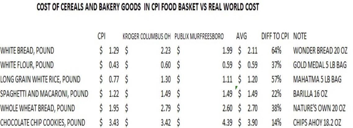
Ignoring such volatile series as cell phones or haircut prices, he instead focused on groceries, and specifically cereals and bakery products, “the kind where you can buy the same thing in every grocery store in the country.” He notes that there are six components to this subindex:
- all-purpose flour,
- long-grain rice,
- white bread,
- wheat bread,
- pasta
- chocolate chip cookies.
Then, to figure out what the real world prices are (i.e. not the “extorionate prices we pay in greater New York”), he signed up for supermarket delivery services in Columbus, Ohio, and Murfreesboro, Tennessee, because “while they may not represent the exact national average, they nevertheless seem like a reasonable proxy for middle America.”
Once the representative middle-America venues had been picked , a selection was made of an identical basket of six goods, converting them to a unit price per pound ala the CPI basket. And while the products chosen “aren’t bargain-basement” value” generics, they aren’t premium foodstuffs either.” The results, as Crise, notes, “were pretty compelling.”
As the table below shows, the CPI is chronically misrepresenting the price of every product in the food basket, with the gap between the government “price” and the average real-world price ranging from 14% in the case of chocolate chip cookies, to as much as 64% for a pound of white bread.
Overall, in the specific case of cereals and bakery goods, the difference between the CPI price for the basket of six core food products, and the average price of the same products in Ohio and Tennessee, is a whopping 39%. This same execrise extended to all other goods and services in the basket would reveal a similar bias to misrepresenting prices to the downside relative to reality.
Here again are the results, represented visually.

The critical problem represented above is that while the Fed believes that the CPI calculation is accurate, and thus Americans can be subject to far looser monetary policy as the FOMC believes they are paying far less, the reality is that monetary conditions have to be far tighter for reality to catch down with the BLS’s woefully incorrect price assumptions.
And keep in mind, the example above represents what middle-America is paying. The prices for these goods along the east or west seaboard would be substantially higher, resulting in a far greater underpricing of reality by the BLS.
As Crise observes: “while there was one instance where the real world cost matches the bureaucratic estimate, for the most part food – or at least this kind of food – is a lot more expensive than the bean counters would have you believe.“
And his conclusion: “perhaps if the Fed wants to see higher inflation, they should just send a few staff economists to the “social Safeway” in Georgetown.”
For once, we actually agree with “MacroMan.”
via ZeroHedge News http://bit.ly/2JD8s7H Tyler Durden