As we await for Goldman to throw in the towel and admit its forecast of one rate hike in 2020 (and no cuts in 2019), was overly… optimistic, moments ago Barclays had a “hold my beer” moment, and just hours after JPMorgan changed its forecast, and as a result of an economic slowdown resulting from the escalating trade war now expects 2 rate cuts in 2019, Barclays has one-upped the largest US bank, and moments ago revised its FOMC forecast, now expecting 3 rate cuts in 2019.
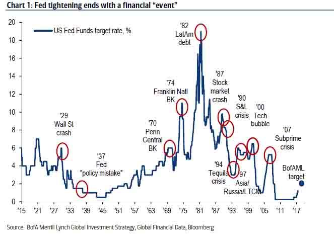
Now, while some may debate whether a curve inversion begins the clock on an upcoming recession, one things is undisputable: while many analysts will caution that it is the Fed’s rate hikes that ultimately catalyze the next recession and that every Fed tightening ends with a financial “event”, the truth is that there is one step missing from this analysis, and it may come as a surprise to many that the last three recessions all took place with 3 months of the first rate cut after a hiking cycle!
In other words, if JPM and Barclays are right, the US economy will enter a recession some time around January 2020.
It is this historic inflection point that Wall Street and traders will be focusing on, because after what now appears set to be the longest economic expansion in history starting at midnight tonight, the recession now appears inevitable. Although don’t assume for a minute that Wall Street won’t fight tooth and nail to delay this admission.
Case in point, as BofA’s Michael Hartnett writes, in the next few days we have a barrage of data which will prompt a “recession panic”, including last night’s dismal China manufacturing PMI <49, next week's US ISM new orders (watch for a <50 print) and the June 7 payrolls report (flashing alert if NFP is <100k). However, as Hartnett writes, while the data would likely initially cause markets to gap lower, they would then stabilize in anticipation of policy response; while if data better-than-expected, yields could rise & bearish positioning would allow risk assets to bounce in June.
That may be optimistic, because if Pimco’s unprecedented warning that the Fed is about to lose control of markets, going forward bad news will no longer be bad news. Instead they will be terrible news, and a coming recession would have devastating consequences on the market and global economy.
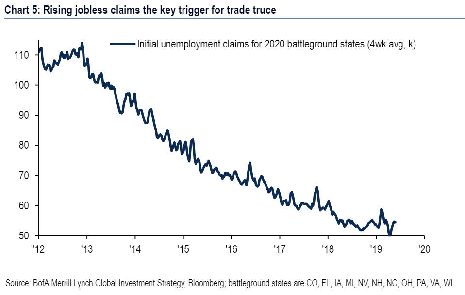
That said, there is one potential way to short-circuit the process. As Hartnett claims, the 8.3% SAAR plunge in exports over the past 6 months will soon negatively impacts jobs, and BofA expects a quick trade resolution as Trump folds as since the last election initial unemployment claims in 11 most important battleground states are down from 66k to 49k (week of Apr 13th); but since then are up to 54k, “indicating job losses in key “swing states”; further rise >60k could cause White House policy panic.”
Whether or not both Trump and the Fed fold, as BofA expects, stabilizing the market and preventing a contraction in the economy, has yet to be seen. However, in what is a note from BofA that will be very useful in the coming months, the bank writes that with recession concerns again on the rise, it is updating its recession FAQ guidebook with the bank’s latest views.
And while the bank writes that its “analysis continues to suggest that near-term recession risks are limited but some financial indicators are flashing red” and that “the trade war is the clear risk to the outlook. Slowing global growth and low potential growth increases the vulnerabilities.”
Here are the rhetorical Q and A’s from the BofA report:
Q: What do recession models say?
Recession risk still contained
In February, we introduced a composite recession model to consolidate signals from both economic and financial market data. Here we provide an update to our model.
- Risks of a recession over the next 12-months remain contained. The latest reading of our model shows a 19.5% chance of a recession occurring within the next 12 months (Chart 1). Looking at the history of the model, we identify 30% as the threshold where we become concerned of an impending recession. To evaluate the signal of the inputs of our model we take z-scores of each. A higher z-score suggests that the indicator is showing a greater risk of a recession and is represented by a darker shade of red in Table 1.
- Some concerning signs in financial data. Although the aggregate measure from our model sends a relatively sanguine signal, there are some areas of financial markets that are more worrisome. In particular, the slope of the yield curve continues to send a fairly strong warning. However, as we have noted in the past, there are reasons to discount the signal from the yield-curve despite its proven track-record. Additionally, despite the inverted yield curve, other financial market signals are not flashing red yet.
- Economic data continue to say “no” to recessions. Economic data, although much more of a coincident indicator than financial data, continue to show an economy that is on solid footing. The Philadelphia Fed manufacturing index has recovered after a brief turn negative in February and labor market data continues to signal an economy that has more room to run.
Bottom line: Despite some worrying signals to start the year, both financial and economic data continue to suggest that near-term recession risks are not yet elevated. However, our model likely does not fully capture the threat of US-China trade tensions spiraling into a more severe trade war, which we view as the biggest downside risk for the US economy.
Q: What are the data to watch?
The Business Cycle Dating Committee from the National Bureau of Economic Research officially calls peaks and troughs of business cycles. However, the Committee waits until there is sufficient data available to call turns in the business cycle, meaning it is many months after a peak or a trough for the referees to make an official ruling on the economy. Financial markets don’t have the luxury of time.
To get a sense of how the NBER may rule on the business cycle in the future, we look to the past. We apply a Markov switching model-a popular nonlinear framework to characterize asymmetrical signals like expansions and recessions- to all major economic indicators in the US. The model gives us two bits of information: 1) we can see which economic indicators most accurately follow the NBER’s recession dating, allowing us to monitor the most relevant indicators. 2) The latest reading of the Markov switching model gives us a real time assessment of the business cycle (i.e. a “nowcast” probability of a recession, similar to the St. Louis Fed recession probability measure(*)). Here is what we find:
- Watch labor markets and factories: The top 5 economic indicators that track the NBER’s recession dating are initial jobless claims, auto sales, industrial production, Philly Fed index, and aggregate hours worked. This is consistent with NBER’s definition of a recession: “a significant decline in economic activity spread across the economy, lasting more than a few months, normally visible in real GDP, real income, employment, industrial production, and wholesale-retail sales.”
- Look for the data to rollover: These top 5 economic indicators usually deteriorate heading into recessions. In the last seven recessions, the 6-mo growth rate of initial claims have, on average, jumped double digits while the 6-mo growth rate of auto sales declined. The level of the Philly Fed index is usually near or in negative territory and the 6-mo growth rates of industry production and aggregate hours have generally fallen below trend.
- Currently flashing green: What are the data telling us about today? There’s little sign that we are headed into an imminent downturn. With the exception of auto sales, these measures are well off their levels seen at the start of prior recessions (Table 2). Initial jobless claims are worth close scrutiny when looking for recession risks because it is timely and released weekly. Currently, growth of initial claims is subdued and starting to reverse (Chart 2).
Q: What does big data tell us about this cycle?
Last year we took a big-data view of the business cycle. Specifically, we applied a machine-learning algorithm to more than 55 years of monthly data spanning over 120 variables in order to identify the phases of the cycle. Recently we updated our work.
- Does 2019 look like 2016? Yes and no. The algorithm identifies three phases of the business cycle: economic booms, soft patches and recessions. We find that the economy is still stuck in the soft patch that started at the beginning of the current expansion. However, the data have deteriorated in recent months, moving further away from the “boom” phase of the cycle and closer to the “recession” phase.
Chart 3 shows that in terms of where we are in the cycle, February 2019 looks a lot like February 2016. There are distinct differences in the drivers, however. Today, equity-market variables are stronger and indicators related to money and credit are weaker. According to our classification though, in terms of the overall state of the economy these differences almost perfectly net out.
- Boring isn’t always bad. The 2016 slowdown did not lead to a recession and our work does not point to an imminent recession this time either. We tweak our approach by running the algorithm on a shorter sample that excludes older boom-bust cycles. This helps pick up smaller variations in recent cycles. Specifically, with a shorter sample we find that the current expansion saw a brief boom period in 2017-18, when the US economy benefited first from the synchronized pickup in global growth and then from tax cuts. Although we would not rule out another brief boom period in the spring, the cycle is probably past its peak (Chart 4).
But there is good news as well. While much has been written about the weakness of the ongoing recovery, our work suggests it has actually been very durable. The data in past cycles mostly flip-flop between the boom and downturn clusters. Yet not even one of the 116 months in this expansion falls into our algorithm’s downturn cluster. In this sense it might be more appropriate to refer to this cycle as “flat” rather than “weak.” This is one reason why we expect a soft landing back to trend-like growth rather than a recession in the medium term. In other words, we are likely back in a “no boom, no bust” paradigm, which is supportive for carry trades.
Q: How do consumers feel?
Consumer demand is the key driver of the US economy, making up 70% of real GDP. As such, consumer confidence is an important indicator to watch when looking for cracks in the economy. Consumer confidence usually deteriorates during downturns. Here we take a look at where things stand:
- Consumer sentiment is at cyclical highs: Confidence deteriorated at the turn of the year due to the equity market selloff and the federal government shutdown. Since then confidence has creeped back higher with both the Conference Board’s consumer confidence and the University of Michigan’s consumer sentiment indexes only a several points below their cyclical highs (Chart 5).
- Consumers see a strong job market: Labor market conditions remain tight, according to the worker. The labor market differential index (the % of respondents reporting that jobs are plentiful less % of respondents reporting that jobs are hard to find) from the Conference Board is at 36.3 in the latest reading, reaching a cyclical high (Chart 6). Indeed, the latest JOLTS data show there are more job openings than unemployed workers.
- Expectations are still strong: Concerns around a downturn remain subdued. The mean probability of the unemployment rate being higher in one year tracked higher in December and January but has receded since likely due to the recovery in financial markets and solid job numbers in recent months. Similarly, percent of respondents who think their financial situation will be worse off one year from now remain at low levels (Chart 7 & Chart 8).
Q: What about global factors?
The two major global risks facing the US economy right now are the US-China trade war and the (related) slowdown in global growth.
- Trade tensions rising. The latest round of tariffs between the US and China was a major escalation. Our base case is that there will be further brinkmanship for a few more weeks, followed by a deal that walks back some of the measures currently in place. In this scenario, which is baked into our GDP forecasts, we expect only a muted impact on US growth due to slightly-weaker consumption, investment and exports (because of retaliatory tariffs). One reason we do not see a big impact on the US economy is that FX moves will likely mitigate the impact on import prices: as Chart 9 shows, periods of trade war escalation have been accompanied by a much weaker renminbi.
However the risks to our outlook are skewed firmly to the downside. If the US imposes 25% tariffs on all remaining Chinese goods, we would find ourselves in a full-blown trade war. In this scenario real domestic demand would slow significantly as higher tariffs cut into the purchasing power of the consumer. Elevated uncertainty would weigh on business investment and the Chinese retaliation would likely deal a huge blow to US exports. Tightening of financial conditions would amplify the shock. This would leave the economy much more likely to fall into a recession.
- Broad-based global growth slowdown. While the US economy has remained relatively robust, many other major economies have slowed; some for reasons unrelated to the trade war. We expect ex-US global growth to fall from 4.0% last year to 3.5% in 2019. Assuming there is no further trade-war escalation, will the US import a recession? Probably not. Compared to other large economies the US has limited exposure to global demand (Chart 10). Recent undulations in the global backdrop, from the soft patch of 2015-16 to the coordinated pickup in 2017, suggest that a slowdown in demand for US exports would not be large enough to cause a recession.
That said, a global slowdown could also weigh on US growth indirectly via a weakening in financial conditions and business confidence. This channel is perhaps more concerning, particularly since risk-off sentiment usually strengthens the dollar and thus amplifies any weakness in external demand. This indirect effect is harder to quantify, although history still suggests a recession is unlikely.
Q: What can we learn from the profits cycle?
We can look at corporate profits and equity markets for signals of building excesses or a turning point in the economy.
- In previous work, we noted that corporate profits are a reliable leading indicator as they tend to peak prior to that of GDP by an average of four quarters during expansions dating back to 1953. We show a log-level time series in order to gain the historical comparison (Chart 11). However, they are not the best predictor of a coming recession as a simple probit model that uses the two-quarter change in profits to predict recessions yields several false positives (Chart 12).
- Our equity strategists note that the share of non-earners in the Russell 2000 has continued to climb and remains at levels typically only seen during or prior to a recession (Chart 13). Additionally, the latest reading of their regime indicator-an aggregation of earnings, economic growth expectations, inflation, credit conditions and other variables-has crossed into the “recession” or “downturn” phase (Chart 14). However, this indicator has often entered the “downturn” phase outside of economic recessions. We therefore think it is consistent with a slowing in the economy where there are increased vulnerabilities, as we are forecasting.
Q: Should we pay attention to housing?
Buying a home is one of the biggest investment decisions a consumer can make and is highly sensitive to interest rates and the overall business cycle. As we learned during the financial crisis, housing can be a crippling source of economic pain and instability. Will history repeat in the current cycle? Can we once again look to housing as a harbinger of imminent doom and gloom? We don’t think so. In our view, housing is unlikely to be front and center in the next downturn.
- A laggard this cycle: Housing was slow to turn and has been slow to pick up. Residential investment’s share of GDP remains subdued, as is the pace of housing starts, suggesting little sign of excess in housing-related real activity (Chart 15). In fact, the data suggest the pendulum has swung into a housing shortage.
- Households have deleveraged: Households have reduced the amount of mortgage debt (as a share of disposable income) in the system (Chart 16). Low rates have also led to historically low debt service ratios (Chart 17). It is unlikely that leverage picks up meaningfully given that purchase mortgage demand will be constrained by lean housing supply and turnover, as well as tighter lending standards post crisis.
- Less dependent on housing wealth: The housing wealth effect has diminished over time as households have become more reluctant to spend from rising home valuations (Chart 18). Consistent with this, outstanding home equity lines of credit (HELOC) have declined over time. If home prices weaken going forward, the effect on consumption should be muted.
Q: Which sectors are vulnerable?
There are growing concerns that higher borrowing costs will impair those who are most highly indebted. Therefore, we take a look at leverage measures for the household, corporate and government sectors for signs of concern (Chart 19).
- Household. The good news is that household balance sheets are very healthy. Household outstanding debt as a % of total GDP has been on a downward shift since the beginning of the expansion and is currently at around 75% compared with the 2008 peak level of 98%. Additionally, both the household debt service ratio and financial obligation ratio are near historically low levels.
- Corporate. The corporate sector shows mixed signals. On one hand, the nonfinancial business debt to GDP ratio is currently well above its historical average amid the favorable interest rate environment. Across loan types, non-bank lending saw the biggest increase (Chart 20). On the other hand, there is evidence that corporates are well positioned for shocks. For example, as the US Treasury pointed out in their Financial Stability report, improvements in earnings during the past few years have allowed firms to enhance their ratio of cash to assets.
- Government. Contrary to household debt, government debt has increased significantly during the current expansion, to around 100% of GDP compared with just around 79% in 2009. Although high level of government debt alone is unlikely to trigger a recession, its long term impact on crowding out private investment and increasing interest rates can create headwinds for growth. It also may imply that there is less capacity for countercyclical policy support once the recession hits.
Q: How do recessions usually start?
Expansions don’t die of old age; rather they die from excesses that lead to economic shocks such as:
- Overheating in cyclical sectors of the economy which can manifest itself in an asset bubble. Two recent examples are the credit/housing bubble and the dot-com boom which were major factors in the two most recent recessions. As Chart 21 shows, residential investment is still below the historical average as a share of the economy, showing no sign of concern. Nonresidential investment is near levels seen prior to the Great Recession, which could be an area of concern. Similarly the cyclically adjusted PE ratio is elevated but not at the 2001 peak levels (Chart 22).
- Commodity price shocks. Oil prices have spiked prior to most of the recessions dating back to the 1980s (Chart 23). This was even the case for the Great Recession which might not have been as dire absent the oil price shock (Hamilton 2008). Following President Trump’s decision to remove the Iran oil waivers, there is a greater risk for an upward shock to oil prices in the near-term. That said, an increase in oil prices this time around may not be as damaging as the US has become a much bigger producer of oil and, in turn, less reliant on crude oil imports.
- Monetary policy mistakes. In previous expansions, the Fed has acted aggressively to fight inflation by quickly tightening policy which has often been followed by a recession. Today, the Fed seems set on holding pat at neutral (Chart 24).
Q: Is this recovery too long?
Here, we take a close look at the current business cycle and some of its characteristics. Specifically, the current expansion is the second longest in history. However, the pace of recovery has been particularly weak compared with prior cycles with annual GDP growth averaging 2.3%.
- Lengthy recovery. The current recovery has been 119 months long, the second longest in history and only behind the 1991-2001 cycle which lasted 120 months (Chart 25). We are on track to reach a new record in July 2019.
- Weak recovery. Despite the length of recovery, the level of growth has been weak for the current cycle (Chart 26). Real GDP growth has only averaged around 2.3% for the current expansion, compared with 2.9% for the last expansion and 3.6% for the 1991-2001 expansion. As a result, the output gap was closed at a much later stage in this cycle (Chart 27).
- Government spending is partially to blame. Government spending, which accounts for almost one fifth of GDP, has shrunk by roughly 0.4pp as a share of GDP per year since 2Q 2009 due to fiscal austerity measures implemented during the recovery, consequently dragging down overall growth. This contrasts with other recoveries where government spending was a notable contributor.
via ZeroHedge News http://bit.ly/30ZzQSM Tyler Durden