Freaky Markets
Authored by Sven Henrich via NorthmanTrader.com,
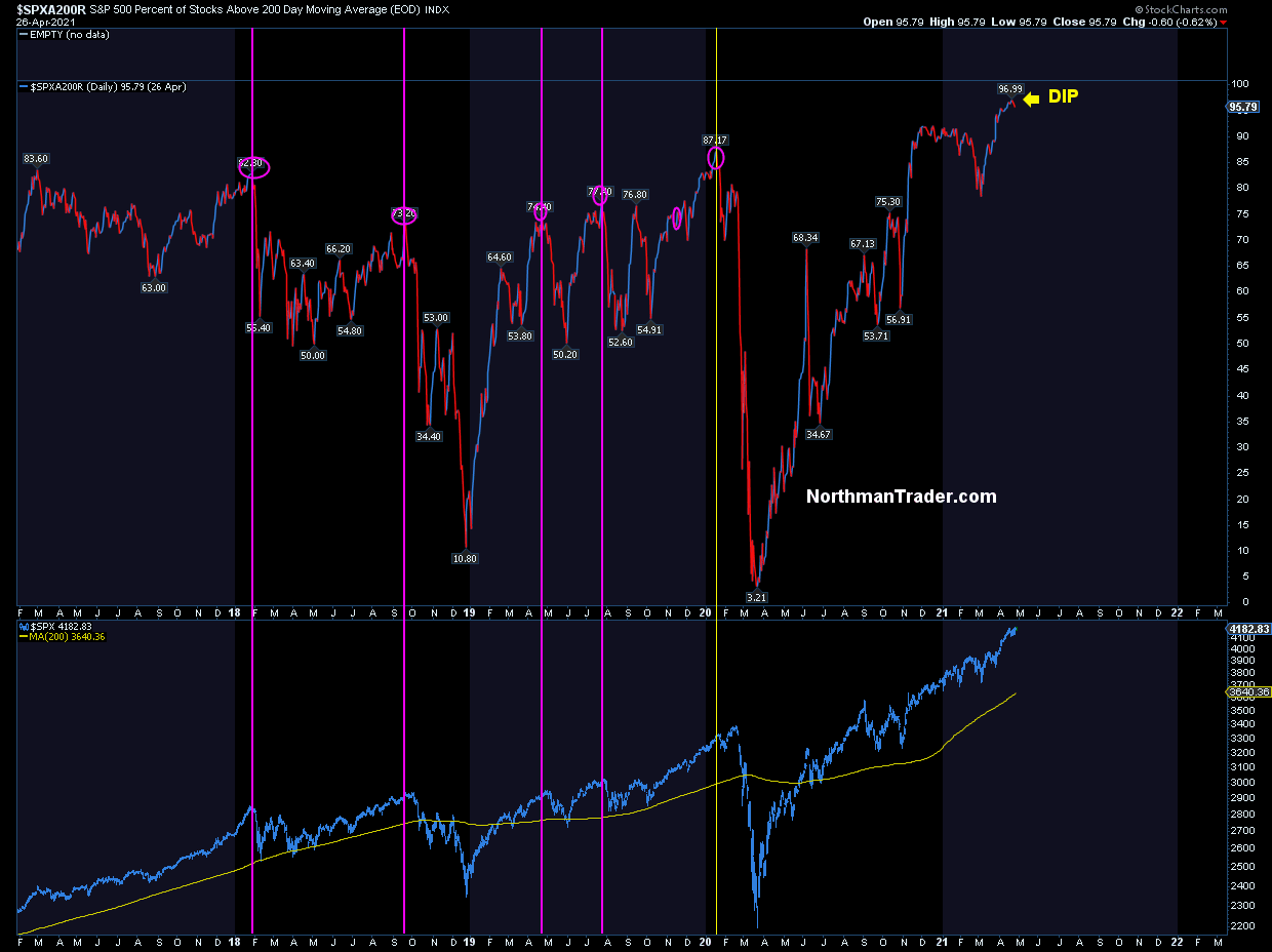
On April 26 $SPX made a slight new high on a negative RSI divergence following a historic, near uninterrupted rally off of the March lows from the previous year.

If you think I’m talking about current markets you are correct, but literally the same sentence word for word can be uttered about the rally from the March 2009 lows to their April 2010 top before a sizable correction emerged.
No, really, market peaked then on April 26 following a relentless and steady move higher and following making a slight new high:
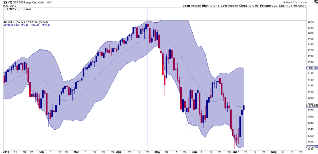
All of this following a year long ramp which had followed a very well established trend:
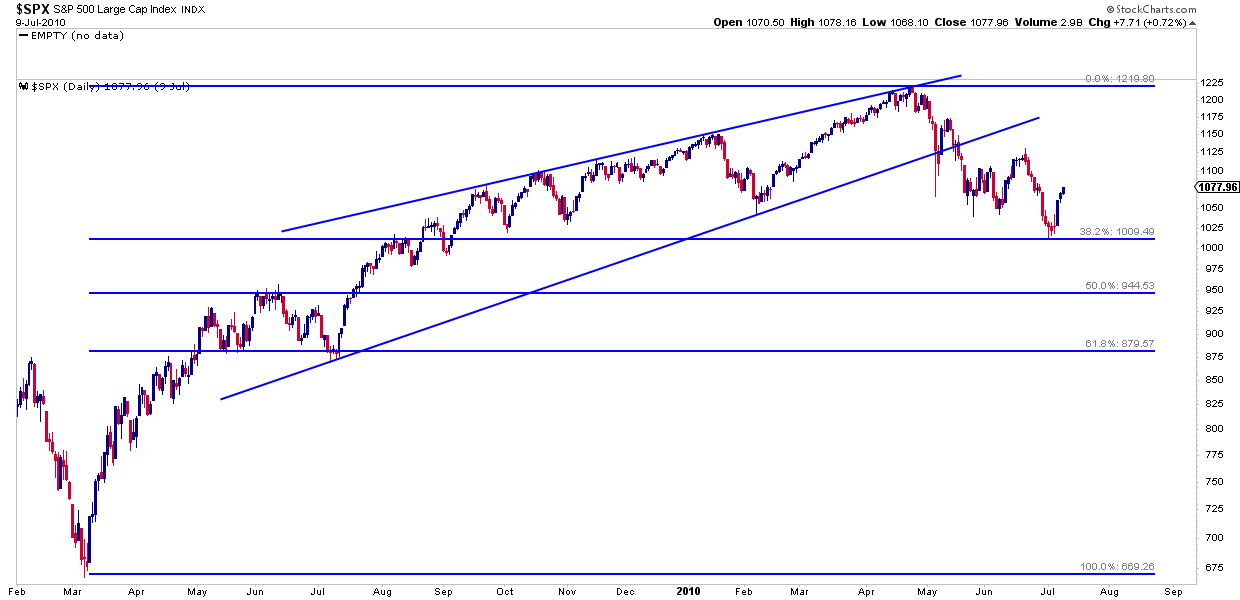
It was following this trend that $SPX peaked on April 26 at the top of that trend line and then put in a classic correction tagging the .382 fib by the end of June of that year. Notably, this correction then retraced the entire rally that had emerged following the September and October corrective periods.
If this all sounds a bit familiar it should. Consider the path $SPX has embarked on since the lows last March:
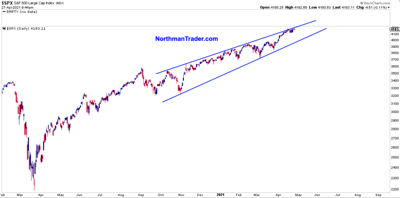
No analog is perfect, no market is alike, but it is noteworthy that $SPX just repeated the same script.
A slight new high on April 26 on a negative RSI divergence tagging the top of its trend:

It seems incredulous to think that markets may repeat the same script following the same day, but then at the time of this writing, markets are trading lower for the moment on this April 27th yet a Fed meeting and plenty of big earnings reports are still ahead of us which may people markets higher still.
And principally my view is as long we don’t see a trend break risk remains higher:
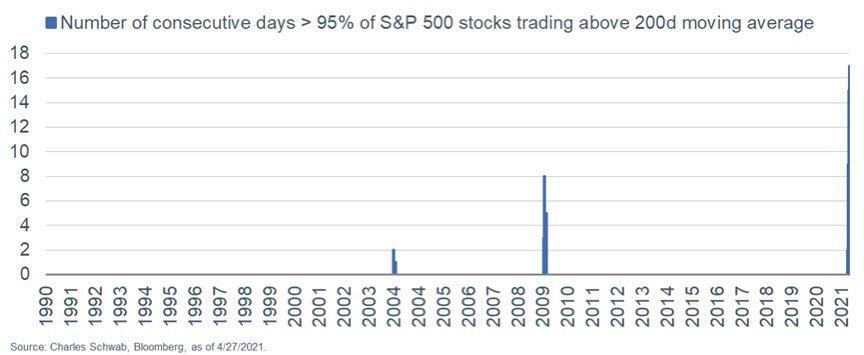
But this rally has also been a freak show as the number of technical never seen before events keep mounting.
One of these events is for how long $SPX components above their 200MA have parked themselves above the 95% level. A rare level of uniform bullishness in any setting:
How freaky is this reading? This freaky:
In short, historically speaking, markets are way overdue for a sizable correction. And this 2009/2010 analog at least provides a potential roadmap of how this could eventually unfold.
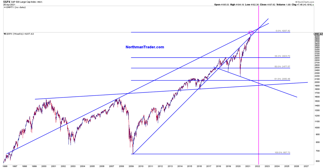
Following the 2010 script we may see something like this unfold for an eventual tag of the .382 fib of this rally (note: this chart using the current high with may or may not be the high):
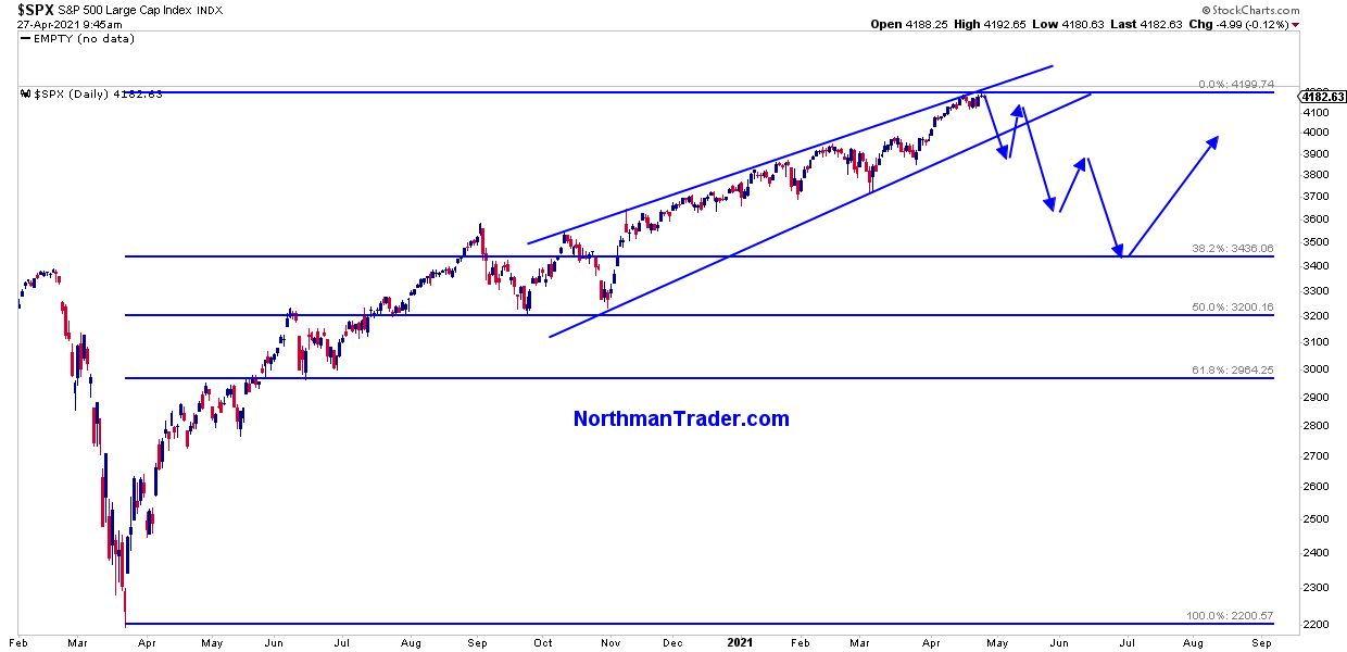
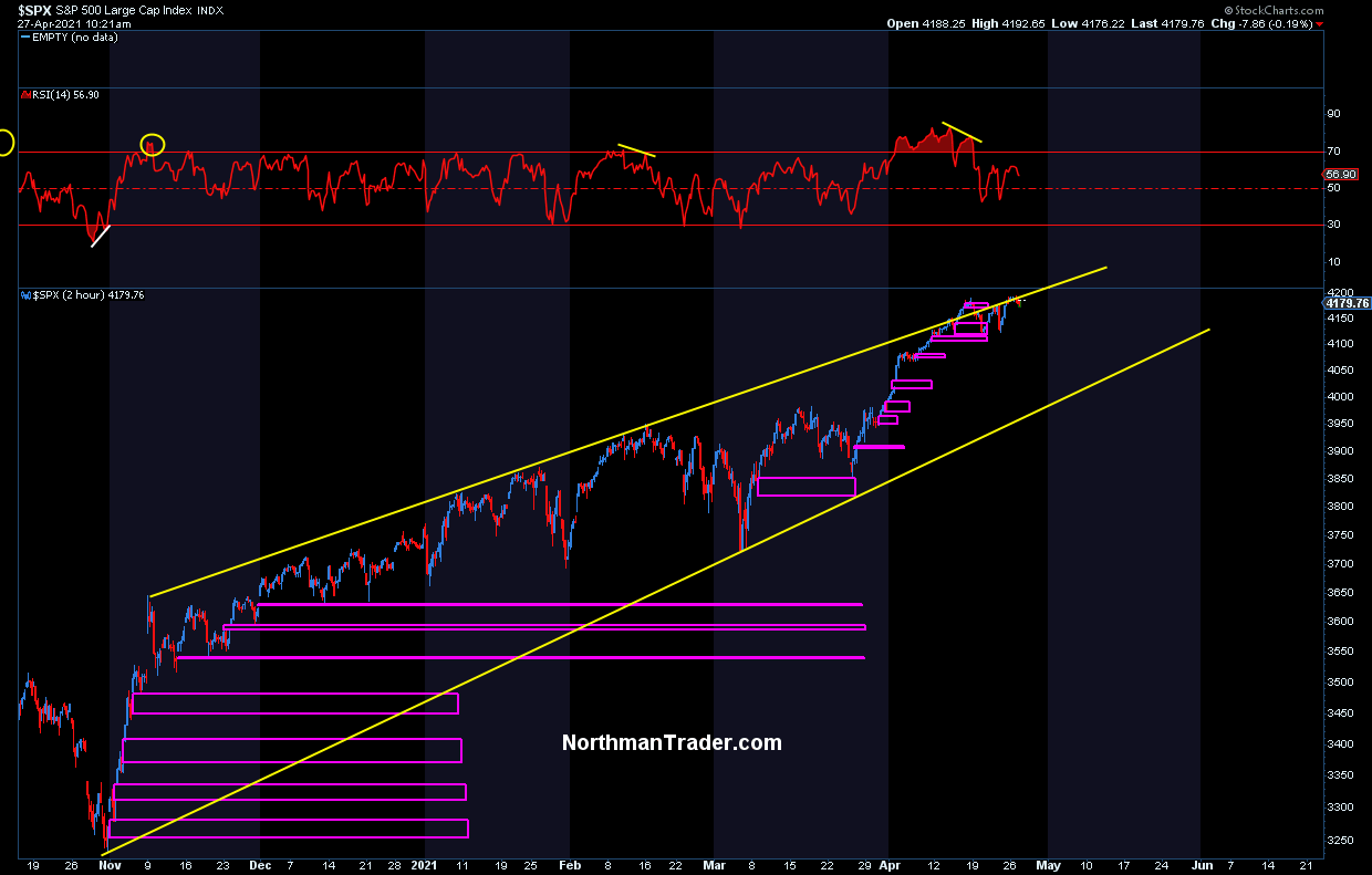
That fib currently sits at 3436 on $SPX and would go a long way to fill many of the unprecedented number of open gaps we see on $SPX since November:
To boot index charts find themselves massively above their yearly Bollinger bands and 5 EMAs:
Incidentally these big upper yearly Bollinger band disconnects are found everywhere.
It’s standard to have reconnects.
This market is technically imbalanced in a big way.#playingwithfireHere’s $NDX pic.twitter.com/7GeLcpisbC
— Sven Henrich (@NorthmanTrader) April 27, 2021
These historic tags may be of relevance, note that the .382 fib in the earlier chart and the yearly 5 EMA on $SPX are not that far apart:

Back in 2010 that June low marked the low of that year and a great buying opportunity. It cleaned out some of the technical excess, offered technical reconnects and was supported by a recovering economy.
Yet, while the charts look so very similar then to now there were also important differences. What accompanied the 2010 correction? A significant reduction in the amount of liquidity the Fed pumped into the system. Oh yes, QE1 had ended by March 2010, and the April-June correction inspired the next round of QE which became official in November of 2010. When markets drop, the Fed flops.
There is no end in sight to QE in 2021, certainly not now. And hence one may argue this analog is not applicable, for the liquidity machine keeps rolling a la 2013.
Yet there is also another important difference. Back in 2010 markets were not anywhere new highs following the GFC.
We are dealing with a different beast here:
March 2009 – April 2010
vs
March 2020 – April 2021$NYSE pic.twitter.com/H2pW6L55na— Sven Henrich (@NorthmanTrader) April 26, 2021
A rally more vertical than any of us have witnessed during our lifetimes and one that keeps pressing to new highs without any real corrective activity whatsoever.
Perhaps more importantly: The recovery rally of 2010 had moved markets to 95% market cap to GDP. Now we are sitting at an unprecedented 204%:
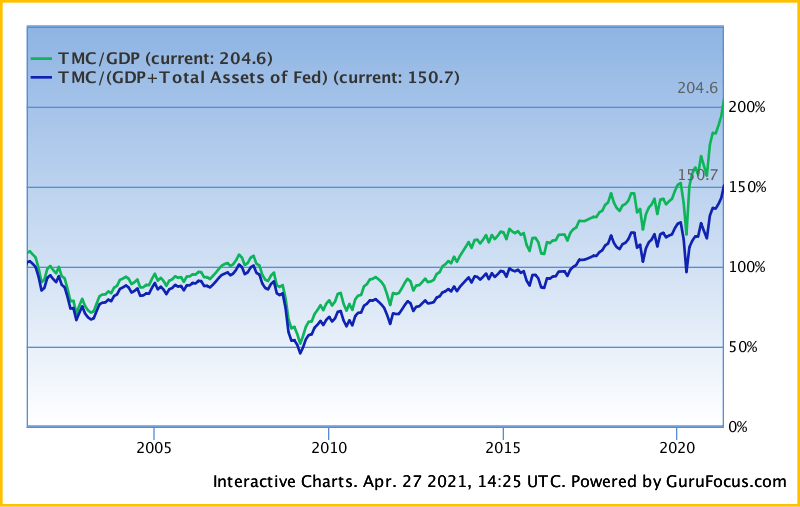
Granted that number will come down as GDP improves but it remains at levels we’ve haven’t seen before.
Somewhere between record asset price disconnects from the economy, artificial liquidity distortions and technicals, never mind fundamentals, lies an ultimate truth.
For now the current market truth is that financial asset valuations have never been so far removed from the actual economy:
That GDP, or the measure of productive output of an economy, no longer matters is the rallying cry of capitulation.
This chart is insane. pic.twitter.com/MgLHInuSQ6
— Sven Henrich (@NorthmanTrader) April 25, 2021
This markets remains way overdue for a healthy correction. Once one ensues all of these factors above will have to be reconciled & negotiate the path forward. The 2010 analog offers one such potential roadmap with a possible target. But for now the trend remains intact and the Fed keeps printing for that is now their self anointed permanent role in life:
Central banks now print during times of recessions & during times of non recessions. They cut rates with unemployment at 3.5% & they run the biggest QE programs ever during times of 5%-8% GDP growth.
There is no exit & all their talk about a future exit is ill defined & bogus.
— Sven Henrich (@NorthmanTrader) April 27, 2021
In 2010 Ben Bernanke at least had the wisdom to at least try to stop QE on occasion only to be called out by markets to do more and he acquiesced at every point of market weakness.
Jay Powell tried once in 2018 to become non accommodative and he failed miserably. Ben Bernanke had to deal with the taper tantrum. Powell I suppose is highly unlikely to risk the same thing happening to him. But the upside to Bernake’s method was that he always had a new carrot to dangle: New QE. What carrot does Jay Powell have if he never ends QE? For the worst thing that could happen to him is that markets sell off in sizable fashion even with record QE running still.
Bottomline: It comes down to continued liquidity control versus a nascent organic market lurking in the shadows that may at some point rebel against the historic distortions and imbalances wrought upon it.
* * *
For the latest public analysis please visit NorthmanTrader. To subscribe to our market products please visit Services.
Tyler Durden
Tue, 04/27/2021 – 14:50
via ZeroHedge News https://ift.tt/2R682LP Tyler Durden