Rent Affordability In Just One Chart

We noted earlier this week that the number of cost-burdened-renters has surged to historic highs, as 21.3 million households now pay more than 30% of income for housing.

The WSJ has an incredible chart that shows this development in crystal clear terms: Since 1960, inflation-adjusted rents have risen by 64%, while household incomes only increased by 18% during the same period.

* * *

One final observation on this matter is that as the chart shows, the rate of change in household income since 1960 dropped significantly between 2000 and 2010, and has remained flat since.

Welcome to the recovery:

via http://ift.tt/2984ctm Tyler Durden

ObamaScare Looms – Health Insurers Are Looking For A Taxpayer Bailout

Submitted by Edward Morrissey via The FiscalTimes.com,

Insurers helped cheerlead the creation of Obamacare, with plenty of encouragement – and pressure – from Democrats and the Obama administration. As long as the Affordable Care Act included an individual mandate that forced Americans to buy its product, insurers offered political cover for the government takeover of the individual-plan marketplaces. With the prospect of tens of millions of new customers forced into the market for comprehensive health-insurance plans, whether they needed that coverage or not, underwriters saw potential for a massive windfall of profits.

Six years later, those dreams have failed to materialize. Now some insurers want taxpayers to provide them the profits to which they feel entitled – not through superior products and services, but through lawsuits.

Earlier this month, Blue Cross Blue Shield of North Carolina joined a growing list of insurers suing the Department of Health and Human Services for more subsidies from the risk-corridor program. Congress set up the program to indemnify insurers who took losses in the first three years of Obamacare with funds generated from taxes on “excess profits” from some insurers. The point of the program was to allow insurers to use the first few years to grasp the utilization cycle and to scale premiums accordingly.

As with most of the ACA’s plans, this soon went awry. Utilization rates went off the charts, in large part because younger and healthier consumers balked at buying comprehensive coverage with deductibles so high as to guarantee that they would see no benefit from them. The predicted large windfall from “excess profit” taxes never materialized, but the losses requiring indemnification went far beyond expectations.

In response, HHS started shifting funds appropriated by Congress to the risk-corridor program, which would have resulted in an almost-unlimited bailout of the insurers. Senator Marco Rubio led a fight in Congress to bar use of any appropriated funds for risk-corridor subsidies, which the White House was forced to accept as part of a budget deal. As a result, HHS can only divvy up the revenues from taxes received through the ACA, and that leaves insurers holding the bag.

They now are suing HHS to recoup the promised subsidies, but HHS has its hands tied, and courts are highly unlikely to have authority to force Congress to appropriate more funds. In fact, the Centers for Medicare and Medicaid Services formally responded by telling insurers that they have no requirement to offer payment until the fall of 2017, at the end of the risk-corridor program.

That response highlights the existential issue for both insurers and Obamacare. The volatility and risk was supposed to have receded by now. After three full years of utilization and risk-pool management, ACA advocates insisted that the markets would stabilize, and premiums would come under control. Instead, premiums look set for another round of big hikes for the fourth year of the program.

Consumers seeking to comply with the individual mandate will see premiums increase on some plans from large insurers by as much as 30 percent in Oregon, 32 percent in New Mexico, 38 percent in Pennsylvania, and 65 percent in Georgia.

Thus far, insurers still claim to have confidence in the ACA model – at least, those who have not pulled out of their markets altogether. However, massive annual premium increases four years into the program demonstrate the instability and unpredictability of the Obamacare model, and a new study from Mercatus explains why.

The claims costs for qualified health plans (QHPs) within the Obamacare markets far outstripped those from non-QHP individual plan customers grandfathered on their existing plans – by 93 percent. They also outstripped costs in group QHP plans by 24 percent. In order to break even without reinsurance subsidies (separate from the risk-corridor indemnification funds), premiums would need to have been 31 percent higher on average for individual QHPs.

The main problem was that younger and healthier people opted out of the markets, skewing the risk pools toward consumers with much higher utilization rates – as Obamacare opponents predicted all along. With another round of sky-high premium increases coming, that problem will only get worse, the study predicts.

“[H]igher premiums will further reduce the attractiveness of individual QHPs to younger and healthier enrollees, resulting in a market that will appeal primarily to lower-income individuals who receive large subsidies and to people with expensive health conditions,” it concludes. “To avoid such an outcome, it is increasingly likely that the individual insurance market changes made by the ACA will have to be revised or reversed.”

Galen Institute senior fellow Doug Badger, one of the study’s co-authors, wonders how long insurers will continue to publicly support Obamacare. In an interview with me this week, Badger noted how critical that political cover is for the White House, but predicted it won’t last – because the system itself is unsustainable, and no one knows this more than the insurers themselves, even if they remain reluctant to voice that conclusion. Until they speak up, however, the Obama administration can keep up their happy talk while insurers quietly exit these markets, an act that should be speaking volumes all on its own.

Even the Kaiser Foundation, which has supported Obamacare, has admitted that the flood of red ink has become a major issue. “I don't know if we're at a point where it's completely worrisome,” spokesperson Cynthia Cox told NPR, “but I think it does raise some red flags in pointing out that insurance companies need to be able to make a profit or at least cover their costs."

Red flags have flown all over the Obamacare model for six years. Instead of suing the federal government for losses created by a system for which they bear more than a little responsibility, insurers should finally admit out loud that the ACA is anything but affordable – not for insurers, and certainly not for consumers or taxpayers. When that finally happens, we can then start working on a viable solution based on reality rather than fealty to a failed central-planning policy.

via http://ift.tt/29dSEac Tyler Durden

Why Was A Gun Used in The Paris Terrorist Attacks Linked To “Fast And Furious”

From Judicial Watch

Law Enforcement Sources: Gun Used in Paris Terrorist Attacks Came from Phoenix

One of the guns used in the November 13, 2015 Paris terrorist attacks came from Phoenix, Arizona where the Obama administration allowed criminals to buy thousands of weapons illegally in a deadly and futile “gun-walking” operation known as “Fast and Furious.”

A Report of Investigation (ROI) filed by a case agent in the Bureau of Alcohol, Tobacco Firearms and Explosives (ATF) tracked the gun used in the Paris attacks to a Phoenix gun owner who sold it illegally, “off book,” Judicial Watch’s law enforcement sources confirm. Federal agents tracing the firearm also found the Phoenix gun owner to be in possession of an unregistered fully automatic weapon, according to law enforcement officials with firsthand knowledge of the investigation.

The investigative follow up of the Paris weapon consisted of tracking a paper trail using a 4473 form, which documents a gun’s ownership history by, among other things, using serial numbers. The Phoenix gun owner that the weapon was traced back to was found to have at least two federal firearms violations—for selling one weapon illegally and possessing an unregistered automatic—but no enforcement or prosecutorial action was taken against the individual. Instead, ATF leaders went out of their way to keep the information under the radar and ensure that the gun owner’s identity was “kept quiet,” according to law enforcement sources involved with the case. “Agents were told, in the process of taking the fully auto, not to anger the seller to prevent him from going public,” a veteran law enforcement official told Judicial Watch.

It’s not clear if the agency, which is responsible for cracking down on the illegal use and trafficking of firearms, did this because the individual was involved in the Fast and Furious gun-running scheme. An ATF spokesman, Corey Ray, at the agency’s Washington D.C. headquarters told Judicial Watch that “no firearms used in the Paris attacks have been traced” by the agency. When asked about the ROI report linking the weapon used in Paris to Phoenix, Ray said “I’m not familiar with the report you’re referencing.” Judicial Watch also tried contacting the Phoenix ATF office, but multiple calls were not returned.

The ATF ran the Fast and Furious experiment and actually allowed criminals, “straw purchasers,” working for Mexican drug cartels to buy weapons at federally licensed firearms dealers in Phoenix and allowed the guns to be “walked”—possessed without any knowledge of their whereabouts. The government lost track of most of the weapons and many have been used to murder hundreds of innocent people as well as a U.S. Border Patrol agent, Brian Terry, in Arizona. A mainstream newspaper reported that a Muslim terrorist who planned to murder attendees of a Muhammad cartoon contest in Garland, Texas last year bought a 9-millimeter pistol at a Phoenix gun shop that participated in the ATF’s Fast and Furious program despite drug and assault charges that should have raised red flags. Judicial Watch has thoroughly investigated Fast and Furious and has sued the Obama administration for information about the once-secret operation.

via http://ift.tt/29dNdIe Tyler Durden

Bad Earnings, Balance Sheet Rot, & The “Brelief” Rally

Submitted by Lance Roberts via RealInvestmentAdvice.com,

Negative Revisions Coming

Despite mainstream economists hopes that somehow “this time will be different,” the ongoing massaging of economic data through seasonal adjustments to obtain better headlines did not translate into actual prosperity.  Of course, “reality” is a cruel mistress and despite ongoing hopes and overstatements, “fantasy” eventually gives way. 

The chart below shows the S&P 500 index with recessions and when the National Bureau of Economic Research dated the start of the recession.

SP500-NBER-RecessionDating-040416

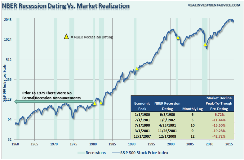
There are three lessons that should be learned from this:

  1. The economic “number” reported today will not be the same when it is revised in the future.
  2. The trend and deviation of the data are far more important than the number itself.
  3. “Record” highs and lows are records for a reason as they denote historical turning points in the data.

The last two-quarters of economic growth have been less than exciting, to say the least. However, these rather dismal quarters of growth come at a time when oil prices and gasoline prices have plummeted AND amidst one of the warmest winters in 65-plus years.

Why is that important? Because falling oil and gas prices and warm weather are effective “tax credits” to consumers as they spend less on gasoline, heating oil and electricity. Combined, these “savings” account for more than $200 billion in additional spending power for the consumer. So, personal consumption expenditures should be rising, right?

PCE-Nominal-YoY-Pct-Chg-063016

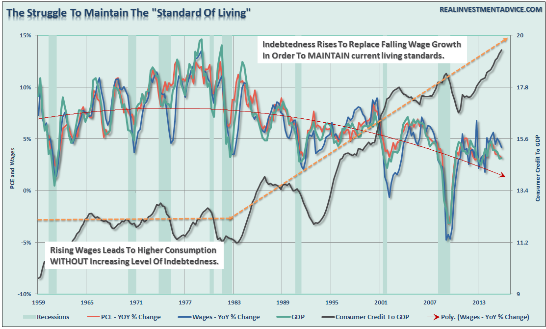
What’s going on here? The chart below shows the relationship between real, inflation-adjusted, PCE, GDP, Wages and Employment. The correlation is no accident.

PCE-Nominal-Real-Employment-063016

Economic cycles are only sustainable for as long as excesses are being built. The natural law of reversions, while they can be suspended by artificial interventions, can not be repealed. 

More importantly, while there is currently “no sign of recession,” what is going on with the main driver of economic growth – the consumer?

The chart below shows the real problem. Since the financial crisis, the average American has not seen much of a recovery. Wages have remained stagnant, real employment has been subdued and the actual cost of living (when accounting for insurance, college, and taxes) has risen rather sharply. The net effect has been a struggle to maintain the current standard of living which can be seen by the surge in credit as a percentage of the economy. 

PCE-Wages-GDP-Debt-Post2007-040416

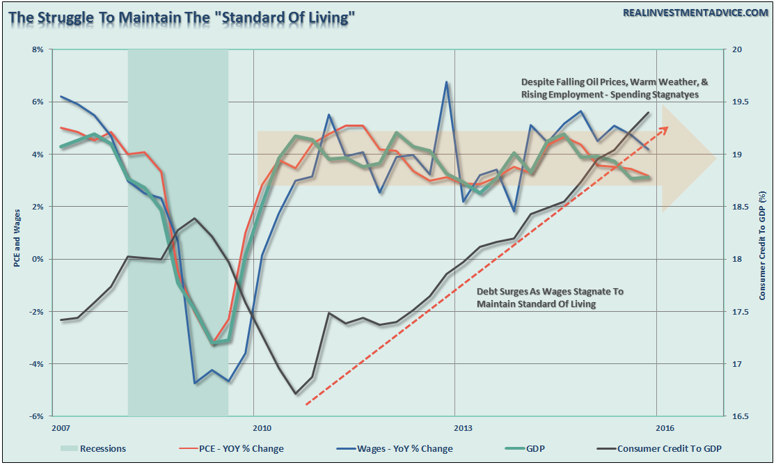
To put this into perspective, we can look back throughout history and see that substantial increases in consumer debt to GDP have occurred coincident with recessionary drags in the economy.

“No sign of recession? Are you sure about that?”

PCE-Wages-GDP-Debt-040416

Furthermore, the recent decline in rates likely suggests a much weaker economic environment than is currently expected. The last time that rates were this low, and potentially heading lower, was during the economic slowdown in 2012 which bordered on a recession. The difference is that in 2012 the Federal Reserve was in extreme accommodation mode, profits were growing and multiples were expanding. That is not the case today.

In July, the BEA will negatively revise the economic data going back over the last eleven years.

“During 2012 and 2013, when the U.S. economy had what some have referred to as a micro-recession, the overstatement of real GDP growth ballooned to about $275 billion. Despite over $100 billion in revisions to real GDP growth in 2014 and 2015, the overstatement continued to grow to $324 billion, or 2 percent of GDP.”

Importantly, these aren’t the only forthcoming revisions. The extremely warm winter weather is currently wrecking havoc with the seasonal adjustments being applied to the economic data. This makes every report from employment, retail sales, and manufacturing appear more robust than they would be otherwise. However, as the seasonal trends turn more normal we are likely going to see further negative adjustments in future revisions. 

Here is my point. While my call of a forthcoming “recession” may seem far-fetched based on today’s economic data points, it should be remembered that no one was calling for a recession in early 2000 or 2007 either.

The takeaway of all this is the risk to equities may be higher than currently expected.  If rates, economic data trends, and valuation reversions are sending the correct message, the forthcoming negative revisions to the underlying data will derail the current bullish thesis of a profits recovery in the making.


Share Buybacks & Balance Sheet Rot

Chris Martenson via Peak Prosperity wrote early this year:

“Corporate debt is a hot topic this year. Before the 2008–09 calamity, U.S. non-financial corporate debt teetered at $2.6 trillion dollars. It is now $5.8 trillion. The reported $2 trillion of corporate “cash on the balance sheet” constitutes only 30–35% of the corporate debt. So much for that meme. The high-yield debt placed in peril by the collapse of commodities is putting serious pressure on the high-yield (junk) bond indices. GM and Chrysler are way out on the subprime yield curve; a recession would be poorly timed, which is precisely why it will arrive soon. Auto loans are pushed out 67 months. Liquidity in the market is faltering—a sell-off could get ugly.”

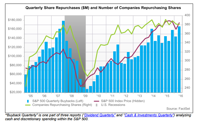
“So what’s all this debt being used to fund? Share buybacks, of course. More is spent on share buybacks than on capital expenditures (Capex). Companies are making corn dogs from their seed corn. The record buying spree is twice that of the early months of 2014.


Citi analysts noted that ‘if leverage is going up today because it’s funding tomorrow’s growth that might not be a bad thing. Unfortunately, that’s not what’s going on.’ Companies reaching for returns on their cash have found another overpriced investment on which to squander their shareholders’ value—other companies’ bonds. The sellers of these corporate bonds are reputed to be using the proceeds to . . . wait for it . . . buy back shares of their companies! This is financial engineering that would make Escher proud.”

Why is this important? Because it is the ongoing rot of corporate balance sheets and obfuscation of earnings that are a potential trap for investors. Yesterday, the problem got even worse following the release of the “stress tests” which immediately led to a stock buyback, dividend boosting, frenzy in a sector already plagued by low net interest margins – the banks.

  • JPMorgan: $10.6 billion
  • Citi: $8.6 billion
  • Bank of America: $5 billion
  • Goldman Sachs: Will buy back stock, but did not release the amount.
  • State Street: $1.4 billion
  • Ally Financial: $700 million
  • American Express: $3.3 billion
  • BB&T: $640 million
  • Capital One: $2.5 billion
  • Discover Financial: $1.95 billion
  • PNC Bank: $2.0 billion
  • SunTrust: $960 million
  • Northern Trust: $275 million
  • Regions Financial: $640 million
  • KeyBank: $350 million

Just as a reminder, In 2007, S&P 500 firms allocated more than one-third of their cash to buybacks just before the S&P 500 plunged by 56%.

According to FactSet:

“Companies in the S&P 500 spent $166.3 billion on share buybacks during the first quarter, which marked a new post-recession high. Since 2005, only Q3 2007 produced a larger amount of buybacks ($178.5 billion). Dollar-value buybacks in Q1 represented a 15.1% increase in spending from the year-ago quarter, and a 15.6% jump from Q4. This breakout in the first quarter of the year comes amid somewhat of a stabilization period for buybacks since the middle of 2014. With that said, buyback spending still remained at very high levels for the index during this period.”

FactSet-Q2-2016-ShareBuybacks-062014

There are many layers to this magical onion. If Eugene Fama was correct, an efficient market would reduce the P/E ratios to account for the rot contained in the balance sheet. Leveraged share buybacks are a zero-sum game (like stock splits).

As Chris concluded:

With almost a third of the ‘buying pressure’ in the S&P coming from share buybacks, however, markets are not very efficient. Let’s take this notion to the limit. Imagine you borrow enough to buy up almost all the shares. The last share represents ownership in a company whose assets are entirely offset by debt. The P/E ratio of that share will head to zero in the limit. So who owns the company? The creditors! Yes indeedy, leveraged share buybacks constitute a sale of the company to creditors. It’s an LBO. Long before the LBO is complete, however, corporate debts that soared with century-low interest rates will lead to an 80-car pileup. Shale companies are being forced to re-issue shares—the reverse of a share buyback—at fire sale prices to cover their debt payments. A bond crisis will force an analogous deleveraging across the broader equity markets. The flawed TINA—There Is No Alternative—equity model will morph into TINWA—There Is No Worse Alternative. But until then, you just keep buying shares because insiders are buying, and they know what’s best.


BRE-LIEF Rally

Just a quick update to Tuesday’s discussion on the market.

We can benefit from the alignment of policies. What I mean by alignment is a shared diagnosis of the root causes of the challenges that affect us all; and a shared commitment to found our domestic policies on that diagnosis.” – Mario Draghi at the ECB Forum in Sintra, Portugal.

As I noted, the belief that Central Banks can “heal all ills,” quickly drove buyers back into the markets following the brief two-day rout on the heels of the “Brexit” vote. However, there are two things to note about the recent rally as notated in the chart below:

SP500-MarketUpdate-063016

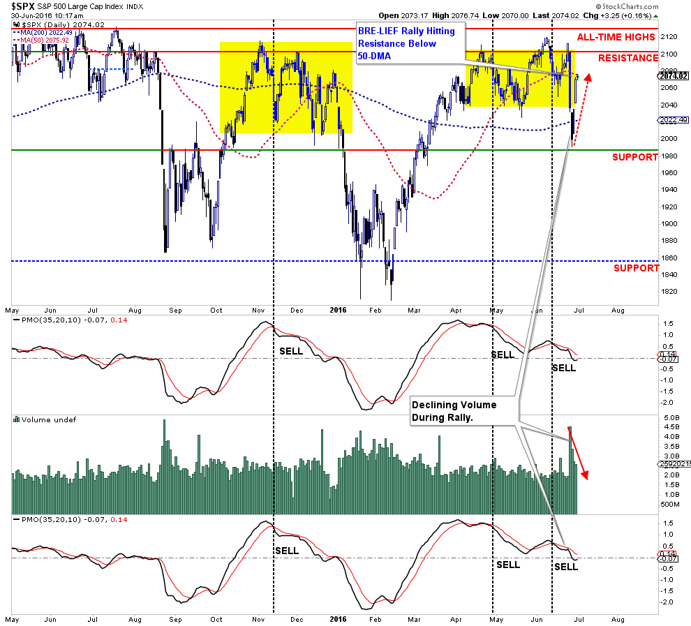
The first is that volume has declined during each day of the rally. While both days were 90% up days in terms of positive stock performance, the negative divergence in volume is concerning.

Secondly, the rally in the market is currently retesting the 50-day moving average which is currently acting as resistance. The market must reclaim the short-term moving average if another attempt at 2100 is going to be made.

The biggest concerns, however, remain at price momentum remains weak and with both price and volume oscillators currently on “sell signals,” the risk of a failed rally is currently high.

The rally on Tuesday and Wednesday was not unexpected. With the markets oversold on a short-term basis, end of the quarter portfolio “window dressing” at hand, and soothing comments from Central Banks, the rally off of critical support at 2000 was certainly viable. 

The question now becomes sustainability. As we head into the depths of the summer months, all eyes should begin to focus once again on the month of August. The potential of a rather severe market rout in August and September from a technical perspective is extremely high. Despite the rhetoric, the best thing that investors can likely do this summer is to continue operating at reduced risk levels in portfolios.

Just some things to think about.

via http://ift.tt/297Y7xb Tyler Durden

JPM Head Quant Explains How The Algos Traded The Brexit Crash, And Why He Sees “Elevated Risk”

When looking at the kneejerk devastation in the aftermath of the Brexit vote, JPM’s head quant Marko Kolanovic said that he expects up to $300 billion in program selling, coupled with 5-10% in near-term downside to the S&P500. While Kolanovic was correct about quant and technical fund flows, what he likely did not factor in was the dramatic crisis response by central bankers who have now made it very clear their only mandate is to keep global equity markets disconnected from reality and artificially bid higher no matter the cost.

So what does he think happens now that the S&P has wiped out all losses from Brexit in the past three days?

Here is his explanation, released moments ago:

Flows and Price Action—Largely a Repeat of August 2015

In our note last week we discussed how the impact of Brexit would likely be similar to August 2015. Market price action and flows observed so far this week are fully consistent with the moves that followed August 24. The Figure below (left) shows S&P 500 moves over the four days starting with the “crash” day (i.e., August 24, 2015, and June 24, 2016). The “crash” day itself both witnessed futures hitting limit down during pre-market hours and a significant move on the day itself (-3.9% on 8/24 vs. -3.6% on 6/24). The following day’s move was again lower, largely driven by flows from convex strategies (e.g., CTA outflows, derivatives hedging). The bounce-back that followed on days 3 and 4 were also similar in August and this week (in fact, the market rallied more on days 3 and 4 in August 2015). We would like to point out that both in August and now, market realized volatility reset significantly higher, and market outflows from various “VAR-based” investors (volatility targeting, risk parity, etc.) followed in the days and weeks ahead. This contributed to the market bottoming only weeks after the crash (in 2015, the market bottomed on 9/28).

In the past few days we have heard various arguments about how market action this week was substantially different from August 2015. This was argued based on the perception of lower volume orderly move, market bouncing back (which was identical in August), and supposed pension fund inflows that propped up the market this time around. Below we will address each of these.

Total US share volume on 6/24 (18.6 bn shares) was higher than on 8/24 (18.3 bn). This was helped by the Russell rebalance, which provided extra liquidity (e.g., market depth dropped by ~50% as opposed to the ~70% drop on 8/24). Futures volumes on 6/24 were the highest since 8/24. On both days futures hit their 5% limit down pre-market, and the end-of-day moves were similar in size. The fact that the 6/24 move was not larger than the 8/24 move can be largely attributed to the lower S&P 500 option gamma imbalance as compared to 8/24 (over the 6/24 move gamma imbalance averaged ~15bn per 1% vs. ~30bn for the 8/24 move, which was an alltime high as we pointed out before the crash). As gamma exposure turned significantly short on Monday 6/27, it also contributed to a larger squeeze up on Tuesday and Wednesday (please note, these were even more prominent on 8/26 and 8/27 than this week).

How about pension fund quarterly inflows? We have come across what we consider wild estimates of pension fund buying on account of quarterly rebalances. A number of clients told us how they are hesitant to sell equities until these alleged flows are out of the way. The figure above (right) shows the quarter-end effect of equal weight portfolio rebalances (% of quarterly to day move that is reversed in the last week of a quarter). The chart shows that this effect largely disappeared over the past roughly two years. This means that quarterly rebalancing funds that allocate based on fixed weights (which would drive mean reversion) are likely similar in size to those that rebalance based on fixed risk budgets (which would generally do the opposite), washing out any quarter-end effect. It should not be surprising that pension funds are moving away from fixed weight rebalances as these were the worst performing strategies over the past two decades (see our Primer on Systematic Strategies, page 105). We have extensively analyzed in the past another effect—the “month-end reversion effect” (see our report here). We argued that the month-end effect is increasingly related to the option expiry cycle rather than pension fund rebalances (this can be shown by isolating month-ends that did not coincide with post-option expiry weeks). The effect was obviously present and even more significant in the August 2015 (and January 2016) market declines, so there is nothing different about it now. The expected market impact of the month-end effect this week was about ~40bps of market upside and can hence explain only a small fraction of the market move higher post the crash. In order of importance, in our view, the drivers of the midweek rally were the snapback of oversold (European) markets and short S&P 500 gamma squeeze, and then the lesser drivers of S&P 500 price momentum turning neutral (from negative), month-end-effect, unwind of hedges, and short covering. As most of these were present in August, too, they don’t change our view on higher realized volatility and expected outflows from VAR-based investors.

One notable difference between the August crash and Brexit impact on US markets is the reaction of implied volatility, e.g., the VIX. The August 2015 crash was largely unexpected by the market, and hence the VIX increased from ~13 in the week before the crash to ~40 on the day of the crash. The Brexit risk was fairly anticipated with significant buying of VIX products (e.g., VIX ETP exposure reached near record levels in the weeks before the event). As a result, the VIX moved to ~19 in the week before Brexit and increased only to ~26 on the event. As the VIX was pricing in a large move in either direction (for the methodology see appendix of this report), once the event passed, its contribution was mechanically priced out of the VIX (e.g., think of it as a ~6 point drag). In addition, many investors rushed to monetize VIX hedges, which resulted in large outflows from long VIX ETPs and closing out of VIX call positions (as well as new shorting of VIX ETPs and opening of VIX put positions). Overall, VIX ETP exposure dropped by around half. We maintain the view that we have not yet seen the highs of VIX due to Brexit and  related risks (increase of market realized volatility, upcoming earnings season, and geopolitical consequences including post Brexit shift in US election polls).

Fund Performance and Positioning: Trend followers (CTAs) were the best performing strategies on the day of the Brexit result. Due to long bond and gold exposure, and low equity exposure, these funds returned on average ~2.3%. As we argued in our previous report (see here), Hedge Funds were going into Brexit fairly long equities. Equity long-short funds drew down ~2% (consistent with our estimation of their equity beta of 0.45), and Risk Parity funds drew down on average ~1% as their long bond exposure was not sufficient to offset high levels of equity exposure. Despite the very strong performance of long-short equity Momentum (3%) and Low volatility (~3%) factors, Equity Quant Hedge Funds were still down on the day (~0.6%) given the likely net long equity bias and ~1.5% pullback of the Value factor. Interestingly, the equity exposure of long-short Hedge Funds (and Hedge Funds in general) did not materially decrease since Brexit. Discretionary Hedge Funds likely decided to avoid selling into more volatile/less liquid markets. We have also noticed investors adjusting trading and prepositioning for various end-of-day hedging flows (Hedgers are adjusting accordingly, as one could for instance notice the moves of S&P 500 and VIX futures after the 4pm market close on Friday and Monday as opposed to the more common 3:30-4PM hedging window). Finally, we would like to point out that the size of all equity short positions calculated after Brexit is near the lowest point since September 2015 (i.e., very little shorts currently in place).

The points discussed above suggest equity markets face elevated risk in the days and weeks ahead.

via http://ift.tt/298Eo3i Tyler Durden

Tesla Tumbles After Fatal Self-Driving-Mode Car Crash

It appears Elon Musk has more problems than simply corporate incest:

  • *NHTSA RECENTLY LEARNED OF FATAL CRASH W/ 2015 MODEL S
  • *NHTSA OPENING EVALUATION ON TESLA MODEL S
  • *TESLA SAYS INFORMED NHTSA ABOUT INCIDENT IMMEDIATELY
  • *TESLA SAYS BRAKE WAS NOT APPLIED, CAR WAS ON AUTOPILOT

Tesla Statement: A Tragic Loss

 The Tesla Team June 30, 2016


We learned yesterday evening that NHTSA is opening a preliminary evaluation into the performance of Autopilot during a recent fatal crash that occurred in a Model S. This is the first known fatality in just over 130 million miles where Autopilot was activated. Among all vehicles in the US, there is a fatality every 94 million miles. Worldwide, there is a fatality approximately every 60 million miles. It is important to emphasize that the NHTSA action is simply a preliminary evaluation to determine whether the system worked according to expectations.


Following our standard practice, Tesla informed NHTSA about the incident immediately after it occurred. What we know is that the vehicle was on a divided highway with Autopilot engaged when a tractor trailer drove across the highway perpendicular to the Model S. Neither Autopilot nor the driver noticed the white side of the tractor trailer against a brightly lit sky, so the brake was not applied. The high ride height of the trailer combined with its positioning across the road and the extremely rare circumstances of the impact caused the Model S to pass under the trailer, with the bottom of the trailer impacting the windshield of the Model S. Had the Model S impacted the front or rear of the trailer, even at high speed, its advanced crash safety system would likely have prevented serious injury as it has in numerous other similar incidents.


It is important to note that Tesla disables Autopilot by default and requires explicit acknowledgement that the system is new technology and still in a public beta phase before it can be enabled. When drivers activate Autopilot, the acknowledgment box explains, among other things, that Autopilot “is an assist feature that requires you to keep your hands on the steering wheel at all times," and that "you need to maintain control and responsibility for your vehicle” while using it. Additionally, every time that Autopilot is engaged, the car reminds the driver to “Always keep your hands on the wheel. Be prepared to take over at any time.” The system also makes frequent checks to ensure that the driver's hands remain on the wheel and provides visual and audible alerts if hands-on is not detected. It then gradually slows down the car until hands-on is detected again.


We do this to ensure that every time the feature is used, it is used as safely as possible. As more real-world miles accumulate and the software logic accounts for increasingly rare events, the probability of injury will keep decreasing. Autopilot is getting better all the time, but it is not perfect and still requires the driver to remain alert. Nonetheless, when used in conjunction with driver oversight, the data is unequivocal that Autopilot reduces driver workload and results in a statistically significant improvement in safety when compared to purely manual driving.


The customer who died in this crash had a loving family and we are beyond saddened by their loss. He was a friend to Tesla and the broader EV community, a person who spent his life focused on innovation and the promise of technology and who believed strongly in Tesla’s mission. We would like to extend our deepest sympathies to his family and friends.

Does Musk have another brother, cousin, aunt, uncle to buy this?

via http://ift.tt/29bPRfZ Tyler Durden

Silver Market Set To Break Out Above 20 Dollars (Video)

By EconMatters


The Silver Market really broke out this week, far outpacing Gold, and is the market to watch in my opinion going forward regarding more “Central Bank Currency Devaluation QE Stimulus Initiatives” and the resultant implications for financial markets.


© EconMatters All Rights Reserved | Facebook | Twitter | YouTube | Email Digest | Kindle    

via http://ift.tt/298WnVv EconMatters

Silver Surges To 21-Month Highs, Gold-Ratio Crashes

While gold surged to its highest since March 2014 on Brexit; Silver is nearing $19, up almost 9% since Brexit, breaking above Jan 2015 highs to its highest since Sept 2014


Gold has not been this ‘cheap’ to Silver since May 2015…


If gold is institutional safe-haven buying then many argue the surge in silver is retail rotation out of fiat.

via http://ift.tt/29dwoNJ Tyler Durden

Stocks Bounce, Bonds Bid, But Gold Soars To Best Year Since 1980

Overheard everywhere this week…


But it seems something changed…

*  *  *

Across global assets…

Half-way through the year and judging by the last 3 days, everything is awesome… Gold and Silver are massive outperformers, stocks just broke even, and bonds are surging…


This is gold's best H1 since 1980…


Stocks bounced hard off their End-QE3 levels…


But Nasdaq -4% and Trannies remain the laggards year-to-date…


*  *  *

In Q2, Silver and Crude were best performers, stocks and HY debt worst with bonds and gold doing well…


This was the worst quarter for the Chinese Yuan since 1994's Q1 49% devaluation…


Trannies ended the quarter down 6% and Nasdaq -1.6% while Small Caps short-squeezed themselves to a 4% gain…


*  *  *

And finally, for June…stocks managed to scramble back into the green barely this week but Silver soared with bonds and bullion big winners…


A 3rd 200-point plus gain in The Dow was the first since the face-ripping rally off mid-Feb lows…


If ever there was a presence of The PPT to be found, we note that the last 3 days are the first time since the August crash rebound that The Dow has ripped over 200 points from the open to the high…same as in Oct 2014 when Bullard saved the world…

Makes sense – if The PPT is going to step in then they will want cash investors to take the momentum… not overnight futures traders.

Here is June – The S&P scrambled all the way back to unchanged (ending June +2pts)…

Manipulation instrument of choice – VIX – collapsed almost 40% (yes we know we don't like using %ages with VIX) – the most since the Bullard bounce in Oct 2014…notice VIX is stuck right at its 50DMA


*  *  *

Since Brexit, gold remains the winner but stocks are catching back up to unch…


While Trannies and Small Caps are laggards, Dow & S&P surge desperately for the pre-Brexit levels…


VIX broke down to 15.29 intrday today, but was unable to hold below its 50DMA at 16.05…


Treasury yields were crazy today – spiking higher early at the EU open, then plunging on BoE, spiking again on ECB, then tanking into the close…


Notably on the day (this is bond futures) – Gilts gained (BoE easing), TSYs unch to lower (safety/yield), and Bunds tumbled (ECB buying elsewhere)


FX Markets were nosiy…Cable dumped on Carney but rallied back, JPY dumped (to support stocks) and EUR dumped and pumped…


Commodities were mixed as the USD swung around. Crude was weakest as Silver soared…


Crude ramped into the NYMEX close yet again… and then crashed…


Finally, Precious Metals are soaring. Silver is at its highest since Sept 2014…


Charts: Bloomberg

via http://ift.tt/2988Dnc Tyler Durden