“When The Fed Pivots, We Get Paid”
Submitted by QTR’s Fringe Finance
Friend of Fringe Finance Lawrence Lepard released his most recent investor letter this week. He gets little coverage in the mainstream media, which, in my opinion, makes him someone worth listening to twice as closely.
Larry was kind enough to allow me to share his thoughts heading into Q4 2023. The letter has been edited ever-so-slightly for formatting, grammar and visuals.
This is the most recent investor letter from my good friend Lawrence Lepard, which contains a detailed writeup on the following and will be broken up into two parts:
-
2023 Year in Review
-
The FED and Treasury Blink in Q4
-
Inflation
-
Gold and Bitcoin Got the Memo
-
US Fiscal Position Not Improving
-
Catalysts for a Full Fed Pivot
-
When The Fed Pivots, We Get Paid
-
Gold’s Outlook Is Improving
Part 1 of this letter can be found here.
GOLD AND BITCOIN GOT THE MEMO
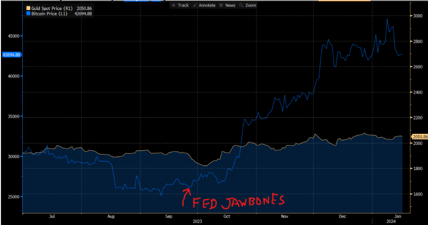
As we have chronicled above. the Fed is making its best effort to give us monetary chaos. The interesting thing is that the two sound money alternatives, GOLD AND BITCOIN can see it loud and clear. Basically, the FED began its “we are done raising rates” jawboning at the end of September and since that time frame gold is up 15% and Bitcoin is up 61%. Fairly outsized moves for a 3-month period. Annualize these rates and you see the problem they have.
This is not just a US problem of increasing debt and dollar debasement funding that debt. Rather, it’s a global issue. As the chart below shows, global M2 money supply (gold line) is growing again (e.g., Europe/China are stimulating while the US M2 has declined). It is not a coincidence that gold prices correlate with this global M2 money supply and likely is part of what propped up gold making it one of the best performing commodities in 2023.
US FISCAL POSITION NOT IMPROVING
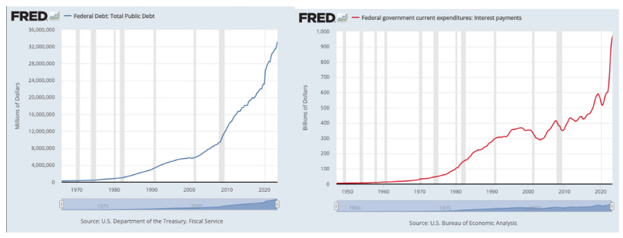
Our investment thesis is that we are in a “sovereign debt crisis” and the largest driver of that crisis is the ever-growing US Federal Debt burden, and that deficit spending is bad and getting worse. Until the Fed’s most recent interest rate hiking campaign, the ZIRP and low interest rate policies masked the underlying problem. But now that interest rates have been increased to fight inflation, the pending insolvency of the US Federal Government is on full display. The charts below show the growth of the debt and the sharp increase in Federal interest carrying costs.
We have often said that the reason we are so confident in our “monetary debasement” thesis is because there appears to be very little will to reign in or reduce the US Federal Deficit. With a deadlocked government, it currently appears to be impossible to reduce expenditures or to increase taxes. Furthermore, the problem appears to be getting worse.
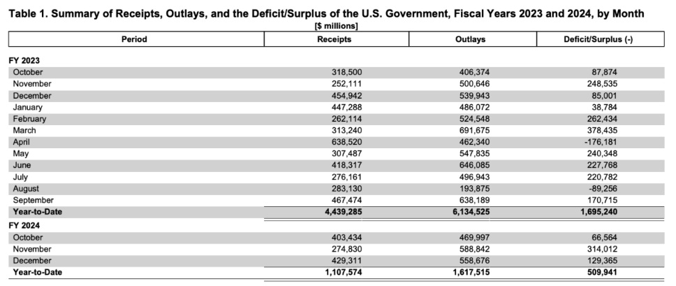
In the schedule above, we can see that the Government incurred a deficit of $1.7 Trillion in the fiscal year ended September 30, 2023. These kinds of deficits in a healthy economy are unheard of. The Receipts and Outlays are lumpy, but in fiscal Q1 2024 ended December, the deficit grew from $421 Billion in 2023 to $510 Billion, +21% y-o-y. If this annual rate holds, the deficit will be $2.04 Trillion next year. We believe it is likely to be larger.
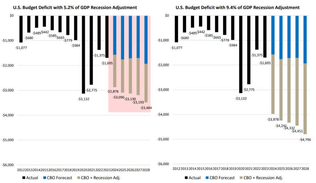
Moreover, as recessions transpire, the annual deficit tends to blow out over the ensuing few years. In fact, the range of incremental growth in the annual deficit is on average 5.2% over the past 55 years, and 9.4% in the last three recessions. Below, is a CBO estimate chart showing these deficits as a % of GDP using these historical averages. Note that annual deficits will migrate to $3-5 Trillion during our next recession – per the CBO’s estimates. This will require more money printing (“Brrr”), and debasement, which should catalyze Gold, Silver and Bitcoin in that event.
We think it is instructive to point out an accounting issue that has puzzled us. In fiscal 2023, the US Federal Government deficit was $1.7 Trillion. But, if we look at the US Federal Debt balance on September 30, 2022, it was $30.9 Trillion. A year later, it was $33.2 Trillion, or +$2.3 Trillion y/y, not the $1.7 Trillion that they show above. Perhaps there is a logical explanation for this $600 Billion difference, but it appears that the Government could be underreporting the deficit. Whatever the reason, we can be sure that the Government has to pay interest on the entire debt balance which grew by 7% last year. Note how a 7% increase in the debt exceeded the GDP growth of 2.8%. This is a trend which sows the seeds of its own destruction.
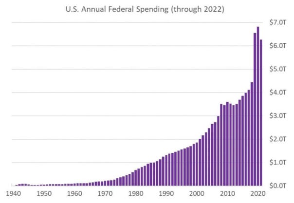
One of the unfortunate side effects of the COVID crisis is that it reset the US Federal spending level to a higher level. Notice in the Chart below how Federal Spending took a huge jump in 2020 but it has not subsided even as the crisis abated. As we stated above in our year-end review, we think this fiscal spending has held the economy together, thus far.
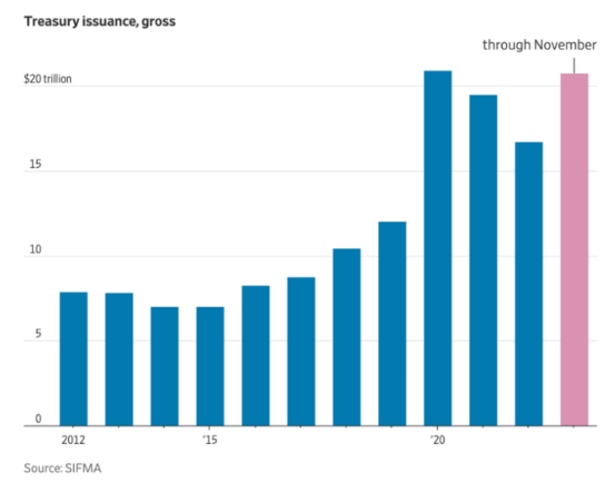
Of course, the implication of this is that the US Treasury issuance has not shrunk either as shown in the next chart.
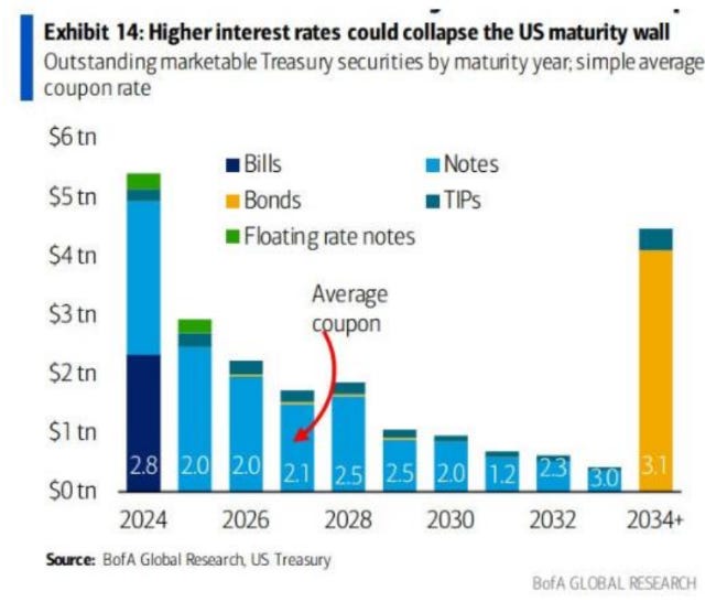
And as the next chart below shows, $10 Trillion of Treasuries mature in the next three years, given that the only real demand for Treasury bonds has been in short duration T-Bills and Notes due to inflation fears. Note: this chart below does not capture the $2 Trillion of annual deficits that will require additional financing – so conceivably $16+ Trillion of Treasury issuance will be required. With the Fed / banks having been forced to finance 25% of these in recent auctions (as described earlier), more and more money printing will be required. This is why gold and gold miners do not need the US to “hit the wall”, rather the simple math shows that macro tailwinds will propel gold prices and miner profits.
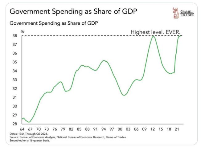
As the next chart shows, Government spending as a share of GDP has matched its highest level ever achieved in the modern era. In WWII there were years that fiscal spending as % of GDP was higher.
The US has a spending and debt problem, and no one is talking about the adult solution.
🔥 50% OFF ALL SUBSCRIPTIONS: Subscribe and get 50% off and no price hikes for as long as you wish to be a subscriber.
WHY A FULL PIVOT IS HIGHLY PROBABLE
Look, it is possible that what Powell and the Fed Governors said was not a full pivot. They are unpredictable and they lie. When they saw the stock market take off following their press conference, they were very quick to have several Fed Governors on the tape walking back Powell’s dovish comments.
We do not know the path and the timing of rate cuts or elimination of QT, but we do understand the math. In the next 12-24 months (probably much sooner), they will be forced to loosen monetary conditions and bring interest rates down. Particularly on the short end. This is not just idle speculation. The CME FedWatch Tool has some market participants calling for 7 rate cuts in 2024 – substantially more than the 3 that the Fed dot plot consensus indicates.
But, the math is relentless. If interest rates don’t decline, a debt doom loop will ensue. We have outlined this multiple times. Our view is they will bring rates down slowly if things hold together or extremely quickly if we get another 2008, 2019 repo crisis, 2020 Covid shock, or 2023 bank run. Where will the next shock come from? In our view there are several candidates for where the next problem may erupt.
POTENTIAL FULL PIVOT CATALYSTS
THE STOCK MARKET
We believed that an enormous bubble, driven by low-cost money and ZIRP, found a pin in January 2022 and as the Fed aggressively hiked rates, it looked like we were right with the market down 25% in October 2022 from its peak. But alas, we were early/wrong as by late 2022, the market found its footing and on the back of 7 large technology and AI stocks, it has rallied to set a marginal new high at year end 2023.
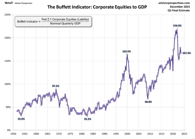
The Fed’s rate hikes dampened animal spirits somewhat but not completely. As the next chart shows the stock market is still on the expensive side (at the same level as stocks in the 2000 Bubble) using the widely followed Buffet Indicator which compares aggregate market capitalization to GDP. It is surprising to us that the economy and market have held up as well as they have. We guess that it reflects all the money that was injected into the system.
We do, however, find the next chart by Robert McHugh to be fascinating. The blue line is the Federal Funds Rate. The black arrows on this chart represent the point at which the Fed stopped raising rates and began cutting rates. The red percentage numbers are the amount that the stock market declined following the pause and rate cuts. The grey shaded areas represent a recession. Note that since 1957, EVERY TIME this set of conditions has occurred a recession has ensued and the stock market has followed with a meaningful correction or decline. Will it be different this time?
We believe the reason for this is straightforward. The Fed is always behind the curve, overtightens when inflation threatens or a bubble is present, and then is forced to react aggressively to clean up the mess they have made. The Fed acts as both arsonist and firefighter.
The reason the stock market is so important is that 62% of Americans have their savings and retirement accounts tied to stocks. Since 2008, it has been a one-way trade. Buy the dip and it will work out. If we were ever to have a financial event like the 2000 bursting of the dotcom bubble, or the 2008 GFC, the market could easily decline 50% in the blink of an eye. This would not be good for the US Federal Government as tax receipts would decline and safety net payments would increase substantially. In the prior two instances, deficits to GDP soared when the stock market turned down. In those two instances, peak to trough the S&P 500 was down 50% and the areas where the bubble was centered (dotcoms and housing finance) were down over 80%. In some of the financial cases (Lehman) the stocks went to zero.
RECESSION
We’ve been calling for a recession for so long that we feel like the “boy who cried wolf”. We have a long list of indicators that in the past have reliably signaled an oncoming recession (e.g., see Chart on pg. 12 of our Q2 ’23 letter on our website showing that recession always follow the end of Fed rate hikes).
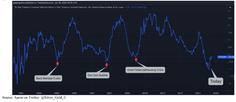
One clear signal presently of a pending recession is the severely inverted 2 vs. 10 year yield curve spread. Over the past 35+ years, US recessions or other market snafus begin six – nine months post inversion. Typically, the yield curve begins to steepen contemporaneously with a recession and a stock market decline. As you can see in the below chart, peak inversion was in July 2023. This implies a recession beginning between January and April 2024.
UNEMPLOYMENT
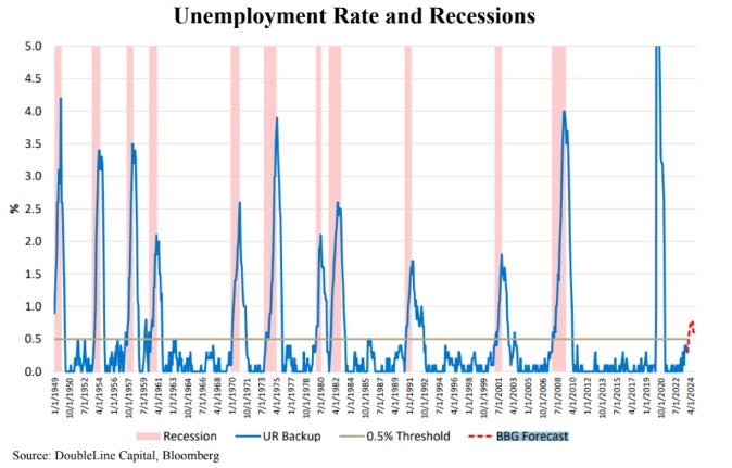
The most important metric to watch in Q1 is the job market. As unemployment rate increases, recessions ensue. The left axis on this below chart shows the incremental change in the unemployment rate.
As you can see, we are on the cusp of the unemployment rate crossing the recession threshold.
BANKRUPTCIES
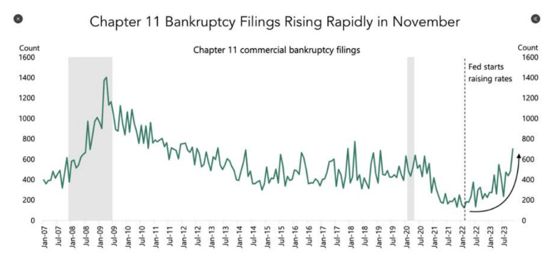
The chart below shows Chapter 11 Bankruptcy filings appear to have accelerated in the second half of 2023.
CREDIT DELINQUINCIES
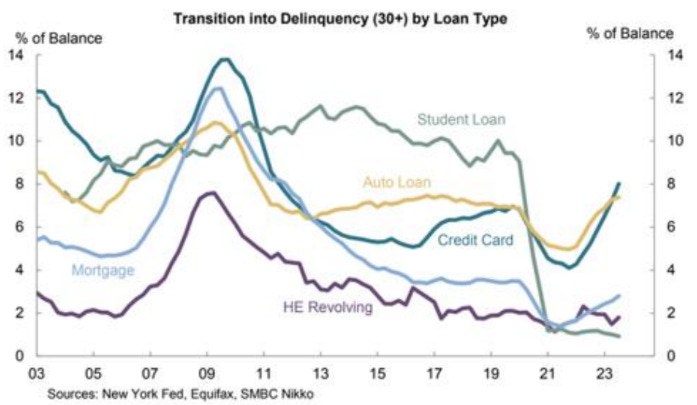
We also observe in the next chart that loan delinquencies are turning up in credit card and auto loans.
Look, it is possible this time will be different, and we will be wrong. If the Fed gets extremely aggressive about monetary accommodation it is possible that they will re-start the bull market in everything and we will head into a crack-up boom. But, keep in mind that if this direction is taken, it will be highly inflationary which will be extremely good for the assets that we hold.
REGIONAL BANKS
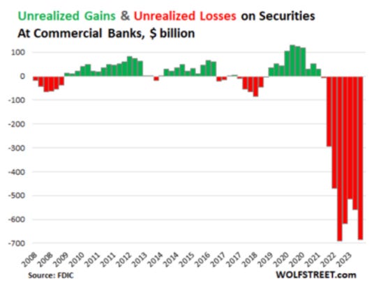
Regional banks have been protected by the Fed via the BTFP program. However, it doesn’t mean that bank losses can’t grow….it would simply mean more “Brrrr” from the Fed to bail out the banks. Losses have been growing at these banks, and the commercial real estate mess hasn’t even really begun yet.
So, there you have it. In order to assume that we get by without a recession you have to assume that prior historical recession indicators do not work anymore and that the US stock market and the Regional Banks do not run into trouble. Not impossible. But not likely in our view.
WHEN THEY DO PIVOT, WE GET PAID
One thing that we can be sure of is that when the Fed finally does complete its pivo,t the effect upon gold and gold mining equities will be substantial. Note in the chart below how the last three Fed pivots led to rallies in the price of gold of 66%, 189% and 50%, respectively.
And, as if that is not enough, the impact on the gold mining equities will be even more dramatic as the following schedule shows:
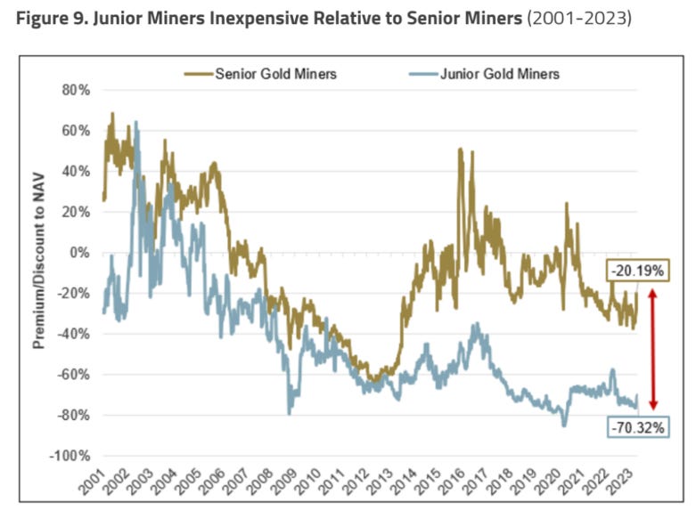
And the schedule above only shows the gains in the larger gold equities index, the GDX. As the next schedule shows, the discount on the Junior Gold Mining equities is even more extreme than the discount on the Senior Miners. Note: this schedule by Sprott & Co. shows the premium/discount to Net Asset Value (NAV), a widely used valuation metric in gold mining. Historically companies have traded at or sometimes above their NAV. Presently, the discount on the Juniors is at an historical extreme.
Despite this deep undervaluation, the Junior Miners are beginning to show some signs of life on a technical basis as depicted in the following chart:
GOLD
Quietly, gold’s outlook is improving. We say quietly because gold recently attained a new all-time high price of $2,077 per ounce and yet there has not been much fanfare. In part this is because the new all time high did not hold, but nonetheless gold has reached a new all- time high in every currency except the dollar and it is knocking on the door of consistently breaking out in dollar terms as well.
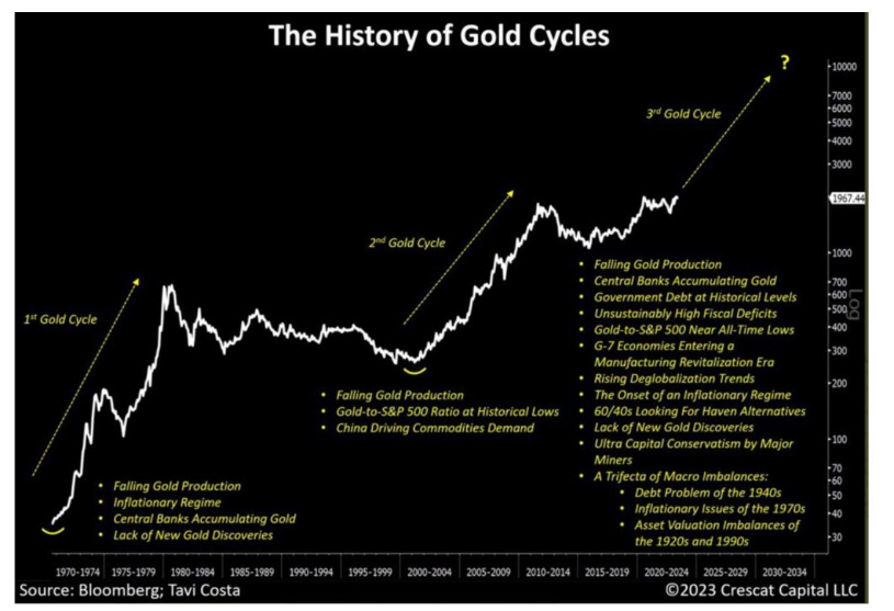
We believe we are on the cusp of entering the third major gold cycle of the post 1971 era as outlined below in the excellent chart prepared by our friend Tavi Costa. If we are correct it will turn into a mania for gold stocks and investors will be surprised by how well this asset performs in a sovereign debt crisis.
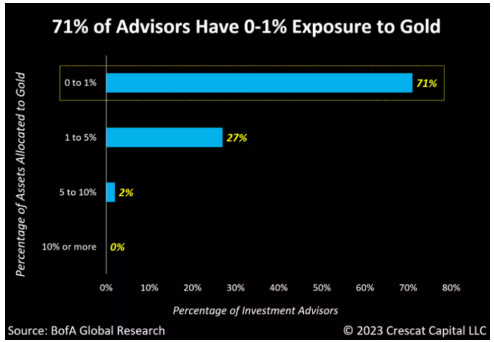
Furthermore, gold has achieved this in spite of it still being widely unknown and unloved.
Further note, (see next schedule) that while Central Banks have continued to purchase gold, the Futures and ETF buyers of gold have been generally absent since late 2020. We think a large part of the investment world still believes that the Fed has solved the inflation problem and that we will return to the conditions which existed before 2020. Given the Federal Budget issues we outlined above we think this conclusion is wrong. As investors come to see that it is wrong we fully expect that purchases by the Futures and ETF investors will return to the 2016, 2019, and 2020 levels.
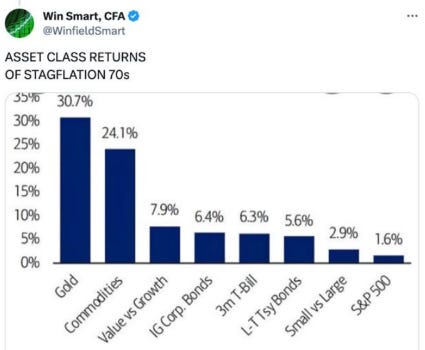
In our view, we are headed into a decade where the investment climate resembles the 1970’s and as a reminder, the schedule below shows how various asset classes performed in the 1970’s.
CONCLUDING REMARKS
We feel we are on the precipice of not only favorable macro tailwinds (money printing), but also a major turn in sound money assets. We can imagine many saying we are crying wolf – again! But as the great market historian/value investor Jeremy Grantham has pointed out
-
“If you have a decade of strong inflation, commodities do well and all other assets do badly; so they are much higher quality diversification than any other asset you can pick”.
-
“Value managers have always hated commodities. It feels completely out of their control and it largely is. They’re about as unpredictable as anything on the planet and if you go short, you die a thousand deaths and if you go long, it’s pretty much as bad. I certainly don’t recommend people to go short metals. If you can go long and throw the key away, I think that will do just fine. It does take nerves of steel and you better have a good look at your nerves before you do it”
Given what we see happening in the world today, we believe that monetary debasement will only accelerate. If we can remain patient, the IRRs will be remarkable.
Part 1 of this letter can be found here.
QTR’s Disclaimer: I am an idiot and often get things wrong and lose money. I may own or transact in any names mentioned in this piece at any time without warning. Contributor posts and aggregated posts have not been fact checked and are the opinions of their authors. They are either submitted to QTR, reprinted under a Creative Commons license or with the permission of the author. This is not a recommendation to buy or sell any stocks or securities, just my opinions. I often lose money on positions I trade/invest in. I may add any name mentioned in this article and sell any name mentioned in this piece at any time, without further warning. None of this is a solicitation to buy or sell securities. These positions can change immediately as soon as I publish this, with or without notice. You are on your own. Do not make decisions based on my blog. I exist on the fringe. The publisher does not guarantee the accuracy or completeness of the information provided in this page. These are not the opinions of any of my employers, partners, or associates. I did my best to be honest about my disclosures but can’t guarantee I am right; I write these posts after a couple beers sometimes. Also, I just straight up get shit wrong a lot. I mention it twice because it’s that important.
Larry’s Disclaimer: These presentation materials shall not be construed as an offer to purchase or sell, or the solicitation of an offer to purchase or sell, any securities or services. Any such offering may only be made at the time a qualified investor receives from EMA formal materials describing an offering plus related subscription documentation (“offering materials”). In the case of any inconsistency between the information in this presentation and any such offering materials, including an offering memorandum, the offering materials shall control.
Securities shall not be offered or sold in any jurisdiction in which such offer or sale would be unlawful unless the requirements of the applicable laws of such jurisdiction have been satisfied. Any decision to invest in securities must be based solely upon the information set forth in the applicable offering materials, which should be read carefully by prospective investors prior to investing. An investment in EMA not suitable or desirable for all investors; investors may lose all or a portion of the capital invested. Investors may be required to bear the financial risks of an investment for an indefinite period of time. Investors and prospective investors are urged to consult with their own legal, financial and tax advisors before making any investment.
The statements contained in this presentation are made as of the date printed on the cover, and access to this presentation at any given time shall not give rise to any implication that there has been no change in the facts and circumstances set forth in this presentation since that date. These presentation materials may contain forward-looking statements within the meaning of US securities laws. The forward-looking statements are based on EMA’s beliefs, assumptions and expectations of its future performance, taking into account all information currently available to it, and can change as a result of known (and unknown) risks, uncertainties and other unpredictable factors. No representations or warranties are made as to the accuracy of such forward-looking statements. EMA does not undertake any obligation to update any forward
looking statements to reflect circumstances or events that occur after the date on which such statements were made. Historical data and other information contained herein, including information obtained from third-party sources, are believed to be reliable but no representation is made to its accuracy, completeness, or suitability for any specific purpose.
No representation is being made that any investment will or is likely to achieve profits or losses similar to those shown. Past performance is not indicative of future results. This report is prepared for the exclusive use of EMA investors and other persons that EMA has determined should receive these presentation materials. This presentation may not be reproduced, distributed or disclosed without the express permission of EMA.
Tyler Durden
Fri, 01/26/2024 – 09:25
via ZeroHedge News https://ift.tt/VZYlrew Tyler Durden
