Wondering what a 'market' looks like up, close, and personal in the seconds before, during, and after this week's "most important FOMC meeting ever." From SPY's 50-second lead on the news release to VIX's gap, and from crossed markets to e-mini futures leading the premature charge, Nanex's charts are a smorgasbord of SEC-inspiration…
Close-up charts in SPY (mostly) around the 2pm Federal Reserve FOMC news release on December 19, 2013.
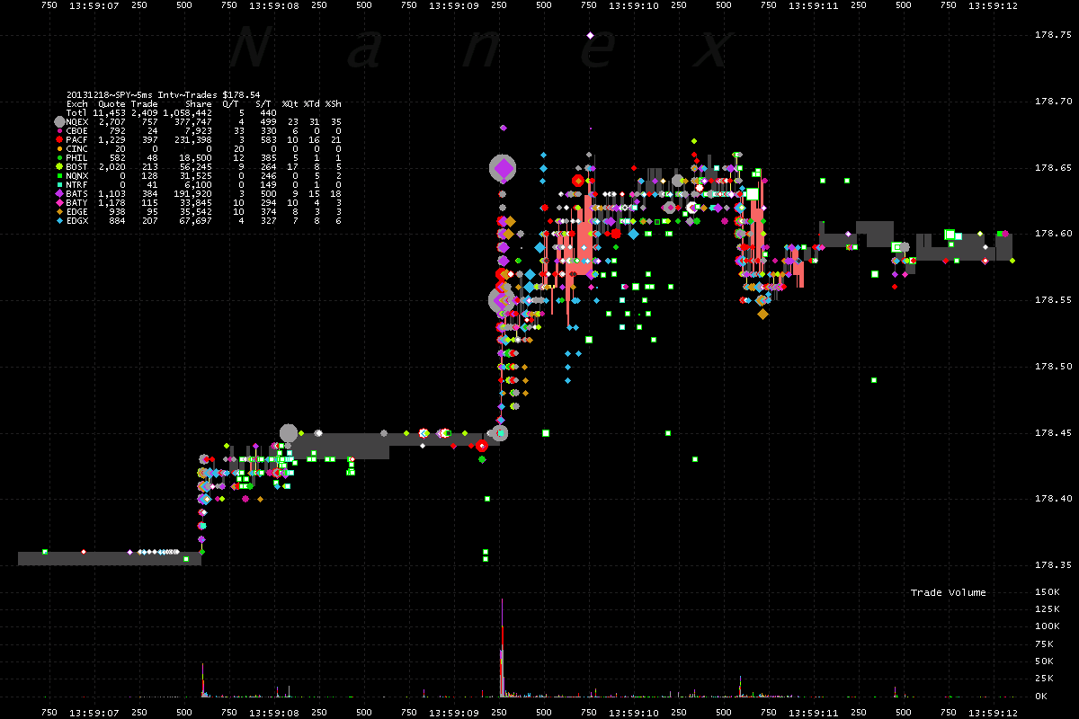
SPY – jumps 50 seconds early. Each dot is a trade. There was more activity in this time period, than during the actual news release.
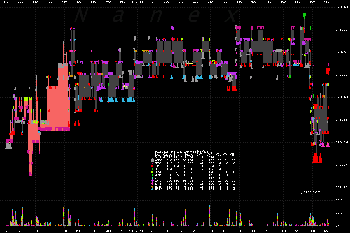
The bid/ask spread got a bit tipsy..
This one-second zoom shows a confused bid/ask spread. What is the bid/ask spread here? What does it matter? Who cares!
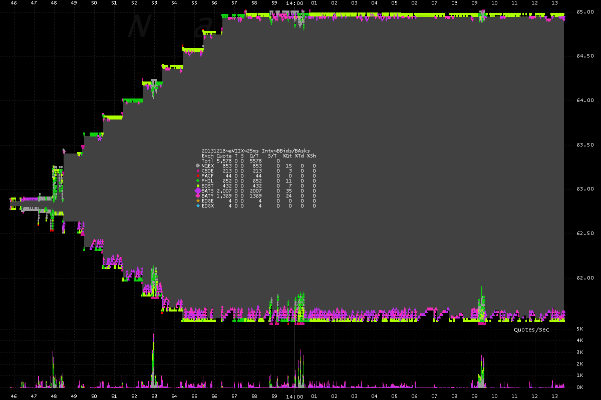
2pm is near, prepare the VIIX!
Not only does the NBBO in VIIX widen from pennies to dollars, but it flutters hundreds – sometimes thousands – of times in a second! No trading though, so that's good. More is always better, right? Wait, did you say no trading? That's bad.
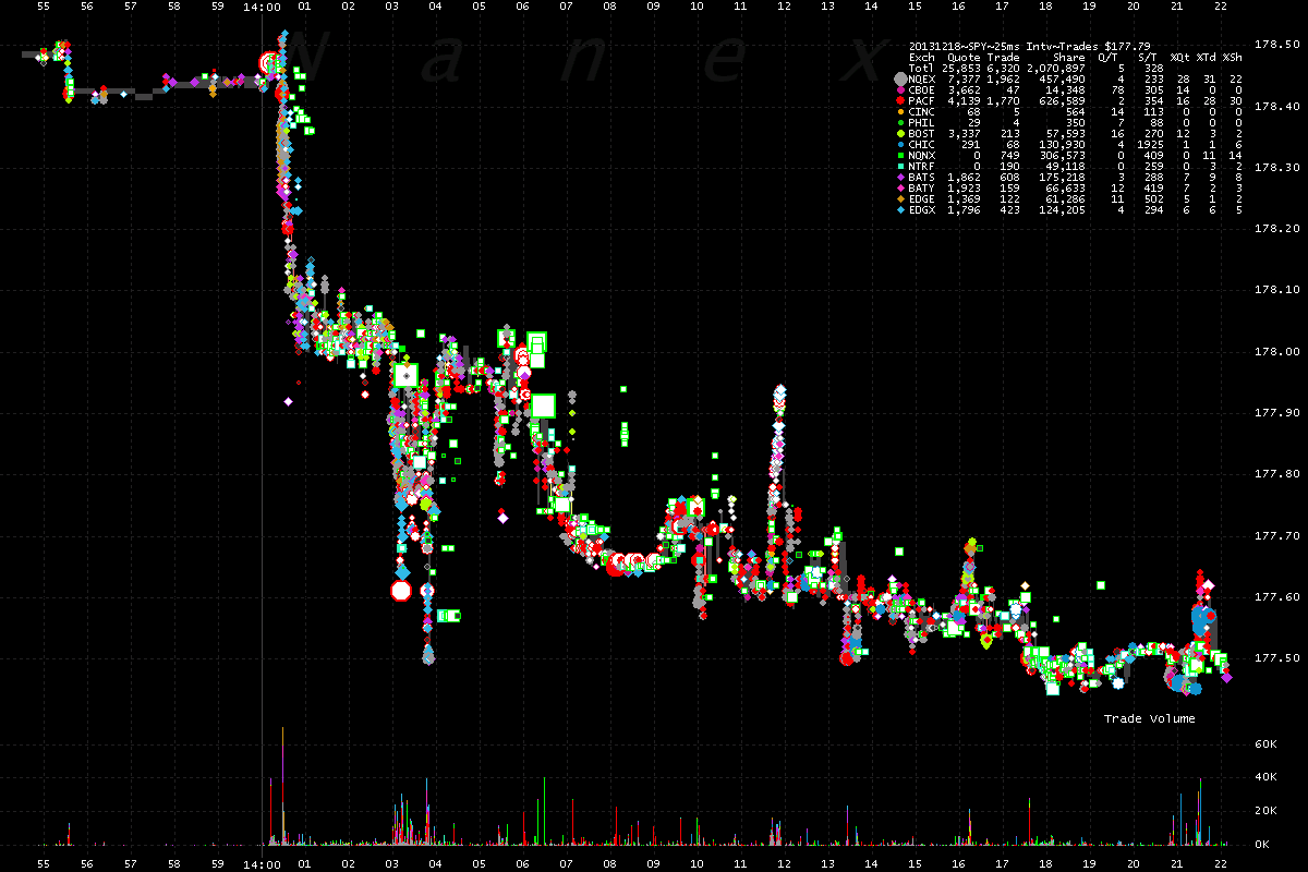
What took you so long? Market reacts hundreds of millions of nanoseconds later than last time.
SPY drops sharply about 488 Million nanoseconds later than last time.
Do you really want to look at this close, under bright lights?
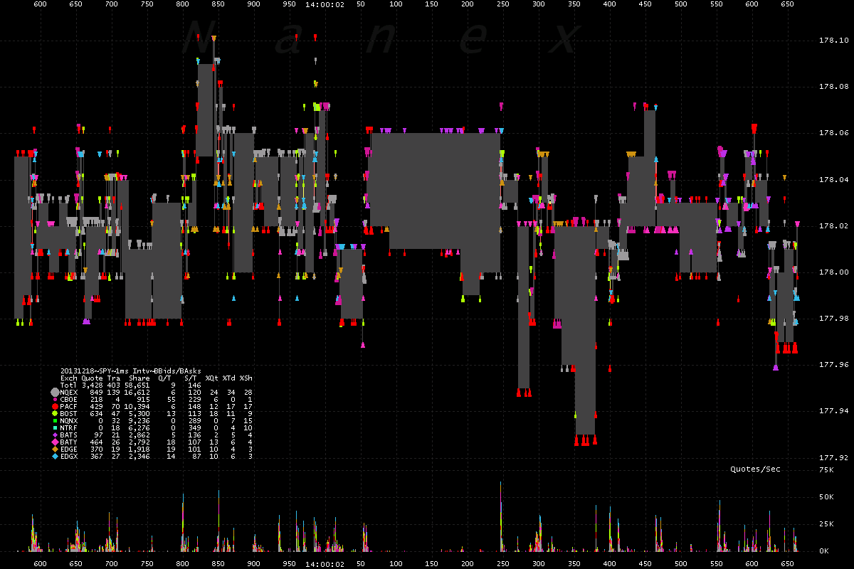
Zooming in on 1 second of trading (shade is NBBO spread). Multiple buying and selling waves – buyers and sellers must keep missing each other.
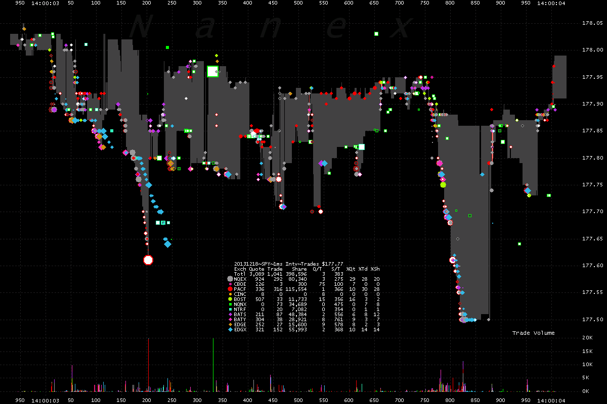
How about that Quote spread?
What exactly is the bid/ask spread in SPY during this one second? How do you measure it? Was there any trading going on? Who cares!
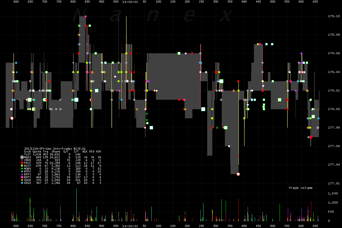
How about that trading!
The same second of time, but showing trades in SPY executing all over the bid/ask spread. Lots of trades. Trading is good!
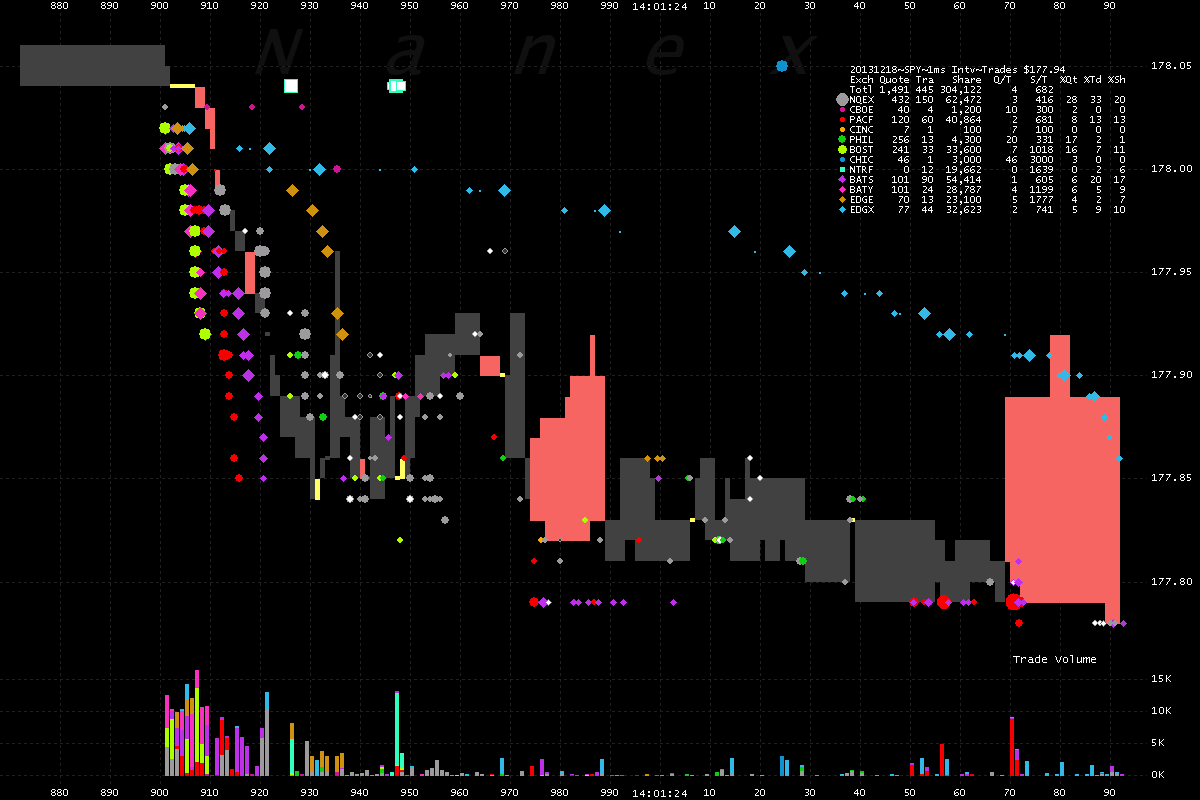
About 91 seconds later, give or take a few million microseconds, this happened:
SPY tumbles in heavy trading. This is just 200 milliseconds of time, literally the blink of an eye. The red shading indicates where the NBBO is crossed (the bid from one exchange higher than the offer from another). Regulations prohibit crossed NBBO's, so this didn't really happen: you didn't see any red shading here.
It was the eMini's fault!
Here's the same time period as chart above, but showing trading in the eMini futures which takes place in Chicago – a city that is a few million nanoseconds away.
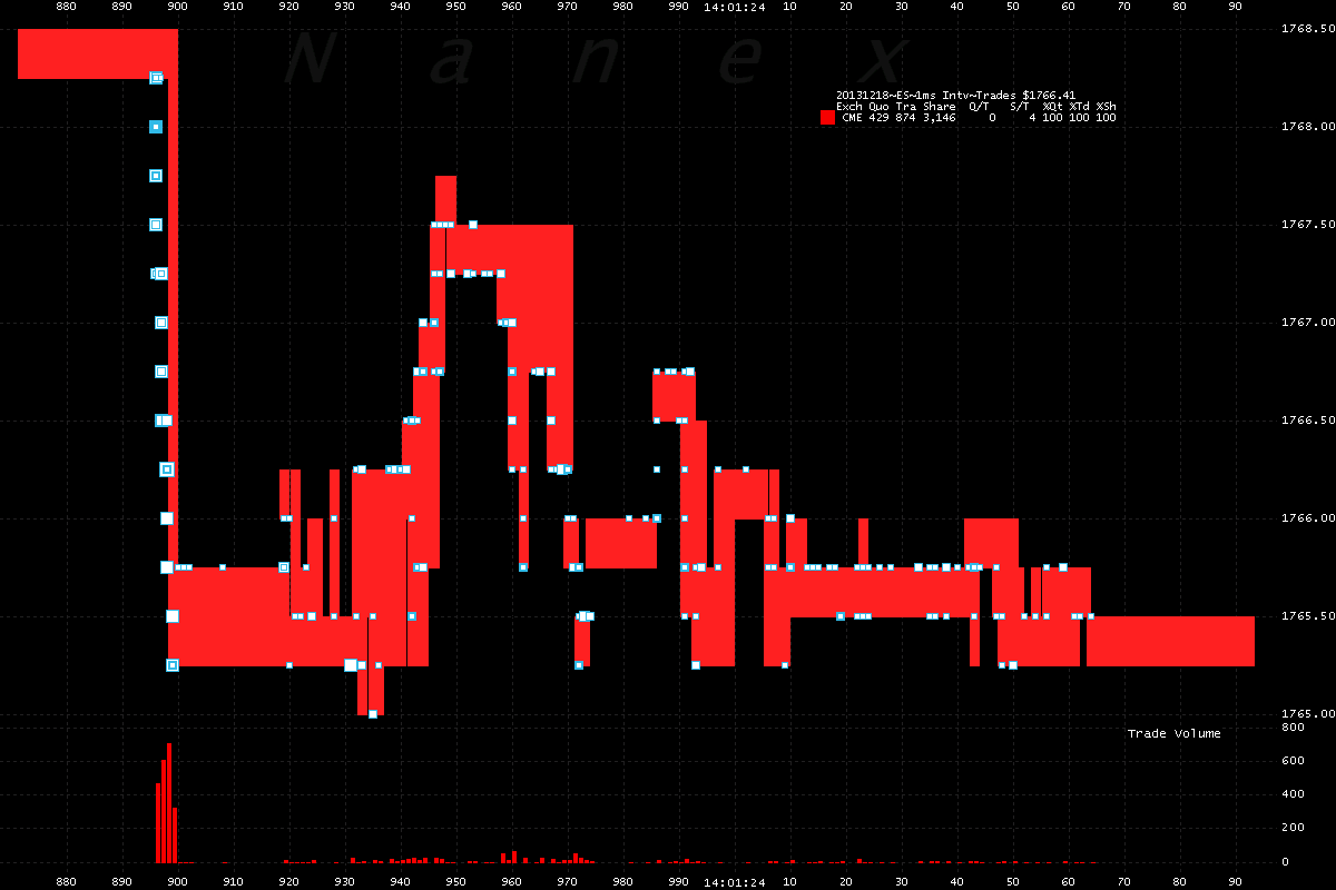
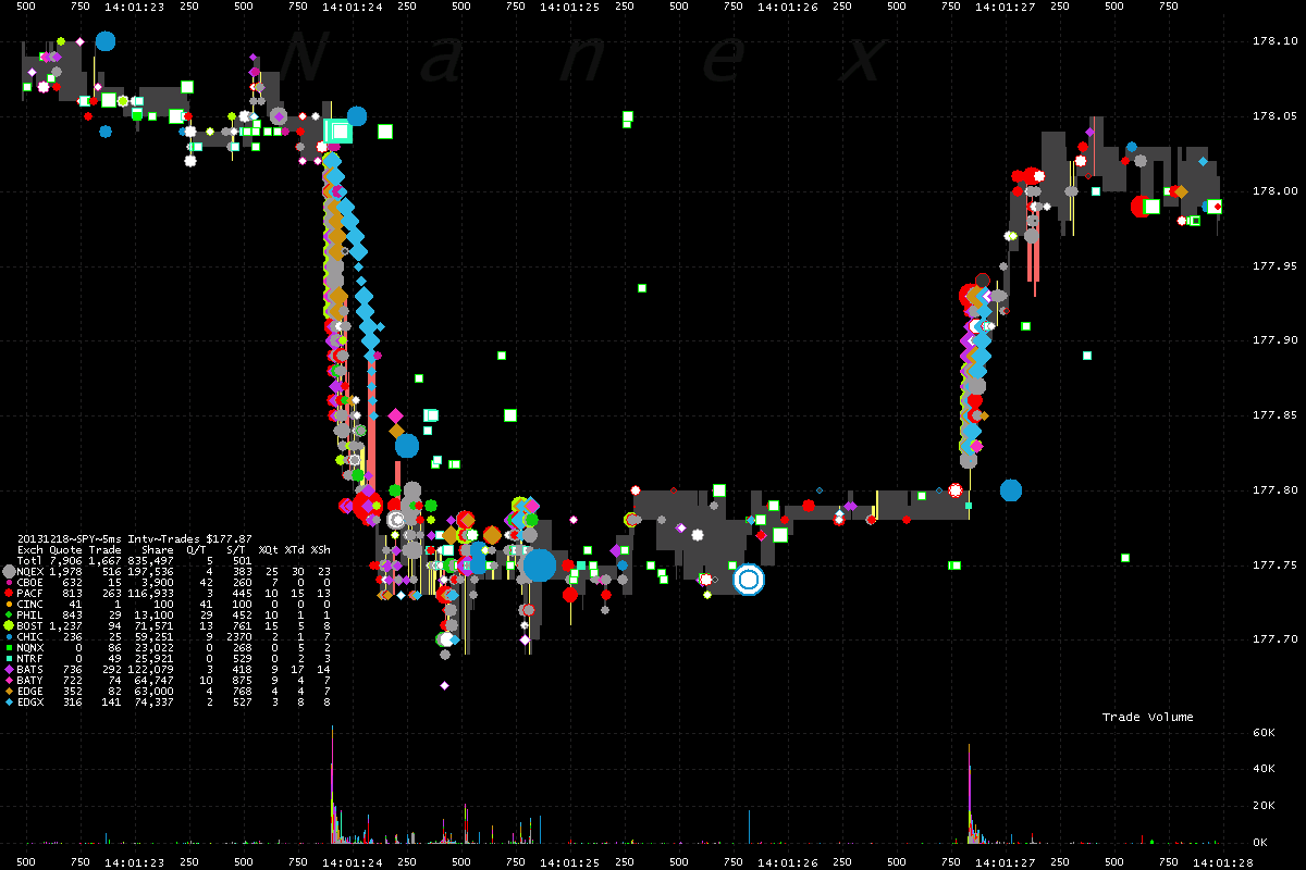
More to and fro trading in SPY…
Down one second, back up 2 seconds later. The people can't decide what the news means. But there is trading, and trading is good!
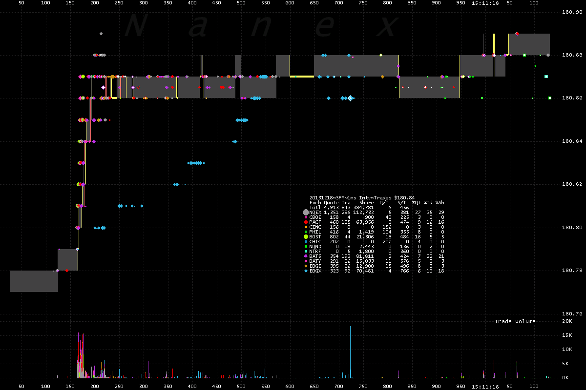
One Exchange starts dragging behind, it must be getting late..
The blue diamonds are late trade reports from Direct Edge. Naughty, naughty.
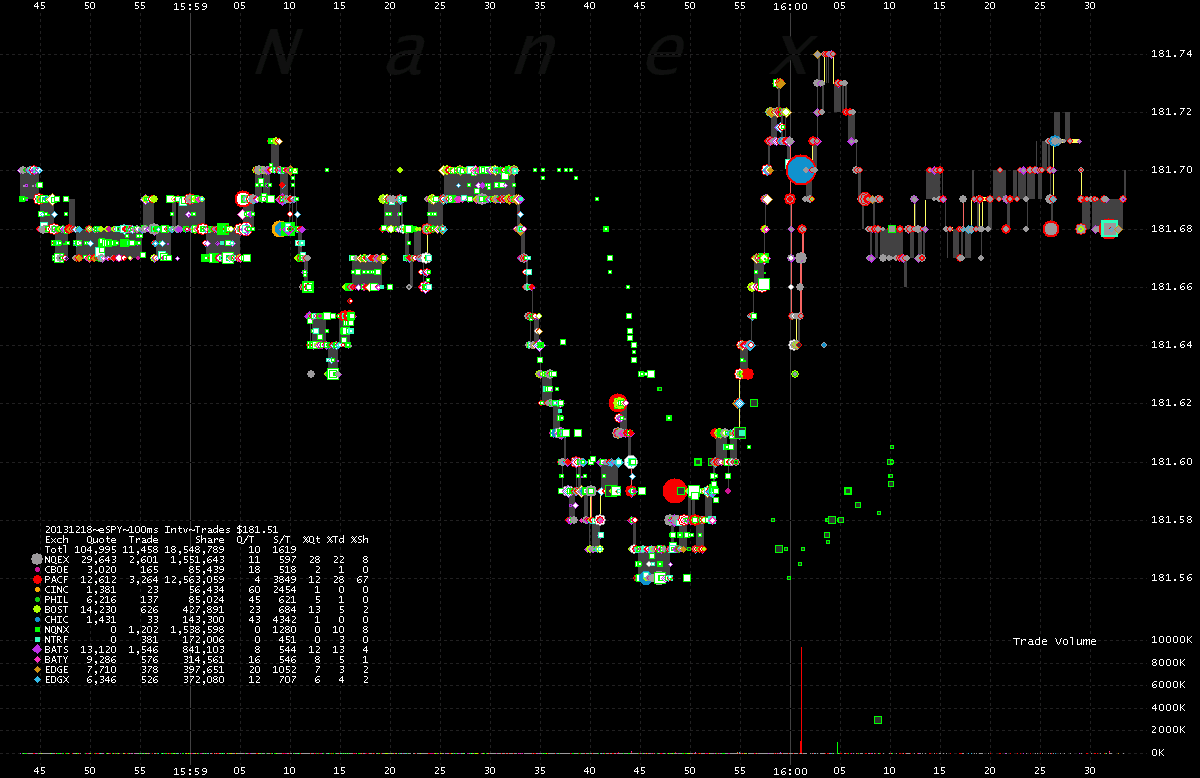
When the dark pools start dragging, it's time to close.
Green dots are trades reported by dark pools – clearly running many seconds behind.
![]()
via Zero Hedge http://feedproxy.google.com/~r/zerohedge/feed/~3/Rd0_Wy61nxo/story01.htm Tyler Durden


