Authored by Michael Lebowitz via RealInvestmentAdvice.com,
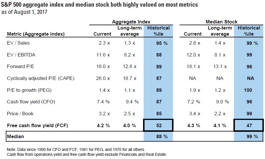
Comparing current equity valuations to prior valuation peaks such as those of 2008, 1999 or any other period is commonplace, but remains an essential way of assessing current market prospects and potential risks. Currently, seven of the eight traditional valuation techniques shown by Goldman Sachs below are in the upper strata of recent history.
The graph above, courtesy Goldman Sachs, is from August 2017. Since that time it is highly likely that all of those valuation levels have risen further.
In Second to None, published March 1, 2017, we opined that simply assessing valuation techniques, as shown above, is a great starting place for investors to gauge the present status of valuations. We added that it is equally important to normalize different periods of time to make their valuations comparable based on the level of economic growth which directly supports corporate profits. The result of our analysis shows that the current level of Cyclically Adjusted Price to Earnings (CAPE) is well above the levels of every other market peak, including 1999 and 1929. Essentially, investors are willing to pay more for each unit of economic growth today than at any time in modern history.
In this article, we update the data to reflect the current GDP adjusted CAPE and take it a step further to include the cyclical nature of corporate profit margins. When both adjustments are factored in, we gain a unique perspective that demonstrates the extent to which today’s valuations are, quite literally, off the charts.
GDP Trends
While the economy cycles from recession to growth and back, the long term economic growth trend, or secular GDP, has trended lower for the better part of the last 30 years. The graphs below show the cyclical short-term nature of economic growth (left) as well as the longer term trend (right).
Data Courtesy: St. Louis Federal Reserve (FRED)
There are a number of reasons for the long-term, downward growth trend about which we have written extensively. In a nutshell, the following are the three largest factors accounting for the deteriorating trend in growth:
- Debt – The amount of federal, corporate and individual debt has consistently risen at a pace faster than economic growth. As such, many debtors are unable to borrow further to keep spending. Others are hampered by interest payments which crowd out spending. The Federal Reserve has used extraordinary policies to force interest rates to historic lows to counter the debt burden, but their actions have only bought time and incentivized even more debt. The debt problem, which we call the Lowest Common Denominator, has only worsened.
- Demographics – Over the last 30 years, baby boomers provided a driving force for economic growth. As this outsized generation nears retirement, they will spend less and, in many instances, become a burden on the taxpayers that support them through social security and other entitlements. Additionally, slowing population growth and tightened restrictions on immigration are reducing the number of workers and consumers that can contribute to economic growth.
- Productivity – Partially as a result of years of poor economic, fiscal and monetary policy that dis-incentivized long-term investment in favor of consumption, the rate of productivity growth, the lifeline of economic growth is nearing zero.
It is primarily these three reasons and their longer-term projections that make us nearly certain that secular economic growth will continue to weaken in the years ahead. That does not mean there will not be periods of stronger growth. However, given that few of our nation’s leaders truly understand what drives sustainable economic growth and even fewer have the courage required to reverse the trends, we see little reason to expect change.
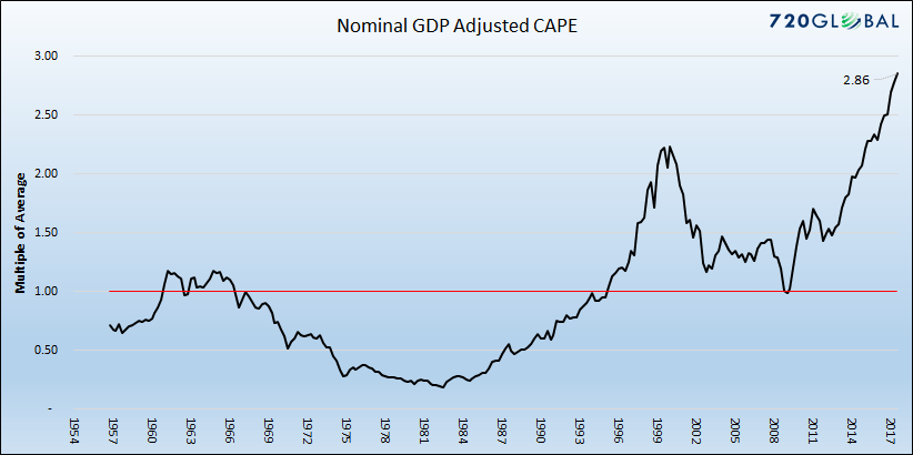
Given our assumption that long-term economic trends are likely to persist, we believe it is necessary to use economic growth to normalize current equity valuations to compare them to prior periods. The following graph is an updated version of the one shown in Second to None. It plots CAPE divided by the trailing ten-year growth rate of nominal GDP.
Data Courtesy: St. Louis Federal Reserve (FRED) and Robert Shiller
Note that the graph above and all of the graphs normalizing CAPE in this article, unlike the one presented in Second to None, are scaled by multiples of the average on the y-axis instead of the calculated number. The rationale being that the purpose of the analysis is not to provide a concrete numerical data point, but a comparative measure that allows one to relate valuations over many different economic environments. As an example the current reading is 2.86, meaning market valuations using this measure are 2.86 times higher than the average since 1956.
The two potential arguments against this type of analysis are likely from those that disagree with our longer-term growth forecast or those that agree with us but believe that we should exclude data from the financial crisis of 2008 as it was far from the norm.
For those that think economic growth will be better than the trend of the last thirty years, you should be aware that a ten-year growth rate of 8.21% is required to bring the adjusted valuation to its long-term mean. Such a ten-year growth rate has not been witnessed since 1987 and is nearly 2% greater than the average over the last 70 years.
For those that think excluding 2008 is appropriate, we calculated a seven-year CAPE divided by seven-year growth. While the current level using this time frame is not as egregious, it is two times that of the average over the last 70 years and only slightly lower than the peak established in the year 2000. We remind those in this camp that the current economic expansion has lasted 103 months, almost twice the average since 1945. The longest expansion during this period was 120 months. No one knows when a correction will come, but we are clearly in the later stages of the cycle unless one assumes that the laws of mean reversion have been permanently suspended for both valuations and economic cycles.
Margins are Cyclical
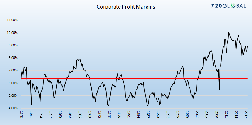
Corporate profit margins, or the difference between sales and net profits, are considered one of the most cyclical fundamental measures that exist. The reason is that, when margins are high in certain industries, new entrants are lured to those industries by the higher margins. Conversely, when margins are low, companies exit those industries and those remaining companies can increase margins. The graph below shows the cyclical nature of corporate margins since 1948.
Data Courtesy: St. Louis Federal Reserve (FRED)
When margins are higher or lower than average, it makes sense to assume they will revert to the mean over time. Therefore, the rationale and logic for normalizing CAPE based on current margins and its historical tendency, provides a valuation level, as shown below, that is comparable to other periods.
Data Courtesy: St. Louis Federal Reserve (FRED) and Robert Shiller
Note that in the first graph showing historical margins that margins over the last 70 years appear to have broken the cyclical pattern and have stayed well above the average for an extended period. Many stock promoters believe this is a reflection of a “new normal” and cheer such a feat. They may be correct, but you might also want to consider that if margins have risen to a new level and are not cyclical anymore, the age-old incentives that drive business decisions in a free market economy no longer exist. If that is the case, we may also want to consider that capitalism may be broken. If capitalism is in fact eroding, do you really want to pay a high premium for stocks? To help answer that question, we suggest a quick review of the gross economic inefficiencies of those nations where capitalism is not employed.
Comparative CAPE
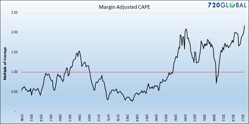
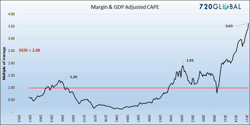
We believe that durable longer-term economic trends and profit margins should be used to normalize CAPE and again make it comparable to prior periods. The graph below presents CAPE adjusted for both.
Data Courtesy: St. Louis Federal Reserve (FRED) and Robert Shiller
The graph above highlights that valuations using this measure dwarf any prior valuation peak since at least the 1950’s. At over 350% above the mean, stock investors are currently paying significantly more for a unit of economic growth than at any time in the last 70 years. To extend the analysis, we estimated the adjusted CAPE level of 1929, as shown on the graph, and come to the same conclusion.
Summary
Most astute investors know that stock valuations are at or near historical highs. Even these investors, however, may be unaware that today’s valuations, when adjusted for the level of economic growth and heightened profit margins, defy comparison with any prior period since the Great Depression. The simple fact is that investors are paying over three times the average and almost twice as much as the prior peak for a dollar of economic growth. Furthermore, it is happening at a time when we are clearly late in the economic cycle and the outlook for growth, even if one is optimistic, is well below that required to justify such a level.
Fundamental valuations are a great means of understanding the potential value or lack thereof in a market or individual stock. However, it is a poor short-term trading tool. There is no doubt that, in time, valuations will revert to the norm. This can occur via sharp earnings increases or slower earnings growth accompanied by years of price stagnation. It can also transpire, as it has in the past, with a sharp drawdown in equity prices. Regardless of how you think this resolves itself, we hope this valuation technique provides another helpful tool for assessing the proper risk and reward tradeoff offered by markets currently.
via RSS http://ift.tt/2DCRfZx Tyler Durden
