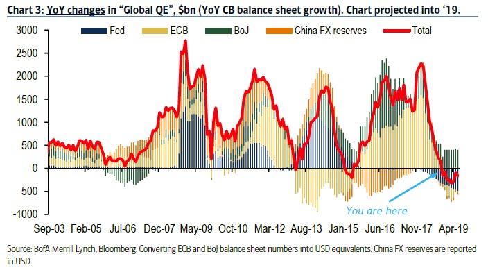
By now everyone has seen some iteration of this chart showing that the annual change in central bank liquidity is now negative.
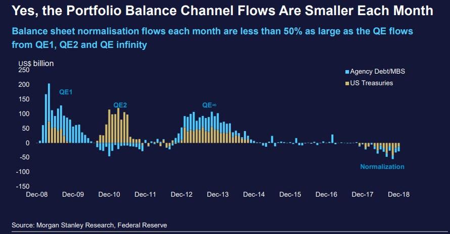
Another way to visualize just the Fed’s balance sheet contraction is courtesy of this chart from Morgan Stanley which shows specifically which assets – Treasurys and MBS – are declining on a monthly basis.
When it comes to markets – where the events of December were a vivid reminder that just as QE blew the world’s biggest asset bubble, so QT will deflate it – there is a simple explanation of this negative effect of QT on Markets – in terms of both flow and stock – and it is laid out as follows from Morgan Stanley:
- THE STOCK EFFECT (SE) – GROUP 1
- The SE relates to the long-term impact on Group 1 asset prices from the overall change to the central bank’s balance sheet and its impact on the stock of available Group 1 assets.
- THE FLOW EFFECT (FE) – GROUP 1
- The FE relates to the short-term impact on Group 1 asset prices from each flow that changes the size of the central bank’s balance sheet.
- THE PORTFOLIO BALANCE CHANNEL EFFECT (PBCE) – GROUP 1 AND 2
- The PBCE impacts both Group 1 and Group 2 assets and incorporates the pricing elements of both the stock effect and the flow effect.
But while the immediate effect of the expansion and shrinkage of the Fed’s balance sheet on various asset classes is rather intuitive – if not to Fed presidents of, course – a more pressing question is how will the upcoming liquidity shrinkage affect the global economy.
Unfortunately, the answer appears to be ominous.
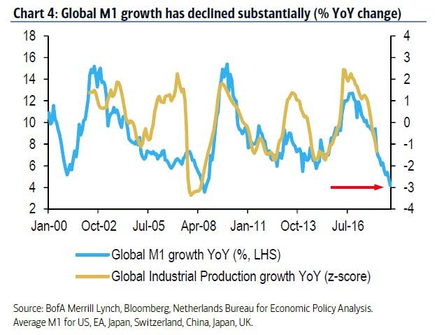
As the following BofA chart shows, global money supply has declined rapidly over the last year and a half. In fact, global money supply growth (using M1) is now flirting with the lows seen in mid-2008. And while some economies, such as China, are now pivoting back to supportive measures, BofA’s Barnaby Martin warns that high global debt will constrain economies’ enthusiasm for engaging in further rounds of stimulus. Meanwhile, as the chart below suggests, lower money supply growth has often pointed to weaker global economic momentum going forward. In fact, if one uses Global Industrial Production growth as a proxy for the global economic expansion, or contraction, the World is now almost certainly in a recession; the only question is when will economists acknowledge it.
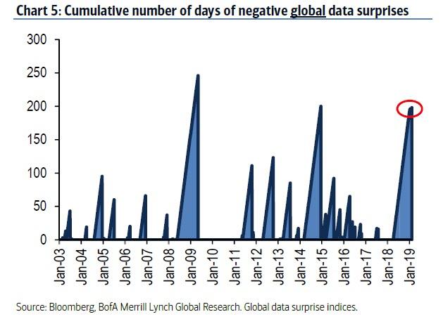
The message from the chart above has also been heard loud and clear in high frequency economic indicators (at least in those countries where the government is not shut down and where data is still being reported), with the number of consecutive days of negative global data surprises now approaching the longest since the financial crisis.
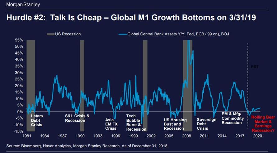
And just to confirm that the collapse in Global M1 growth is a major problem – perhaps the biggest for the global economy – Morgan Stanley shows the following chart which confirms that every time M1 has dipped negative – as central bank liquidity injection either slowed or went into reverse – there has been a financial crisis: whether the 2015 EM and Manufacturing Commodity Recession, the Sovereign Debt Crisis of 2011, the Global Financial Crisis and US Housing bubble burst of 2007/2008, the Tech Bubble burst of 2000 and so on.
Needless to say, the above charts confirm that the key variable for the global economy is not whether the Fed stops hiking or starting cutting rates (although any further rate hikes will surely have an adverse impact on global liquidity), but whether the Fed – and other central banks – pause their balance sheet shrinkage, and once again start actively injecting liquidity into the global system, or soon enough we will be looking for the best description of “[insert here] crisis of 2019.“
via RSS http://bit.ly/2SUaeSV Tyler Durden
