Authored by Chris Hamilton via Econimica blog,
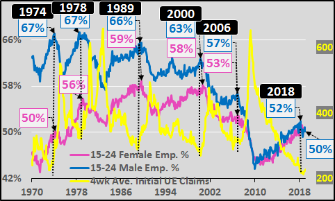
Young adults are the last to be hired and first to be fired. They are the most economically fragile segment of the population and their levels of employment offer the first signs of economic stress. Given that, the chart below showing the percentage of 15 to 24 year old employed males and females versus initial unemployment claims offers a “canary in the economic coalmine”. Every economic cycle, the young adult employment peak has nearly perfectly lined up with cycle bottoms in UE claims and ushered in an economic downturn. Quite noticeable in the chart below, young adult employment peaks have been coming at progressively lower participation rates.
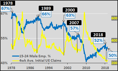
15 to 24 year old males versus UE claims, below. The diving participation rate for young male adults is pretty hard to miss. The negative implications of the declining employment rate (coupled with record student loan debt) on financial insecurity is driving family formation and fertility rates to record lows.
As for 15 to 24 year old females, their labor force participation peaked in 1989 and has likewise been falling since. Perhaps young females are the most economically fragile of all, as their labor force participation rate peaks have almost matched the UE claims lows during each cycle. As the far right of the chart notes, young female employment participation is significantly falling and UE claims appear to have bottomed…the typical sign of the end of the economic cycle.
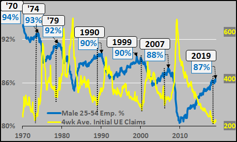
To round out the picture, below is the 25 to 54 year old male participation rate versus UE claims. Again, sliding male participation rates have been the norm for decades and at present levels, full employment has likely been achieved. However, typically peak 25 to 54 year old participation rates have come six months to a year after the UE claims cycle low (Sept, 2018 was likely the UE low).
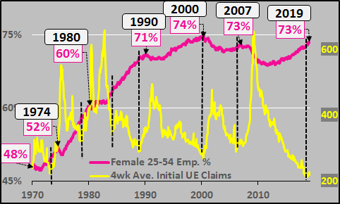
25 to 54 year old female employment percentage versus UE claims. Female participation rates rose rapidly up to 2000, but have been struggling to regain that peak ever since. Once at these levels of employment, recessions have ensued.
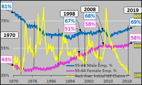
And leaving no stone unturned, below is the 55 to 64 year old male and female employment percentages versus UE claims. Combined 55 to 64 male and female employment is at record participation rates and suggests there is little further participation growth possible. Of note, this group appears to be the least economically sensitive, suffering the least volatility in employment.
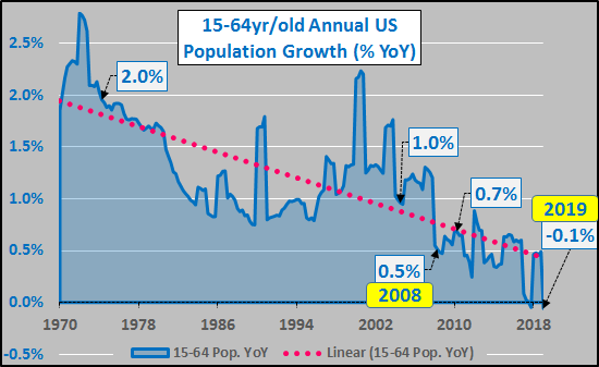
To put this in context, the chart below shows the annual percentage of 15 to 64 year old US population growth (data is from OECD but the spikes are adjustments to Census updates, not sudden growth…just focus on the trend). Working age population growth is presently moving in and out of negative numbers and will remain essentially at this level for at least the coming decade.
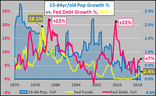
Below, working age population growth versus annual federal debt growth as a percentage of total debt, and Federal Funds Rate. As population growth and potential consumer growth decelerates, so do interest rates to encourage inorganically high economic growth via federal, corporate, and personal debt. Given a recession is highly likely at this point and population driven growth is essentially zero; a similar or even larger growth in federal debt should be anticipated alongside ZIRP and/or NIRP (as well as further QE). A 22% annual increase in federal debt would equate to a $5 trillion increase in the first year of the next downturn. This would, on a year over year basis, be expected in order to have a similar “stimulative” impact as those previous 22% maximum federal debt deluges of ’83 and ’09.
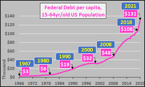
Final chart shows the unbelievable rise in federal debt per capita of the 15 to 64 year old US population. From 2008 to present, the debt per 15 to 64 year old American has increased by $60,000…or a 225% increase (and this doesn’t even begin to count the far larger unfunded liabilities). Given the minimal working age population growth over the coming decade and likely federal debt deluge, this number is set to skyrocket. The chart below also guestimates the impact of a 20% federal debt stimulus on working age debt per capita.
Conclusion:
The early warning signs of recession are everywhere. But the depth of this recession, (absent working age population growth, coupled with large 65+yr/old elderly population growth, record debt levels, and minimal interest rate flexibility) will be more severe than anything the US has faced in its history. This is not business as usual and this is likely the US’s (and most nations) last chance to prioritize and strategize for a best possible outcome in a new and entirely different era.
PS…what about housing?
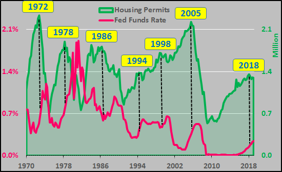
What does it all mean for housing? Chart below shows Federal funds rate versus housing permits. Since 1970, housing permits peaked (at least temporarily) prior to the completion of each interest rate hiking cycle.
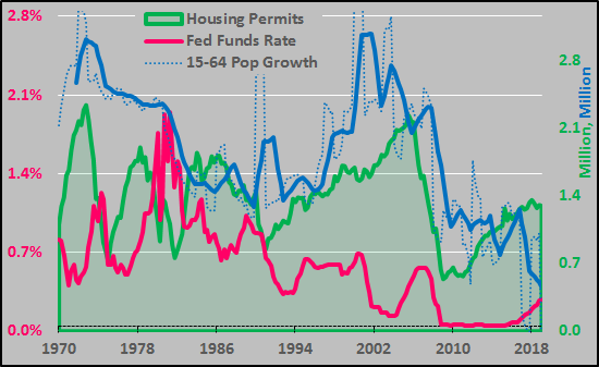
Below, decelerating working age annual population growth (million persons, smoothed 2yr/average), declining interest rates, and far more housing stock creation than potential working age population growth. Permits are nearly a million fewer than the ’05 peak, and yet, are still well too high. Permits are now double the far faster decelerating working age population growth (hard to be a home buyer without a job).
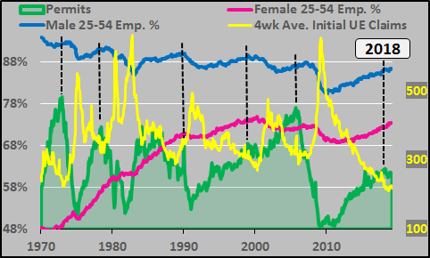
Finally, housing stock creation peaks in relation to employment percentage peaks of the 25 to 54 year old population. 2018 looks an awful lot like 1990, 1998, and 2006.
via ZeroHedge News http://bit.ly/2Vq6kWh Tyler Durden
