Authored by Sven Henrich via NorthmanTrader.com,
“Those who cannot remember the past are condemned to repeat it.” – George Santayana
Are market participants poised to learn this lesson the hard way? Perhaps they should listen to a blast from the past, the lessons of Richard Wyckoff.
Who was Richard Wyckoff?
“Richard was an active trader and analyst in the early 1900s, his career coincided with other Wall Street greats including Jesse Livermore, Charles Dow and JP Morgan. Many have called this the “golden age of technical analysis.”
“Richard Wyckoff began his Wall Street career in 1888 as a runner, scurrying back and forth between firms carrying documents. As with Jesse Livermore in the bucket shops, Wyckoff learned to trade by watching the action firsthand. His first trade occurred in 1897, when he bought one share of St. Louis & San Francisco common stock. After successfully trading his own account several years, he opened a brokerage house and started publishing research in 1909. The Magazine of Wall Street was one of the first, and most successful, newsletters of the time. As his stature grew, Wyckoff published two books on his methodology: Studies in Tape Reading (1910) and How I Trade and Invest in Stocks and Bonds (1924).”
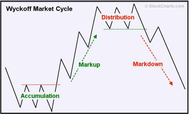
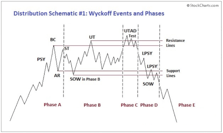
Why may market participants of today want to listen to Richard Wyckoff? Because he developed this market cycle pattern:
A period of accumulation/consolidation a massive mark-up run, then a bunch of back and forth called distribution, and then note the final new high at the end there, followed by a reversal markdown process that reverses it all.
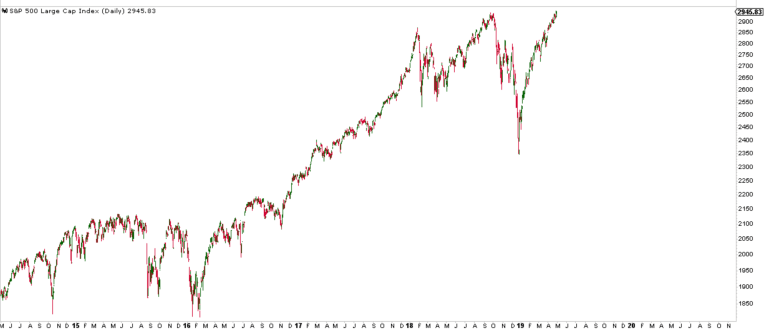
Does this structure look at all familiar to you? If not, it really should:
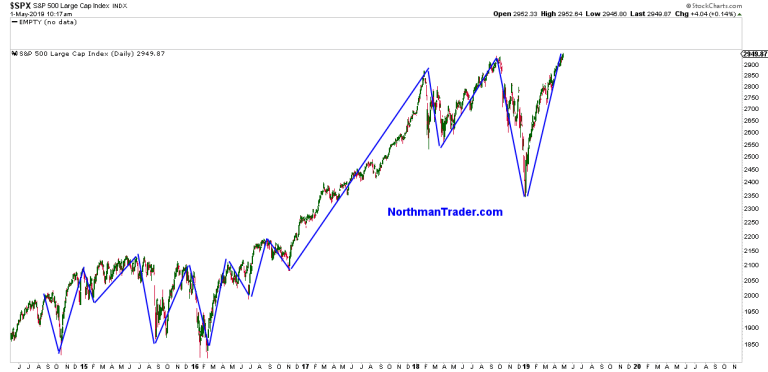
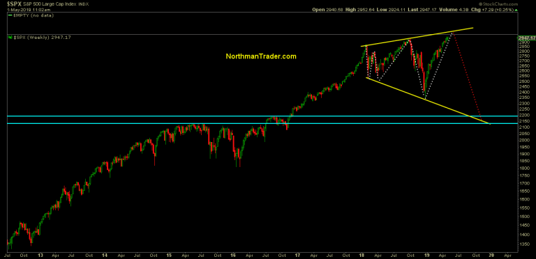
Let me overlay lines outlining the larger moves of the past few years onto the chart and you get this:
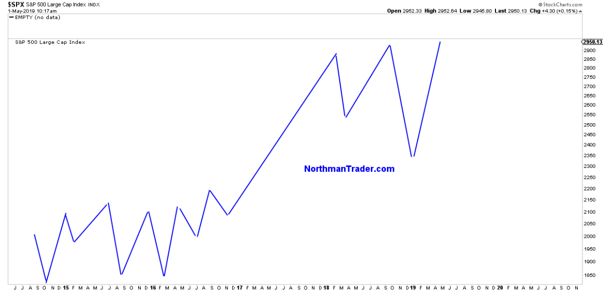
Remove price and you get this structure:
Now compare this to Wyckoff’s market cycle structure:
Are there some differences? Sure there are, smaller deviations have to be allowed for, the key is the larger structure and it fits the larger $SPX structure quite closely.
The structure suggests that the 2014-2016 time frame was the accumulation phase, the run between 2016 into early 2018 was the mark-up phase and the period since January 2018 has been the distribution phase.
What phase are we in now? Here’s a bit more detail on the final topping phase:
If the pattern is applicable it suggests with current new highs we’re in phase C, the UTAD (upthrust after distribution) test.
The definition:
“Upthrust after Distribution. This last gasp rally from support occurs occasionally, and will drive the stock price above resistance and the prior price peaks in the distribution trading range. Price rallies with conviction and often has big leaping bars and volume. Once at new highs, price can stay above the resistance area for days to weeks. The conviction of this rally and breakout will attract a following of buyers. After a series of tests, price begins to sink back below the prior peaks and in short order is heading back to the Support area. After a UTAD, price becomes persistently weak to and through support and into a confirmed downtrend”.
Key takeaways:
Phase C is much shorter compared to the previous phases and any new highs will not sustain suggesting that prices above the September 2018 highs are ultimately a selling opportunity.
This process of new highs could be short lived, a matter of days or it could drag out for weeks perhaps even months, but any price advances from here would be limited.
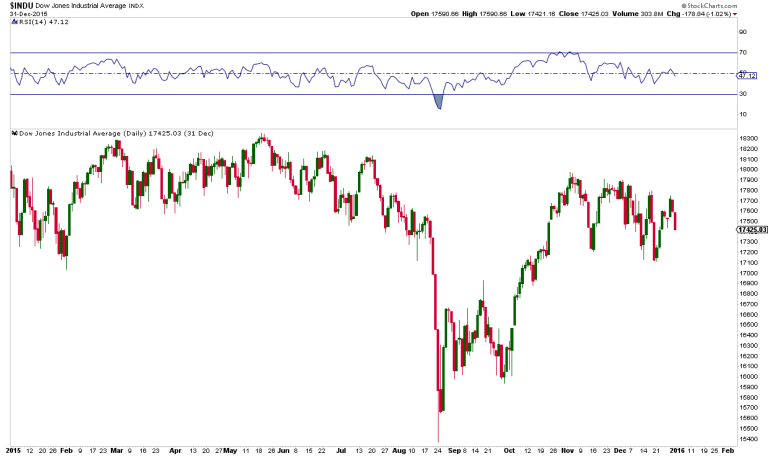
For reference I offer 2015. Prices peaked early in May, frustrated for 3 months and then dropped fast:
But the Wyckoff pattern is suggestive of something more sustained than a quick August 2015 move to come. Rather is suggests not only new lows versus December it suggests an ultimate move back to the accumulation price range meaning back to the 2015 highs or around 2100-2150 $SPX.
What’s the upside risk to stocks here and still fit the pattern? Ironically the price risk range I outlined with the broadening top pattern in Combustion:
Wyckoff’s pattern however does not require for the upper trend line in the chart above to be reached. It can reverse at any time, but strongly suggests some back and forth probing and testing at new highs first before a confirmed breakdown.
The main message of the pattern goes to the question of sustainability of new highs which I recently discussed in my most recent video analysis:
How will we know if the pattern applies to our markets today?
When we see evidence that the break above the September 2018 highs on $SPX does not sustain and price falls back below the 2940 area and then fails to regain it. Then the pattern suggests that the 2019 gains will not only be given back, but that new lows are to come. A price destination that the broadening top pattern is also suggesting.
Until then: Party hardy at your own risk. But remember: “Those who cannot remember the past are condemned to repeat it.” – George Santayana
* * *
For the latest public analysis please visit NorthmanTrader. To subscribe to our market products please visit Services.
via ZeroHedge News http://bit.ly/2VCpYyu Tyler Durden


