Authored by Sven Henrich via NorthmanTrader.com,
Let’s all just step back a minute and drown out all the noise. The economy, the trade wars, the Fed, the news, buybacks, everything. Let’s just look at a few very simple charts.
What have markets done over the past 2 years or so?
We had a massive ramp following the US tax cuts leading to a temporary top in January 2018. It then took $SPX several months to eek out new highs into September.
It was on September 2nd I posted Lying Highs outlining my technical concerns why I thought these highs wouldn’t sustain. I won’t bother you with the details again here, but you can read them here: Lying Highs.
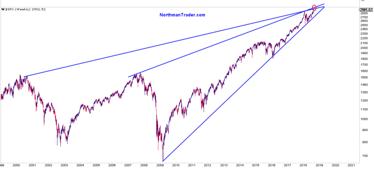
Among the charts I posted then was a simple trend line chart highlighting upside resistance just ahead:
Markets then proceeded to make new all time highs 3 weeks later on September 21 tagging 2940.91. We all know what happened next.
Markets rejected the new highs off of the trend line tag and then carnage ensued into December, breaking the 2009 trend.
Then markets rallied hard again culminating in a set of signals and concerns that prompted a sense of deja vu in me and I posted Lying Highs II on April 16.
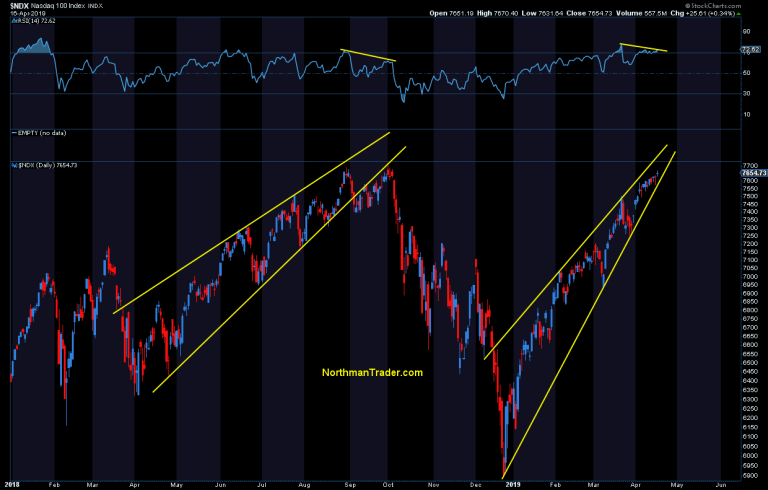
In the article I showed this $NDX chart and pattern, highlighting that markets were on a similar path as last year:
Markets then proceeded to make new highs and topped 2 weeks following my article on May 1st.
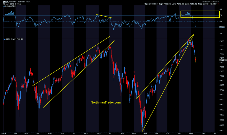
Today we see this:
What’s the lesson here? I need to time my articles better? No, these articles were meant to give a heads up. I can’t pick a top in advance, but I can outline warning signs and while I tend to get bashed for doing so for some unknown reason I think these warning signs are incredibly important to pay attention to.
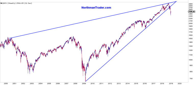
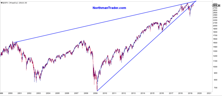
Now let’s revisit that original $SPX chart:
What’s the chart telling us? For one these trend lines matter, they mattered last year and they have mattered once again as $SPX has failed to recapture the 2009 trend line it broke last year. It just rejected it. The signal charts matter and have once again given appropriate warning that something was afoot. And now we’re faced with markets that have failed the general same price zone three times all in a matter of 15 months.
On May 6 I highlighted the break on $ES:
$ES weekly.
Interesting place and time. pic.twitter.com/C46eayprJp— Sven Henrich (@NorthmanTrader) May 6, 2019
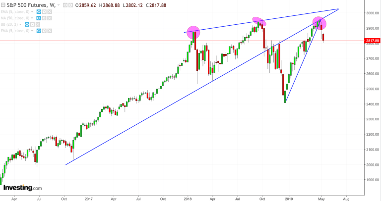
Here we are today:
Price again rejecting the 2940-2950 zone and now falling below the January 2018 highs again.
Forget the noise, the economy, the trade wars, the Fed, the news, buybacks, everything. What are these charts telling you?
To me they are whispering deja vu. Doesn’t mean we can’t have rallies. Of course we will, but these charts are telling a story. I just wonder if anyone’s listening.
* * *
For the latest public analysis please visit NorthmanTrader. To subscribe to our market products please visit Services.
via ZeroHedge News http://bit.ly/2HiI4NO Tyler Durden

