Seeing The Big Picture…
Tyler Durden
Wed, 07/01/2020 – 14:45
Authored by Sven Henrich via NorthmanTrader.com,
Onto the dog days of summer. The first half of 2020 has been intense for all involved and the second half looks to be intense as well. Stepping back from the daily noise of headlines it may serve useful to look at the big picture.
For now there is little doubt that the unprecedented interventions by the Fed continue to support equity markets on their journey toward the largest asset bubble inside of a recession ever. Indeed all market down move events in June found the Fed immediately responding with announcements, from corporate bond buying, to loosening the Volcker rule, and announcing its corporate credit facility to be operational this week. All of these actions produced rallies in markets following downside moves. It remains my view that the Fed has created another asset bubble following the bubble they created with their repo operations in the Fall of 2019.
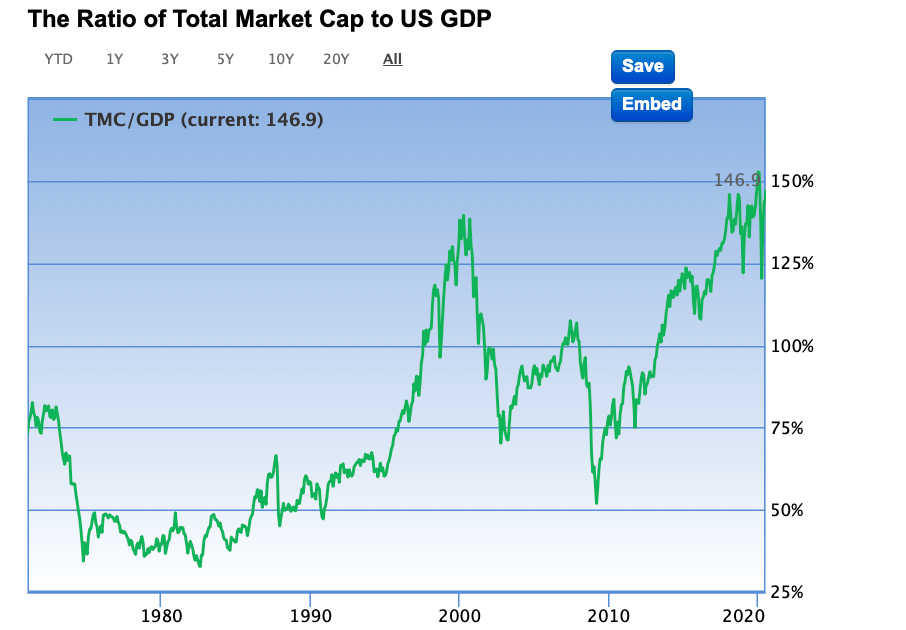
Reminder: It was the Fed’s balance sheet expansion in Q4 2019 into Q1 2020 that led to the largest market cap to GDP expansion on record: 158% in February before markets collapsed triggered by the Covid crisis.
Now, following even more aggressive and historic interventions, market cap to GDP remains far beyond any levels we’ve ever seen during a recession, never mind the worst recession in our life times:
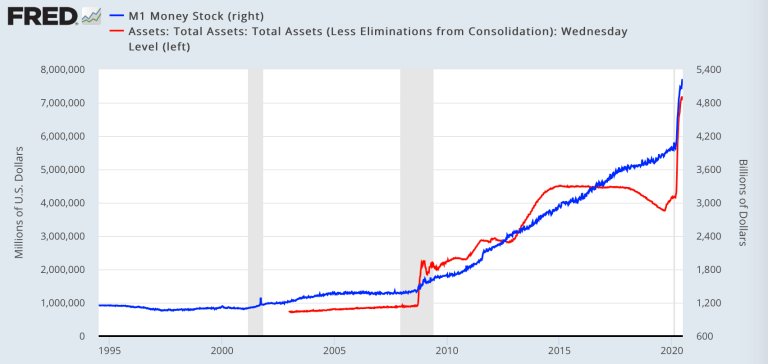
And yes you have the Fed’s unprecedented and historically absurd interventions to thank for that:
What’s it all mean?
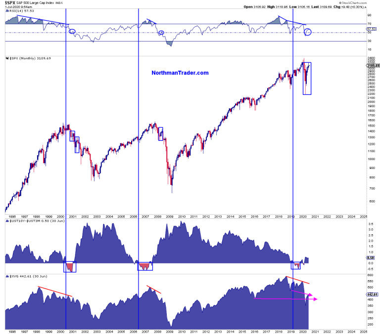
Firstly, let’s start with some basic history here and this history shows that the signals that were ignored in 2019, namely the yield curve inversion as well as the declining participation of equal weight, indeed foresaw a recession coming. Equal weight meaning the broader market lagged versus select leaders that concentrated market cap amongst each other, basically repeating the same patterns we’ve seen during the previous boom/bust cycles:
In this sense markets virtually repeated the pattern we saw in 2006 leading to the 2007 top and then recession and collapse.
It was the Fed’s repo action disconnecting asset prices from the underlying pinnings of the economy that led me to issue a 1999 like warning late in 2019 and early in 2020 (Party like it’s 1999, Ghosts of 2000).
Covid may have been the trigger but the underpinning were there and, like in 2000, markets peaked in Q1 followed by a crash. And now the big recovery rally in Q2 on the heels of Fed intervention which was also advertised in 1929 Redux.
I see no bears on Wall Street and the faith in the Fed is unfalsifiable, never mind that we remain at historic entirely incompatible valuations. To believe in new highs or higher prices is to again believe that markets can sustain a market cap to GDP ratio north of 150% when so far all of market history says otherwise.
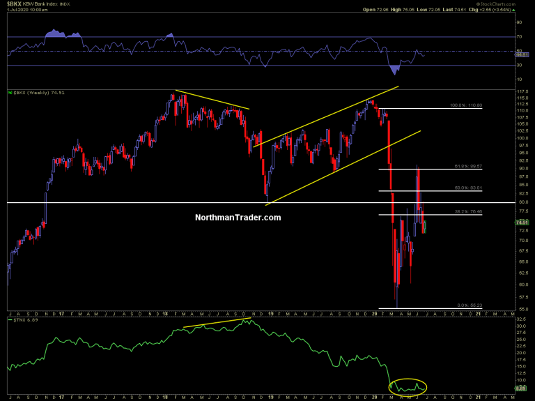
I can’t say whether a new record market cap to GDP extension will happen or not, but from a historic perspective the risk/reward ratio says otherwise. Indeed it was in June when market again broached the 150% market cap to GDP ratio mark on June 8th and failed producing sizable down moves in markets, including 7% down on $SPX, 10% down in small caps and 20% down in banks.
The divergence in markets now is the largest we’ve ever seen. Equal weight as shown in the chart above is below the 2018 lows when $SPX was trading at 2350 and barely above the 2016 lows when $SPX was trading at 2000-2100.
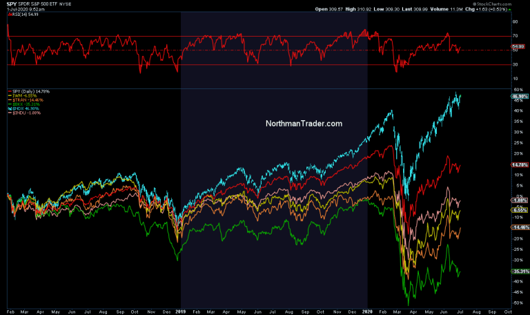
Make no mistake: All is driven by tech and has been since the January 2018 highs:
Without its dominating tech components even $SPX would be down for the count.
Indeed reality is this:
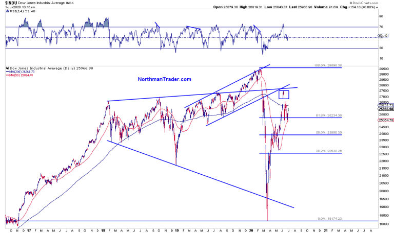
Big picture $DJIA:
Below Jan 2018 highs, hasn’t gone anywhere in 2.5 years.
Blow-off top courtesy Fed repo in Q4/19 into Q1 2020.
Now island reversal and below key resistance.
That’s with rates at zero and a $7 trillion+ Fed balance sheet.
Congrats. pic.twitter.com/gk1BysNy7P
— Sven Henrich (@NorthmanTrader) June 30, 2020
The broader markets hasn’t gone anywhere in 2.5 years, but experienced a Fed induced blow-off top in February and now has again reached levels of resistance in June and has struggled with them.j some bull market. Requires trillions in tax cuts, Fed intervention and zero rates to go nowhere. Congrats.
So the Fed has managed to produced the most aggressive counter rally in decades but it also took unprecedented actions which are unlikely to be repeated again unless the Fed goes towards negative rates.
It is in context of this incredible market range chop that perhaps history can offer some guidance.
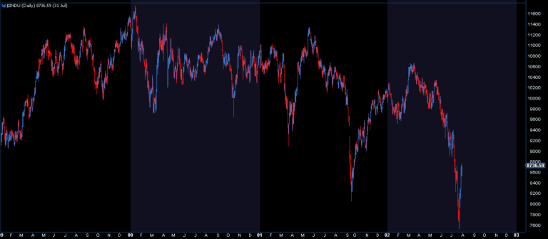
Here’s the $DJIA during the period of 1999-2002:
$DJIA peaked in early 2000 while Nasdaq ran higher into March, then it was a massive counter rally to lower highs followed by more chop and rallies into September of 2000. Then more chop and new lows as the recession continued to persist and the excess was wrought out of tech. A repeat of this pattern would suggest significant more corrections and rallies to come into the rest of the year with even new lows not being beyond the realm of possibility.
I submit with a market cap to GDP ratio again near 150% we haven’t wrought out any excess, which just transferred it into a few tech companies and we do have lower highs on most indices save tech in context of massive range chop:
While hope and optimism headlines continue to dominate the day to day action be very clear: Companies are downsizing, lay off announcements are daily headlines, and hiring freezes remain. Yes companies are bringing furloughed workers back, but the US is far from a clean reopening as Covid is still spiking higher in many states. If there was a V in the offing we would see it in the banks and yields.
We don’t:
Hence I submit to you: We are in a period of great uncertainty and the notion that the global economy goes back to the same size and state as it was in February is a fantasy. Incremental improvement from disastrous conditions yes, but an all clear and all back to normal? Far from it.
Rather what the big picture says is that the structural charts which predicted this recession via the yield curve, negative divergences and weakening participation were absolutely on the money. And they are sending a clear message: This is not over, there is no sudden quick V, and if that is so, then there will be more challenges coming to the Fed’s asset price inflation operation.
Like in 2000 we’ve already been in a period of vast price ranges and chop. As stated before the broader market has not gone anywhere for 2.5 years despite the continues shouting of buy buy buy.
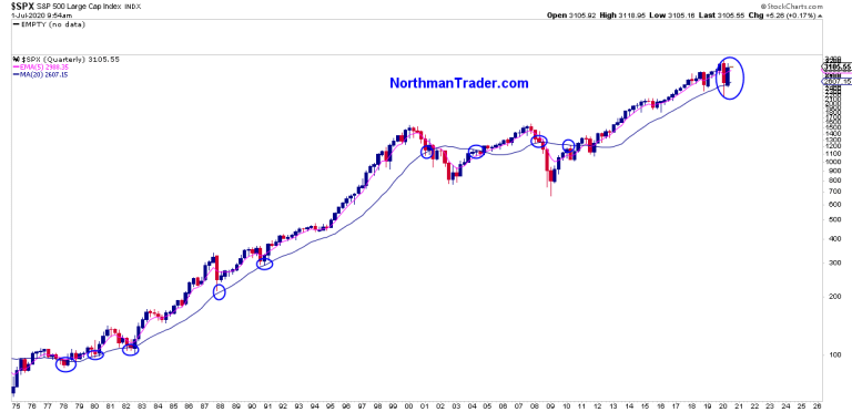
Rather it remains a tradable market. The base reality here is this: As long as the Fed remains in control corrections will be contained on some levels. June demonstrated the Fed has little pain tolerance and they step in during every sell off. So far I suppose it’s working as $SPX managed to defend key support in June stands above the quarterly 5 EMA:
The question of diminishing returns remains and the danger for bulls, who are keen to apparently buy the highest valuations inside a recession ever, is whether the Fed loses control. For if the Fed does lose control history says markets have an appointment with a 100% market cap GDP ratio or below and if that happens the Fed will have no choice but to go with negative rates and ask Congress to be allowed to buy stocks directly. As many red lines have already been crossed, including the Fed buying $AAPL bonds, buying stocks directly is only the last red line to cross. While the Fed pretends to be concerned about moral hazard its actions clearly say otherwise.
From my perch here: Big rallies into key levels offer opportunities to sell markets, dips into key levels of confluence support offer select long trading opportunities. Like in 2000 the winners are not the stubborn ones, but the ones that navigate the wide price range chop in both directions. I suppose this is another way of saying: Buy the dips and sell the rips while maintaining a healthy sense of skepticism and utmost flexibility for that’s what seeing big picture is telling us and it has yet to lead us astray.
via ZeroHedge News https://ift.tt/38prGqT Tyler Durden

