Owning Gold Is As Much About Diversification As It Is About Capital Appreciation
Tyler Durden
Thu, 06/25/2020 – 11:42
Authored by Bryce Coward via Knowledge Leaders Capital blog,
Regular readers of our content know that we have been building the case for several years now on why gold deserves a place in diversified portfolios. Sure, we see significant upside in gold (unlimited upside, in fact), aided as I will show by the unprecedented rise in US dollar money supply in response to the COVID crisis. But the case for gold is much deeper than simply a story of potential capital appreciation.
These days, gold as an asset class is in an entirely unique position to not only provide upside potential, but also provide a layer of diversification within a portfolio that neither stocks nor risk-free nominal bonds can achieve on their own or even together. Much of this has to do with the rather disadvantageous position of risk-free bonds at the moment that have brought us to the death throes of the 60:40 portfolio. Indeed, with risk-free rates so close to zero (even on the long end), bonds simply don’t have enough convexity (aka capital appreciation potential) left in the tank to act as a sufficient diversifier of equity risk. After all, if the 10-year bond yield drops to 0.00% from the current 0.68%, that would provide owners of that bond with a whopping 6% capital appreciation, which is not nearly enough to cushion a 20% or 30% equity selloff.
Now, things may be different if the Federal Reserve was open to the idea of setting the Fed Funds rate at -3% or -4%, but that idea has been sufficiently brushed into the dusk bin. Instead, the Fed appears more likely to add some form of yield curve control to its policy toolbox. This will relegate risk-free bonds to a purgatory of sorts in which they can provide neither income nor capital appreciation potential of any magnitude.
Conversely, gold provides both capital appreciation potential as well as diversification to equity risk. Said in modern portfolio theory parlance, gold has the potential to bring one’s portfolio closer to the efficient frontier. That can no longer be said of nominal risk-free bonds.
Now, let’s get to some charts to illustrate these points.
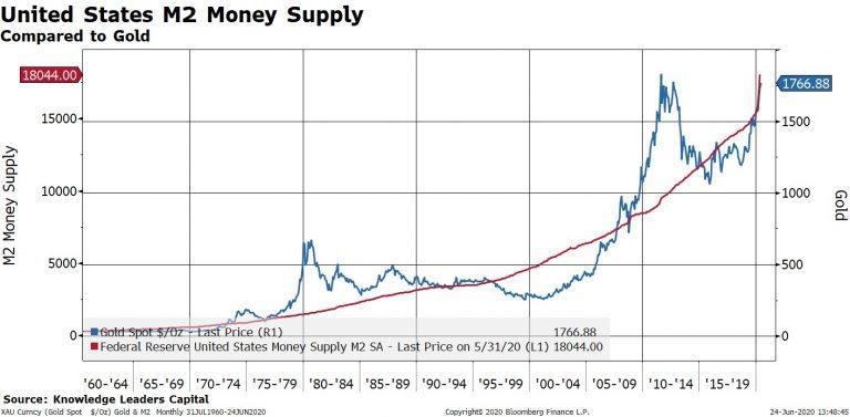
The fundamental case for higher gold prices is really quite simple. While many view gold as an asset class that rises when inflation expectations or actual inflation rises, it’s even simpler than that. The quantity of gold is relatively fixed. The quantity of money is not. Therefore, when the quantity of money rises, the price of gold as priced in terms of that form of money must also rise. Sure, inflation may be a consequence of a rising money stock (Milton Friedman’s “inflation is always and everywhere a monetary phenomenon”), but it also may not be (see 2009-2019).
So from an empirical perspective, we observe that gold has a closer relationship with the quantity of money in the economy than it does actual inflation. The first chart below shows the US dollar price of gold compared to United States M2 money supply. The price of gold tracks the quantity of money quite well, with some deviations from trend that have always corrected over a fairly short period of time (see the late 1970s-1980s, early 2000s, 2010-2011).
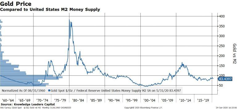
Another way to show this idea is to plot the price of gold relative to the money supply. What we observe is a flat overall trend with the bulk of the distribution concentrated around a rather narrow central tendency (blue bars on the right of the chart show the distribution of observations). Sure, the price of gold is not entirely a function of the quantity of money, otherwise the line would be flat as a pancake, but it’s close enough for government work.
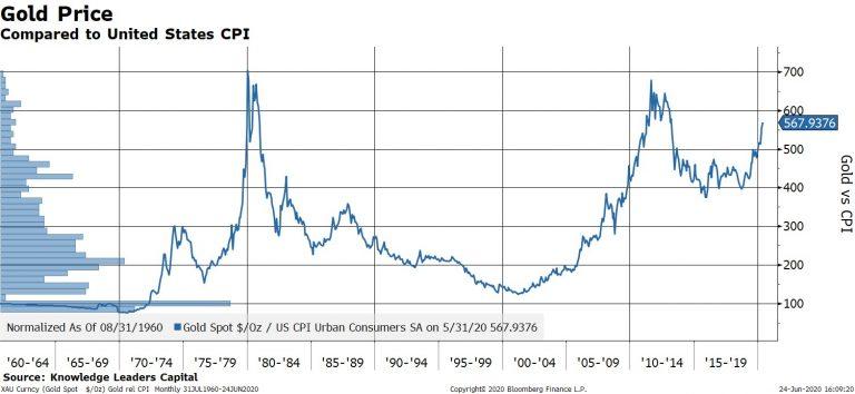
Now, when we do the same exercise again and plot the price gold relative to consumer prices, we see something entirely different. First, the trend is not flat, but has a positive slope. Second, the distribution of the series is not concentrated around a narrow central tendency, but instead the distribution itself (blue bars on the right) is kind of flat. Basically, this chart shows that gold really is a rather imperfect inflation hedge. The other explanation is that our measurement of consumer prices is imperfect, but that is a topic for another day.
Since the price of gold generally rises with the with the quantity of money, it makes perfect sense that gold would perform well with the M2 money supply growing at 23% YoY, as it is currently.
Further, it doesn’t take much extrapolation or imagination to see the path toward continued fast money growth. After all, with policy rates at 0.00%, the remaining tools of fiscal spending that is funded by an ever-growing Fed balance sheet (i.e. money growth) makes logical sense at this juncture.
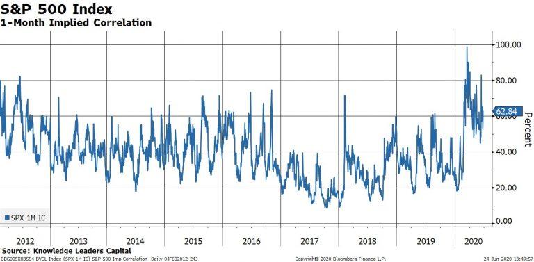
With the fundamental case for higher gold prices out of the way, let’s move onto gold’s application as a portfolio diversifier. The reason it makes sense to form multi-asset portfolios vs all-equity portfolios is that equity risk hard to diversify away with a portfolio of… equities. Indeed, even as there exists idiosyncratic risk exposures of individual stocks, there are market forces of demographics, interest rates, productivity levels, economic growth rates, etc. that affect both public and non-public equities. One way to show this concept is simply to plot the average correlation between stocks in the S&P 500. The average correlation between the S&P 500 constituents ranges from 40-60% in normal times and then rises towards 100% in selloffs (see early 2018, late 2018, early 2020). In other words, all that idiosyncratic risk exposure of equities as an asset class (both public and private as we recently learned) gets tossed out the window in a selloff and one’s “diversified” equity portfolio morphs into market risk only, or beta.
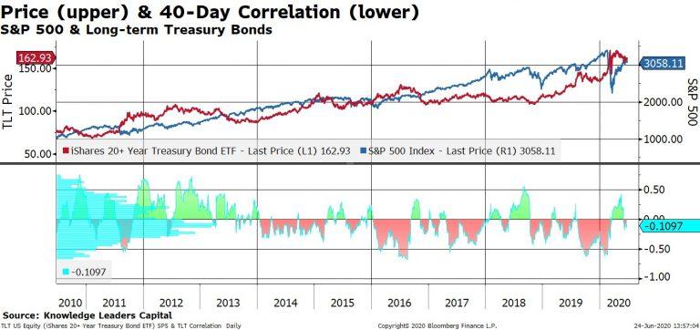
It used to be that long-term Treasury bonds could be used as a diversification tool to cushion the blow of equity selloffs because they typically appreciated a lot during market drawdowns. We can show this by plotting the correlation between US stocks and long-term bonds in the bottom panel in the next chart. Since 2014, long bonds were nearly always negatively correlated with stocks and had a central tendency of -10% correlation to -40% correlation. That negative correlation is what you want from a hedge, or diversifier. But, you also need capital appreciation potential from that hedge. Bonds don’t have that anymore, as I previously showed.
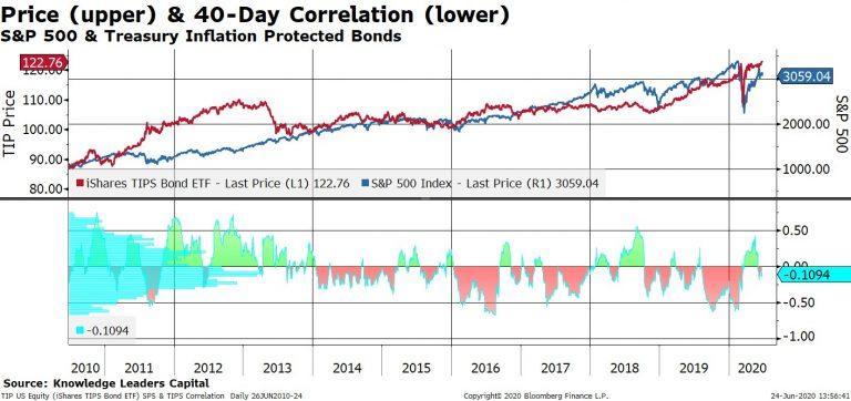
What about inflation protected bonds? TIPS don’t have an interest rate floor the same way nominal bonds do. Theoretically, TIPS yields could trade severely negative if the Fed caps 10-year nominal bond yields at say, 0.50%, while actual inflation runs at 3% or 4%. TIPS also have a negative correlation with stocks just like nominal bonds as we see in the next chart. So, it appears, that TIPS may still have a place in a diversified portfolio as a hedge.
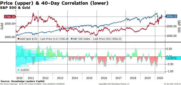
Now, let’s turn to gold. Gold exhibits the same negative correlation with stocks that both the nominal bonds and TIPS do. However, unlike nominal bonds it has no theoretical upside. And unlike TIPS, gold may appreciate in price independent of actual or expected inflation trends.
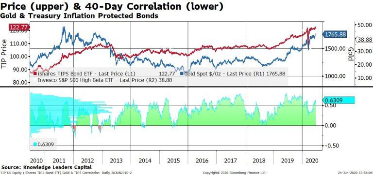
That is not to say, however, that gold and TIPS aren’t related. Indeed, gold and TIPS sport an average correlation between +40% to +60% (chart below).
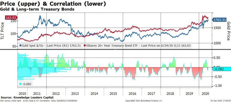
This compares to a negative correlation between nominal long-term bonds and gold (chart below).
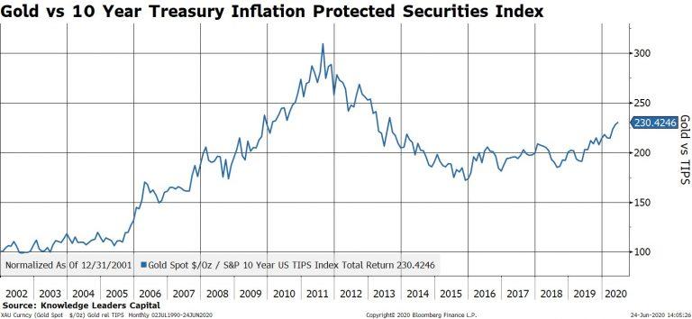
But the drivers in their price are different enough to justify places for both asset classes in a diversified portfolio. Indeed, gold has outperformed TIPS by 20% over the last 12 months and is undergoing what a technician might call a base breakout vs TIPS (chart below).
This action undoubtedly is a result of that growing supply of money to offset what is admittedly a hugely deflationary economic backdrop currently.
via ZeroHedge News https://ift.tt/2Z4nFE2 Tyler Durden
