Submitted by Charles Hugh-Smith of OfTwoMinds blog,
The rise in equities does not mean stocks "buy" more commodities in the real world–they buy less.
If the new highs in the Dow Jones Industrial Average (DJIA) are so wonderful, why does one share of the Dow-30 buy less than it did 14 years ago? What does a nominal new high in the stock market mean in the real world? The only way to know is to ask if the purchasing power of a share of the Dow buys more than it did when the Dow was at lower levels.
If one share of the Dow (defined as one share of each of the constituent 30 companies) buys less than it did when the Dow was as lower levels, the nominal new high is a mirage in terms of increased purchasing power of equities.
Another way of assessing the real-world impact of a nominal new high in equities is to perform a relative strength analysis: did equities outperform essential commodities, or did equities underperform these essentials? If the Dow underperformed, then a new high is an illusion: if equities buy less stuff in the real world, the nominal new high is misleading.
Longtime correspondent Harun I. recently shared a series of charts which reveals what's real and what's false about nominal new highs in the Dow:
Wonderful post, What's Real? What's Fake? (December 16, 2013). Below you will find some charts that may answer: What is real?
RS charts are not new to us, but they need constant study. Nobody eats, clothes, shelters, heats their shelter or fills their gas tank with equity shares. Therefore, when we convert those shares to currency in order to purchase things that are generally useful, their real value is revealed. Purchasing power cannot be faked.
There are several questions that can be explored, however, today I wish to point out the most obvious.
The trend in commodities relative equities over the period ranging from 1970-2000 was down. This indicated that the Dow outperformed commodities, or put another way, was able to purchase more per unit during this time. It is useful to remember that, as you and many others have pointed out, that during this time debt expanded as well. Two wage earners were required per household to produce a standard of living that once required only one wage earner. This effectively was a 50% loss of purchasing power.
However, the fact that household debt expanded to the extent that it has in order to maintain a particular standard of living with even two wage earners suggests an even greater decline in net purchasing power. But I digress.
The downtrend lines drawn on the charts below indicate secular trends that were in place for approximately a thirty year period, much like the decline in interest rates. With equities at new nominal highs, there are many who argue that the worst is behind us.
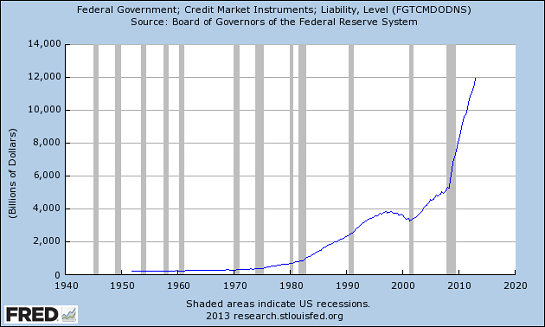
However, as I point out on the first chart (Gold/Dow Ratio), the amount of debt that created the secular bull market previously is dwarfed by the amount of debt that it has taken to create what may be a normal correction in what appears to be a secular bear phase. Despite new historic nominal highs, despite parabolic increases in public debt, not one chart displayed indicates the Dow as having recovered its purchasing power which peaked roughly in 1999.
If we are to believe that the worst is over, we must at the very least answer a few basic questions:
–How much debt is required to get back to the peak in equity purchasing power in 1999?
–Assuming the next leg down is the same as the previous leg down, how much debt would be required to produce such a move?
Conversely, if they are wrong, if the commodity cycle has reversed and the bear phase in equities resumes, how much debt will be incurred while fighting the commodity cycle all the way back to its historic highs?
In either scenario, who is going to take on what will be stupefying levels of debt (after all, it is a geometric progression), and how will it be paid back?
What is real? These charts that lay bare the falsity that "everything is just peachy" are real. Central bank activity is real. Their activity allows nations to bid for commodities for which they produce too little to pay for outright. They have created multigenerational obligations that will likely never be repaid. Keeping commodities well bid based on improbable (impossible?) promises is causing real global instability.
The Fed is leverage 72 to 1. Either way these cha
rts break will represent reality, a reality that will become increasingly unstable.
As for the status quo’s defense of the farce being perpetrated, they will do what we all have observed in children caught doing something naughty. They will lie. It may be understandable in children but in adults selected for national leadership it is gravely disturbing. From Nixon’s, “I’m not a crook”, to Clinton’s, “I didn’t have sex with that woman”, and Nancy Pelosi's defense of the ACA, "the more we see of it the more we will like it" (paraphrased).
It is all very disturbing. Whether there exists a pathological disconnect with reality, intentional deception, or a tendency to revert to childhood psychological defense mechanisms, such behavior from those entrusted with so much is a blaring warning signal.
Thank you, Harun, for an insightful assessment of value and the unsustainable absurdity of a political and financial system dependent on debt, propaganda and falsehoods for its survival. Here are the charts, with comments by Harun and myself as noted.

Federal debt:


The rise in equities does not mean stocks "buy" more goods in the real world–they buy less. So much for "new highs"–the nominal new highs in equities is pure illusion in terms of purchasing power.


via Zero Hedge http://feedproxy.google.com/~r/zerohedge/feed/~3/t4rXzKG9Q8U/story01.htm Tyler Durden
![]()


