Update: It appears that complacency is starting to crack…

Authored by Jesse Colombo via RealInvestmentAdvice.com,
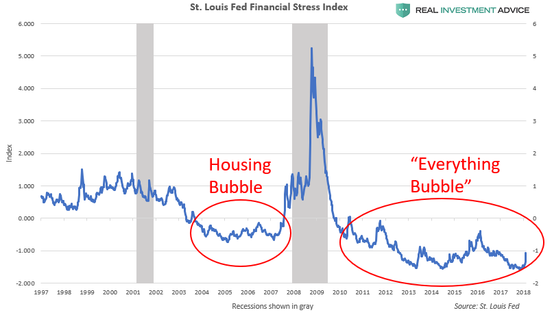
Lately, I’ve been particularly interested in economic or financial indicators that show investor complacency that is typical of dangerous financial bubbles. For example, I recently wrote about the St. Louis Fed’s Financial Stress Index. These indicators oscillate between periods of complacency (ex: 2003 to 2007) and periods of fear (ex: 2007 to 2009) and back again.
Obviously, I’d rather live in times when economic fear is low, but there is an important nuance to keep in mind: if fear is artificially low due to Federal Reserve or other central bank market manipulation (as it has been since the 2008 financial crisis), then it is usually an eerie, unhealthy “calm before the storm.” Also, it’s like comparing a good mood that’s due to healthy living and exercise to one that’s the result of a recreational drug high: one is sustainable, while the other will result in a crash.
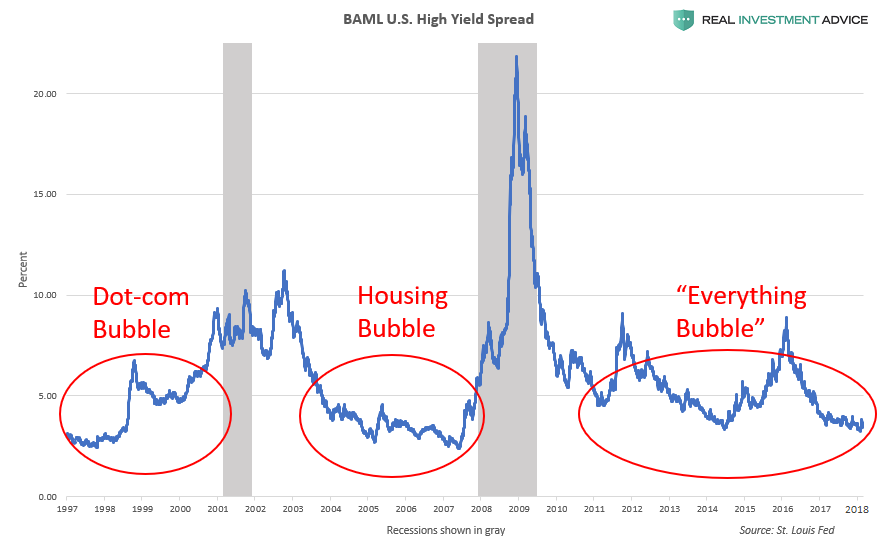
In today’s piece, I will discuss high-yield bond spreads and how they can be an effective complacency indicator. High-yield or “junk” bond spreads are the percentage difference between high-yield or “junk” bond (corporate bonds that are beneath investment grade) yields and investment grade corporate bonds or U.S. Treasury bonds. As the name indicates, high-yield bonds have higher yields than safer investment grade bonds to compensate investors for their higher risk. The gist behind high-yield bond spreads is that the spread between high-yield bonds and investment grade bonds shrinks during bull markets because investors prioritize earning a higher return instead of avoiding risk. In a bear market or in a financial crisis like 2008, however, high-yield bond spreads widen considerably as investors jettison riskier assets like high-yield bonds in favor of lower-risk assets like investment grade bonds.
In the chart below, I’ve plotted the Bank of America-Merrill Lynch High-Yield Spread, which tracks the spread between all U.S. dollar-denominated corporate bonds below investment grade and a spot U.S. Treasury curve. Clearly, the spread rises during recessions and financial crises, and falls during bull markets. My argument is that, in central bank-manipulated environments like we’ve had for several decades, very low high-yield bond spreads indicate the formation of a dangerous economic bubble. The high-yield spread was unusually low during the late-1990s Dot-com bubble and mid-2000s housing bubble, as well as during the current “Everything Bubble” that I have been warning about.
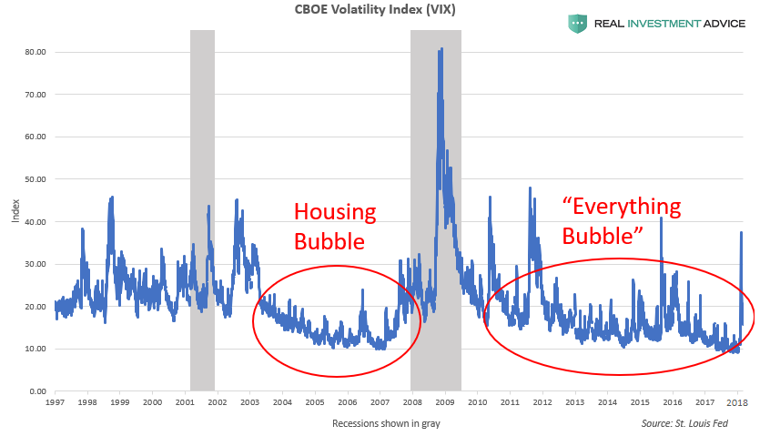
Interestingly, other unrelated sentiment indicators are telling a similar tale as high-yield bond spreads. The chart below shows the popular CBOE Volatility Index (VIX), which measures the fear (or lack thereof) of U.S. stock investors. The VIX was unusually low during the mid-2000s U.S. housing and credit bubble, similar to how it has been unusually low since the 2008 financial crisis. In both cases, the VIX remained at ultra-low levels because the financial markets and economy was backstopped by the U.S. Federal Reserve (via low interest rates), which helped to create a temporary economic recovery and bull market until monetary policy was tightened. Make no mistake: we are experiencing the same phenomenon this time around, and another disaster is inevitable. There is no way that the Fed and other central banks can manipulate the financial markets like they have without any consequences.
The St. Louis Fed Financial Stress Index shows the same complacency as high-yield bond spreads and the VIX, as I recently discussed. I’m aware that high-yield bond spreads and the VIX are actually components of the Financial Stress Index, but I thought it would be valuable to include it among the other charts.
As I’ve already said, the root of much of today’s investor complacency is the backstopping of the financial markets by the U.S. Federal Reserve and other central banks via their ultra-low interest rate policies, quantitative easing, etc. Unfortunately, this has created a moral hazard in which investors and business leaders have come to believe that the Fed will always be there to prop up the markets and will never let the markets properly clear and work off overbought conditions. The chart of the Fed Funds Rate below shows how disastrous bubbles have formed during troughs in interest rates, including today’s still-unpopped “Everything Bubble.” It’s no coincidence that the other complacency indicators discussed in this piece look so similar to the Fed Funds Rate chart; the Fed Funds Rate is the dog and the other indicators are the tail.

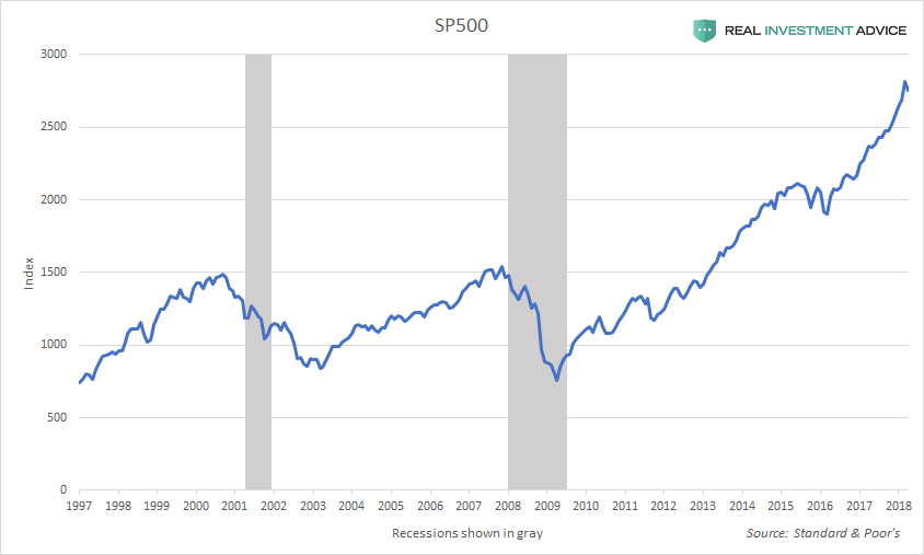
U.S. interest rates have remained at record low levels for a record amount of time, which means that today’s “Everything Bubble” will be even more dangerous than other historic bubbles (when taking into account the global bubble situation). The chart of the SP500 shows that the current bull market has lasted approximately as long as the ultra-low interest rate conditions, which is certainly no coincidence:
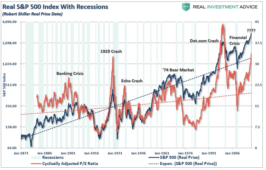
Fed and other central bank-induced investor complacency has pushed U.S. stock market valuations to 1929 levels, which is extremely alarming; the only other time U.S. stocks were more overvalued was during the Dot-com bubble. Despite what the bullish commentators say, reversion to the mean is inevitable – it’s just math.
Undoubtedly, mainstream commentators will try to dismiss my assertions in this piece as being being “alarmist” and will try to argue that today’s calm high-yield spreads are “a sign of financial health” rather than a reason to worry about investor complacency. I’m used to dealing with it at this point – don’t take my word for it… history will prove my assertions to be true.
via Zero Hedge http://ift.tt/2F2bK2y Tyler Durden