Authored by Chris Hamilton via Econimica blog,
According to the BLS data, the 25 to 54 year old labor force participation rate it currently at 82.6%, a full 2% below the 2000 peak and 1% below the ’88 through ’08 average. The implication is that there should be millions of 25 to 54 year olds ready and willing to enter the labor force, given the right incentive. This is the much touted labor force “slack” that is ready and waiting to become new employees, homeowners, tax payers, etc..
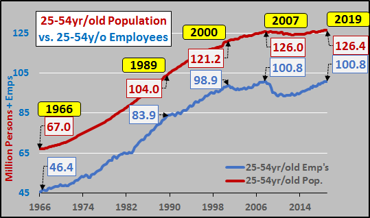
But interestingly, when pulling the historical 25 to 54 working age population data versus the 25 to 54 employee data, seems worth noting that the data doesn’t quite square up. Based on historical data from the OECD (US 25 to 54yr/old working age population, BLS 25-54yr/old employment level…both available from St. Louis FRED), population growth and jobs growth among the prime age population that drives the US economy has stalled for over a decade. The discrepancy may have something or everything to do with the usage of Census overestimated population growth…which I have detailed HERE.
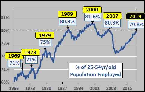
By simply dividing the total working age population of 25 to 54 year olds versus those 25 to 54 year olds employed, a different picture emerges. The chart below suggests that the most economically critical population segment is essentially very near or at full employment. No “slack”.
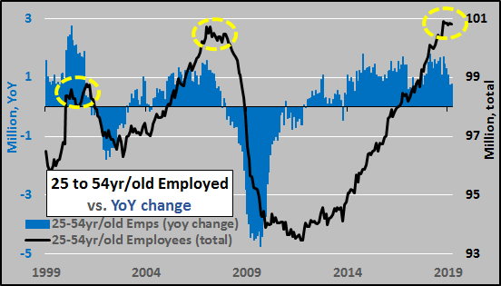
Looking solely at 25 to 54 year old employment (black line) and year over year change (blue column), a clear precursor is visible of full employment…a flattening in total 25 to 54 year old employees is underway signaling peak employment, as has happened prior to every previous recession. Absent “slack” (ready and willing 25 to 54 year olds not already engaged in parenting, caregiving, further education, etc. etc.), the economic engine has stuttered and backfired without the necessary fuel for growth, more potential workers and subsequent potential consumers.
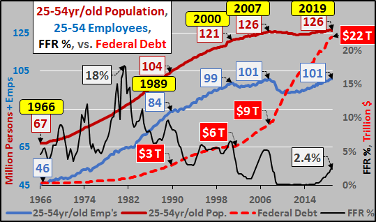
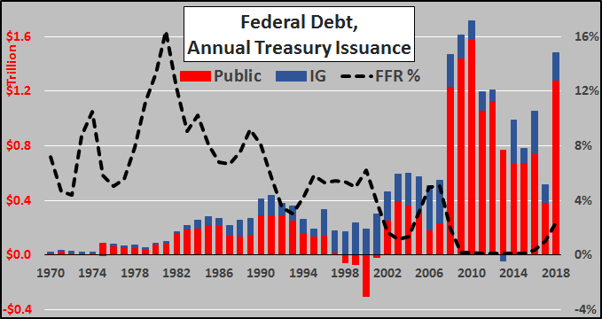
And what happened in ’89, ’00, and ’07 when the 25 to 54 year old population hit peak employment coinciding with rising interest rates? Recession, rate cuts, and massive growth in federal debt. No reason to believe this time will be different!?!
As the chart below details, the end of each interest rate cycle ushered in a new wave of federal debt issuance. Given the massive debt issuance in ’18, interest rate cycle peak in ’18, and the White House is now calling for rate cuts (and QE4), it appears this cycle is already underway.
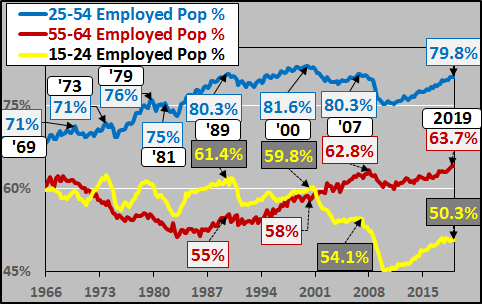
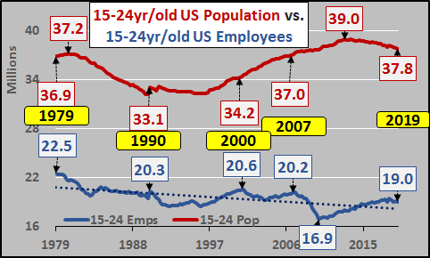
But things change and to broaden out the picture, the chart below shows all the groups that make up the 15 to 64 year old working age population. While the 25 to 54 year olds are essentially at historical full employment, the 55 to 64 year olds are setting new records for employment. Conversely, the 15 to 24 year old segment is almost 11% below historical peak employment and appears to have peaked for this cycle and is now rolling lower. The lower employment among 15 to 24 year olds is in part due to the record portion of young attending college and a myriad of factors limiting their participation.
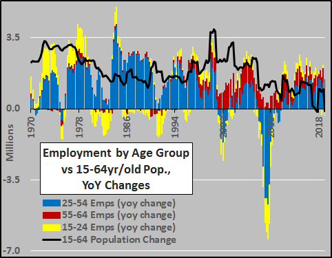
Given we are nearing or at peak employment, a quick look at the relationship of population growth, by age group, versus employment growth among the same group is helpful. The chart below shows the year over year change in the 15 to 64 year old US population (black line) versus year over year change in employment among 15 to 24 year olds (yellow columns), 25 to 54 year olds (blue columns), and 55 to 64 year olds (red columns). Noteworthy is the decelerating working age population growth since 2000 and the shifting employment growth from the 15 to 24 year olds to the 55 to 64 year olds.
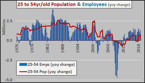
Getting a little more granular, a look at the 25 to 54 year over year population change (red line) versus 25 to 54 employment change (blue columns). The relationship and limiting factor of population growth to employment growth should be fairly obvious (the large population bump in ’00 was a Census adjustment…not sudden growth).
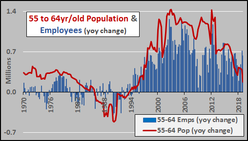
Checking the 55 to 64 year over year population change (red line) versus 55 to 64 employment change (blue columns). It should be clear that this segment has been carrying the load from both a population and employment growth standpoint. However, demographics deem that time is nearly up for this segment.
And looking at 55 to 64 population versus employment…the cresting wave of population growth is now visible.
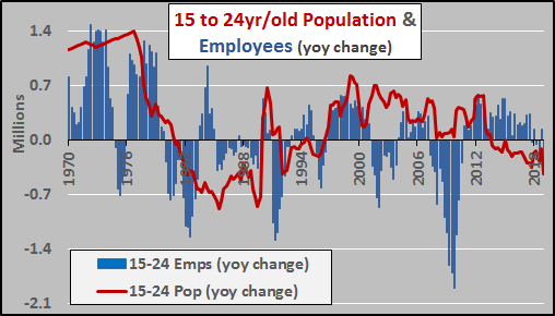
As for the 15 to 24 year olds, they are a declining population and not surprisingly, likewise, the employed among them are now falling. A record percentage are now attending universities (rather than working) and undertaking record debt to do so.
The declining population of young and a declining labor force participation rate among them spells declining employment among the youngest portion of the labor force.
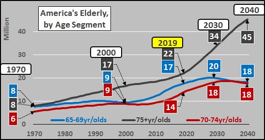
As for the 65+ population (detailed below), the 65 to 74 year olds have a 27% labor force participation rate. But where the bulk of the population growth is taking place, among the 75+ year olds, they have just an 8% labor force participation rate!!! They will not be supplying much, if any, labor force “slack”.
Conclusion:
If the data I show, rather than that offered by the BLS, is correct and the prime aged population is at full employment, get ready for rate cuts, recession, and new jaw dropping record debt to GDP levels.
via ZeroHedge News http://bit.ly/2uVYIMy Tyler Durden

