Authored by Sven Henrich via NorthmanTrader.com,
At the beginning of March I issued a warning about $BA when the stock was trading at $441. The stock has dropped over $70 since. Of course I could not have known the company would experience a disaster with the plane crash and the subsequent software issues and fleet groundings and now canceling of orders. My call was not based on fundamentals, it was based on technicals and the technical case was based on the stock being historically extended and at high reversion risk.
One of the indicators I had based the call on was the yearly 5EMA (exponential moving average). It’s a simple indicator, but a very powerful one that is often used for daily and weekly chart work, but most people do not look at yearly charts. In fact, I don’t see them discussed anywhere and not considered by those making the case for new highs and further gains. Hence I want to raise awareness with this article.
Why are yearly charts of interest in context of the 5 EMA? Because they are highly relevant. Little known fact: Stocks and indices reconnect with their yearly 5 EMA in most years, not in all, but in most.
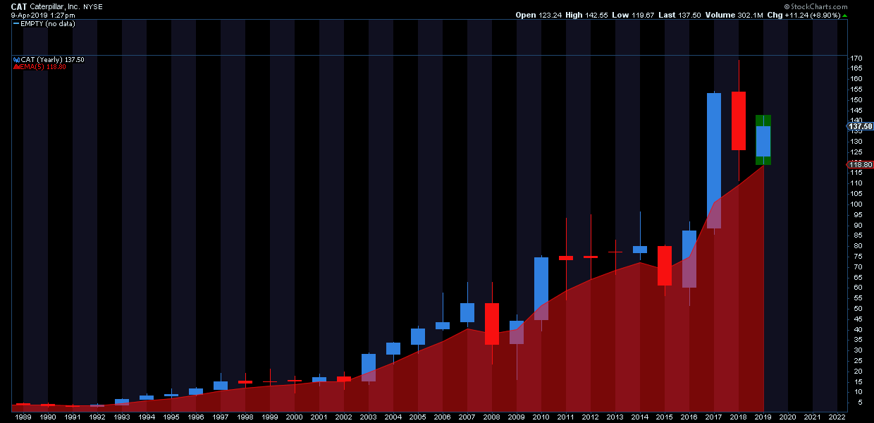
Case in point, here’s a 25 year chart of $CAT, a key industrial stock compared to its yearly 5EMA:
As you can see it touches its 5 EMA in most all years, not only that, the 5 EMA, in bull markets, often acts as critical support. Many times a yearly low is made at the point of reconnect. Hence when stocks disconnect greatly from the 5 EMA, say in the upward direction, it becomes a warning sign. Even $CAT experienced this during the hyper bull phase last year. It got too far ahead of itself and subsequently came back to earth in December nearly reconnecting in full.
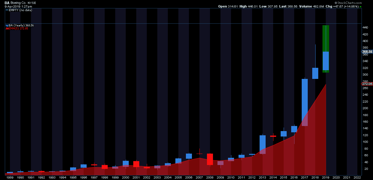
For reference here’s the updated the $BA chart:
Quite the reversal candle since my March note. But still note how far it is still disconnected for a 2nd year in a row no less, something the stock has never done before.
Which brings me to the larger message here: As much as the 20% drop in markets last year is being called a major correction there is hardly any evidence in some stock charts. Indeed some stocks continue to be vastly disconnected which raises an important question: Are investors too complacent here expecting further sizable gains in stocks and markets?
As with $BA I’m not making a fundamental argument here, but a technical one.
Consider 2 further examples here of widely held and extremely successful companies.
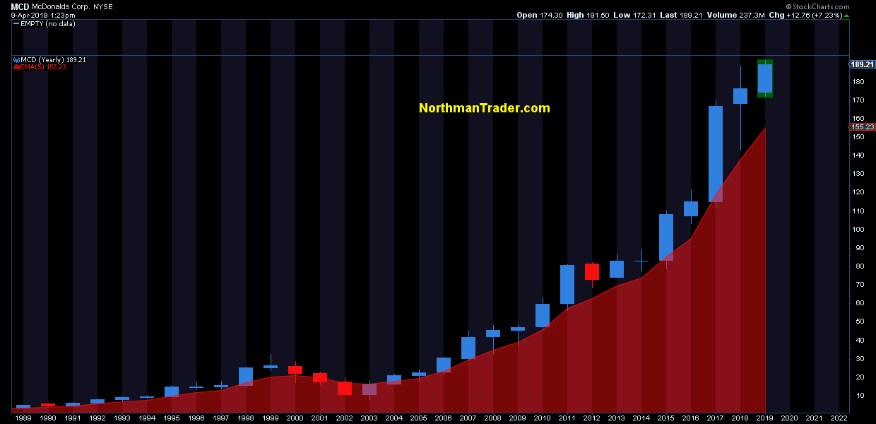
McDonalds ($MCD):
Before anyone chides me for using linear charts: The 5 EMA disconnect makes no difference whether it’s shown on a linear chart or a logarithmic chart, but it helps put these moves into historical perspective.
In the case of $MCD here we see the stock being 22% extended above its yearly 5EMA and entirely disconnected for 2 years in a row. Perhaps more amazingly the stock has had only 1 red candle in 14 years. No red even during the financial crisis. But as steady as the stock has been since 2003 its flight to the heavens far above the yearly 5EMA has me shout: Careful Icarus, you’re getting too close to the sun.
Priced to perfection? A simple 5EMA reconnect, something the stock has done in most years would constitute a reversal of most of 2019’s gains so far.
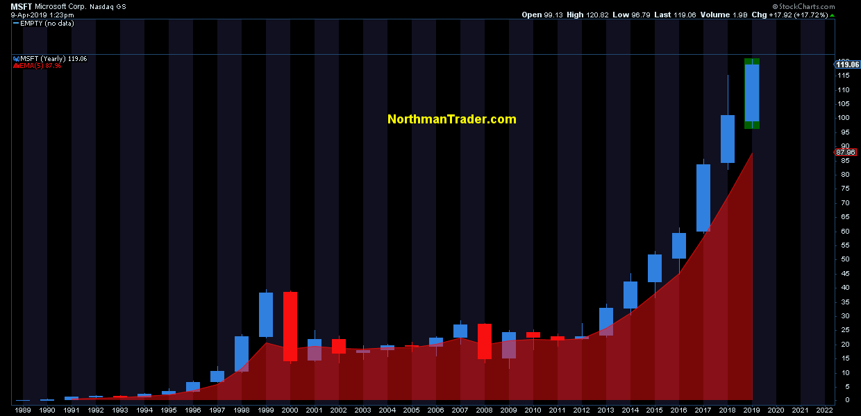
Take another stock, a tech favorite, $MSFT, a stunning chart really:
35% above its yearly 5 EMA. The only time $MSFT disconnected 2 years in a row above its yearly 5EMA was during the tech bubble in 1999/2000 and then it came crashing back to earth when the tech bubble burst. Well, here we are again. You can’t even notice last year’s 20% market correction in the chart. Never happened and the stock is on to new highs for its 8th year in a row. Icarus, careful you’re getting pretty close to the sun there.
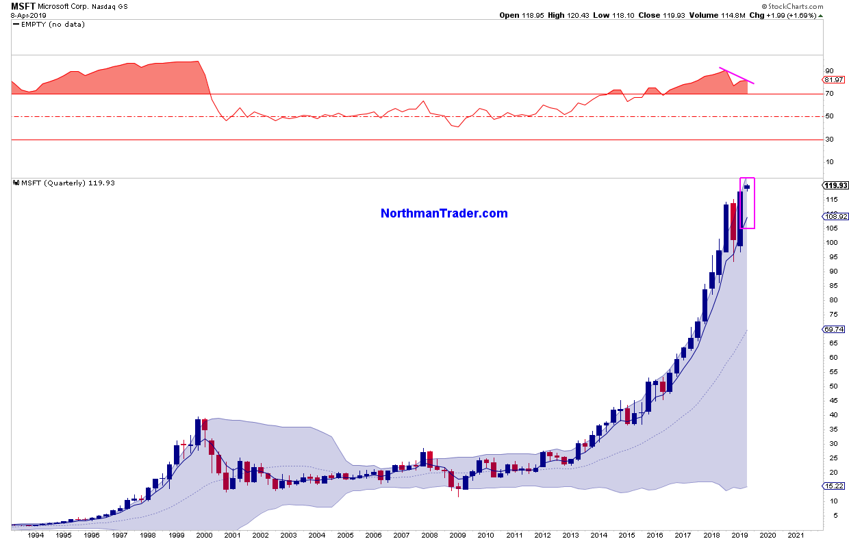
In process the stock is doing something it’s never done before: It’s printing a negative RSI divergence on its quarterly chart:
And see how far the stock is now even disconnected from its quarterly 5 EMA. Doesn’t mean it must reconnect this quarter, but it shouldn’t surprise either. Such a reconnect would involve a drop of 10%.
You see where I’m heading with this: To expect sizable further gains in some of these stocks is to expect the historically unprecedented: Ever further disconnects, something these stocks have no history in showing. In other words: One must assume it’s different this time.
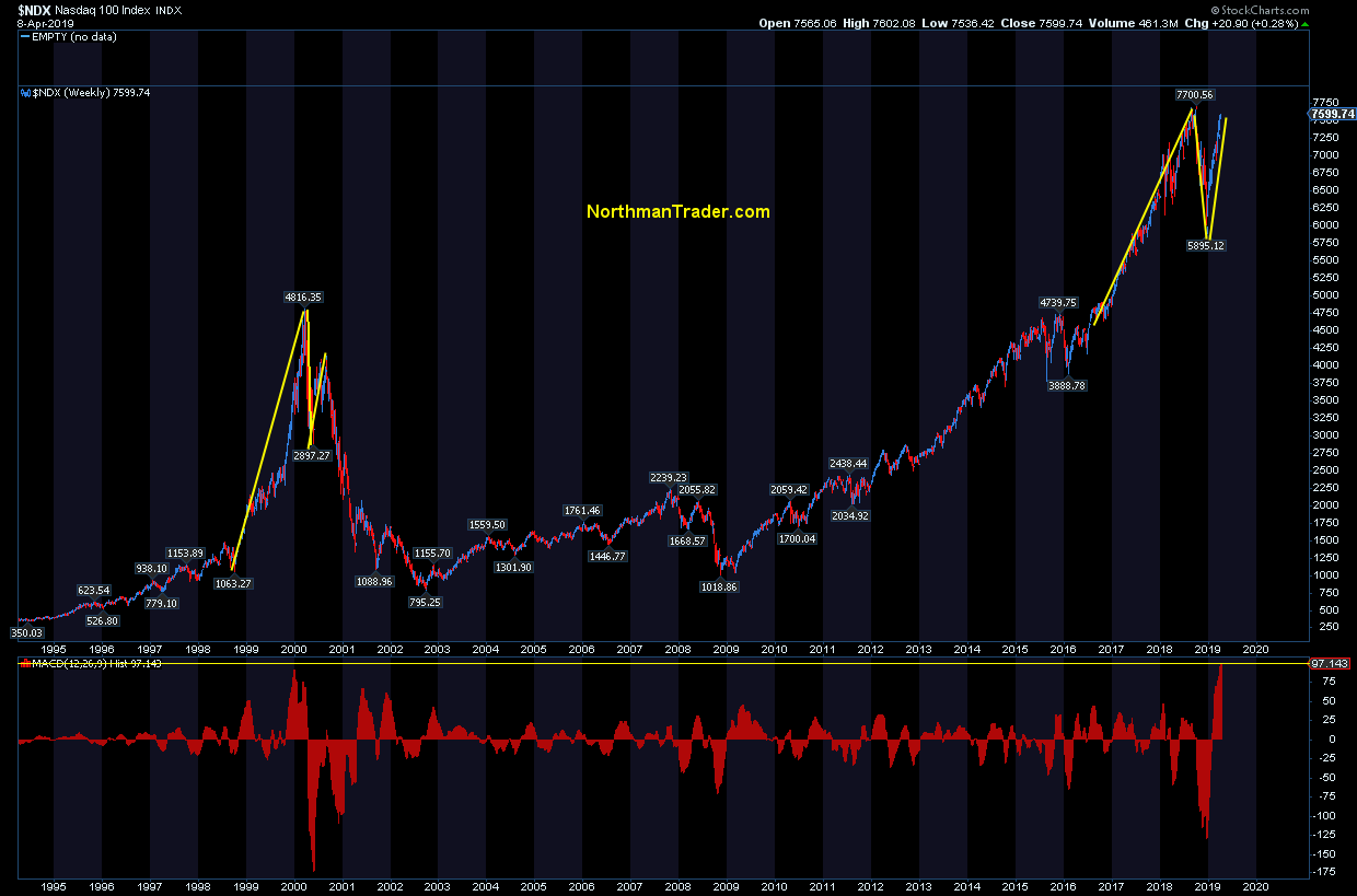
Investors buying these stocks here must surely believe so, after all $NDX just printed its highest weekly upward MACD deviation ever:
Icarus believed he could fly toward the sun as well. His father warns him first of complacency and then of hubris, but to no avail. Icarus ignored his father’s instructions not to fly too close to the sun; when the wax in his wings melted he tumbled out of the sky and fell into the sea where he drowned.
Investors may want to be mindful of this lesson taught a long time ago.
* * *
For the latest public analysis please visit NorthmanTrader. To subscribe to our market products please visit Services.
via ZeroHedge News http://bit.ly/2uWyfOH Tyler Durden

