We first showed it back in November 2017. Back then, with the VIX plumbing record single-digit lows, Morgan Stanley’s contrarian permabear, chief equity strategist Michael Wilson, showed an especially controversial chart and issued a forecast that was eerie in two aspects: he laid out his “base case” target for the S&P500 of 2,750 (which was almost to the dot where the S&P5090 closed 2018) and – more importantly – at a time of record low volatility, Morgan Stanley predicted that the VIX, which then was the lowest it has ever been, would soar to 30.
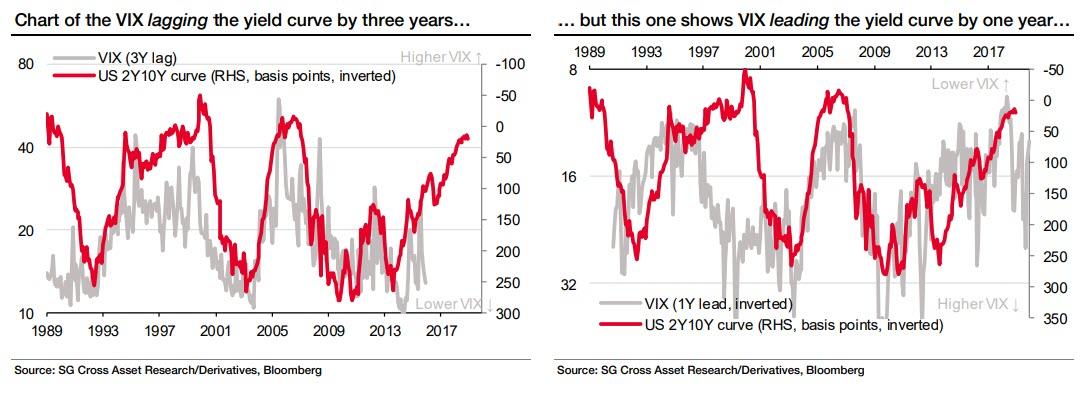
Wilson’s downbeat, if especially accurate assessment – the VIX indeed soared by the most on record just two months later – was based on one infamous chart which illustrated the relationship between equity volatility and the economic cycle. It showed that the 2s-10s yield curve tends to lead the VIX by 2 ½ years. This is what Wilson said at the time:
You will notice that in the past 6 months, this impressive 25 year relationship has broken down with the VIX continuing to significantly fall even though the curve flattening that began 3 years ago would have suggested a rise by now. We think this is a reflection of the very supportive fundamental environment described above and the “give up” by traders who have succumbed to the trend and even turned to methodically selling volatility. Furthermore, many retail products have been created to sell vol and may have exacerbated the trend and overshoot to the downside. As economic data and earnings estimate dispersion increases next year, the underlying trend will likely reverse and these products will only serve to make the reversal more persistent than what we have experienced the past few years.
As we said back then, the chart shown below, “indicates that if historical correlation is maintained, the VIX should be just shy of 30, a level which would have catastrophic consequences for virtually all vol-selling funds, including retail investors, active today.”

Two months later, Wilson was proven right when virtually every vol seller had gotten wiped out following the historic Feb 5, 2018 VIXtermination event, which annihilated most if not all inverse VIX ETPs as equity vol suffered its biggest explosion on record.
It wasn’t just Morgan Stanley that relied on this chart showing the stretched correlation between the VIX and the yield curve. A few months later, it was Bank of America’s turn, and in its rather gloomy preview of 2019 stock performance, in January BofA said that , “a flattening in the yield curve over the last three cycles has preceded rising volatility by about three years, as shown in Chart 1.” As a result, BofA’s chief equity strategist Savita Subramanian “expects a more volatile backdrop for US stocks in the coming years” and believes that as a result, “it will be important to own stocks less sensitive to this and other macro factors.”

So first it was Morgan Stanley, then Bank of America that based a core part of their gloomy forecast, predicting a surge in volatility, on the correlation between the yield curve and the VIX…. and yet, as SocGen writes in a Friday note, both banks are dead wrong for basing their predictions on what the French bank believes is nothing more than a spurious correlation.
As a seemingly disturbed SocGen derivatives strategist Jitesh Kumar writes on Friday, “in recent months we have seen different versions of the chart below left doing the rounds” referring also to the charts above. What troubles Kumar is that the chart “is being used to argue that equity volatility will rise in the future because the yield curve is now flattening” and that “the rationale being used is that a flattening yield curve reflects a downward trajectory in growth and increasing risk aversion, so leading to higher volatility in risky assets. The corollary is also held: that a steepening yield curve reflects increasing growth expectations and greater risk appetites, with a dampening effect on volatility.”
To the SocGen strategist, such conventional wisdom is nothing but garbage, and as he writes, he “cringes every time we hear this ‘flattening curve’ rationale for higher volatility” and here is why:
The yield curve historically starts this flattening as the economy reaches the middle (uneventful) phase of the business cycle. In this boring phase, when investors are unable to enjoy capital gains on risk assets or sharp moves on safe assets, they start a hunt for yield, which in turn compresses volatility (selling volatility generates yield). Therefore, in our view, a flattening yield curve is consistent with lower, not higher, volatility parameters. We observe that sharply steepening yields have typically resulted from the Fed cutting rates aggressively, and therefore most of the initial steepening is due to a deteriorating growth outlook (not an improving one), and this is in turn accompanied by higher volatility.
So how and why did both Morgan Stanley and Bank of America get fooled by what has recently become one of the anchor cross-asset correlation charts? Simple: to SocGen, this is nothing but as case of spurious correlation, as the bank illustrates in the following two charts.
The chart below left is the one being widely circulated as evidence for the flattening yield curve theory. As the French bank concedes, “by pushing the VIX curve back by three years it does suggest some causality between the two series. However, using the exact same data, the chart on the right below brings us to a completely opposite conclusion. In this chart we have brought the VIX curve forward by one year and flipped the VIX axis upside down. This now shows the VIX leading the yield curve, and this instead suggests that it is a lower VIX that leads to a flatter yield curve.”
Ah, the endless pleasure of trying to isolate cause and effect in a market where the VIX used to be a function of underlying volatility, and has since become the catalyst for market moves, ever since VIX futures started trading years ago. So which came first, the chicken or the egg, the surge in the VIX or the plunge in the market?
To SocGen, the answer is clear, and as the bank notes, “just by playing around with the two time series we can demonstrate that the VIX both lags and leads the US yield curve, and that a flatter yield curve can lead to either higher or lower volatility. Hence, we see no real sense in juxtaposing those two time series in this way.”
Which, however, is not to say that SocGen is complacent about what various signals say about the future trajectory of volatility. Just the opposite. The only thing that SocGen does want to highlight is the “futility in trying to correlate the yield curve against the level of volatility” as “neither of the above charts indicate a meaningful relationship, in our view.“
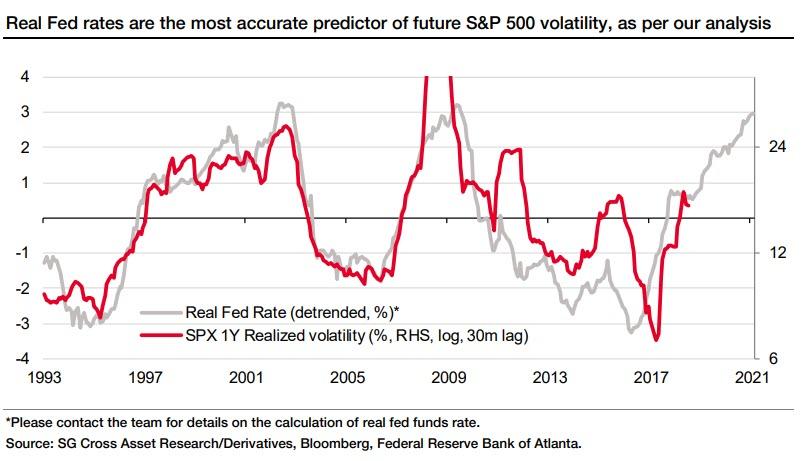
But if not the yield curve, then what, if anything, can server as a leading indicator of vol? It is here that SocGen makes a bold assertion: keep an eye on the real fed funds rate for the future of realized vol (and what that relationship indicates, is that vol is about to explode higher), to wit:
The key takeaway from our work over the past few years analysing the impact of macro factors on equity volatility is that it is the real central bank policy rate that drives the (subsequent) volatility in equities. We first identified this as an important driver almost ten years ago. We have continued to follow this parameter closely and it was one of the reasons we called a turnaround in volatility in 2H17.
Curiously, just like the yield curve effect on VIX – whether it is real or not – lags by 30 months according to conventional wisdom, so the increase in real central bank policy rates also takes a few years, or 30 months as well, to feed through to the economy – even Fed Chairman Powell expressed this view last year, or as SocGen summarizes, “Higher real policy rates are followed by higher equity volatility and vice versa” and while the QE period has distorted the tight fit these two parameters had in the 1990s, SocGen notes that “the inflexion points have overall been forecast quite accurately by our real rates model. This framework also correctly forecasts equity volatility in Europe”
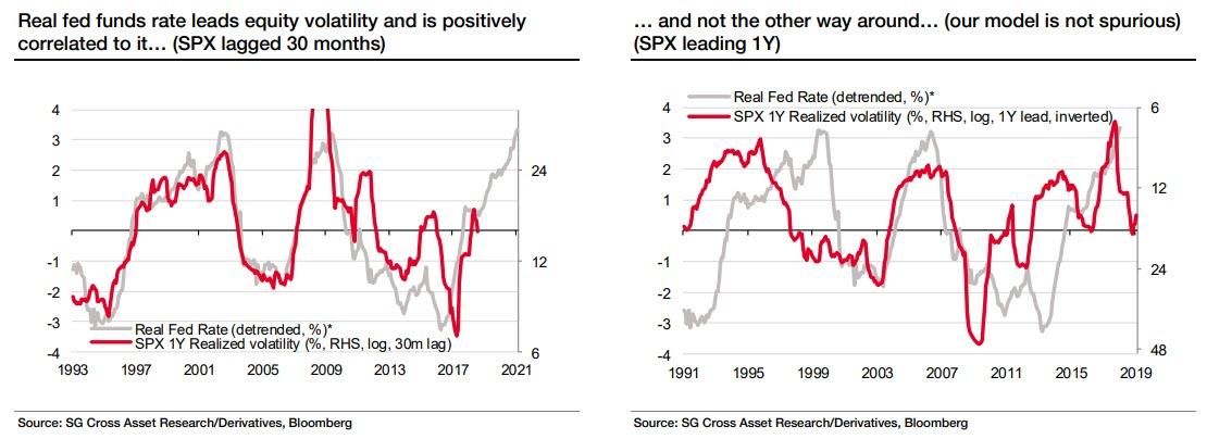
But can someone accuse the SocGen model of the same spurious correlation that the French bank accuses its peers such as BofA and MS in using the correlation between vol and the yield curve? Or, as Kumar concedes, “what about the robustness of our real rates model – is it also susceptible to ‘accidental’ correlations? Would we also get a spurious chart if we inverted one of the vertical axes and tweaked the lead/lag on our model (see charts below)?”
His answer: “we find that doing this does not in any way disprove the informational value of our model”…
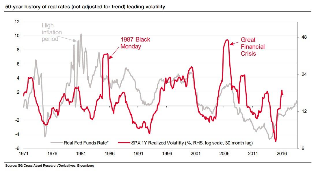
… and, in fact, given we have data going further back, we can extend the analysis to 1971 to see if the model still shows some relationship between real rates and equity volatility. We observe, to our encouragement, that the relationship has held for the past five decades (barring periods of volatile inflation during early and late 1970s due to oil shocks).
Assuming the “alternative” SocGen explanation is accurate, what are the implications? Here it is, from the horse’s mouth:
Our existing framework detrends real fed funds rates over the past 30 years (which has been trending down throughout this period) in the comparison with equity volatility, as it enhances our ability to gauge the level of future volatility. If Albert Edwards is indeed correct in his “Ice Age” theory that the 10y T-bond rate will end this cycle at minus 1%, equity volatility has some room to run, as it implies that the current level of rates is too high.
In other words, there is at least agreement on one thing: whether one uses the – allegedly inaccurate – yield curve to predict volatility, or instead one projects the VIX based on the real Fed rate, volatility is set to explode in the coming months. And that is, at the end of the day, all that matters.
via ZeroHedge News http://bit.ly/2Wmtzha Tyler Durden