Authored by Danny Dorling via TheConversation.com,
When the UK’s annual mid-year population estimates were released in late June 2019, much of the media coverage focused on the fact that the population had risen, but growth rates had stalled.
The Express newspaper reported that the total population rise of just under 400,000 in the year to mid-2018 was still fuelled by immigration, and that:
“The surge is the equivalent of adding a city the size of Coventry to the country.”
But what reporting on this data missed were the 623,000 deaths in the year to mid-2018. This was 20,000 more than the previous year – a 3% increase. That is startling because it continues a rise in mortality that began with the first significant fall in UK life expectancy in 2014 and means that UK life expectancy will still be lower today than it was then, five long years ago.
The mid-year population estimates also reveal by how much the population has aged, and that the rise in mortality is not due to ageing. As mortality rates for almost all age groups have risen, for both men and women, overall life expectancy will have fallen yet again.
When, in August 2018, the Office for National Statistics (ONS) compared the UK with 19 other countries, mostly in Europe, but also including the US and Japan, it found that only the UK had seen such a large fall in life expectancy since 2014, for both men and women. We now know that has continued through to at least the end of the summer of 2018.
Digging into the data
The fact that nobody appears to have noticed is largely due to the volume of data journalists needed to sift through to find this out and because the ONS didn’t point them towards the significance of continued mortality rises in its press release.
Anyone who wants to know what has actually happened most recently to mortality rates in the UK has to download a huge dataset from the ONS website titled: “MYBE2_detailed components of change series”.
The data is very detailed. For instance, it shows that in Coventry more men aged 86, 87, 88, 89 and 90+ died in the year to mid-2018 than the year before. The spreadsheet also revealed, using NHS patient registrations, that the rise in mortality of very elderly men in Coventry was not due to a sudden influx of people aged over 90-years-old – in fact more left than arrived. It even goes as far as to explain that only three men aged 90 or more arrived into Coventry from outside the UK that year.
But Coventry is too small an area to try to examine for reliable trends in just one year for this one small age group. So I combined all the data for all the local authorities in England and Wales to see what has happened.
Office for National Statistics
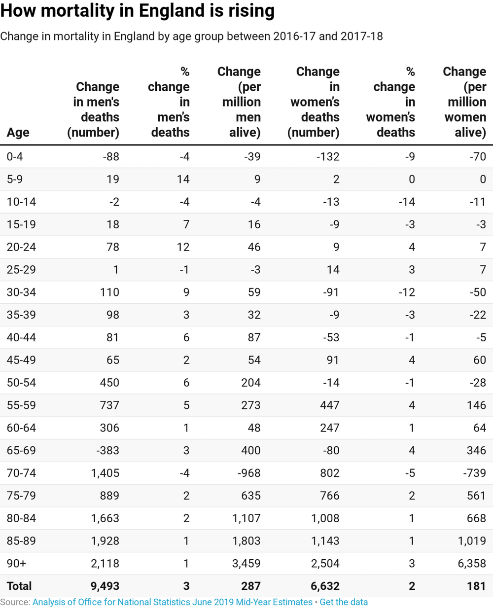
The table above shows that, overall, 9,493 more men died in England between the summer of 2017 and 2018 and the preceding 12 months – a rise of 3%. There was a rise in mortality rates for most age groups, of which the largest relative rise year-on-year was a 14% increase in the rate of mortality of boys aged five to nine.
The table above includes the absolute rise per million people at risk. “At risk” just means being alive at the start of the period, in June 2017. The changes in risk are for each group dying in the subsequent 12 months compared to the same aged group over the 12 months before. Everyone resident in England is included in the groups “at risk”. By that measure, an additional nine boys aged between five and nine-years-old died for every one million alive at the start of the year, compared to the previous year.
For some age groups there has been a rise in deaths – for instance of 802 more women aged 70-74 – but a fall in the death rates as the population at risk rose faster than the number of deaths. However, such examples are rare.
Rising mortality
For men, the largest rise per million people alive was an extra 3,459 deaths for all men aged 90+. This means that the large increase in deaths in this age group was not due to many more people aged 89 becoming aged 90. It was not due to the ageing within the group, nor was it due to a sudden increase in inward migration of very elderly men into Britain (returning from Spain perhaps due to concern over their future health care and Brexit). Instead the rise in mortality is real.
Women did a little better than men according to these latest figures – and the table above shows a 2% rise in age-adjusted mortality rates in the year to summer 2018. But in earlier years it’s been mostly women who’ve died in the greatest increasing numbers. For women in England the highest rise in mortality rates has been for those in their 90s with an additional 2,504 dying of these oldest ages – an additional 6,358 per million at risk. This is the largest rise of all shown in the table above.
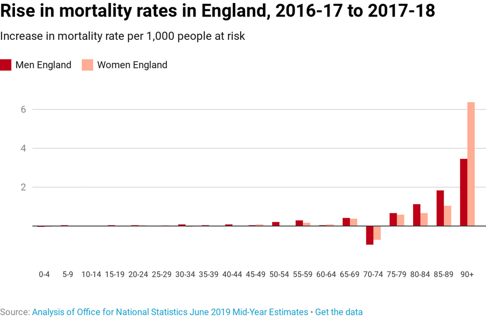
On a graph, the trend of the continued increases in mortality in England is a little more shocking. Only men and women aged 70-74 have experienced the usual improvements in life expectancy that should occur in a normal year for every single age group. The UK has not had a “normal” year when it comes to mortality for at least seven years now.
Office for National Statistics
The larger changes shown in the table above will not be due to random variation because the population of England is so large. But for children – for whom death is far less common – random factors can be important when considering annual changes. The rise of deaths of girls aged between five and nine could be due to chance events, road crashes, childhood cancer, or just neglect. But add the numbers up over recent years and these rates do not rise again and again due to chance.
Warnings for the future
Something is going very wrong. And whatever is going on is unique to the UK because in no other European country have there been overall falls in life expectancy that look at all like this. The figures for Scotland, Wales and Northern Ireland are almost certainly as bad as England, but no one has as yet bothered to study them in any detail – let alone tried to work out where they are heading.
ONS has left some clues about why this is happening. Its statisticians say that currently: “Some 45 local authorities now have falling population.” And they explain that there were also very few births between the summer 2017 and summer of 2018, just 744,000 for the UK as a whole. That’s a remarkable fall of 69,000 births since the year that began in the summer of 2011, when births would have been due to conceptions in early autumn 2010 onwards. We forget how much better things were in 2010, how much more optimistic many of us then felt to start a family, despite the great financial crash of 2008.
The rise in UK mortality began with elderly women and became very clear by February 2014. In June 2016, it was ONS mid-year estimates released on the day of the Brexit referendum result that revealed the rise in mortality rate from earlier to now be accelerating. Few noticed as Brexit transfixed us. In 2017, new ONS figures revealed that a million future years of life in Britain were no longer forecast to be lived. By March 2019, the actuaries of the UK had declared that this change was now established for all age groups including new born infants.
Ask yourself this: why do we care so little that we cannot even be bothered to analyse and interrogate our mortality statistics properly? Why, when infant mortality has risen each year from 2014 onwards – from 3.6 to 3.7 to 3.8 to 3.9 children dying per 1,000 born – do we not care? Why instead are we lamenting that there are still gross annual immigration rates equivalent to the population of the city of Coventry?
We should realise that with birth rates falling and more and more people dying more quickly than those the same age as them were in the past, as well as more falling ill, we will soon need all the people we can get.
via ZeroHedge News https://ift.tt/2NzM01W Tyler Durden


