Authored by Pater Tenebrarum via Acting-Man.com,
Intra-Market Divergences Galore
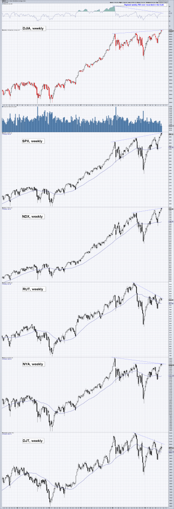
US big cap stocks have rallied to new highs in recent months, but just as in the rally from the low of the February 2018 mini-panic to the September/October 2018 peak, sizable divergences between different indexes have emerged in the process. New highs in the big cap indexes (DJIA, SPX, NDX) are once again not confirmed by small caps (RUT), the broad market (NYA) and a number of sub-sectors (such as the DJTA which is included in the chart below; according to Dow Theory, the DJTA must confirm moves in the DJIA to validate its trend).
From the top: weekly charts of DJIA, SPX, NDX, RUT, NYA and DJTA. The recent new highs in the three large cap indexes have not been confirmed by small caps and the broad market. Note also the sizable RSI/price divergence in the DJIA (which is mirrored by SPX and NDX) – this is a sign of faltering momentum that is often seen ahead of trend changes.
We last discussed a “lengthy non-confirmation” in mid-September 2018 (see “US Equities – Approaching an Inflection Point”). Everything we said about the phenomenon at the time applies to the current case as well. In fact, it could well be argued that the current spate of non-confirmations is even more ominous as they are stretching over a time period of approximately 18 months by now (the broad market represented by the NYSE Index has yet to overcome its January 2018 peak).
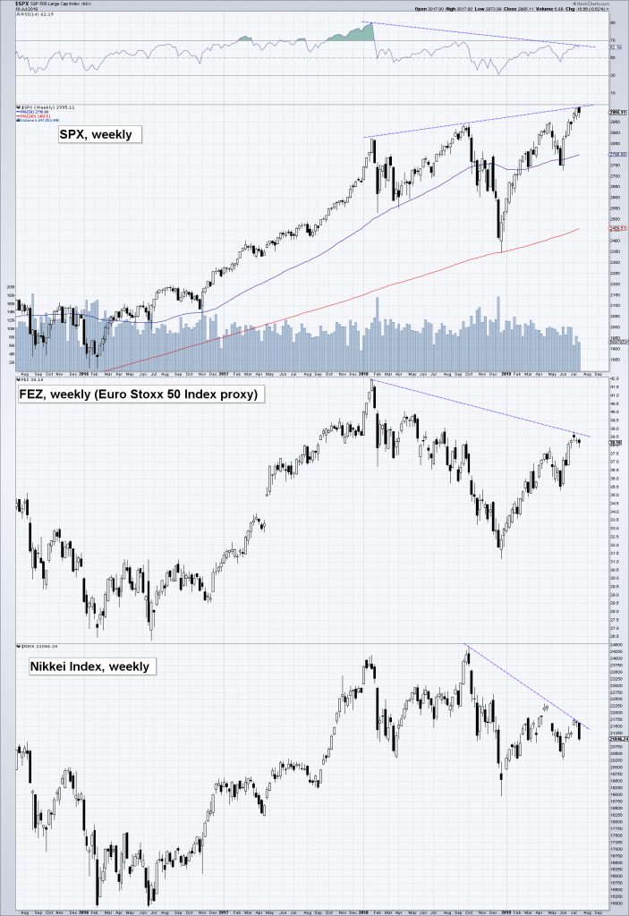
US big caps are diverging from European and Japanese stocks as well, which have failed to reach new highs in the recent rally. It is also noteworthy that stocks and junk bonds have studiously ignored weakening macro-economic data in recent months – the rationale is apparently that an impending easing of monetary policy by Fed and ECB is more important than the economy’s poor performance and the prospect of lackluster earnings. The idea seems to be that a resumption of monetary pumping will immediately arrest and reverse recent economic trends, which is quite a leap of faith.
More non-confirmations: S&P 500 Index vs. FEZ (Euro Stoxx 50 ETF) and the Nikkei 225 (all weekly).
Government bonds and gold have rallied strongly as well this year, and while these markets also reflect rate cut expectations, they normally don’t move in the same direction as stocks for very long. It is a good bet that something will eventually give. Considering the recent yield curve inversion, investors buying stocks and corporate bonds are probably too sanguine about what lies ahead.
The Roaring 20s vs. Today
In April we briefly discussed parallels between the current time period and the late 1920s (see “A Trip Down Memory Lane”). What prompted us to look into this was the fact that the sharp correction in the (normally) seasonally strong October-December period last year was actually a spitting image of the late 1928 correction. As it turned out, this was far from the only similarity between the two eras.
Incidentally, market participants ignored a weakening real economy in the final stretch of the 1920s bull market as well: economic data deteriorated noticeably in the course of 1929, but that did nothing to curb the stock market’s advance – at least initially.
Two women studying the ticker tape in a stock broker’s office in St. Paul, Minnesota in 1929.
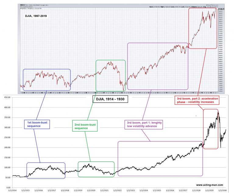
Below is a long term chart comparison as a supplement to the charts we showed in April. Interestingly, there is quite a strong resemblance between the stock market patterns of the 1914-1930 and 1997-2019 periods. The cyclical bull and bear markets of the two eras differ slightly in terms of extent and duration, but the basic patterns look remarkably similar.
It should be noted to this that chart pattern similarities are not unusual per se – all liquid markets exhibit self-similar fractal patterning – both across different time frames and over different historical periods. At some point, these patterns will always diverge – particularly self-similarity between historical periods is usually quite limited.
It is fairly easy to find close correlations over time periods of one year or less, and more often than not they have no predictive value. Nevertheless, we find these long term pattern similarities quite interesting:
Booms and busts in the stock market from 1997 to 2019 and from 1914 to 1930. It is of course possible that the “acceleration phase” of the current bull market still has further to go, but the increase in market volatility, weak money supply growth, historically high valuations and the divergences discussed further above all suggest that a trend change is probably not too far off.
Conclusion
The divergences between the different indexes at the very least represent a heads-up that another correction is likely to begin fairly soon. In view of the increase in market volatility since the January 2018 peak, the next downturn will probably be quite a doozy again.
via ZeroHedge News https://ift.tt/2JNmNvU Tyler Durden


