A Decade Of… What Exactly?
Authored by Rabobank’s Michael Every
Summary
-
We are now close to the end of the year and the second decade of the 21st century
-
2010-19 saw a marked difference between growth in developed and emerging markets – but both may be about to slow together
-
World Total Factor Productivity growth was virtually zero – and China’s performance crucial
-
2010-19 was a decade of record high debt… following a global crisis created by too much debt
-
Absolute poverty levels continued to decline – yet there was increased in perceived insecurity and hardship in many developed markets
-
There was a major increase in global asset prices, especially of stocks and houses…
-
… and in inequality of wealth and income, even as gaps between states narrowed
-
Interest rates went up and then down again in developed markets, and bond yields fell to record lows; but emerging markets also saw rates and yields spike
-
The USD gained against most major FX crosses, and most so against struggling emerging markets
-
What do the 2020s hold for us if this was what the 2010s provided? China arguably holds the key on many fronts
A very mixed decade
We are now close to the end of the year and, given it is 2019, also of the second decade of the 21st century. That marks an opportune time to look backwards in order to then try to look forwards.
In many respects this has been a difficult decade – for example, what do we even refer to it as: “The twenty-tens” or “The twenty-teens”? Far more importantly, of course, the key developments seen over the last ten years present a very mixed picture. Some are certainly positive, and yet arguably more are deeply negative.
It has been a decade punctuated with both rapid economic growth – and disappointing growth; of economic crises in both emerging and developed economies; of major market volatility – and periods of eerie calm and no volatility at all; and of escalating geopolitical tensions, and a surge in political populism and unrest.
But a clear message
Indeed, the message is clear: while the past decade was many things, one thing it was not was the long-hoped-for ‘return to normal’ following the global financial crisis of 2008-09. Quite the contrary, on many fronts.
We will now examine several overarching trends that emerged over the period. Each topic covered arguably deserves far more space than it is granted here, but this is an attempt at a snapshot of overall developments rather than a detailed analysis of each of them.
We will begin with GDP growth 2010-19, which necessarily will be devoted the greatest attention.
So far, so good, so what?
We won’t have full-year GDP data available for 2019 until well into 2020, and many other key data series lag even further behind. Nonetheless, the IMF’s World Economic Outlook (Figure 1) estimates real world GDP growth in 2019 will be 3.0% y/y vs. a decade average of 3.7% and an average for 2000-09 of 3.9%. That’s obviously not a good end to the period, and means growth will be around a fifth lower this year than it has been over the decade to date.
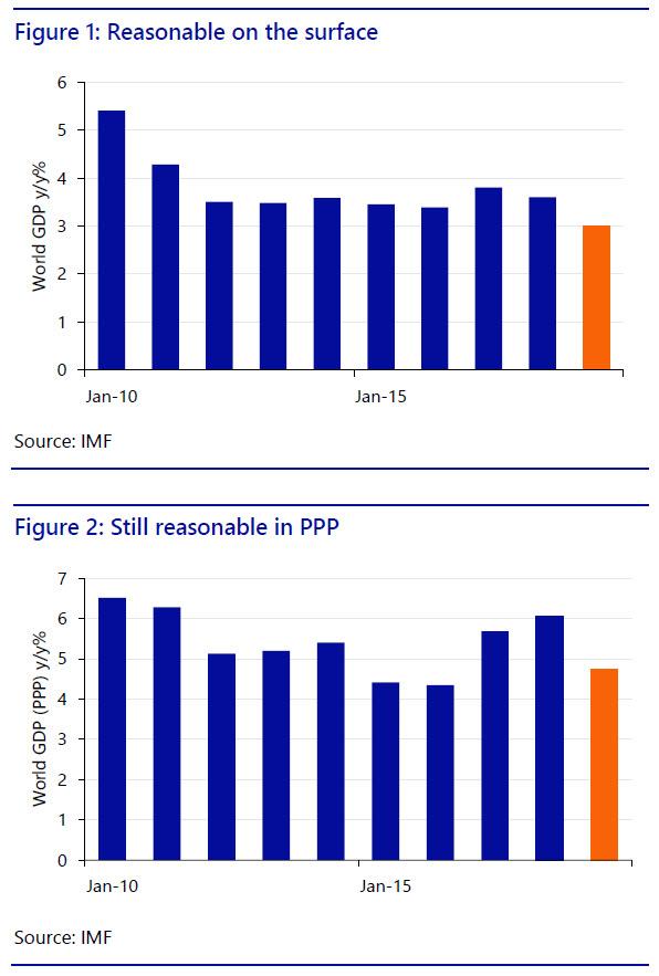
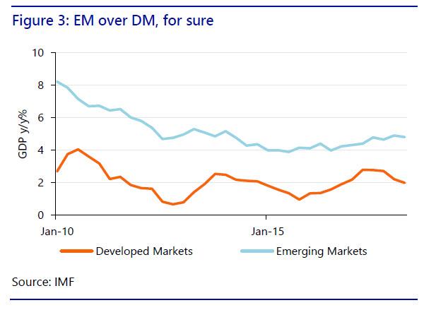
Of course, there has been a marked difference between growth in advanced economies and in emerging markets (see Figure 3). That reflects higher structural growth rates differentials in less-mature markets and is to be expected, but this gap widened into 2019 as advanced economies saw their third cyclical deceleration of the decade.
Yet in January 2019 the IMF claimed “The global expansion has weakened”; in its April update it noted “After strong growth in 2017 and early 2018, global economic activity slowed notably in the second half of last year”; in July this shifted to “Global growth remains subdued”; and in October 2019 it stated:
“After slowing sharply in the last three quarters of 2018, the pace of global economic activity remains weak. Momentum in manufacturing activity, in particular, has weakened substantially, to levels not seen since the global financial crisis. Rising trade and geopolitical tensions have increased uncertainty about the future of the global trading system and international cooperation more generally, taking a toll on business confidence, investment decisions, and global trade. A notable shift toward increased monetary policy accommodation—through both action and communication—has cushioned the impact of these tensions on financial market sentiment and activity, while a generally resilient service sector has supported employment growth. That said, the outlook remains precarious.”
Likewise, the OECD stated in November that the global outlook is unstable; world GDP growth in 2019 at 2.9% is the lowest rate since the financial crisis; we need urgent co-ordinated political action to restore confidence, boost inclusive growth and raise living standards; global trade is stagnating and is dragging down economic activity in almost all major economies; and policy uncertainty is undermining investment and future jobs and incomes. Moreover, risks of even weaker growth remain high, including from an escalation of trade conflicts, geopolitical tensions, the possibility of a sharper-than-expected slowdown in China, and climate change.
Not a nice way to end the year, or the decade!
Exponential underperformance
However, long before 2019 GDP growth in advanced economies had already fallen well below its historic trend rate. Indeed, since 2010 they have consistently failed to close the gap opened up in the 2008-09 recession.
In the case of the US, the cumulative differential between where the economy might have been, based on pre-global financial crisis trends, and where it is at the end of the decade stands at around USD4 trillion, or as much as 20% of current GDP (Figure 4).
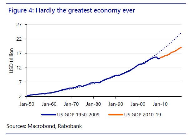
This is in marked contrast to how the US economy reacted to every other post-WW2 recession, even including the biting 2000 downturn following the bursting of the tech bubble. Figure 4 shows that all previous recessions nonetheless saw strong enough V-shaped recoveries that output gaps were closed and the overall GDP trend restored.
Evidentially, this has not been the case post-2008-09. Rather, the shape of the slope of US GDP growth is now significantly flatter than pre-crisis – the so-called “new normal”.
Unsustain-a-bubble?
One might ask if the pre-crisis US pace of growth was unsustainable? One could argue ‘Yes’ based on the large current-account deficit and a series of asset bubbles that sustained spending. However, the slower-growing US of today still has a current-account deficit, even with the help of the shale gas revolution, and a larger fiscal deficit, and asset bubbles. As such, if one wants to argue that 3% US growth was unnaturally high, then perhaps so is 2%. Which is hardly a cheering thought!
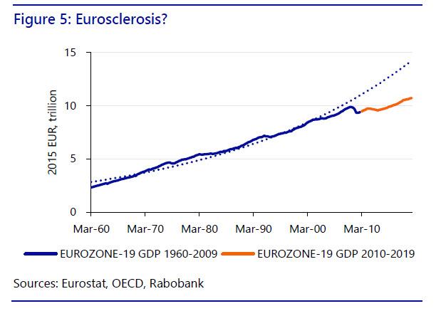
In the Eurozone the difference between actual and potential output is again huge – not far from EUR3.5 trillion since 2010, which is proportionately an even larger sum than in the US (Figure 5).
However, there is a suggestion that with the exception of a brief growth acceleration over 2006-07, perhaps the weak post-2008 Eurozone recovery reflects a structural deceleration that had already begun around the year 2000. In other words, nearly two decades of under-performance.
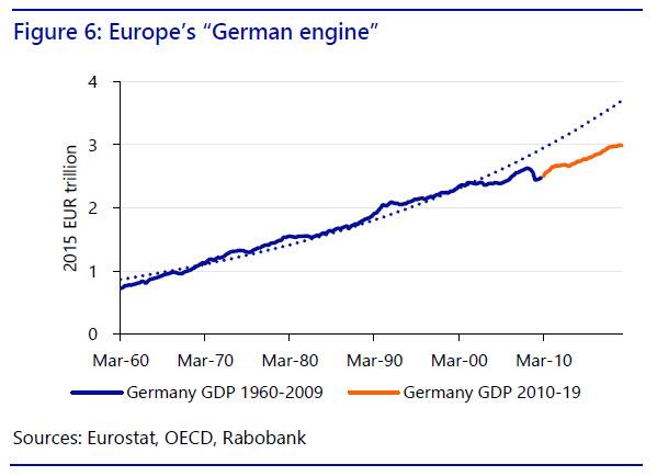
Furthermore, within the Eurozone itself the same disappointing trend is even clear within the core economies like Germany. Indeed, in the German case GDP of around EUR3 trillion today could perhaps have been as high as EUR3.7 trillion (Figure 6). As growth continues to be projected at paltry levels for 2020 and beyond, that gap will only grow further.
Exponential evidential?
Obviously estimates of ‘lost’ economic output, as above, depend on whether GDP growth would have continued on an exponential path or not after the global financial crisis. On one level this is impossible to prove given we don’t know what an alternative future with no such crisis might have looked like. Moreover, trend growth rates can and do change, and for many reasons. Demographics can change, with either faster or slower population growth based on net immigration and/or fertility rates, which naturally flows through to GDP. In the US, and many other countries, fertility rates have certainly declined – though in others net immigration, and official and unofficial, rose.
In emerging markets, for a further example, GDP growth usually starts at a high level due to an easy ‘catch up’ process, and then slows steadily as the economy matures. Very often this ends up in the so-called ‘middle-income trap’, where the country is no longer ‘cheap’ and able to exploit factors like low-cost labour, but neither has it matured sufficiently to move up the value-added ladder to truly developed-market income and status. Did 2010 coincidentally represent the start of a major phase of the middle-income trap? Perhaps.
However, in developed markets this process of changes in trend rates of growth usually happens due to structural shifts, for the better or worse. As already shown, the Eurozone was already seeing a marked dip in growth rates relative to its previous trend long before 2010, suggesting that the growth it was seeing pre-crisis was not high enough to make up for the downturn seen in the 2000 recession.
Arguably, the shift in the global economic paradigm since the global financial crisis also presents exactly the kind of event that can trigger these kinds of structural shifts for the worse. Indeed, it is not a surprise that the Eurozone’s ‘lost output’ only accelerates post-2010. Moreover, if one looks at figure 4 it appears exactly this kind of structural downshift in growth occurred in the US, where GDP was growing precisely on an exponential trend until 2010 – and only then started to fall short.
Of course, this is not ‘science’, and neither is it econometrics. However, it offers a further explanation why core inflation has been persistently low since 2010, much to the consternation of central banks, who long refused to recognise this possibility.
Matri-oy!-shka
In the decade that gave us the 2012 Euro-crisis it should not be a surprise that the Eurozone’s periphery has performed even worse than the core. In the case of Italy this is abundantly clear. GDP growth was already disappointing from 2000-09, but the decade 2010-19 saw things get even worse (Figure 7). Indeed, where Italian GDP is now around EUR1.6 trillion, the same was also true as far back as 2002: in other words, there has been no real Italian GDP growth for nearly two decades, whereas if it had stayed on its previous trend it would now be EUR2.6 trillion.

Of course, Greece has suffered even more substantially. In 2008 GDP was EUR252bn: it is likely to end 2019 around EUR195bn (Figure 8). Moreover, the gap between where Greek GDP is and where it would have been with no crisis is now over EUR150bn, or as much as 70% of 2019’s GDP. That sad fact underlines that while in 2019 Greece was able to sell short-term debt with negative bond yields, it is nowhere near any kind of genuine recovery – certainly not one that can deal with its huge debt overhang.

Quasi-Soviet slump: Amazingly, Greece’s economic performance is in some ways even worse to date than estimates of the collapse in output seen in the Soviet economy after the end of communism.
Figure 9 shows estimates of equivalent 2011 USD real GDP per capita for Russia provided by Angus Maddison: obviously these are not concrete given the inability to provide accurate data for the Soviet and immediate post-Soviet period. Nonetheless, they arguably capture the overall plunge in per capita incomes experienced (despite soaring emigration and mortality rates lowering population); a prolonged stagnation; and then gradual recovery – before another period of relative stagnation post financial crisis.

By contrast in Greece there has been no V-shaped recovery in GDP at all to date, just L-shaped, and there is no prospect of this happening in the foreseeable future.
Crucially, if one accepts the validity of a GDP ‘shortfall’ compared to pre-crisis trend then the persistent lack of inflation pressure in Europe as a whole should be no surprise: there is still too much spare capacity to generate inflation. Of course, this view is not universally accepted.
Best is over Down Under?
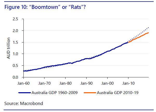
Even Australia and New Zealand, the Western economies best-placed to benefit from growth over the last decade, have arguably experienced a structural slowdown. In Australia’s case one can see that the last decade has been one in which the ‘lucky’ economy, without a recession in a generation, has nonetheless drifted significantly below its longer-term growth trajectory (Figure 10). The gap now stands at around several hundred AUD billion.
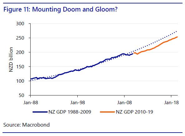
For New Zealand, with a shorter data series available, one can likewise see that the last decade has seen the slope of increase in the trend level of GDP shift markedly lower, a cumulative difference of up to 7-8% of GDP cumulatively over the period (Figure 11).
In both cases, moreover, the impact of this downwards shift in trend GDP growth has occurred despite that rarity among Western economies, a successful export performance to emerging Asia, and to China; and despite a very high level of net immigration, which boosts overall GDP. For example, net migration into Australia was 291K people in 2018, increasing the population (and GDP) by around 1.2%: into New Zealand it was 54K, increasing the population (and GDP) by around 1.1%.
To underline the slowdown which has taken place in Australia and New Zealand look at the trend in real GDP per capita – there the results are far starker (Figure 12). Australia would have been around AUD77,000 per capita if the previous trend has been sustained vs. the actual AUD74,992; New Zealand would have been closer to NZD58,000 than the actual NZD51.652.
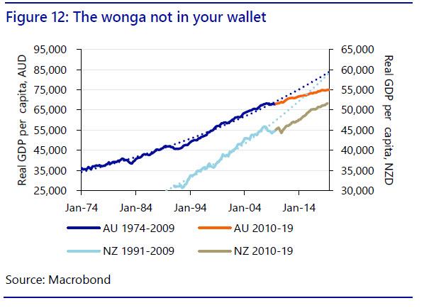
Ironically, the constant increase in immigration arguably helps to cap real wage growth, and hence growth in real GDP per capita: as such, what has been sustaining headline GDP growth over the last decade could also be seen as in some ways undermining it too.
Certainly, combine an outcome of lower real income growth with house prices at ever more extreme levels in many cities, and it is hard to see the last decade as what might be dubbed an outright economic success. Indeed, failing serious structural changes to the growth model, is the best over now over for Down Under?
The Asian decade?
The last decade has also seen Japan continue to underperform economically. However, as the country is widely-recognised to have experienced the kind of drift away from its previous growth trend all the way back in 1990, when its economic bubble burst, 2010-19 was not actually as bad, relatively, as is the case in many other developed economies (Figure 13). Even so, this still means that Abenomics has failed to live up to its hype.

Arguably of most importance has been the performance of China over this period. It is incontestable that China has taken huge steps forward in almost all areas in this decade, increasing the size of its economy, strengthening its role in many areas, broadening its reach, and deepening its markets.
Nonetheless, despite its strong performance in the first half of the decade, and a recent 2.1% statistical upwards revision to 2018 figures that ensures it will meet its target of doubling GDP from 2011 to 2020, even China has begun to see its rate of GDP expansion drop well below the previously-established trend (Figure 14). GDP would have been some CNY20 trillion higher if that had not happened. That is of course based on official growth figures, which some estimate may over-state the actual level of GDP growth by as much as 2 percentage points per year: on that basis GDP would already be showing a pattern similar to that of advanced economies, albeit with growth starting from a higher base.
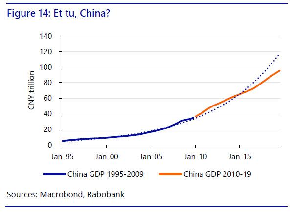
Crucially, as we previously explained here, we believe that China will continue to slow ahead regardless of the policy action that it takes. In short, 2010-19 ends with the economy regarded as the most significant source of regional and global demand also showing serious signs of structural, not cyclical, fatigue.
Equally, South Asia had a good decade by its own disappointing standards until recently (Figure 15); however, India is of course currently experiencing its own painful slump in growth, not captured in these data, that takes much of the shine off of this recent performance. GDP growth of just 4.5% y/y in Q319, and likely even lower in Q3, suggests that there is a risk that, absent reforms, this good-news story may be significantly less positive in the decade to come.

(Sub)merging markets(?)
Latin America has had a decade to forget (Figure 16). Brazil experienced a major political shock and economic crisis, as did Argentina. Venezuela has continued its downwards spiral. Even Chile and Bolivia have now been swept by political instability. It is perhaps no surprise then that the region has fallen far behind the trend projected back in the 1990s and late 2000s, with a cumulative GDP gap of as much as USD2 trillion emerging. It seems unlikely that this situation will be reversed any time soon.

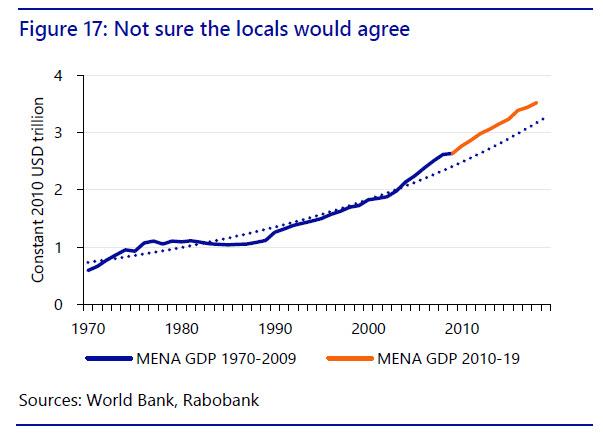
By contrast, the Middle-East and North African region–MENA–sees a more positive picture (Figure 17). GDP has continued to expand above the long-run trend rate, maintaining a momentum that began around 2005. However, one has to question the validity of these data given Syria has seen ruinous civil war for much of the decade; Libya has been unstable since 2011; Egypt’s economy has hardly prospered; and Saudi Arabia has been forced to move to list its petro-giant Aramco to raise revenue.
Yet sub-Saharan Africa has had a stellar decade even given the problems in its most developed economy, South Africa. The region’s GDP has soared above the disappointing trend evident until the mid-2000s (Figure 18). Yet once again there are already signs that this may be beginning to level off, and the latest data have shown a further deceleration in growth.

2010 USD the global net loss of output over 2010-18 vs. previous trend was around USD5 trillion vs. world GDP of USD83 trillion, or a 6% differential.
A Decade of Disappointment: 2010-19 has seen a failure to close output gaps that emerged in advanced economies during the global financial crisis, and a marked slump in trend-rates of GDP growth subsequently. As a result, GDP today is far lower than would otherwise have been the case. For Latin America, the decade has also been terrible; South Asia outperformed but is now slowing sharply; MENA is supposedly doing well but does not look like it; and Africa has performed well but is also now slowing. Crucially, China has also begun to slow, and more than captured by official data. This is likely to cast a shadow over the recent gains in Asia and Africa. In summary, it has been a decade of disappointment.
* * *
Rotten produce
That all sounds bad enough – but it’s arguably worse. The decade has also seen a worrying decline in productivity growth. Although it is hard to measure definitely, world Total Factor Productivity (TFP) growth–the ratio of aggregate output to aggregate inputs–rose just 0.7% 2010-18 (Figure 19). Although we saw a similar TFP flat-line in the decade 1990-99 before a rapid recovery, there appears little likelihood of such a turnaround this time.

Without going through all the major economies note that this disappointing TFP trend is even more evident in the US (up just 0.7% to 2018) than it is in the Eurozone (up 2.6%), and is clear in the UK (up 0.5%), or in Australia (where it was minus 1.7%).
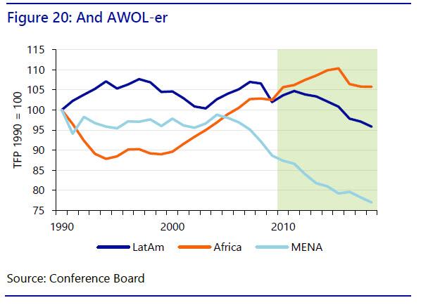
At the same time, emerging markets have not proved immune to the same problem despite their lower starting base. Indeed, over the last decade TFP in emerging markets (Figure 20) has fallen precipitously in the MENA (-13.2%) and in Latin America (-6.0%), and has shown only a slight increase in sub-Saharan Africa (3.2%). Indeed, this appears to be a global issue.
Crucial once again is China. Estimates for its TFP growth vary sharply (Figure 21). On one measure, it has accelerated 34% along with rapid growth over the decade; on an alternative measure it has actually declined 4% over the period. Given China has driven much emerging-market growth, and so global growth, this really matters.
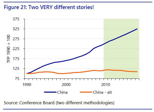
In short, if China is investing prudently and so is more productive, this decade ends on a high note, as higher Chinese growth can be sustained, acting as an anchor for global growth; yet if China is mal-investing, and so its TFP growth is actually falling, we end on a very worrying note instead, both for China and for the world. Regrettably, given China’s extensive-over-intensive growth model, the latter seems more likely.
A Decade of Decay: 2010-19 will also go down as a decade which despite technological innovation also saw a global slump in productivity – one that produced many theories and no concrete action. Notably, if this problem cannot be successfully resolved then potential GDP growth rates in a swathe of countries are now far lower than previously estimated. Indeed, we will likely have to accept a marked structural decline in global growth – with many worrying potential consequences.
* * *
Debt’s what you get
2010-19 was also a decade of record high debt – following a global crisis created by too much debt!
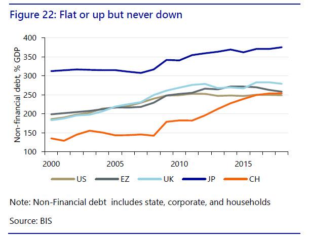
From the end of the previous decade through to 2018 non-financial debt increased from 342% of GDP to 375% in Japan; from 261% to 279% in the UK; in the US the increase was marginal, just 1ppt to 249%; in the Eurozone it rose from 248% to 258%; and China saw a staggering increase from 179% to 254%, giving it as much debt to carry as far more developed economies – and likely still underestimating the total (Figure 22). 2019 is likely to have continued these trends, and seen higher US debt too.
A few economies saw debt decrease through to 2018 (Figure 23); but even there the mix of debt increases and reductions between public, household, and corporate was far from healthy. Indeed, overall the decade saw that:
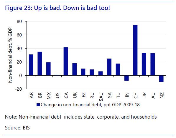
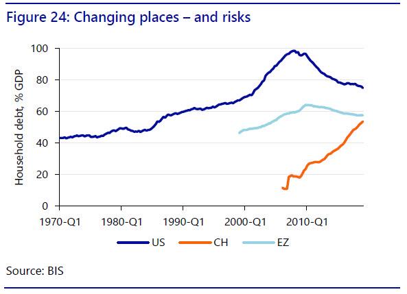
- While the US and Eurozone consumers gradually decreased their leverage, Chinese consumers rapidly increased theirs; more so as Chinese household share of GDP is far lower than in the US or Europe, meaning household debt/income ratios are already now similar. As such, household-debt risks seen in developed economies pre-2008 have moved east (Figure 24);
- Chinese corporate debt is also too high, and public debt is significantly higher than recorded when one accounts for local government debt, meaning China is now running debt risks on many fronts; and
- Public-sector austerity in developed economies has failed. There has been little reduction in debt-to-GDP in most cases, and the decade has ended with calls from the IMF, among other such bodies, for large-scale fiscal stimulus instead of saving.
A Decade of Debt Record: global debt clearly factors in to the slowdown in GDP growth and the slump in productivity. Again, however, we have no solutions on offer. Austerity has not worked, and it is not possible for all economies to simultaneously delever without spontaneous rapid GDP growth, which requires more borrowing somewhere. With China hitting a ‘debt wall’, and its growth set to slow, the need for action is urgent. It remains to be seen what form that action can, or will, take. However, consider that QE and negative rates can be seen as de facto partial debt defaults, especially now that QE’s reversal, QT, has been shown to be impossible to sustain.
* * *
The good, and bad, news
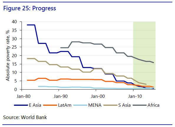
There is good news: absolute poverty levels continued to decline. Defined as less than USD1.90 per day, this dropped from 5.4% in 2009 to 3.1% by 2015, the latest data available. That is the lowest in human history, and means a better life for hundreds of millions. These gains were geographically widespread (Figure 25). In East Asia, it declined from 3.8% to just 0.5%; in Latin America from 2.8% to 1.3%; in South Asia from 6.6% to just 3% (data are to 2013); in sub-Saharan Africa from 5.7% to 3.1%; and only MENA saw an increase from 0.5% to 1.0%.
Yet regrettably there was increased hardship in many advanced economies. While unemployment rates have declined to record lows, wages have not increased in tandem. Rather, a phenomenon of ‘working poverty’ has developed via a combination of state austerity, flexible labour markets (e.g., German “mini-jobs”), globalisation, house-price bubbles, and technological change. This represents a large step away from the security previously associated with having a job in a Western economy.
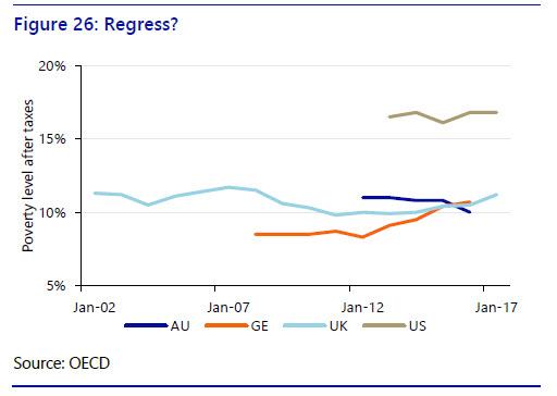
Indeed, a ‘precariat’ has emerged as workers shift into the ‘gig’ economy delivering food orders, driving cars, or working as on-line freelancers, etc. Official labour-market data has been slow to recognise this structural shift, and some estimates of the total number of workers involved say it is a marginal issue (Figure 27). However, a 2017 Federal Reserve survey found 31% of respondents had undertaken some gig work in the past month, in line with other estimates for China or Indonesia, and other sources say 35% of the US labour force is now working independently. Even in ‘lucky’ Australia, 20% of those in poverty are working full-time, and it is estimated one in four Australians is working multiple jobs simultaneously to make ends meet.

Such developments have started to give Western economies some of the characteristics of emerging markets, where a heavily-regulated official labour market sits alongside a large unregulated, ‘hawker’ economy; one that is plagued with working poverty and generalised insecurity.
A Decade of the Downtrodden: The global poorest are now less poor. However, many in the richer economies feel worse off, and central banks and governments face the quandary of how to reduce poverty when work itself is no longer the cure, and the gig economy leads to lower productivity, a relationship already long-established in emerging markets. No solutions are being presented.
* * *
Stocks and houses
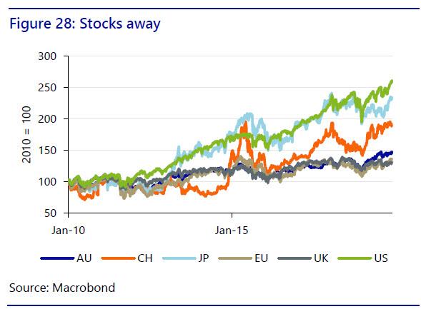
The decade has also seen a major increase in most asset prices. Stocks (as measured by the S&P) are at a record high in the US and have more than doubled since 2010; Japanese stocks have fared almost as well; surprisingly, Chinese stocks are not far from a similar performance even after experiencing two burst bubbles; and Eurozone, British, and Australian stocks are up around 50% (Figure 28).
At the same time, there has been a major increase in house prices in almost all countries globally, with only a rare few seeing prices decline in the last few years from what were record highs. Prices in advanced economies now exceed the peaks reached prior to the onset of the global financial crisis in 2008-09, and the increase in prices in emerging markets has been even more rapid (Figure 29).

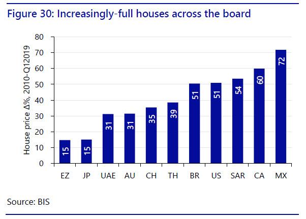
The aggregate house-price series assembled by the Bank for International Settlements (BIS) shows advanced economy aggregate house prices have increased by around 33% since 2010, an average increase of around 3% per year assuming this trend continues in the final three quarters of 2019. In emerging markets the increase has been nearly 60%, meaning an average annual increase closer to 5%.
In more detail, the BIS shows from 2010-Q12019 prices rose: 15% in the Eurozone and Japan, 31% in Dubai and 32% in Australia; 35% in China; 39% in Thailand; 51% in Brazil and the US; 54% in South Africa; 60% in Canada; and 72% in Mexico (Figure 30). This has been a decade where it paid handsomely to have bought property early on.
Indeed, these series arguably understate the degree to which prices have risen globally. Housing has soared to a much larger degree in the largest and most economically-dynamic locations globally, where the best jobs are increasingly located, and homes are increasingly unaffordable to average families in London; most European capitals; New York, Boston, LA, and San Francisco (to name just a few); Sydney and Melbourne, even given a recent short-lived down-turn in the market; and most major Latin American, African, and Asian cities – particularly in China.
A Decade of Developers: Is this ‘success’? The answer is yes if one is a property developer, or if one believes that a ‘wealth effect’ can help drive consumer spending and economic growth. However, there are numerous, painful socio-economic side-effects that question the validity of that assumption. The last decade already made abundantly clear how dangerous it is to base economic growth on ever-increasing house prices.
* * *
This plus that equals inequality
A slowdown in growth and productivity, an increase in debt, a shift to outsourcing, offshoring, and a gig economy in the West, alongside rising asset prices meant 2010-19 was dominated by one overarching theme: inequality of wealth and income. The World Economic Forum’s Executive Chairman Klaus Schwab stressed at Davos 2019: ”Now we have to look after the losers, after those who have been left behind. So, if you speak about globalization 4.0, it has to be more inclusive, more sustainable.”
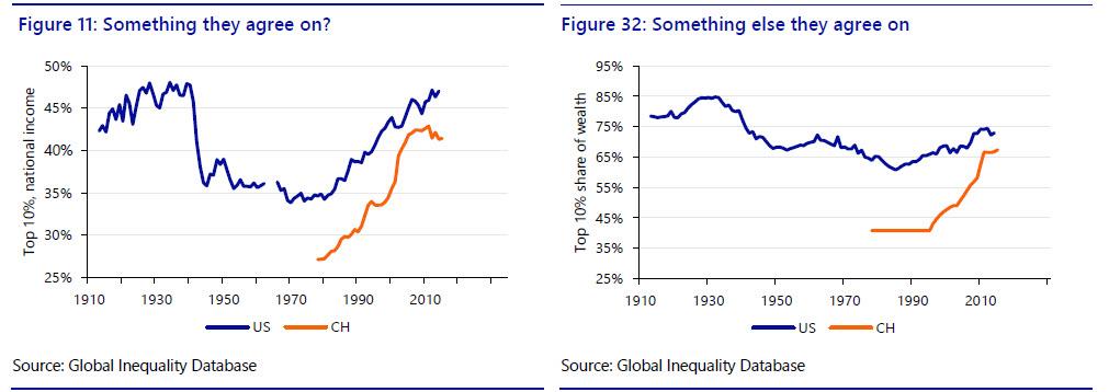
Specifically, the 2018 World Inequality Report (WIR) makes the following key claims:
- Since 1980, income inequality has increased rapidly in North America and Asia, grown moderately in Europe, and stabilized at an extremely high level in the Middle East, sub-Saharan Africa, and Brazil;
- The poorest half of the global population has seen its income grow significantly thanks to high growth in Asia. But the top 0.1% has captured as much growth as the bottom half of the world adult population since 1980;
- Income growth has been sluggish or even nil for the global bottom 50% and top 1%. This includes North American and European lower- and middle-income groups;
- Global income growth dynamics are driven by strong forces of convergence between countries and divergence within countries (i.e., the income gap between rich and poor countries has narrowed, but the gap between the rich and poor within countries has widened);
- New technology threatens to accelerate these trends.
Does this matter? The 2018 WIR concludes: “Economic inequality is widespread and to some extent inevitable. It is our belief, however, that if rising inequality is not properly monitored and addressed, it can lead to various sorts of political, economic, and social catastrophes.” Indeed, the UK 2019 and US 2020 elections are being dominated by talk of inequality and radical responses, while protest movements are taking place across a swathe of different countries.
A Decade of Disparity: Although key data are sparse and lag, 2010-19 leaves a global economy where the rich are richer and the middle-class and poor relatively poorer. The political and geopolitical consequences of this are already clear: the solutions are clearly not.
* * *
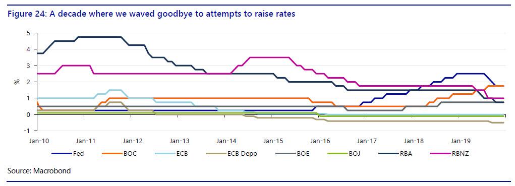
Not-of-interest rates…
In almost all major economies base rates have gone down and/or are going down, or are expected to fall again in the near future as we end the decade – and major central bank balance sheets are rising once again. Specifically:
- The Fed left rates at zero for years before hiking to 2.5%: then reversed to cut to 1.75%. It ran QE for years, reversed via QT, and yet is now injecting USD60bn a month in T-bill purchases and offering huge repo ops in ‘not QE’;
- The BOC started at 0.25% and ended at 1.75%;
- The ECB hiked rates to 1.5% before cuts to zero and -0.4% for the deposit facility. It started, stopped, and restarted QE;
- The BOE hiked from 0.25% to 0.75%;
- The BOJ cut from 0.1% to -0.1% and introduced QQE and YCC (yield curve control) policies;
- The RBA started at 3.75%, hiked to 4.75%, but ended at 0.75% and talking of a 0.25% floor and QE; and
- The RBNZ started at 2.5%, hiked to 3.5% and ended at 1%.
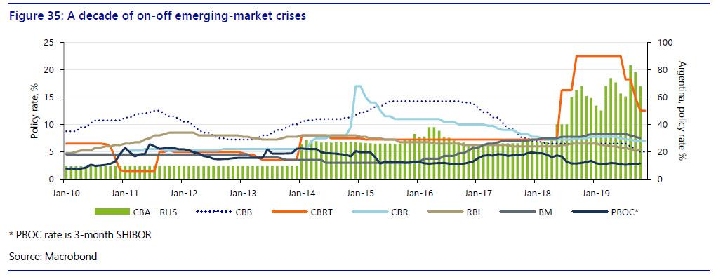
…and too-much interest rates
Emerging markets, by contrast, saw several episodes where rates were forced to rise sharply in order to try to stabilise collapsing currencies – related to US attempts to normalise rates. The major exceptions were China and India. Indeed:
- The PBOC saw 3-month SHIBOR fall close to levels last seen in the deep slowdown of 2015;
- India (RBI) started at 2.5%, went to 7.5%, and ended at 4.9%;
- Russia (CBR) started at 5.25%, went to 17%, and ended at 6.5%;
- Turkey (CBRT) stated at 7%, hiked to 24%, and ended at 14%;
- Argentina (CBA) ended the decade at 63% having been over 80%;
- Brazil (CBB) started at 9.75%, rose to 14.75%, and ended at 5%; and
- Mexico (BM) started at 4.5%, rose to 9.25%, and ended at 7.5%
Oh come all yield faithful
In terms of bond yields (here the benchmark 10-year will be the main focus in all countries), the decade 2010-19 saw developed markets all follow the same pattern: yields started at what were considered moderate levels, on the back of a global crisis; and then, despite the ongoing recovery, trended ever lower.
Figure 36 shows the starting 10-year yield at the beginning of 2010, shaded green. and the closing 10-year yield as of publication on December 6 2019, shaded red. In almost all cases the difference is substantial. Figure 36 also shows the highest yield seen in the decade and the lowest – and as can be seen, in almost all cases economies finished the decade far closer to the record low than the record high.
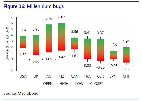
For example, US 10s were 1.80% on December 5, 43bp away from the lowest seen over the entire period, and vs. 4.01% at the start of January 2010. Moreover, despite being the trigger for, and ground zero of, the global financial crisis. the US actually emerged as a high yielder over this period! In the UK 10s had fell to 0.61%, a drop of nearly 330bp, not helped by Brexit. Yet ‘lucky’ Australia and New Zealand saw their 10s decline from 5.76% and 6.02% to 1.31% and 1.48%, respectively, pushing both below the US despite having experienced no GFC recession.
Of course, Europe saw an even worse performance as German yields turned negative. France yielded 3.41% a decade ago, and Germany 3.37%: now both yield less than Japan, which has itself seen already-low yields grind negative. Moreover, Switzerland is worse than all of them, with 10s at -0.58%.
Indeed, it is worth emphasizing that yields remain close to historic lows – in some cases this not meaning decades, or even centuries, but millennia. Lower for longer is now lower forever, as our rates strategy team argue.
Ups for every down
Meanwhile, as developed markets saw the lowest yields ever in many cases, emerging markets saw periodic periods of yield spikes, matching what occurred in rates markets of course.
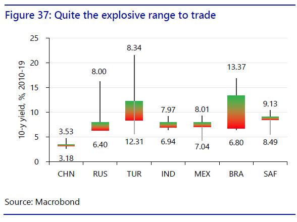
Again, the one exception was China, where 10s opened the decade at 3.53% and were relatively stable 10-years late at 3.17%: indeed, the decade-high and low were also not too far apart. That makes China look more like a developed economy, even though in terms of regulation and key structural risk is certainly is not.
South Africa, India, Mexico, and Russia also saw relatively narrow spreads between their decade open and close. However, in their cases the spread between their decade lows and the highs seen when under pressure were extreme. In Russia yields got up to over 16%, in Brazil to 13.47%, and in Turkey’s case to well over 21%. By contrast, in Mexico 10s got as low as 4.44%, over 250bp above where they end 2019, and Russia is closing at a decade low of 6.45%, reflecting a sluggish economy.
Turkey is also the only major emerging market listed here where the decade close in 10s is actually higher than the decade open (12.47% vs. 8.34%). Yet the general picture is of a global deflationary environment and ‘hunt for yield’ that pushes down emerging-market yields,…but then punctuated by explosive blow-outs when economic, political, geopolitical, or financial crisis develop in the recipients of those yield-seeking foreign capital inflows.
As such, one can argue that the decade finishes with potential risks elevated alongside rewards: many emerging markets can borrow more cheaply than in their history. However, yields can also rise explosively if they fall foul of the market, which in a low-inflation environment is all-the-more painful.
FX for the memory
On the foreign-exchange front the decade 2010-19 saw the USD perform extremely well – again despite being the centre of the global financial crisis. For example, the DXY index which looks at the USD against a basket of major currencies rose nearly 25% over the period, and closes the decade not far from its decade high (Figure 38).
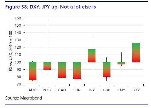
In terms of other currencies’ performances, which have been rebased to 100 at the start of 2010:
- AUD slumped nearly 25% vs. USD and ends the decade close to its 10-year low;
- NZD closed down around 10% – and very significantly lower than the highs it recorded earlier, when it was up over 50% vs. the USD relative to its 2010 starting position;
- CAD fell nearly as much as AUD, but is well off its decade lows;
- EUR performed similarly to CAD, ending the decade over 20% lower; and
- Despite Brexit, GBP was not dissimilar to EUR.
The two major crosses that were stand-outs were twofold:
- JPY, which despite a very wide trading range due to the initial FX impact of Abenomics, actually gained around 20% vs. USD; and
- CNY, which closed the decade slightly weaker than it started it – although that overlooks the fact that in the early part of the period it had been gaining significantly, which has since been completely reversed. Indeed, the trend is very much in the opposite direction.
FX, but no FX
Once again, emerging market currencies ex-China saw a more extreme performance vs. USD over the period. None saw an appreciation by end-2019, even though several did experience decade highs that did show net appreciation. Moreover, all close the decade close to their decade lows, and in most cases at all-time record lows vs. USD.
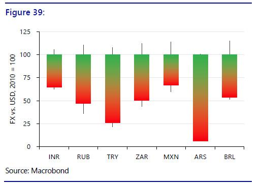
- Far and away the worst performer has been Argentina’s ARS, which starting at base 100 in January 2010 closes the decade at just 6. That is a quite staggering decline;
- Second-worst performer was Turkey’s TRY, which was volatile and slumped 75%;
- Third-worst was Russia’s RUB, down just over 50% vs. USD;
- South Africa’s ZAR was likewise 50% lower over the period;
- Brazil’s BRL also declined nearly 50% over the period and is once again weakening as the decade ends;
- India’s INR is close to record lows and is down around 30%; and
- Mexico’s MXN is down around 25%, if off its record lows.
In short, 2010-19 was a decade of intermittent, severe emerging-market currency crises, just as it was in emerging-market rates and yields. This is all the more remarkable given that on many measures overall financial-market volatility has declined markedly: yet clearly that does not capture the reality for a broad range of major emerging economies.
Past Decade…
To summarize, 2010-19 saw:
- A slump in global economic growth, especially relative to pre-crisis expectations;
- An unexplained, broad-based slump in global total factor productivity;
- A massive increase in debt, the composition of which switched from the private to the public sector in most developed markets, and even more to the private sector in most emerging markets;
- A surge in asset prices, most notably of stocks in the US, and in property prices almost everywhere, making owning or renting a home increasingly unaffordable for many;
- A reduction in global absolute poverty driven by better growth in key emerging markets – but an increase in poverty and insecurity in developed economies for many;
- A marked increase in global inequality even as the gaps between countries narrowed – because the gaps within countries widened;
- Attempts at developed-market interest rate normalization mostly reversed, despite no sign of that being recognised as recently as January 2019, and central-bank activism increasing once again;
- Emerging-market central banks forced to raise rates hugely periodically;
- Developed-market bond yields closing near to their decade lows, which in some cases means the lowest in recorded human history;
- Emerging-market bond yields trending lower – but then also exploding higher as periodic crises hit;
- The USD rallying against most major currencies, but up to 25%; and
- Key emerging-market currencies periodically collapsing vs. USD.
In short, future record-keepers will judge the post-financial crisis decade 2010-19 as a real success in terms of emerging-market growth, until the final year at least, and in fighting absolute global poverty; but also a failure in terms of advanced-economy growth, relative poverty, inequality, and central-bank credibility.
That is even before we turn to issues like rising political populism, which hardly seems a surprise when framed against the list of failures above; or to rising protectionism, which is again not unexpected against that kind of socio-economic backdrop – indeed we predicted it back in 2017; or to the global climate crisis, which is potentially a failure which totally eclipses all of the above.
…Next Decade
So what does 2020-29 hold? Obviously nobody knows what the future will look like. Few in late 2009 would have expected that in late 2019 bond yields would be far lower and the USD far higher. However, we can see that in many key respects the answers depend on China. For example:
- The global growth that we saw over 2010-19 largely relied on China, both directly and indirectly, but it doesn’t seem likely that will be repeated in the next decade;
- The global productivity outlook will be far brighter if Chinese productivity is rising, but if it is falling, the outlook is gloomy;
- The global decline in absolute poverty was again centred on China and its spillovers to other emerging markets;
- The global increase in debt has been worryingly centred on China and Chinese households. Any suggestion of either a US 2008, a Thailand 1997, or a Japan 1989 scenario would flag the 2020s as deeply troubled;
- Asset-price inflation is an issue almost everywhere, but China’s reliance on it, and Chinese relative asset values, are a point of deep concern;
- It has been argued that a significant portion of global inequality over 2010-19 was directly or indirectly driven by China and Chinese exports. China’s aim to move up the value chain to high-end products such as those made in the US and Germany could threaten another wave of the same;
- Bond yields and FX markets (though not equities) both showed China behaved far more like a developed market than an emerging market over 2010-19. If China starts to behave more like an emerging market with yield spikes (unlikely) or an FX crisis (quite likely) then this source of global stability will become one of global instability.
Indeed, while there are challenges on a huge number of fronts, the 2020s threaten to prove a decade to remember for all the wrong reasons, just as 2010-19 has proved to be a decade to try to forget for many.
Tyler Durden
Tue, 12/24/2019 – 12:50
via ZeroHedge News https://ift.tt/35RTYs8 Tyler Durden