“This Might Be The Weirdest Market I’ve Ever Seen” – Charting The Market’s Descent Into Insanity
Tyler Durden
Sat, 08/29/2020 – 15:00
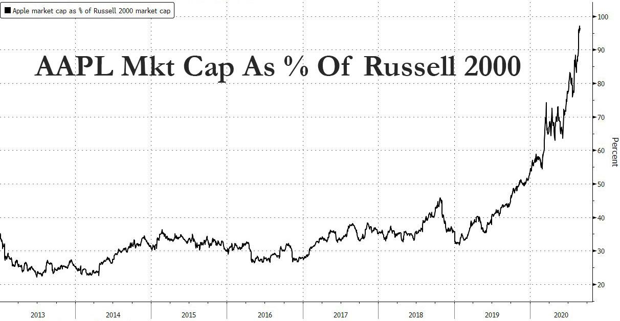
If there is just one chart that captures the unprecedented market moves observed not only since March, when the Fed threw aside any pretense of propping up equities and when the government launched a soft form of Universal Basic Income handing out benefits checks to virtually everyone including a new generation of traders who put much of the “free money” into momentum stocks, but also since last 2019 when two things happened – online brokerages eliminated trading commissions and the Fed started “NOT QE” to bail out JPM from a collapse in On-Off The Run treasury spreads – it is this one, which shows that as of Friday, Apple’s market cap is now 98% of the entire Russell 2000. A few more trading days, and one company will have more “value” than the entire index of small public companies.
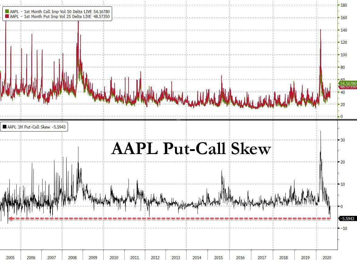
Of course, there are many more charts that document the market’s dislocations and transition to madness and below we want to share some of them with our readers, starting with one that may explain the unprecedented blow off top in Apple stock, whose ascent has been driven not so much by purchases of the underlying stock but a flood of buying of AAPL calls, so much so that its Put-Call skew is now the most negative it has been in 15 years, representing a furious surge in gamma and which means that Apple is now caught in a feedback loop where the higher it goes, the more calls are bought to chase the momentum, leading to a higher stock price, more call purchases and so on (as described recently in “How To Hedge An Apple “Blow-Off Top” Melt Up“).
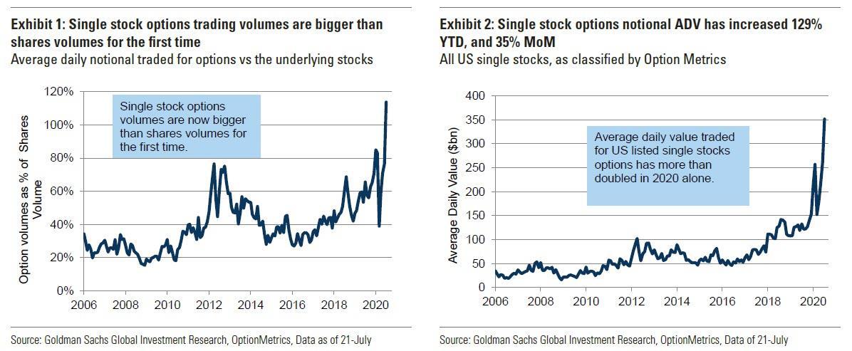
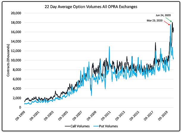
In other words, we have become a reflexive market of derivatives, where option flow dictates the action of underlying securities. We first noted the flood of option activity in July when we showed a Goldman chart which observed a “historic inversion”: for the first time ever, the average daily value of options traded exceeded shares with July single stock options volumes tracking 114% of shares volumes. This trend has only accelerated since.
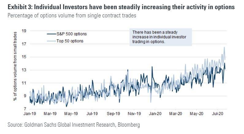
This move was largely driven by individual, or retail investors, whose activity in both the top 50 and the top 500 US names has continued a steady climb over the past two years with a larger recent increase in the proportion of volume among the top 50.
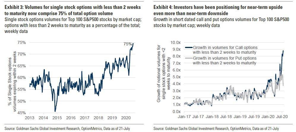
A significant portion of this increase has been driven by soaring volumes in short dated contracts, as investors are literally using massive leverage to wager on imminent momentum moves such as those often highlighted OTM calls traded in Tesla stock. As Goldman explains, “the proliferation of weekly options, and increased focus on using options to trade catalysts, has likely boosted growth in shorter dated (options with less than 2 weeks to expiry) trading strategies. While weekly maturities on single stocks became popular in 2012, volumes in short dated options typically comprised 50-60% of total volumes until 2017. This changed in 2018, as the volatility spike early in the year likely led to investors increasingly trading short dated options, driven by low absolute premiums and better visibility of the catalyst path. In 2020, volumes in short dated options have increased to record highs.” As a result, single stock options with maturities less than 2 weeks now comprise 75% of all maturities, up from their average in the 55-60% area. And in recent weeks, investors have further increased focus on trading calls with volumes of short dated call options having increased rapidly relative to puts.
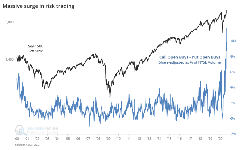
All these charts underscore the unprecedented role and importance the interplay of retail investors with volatility, and by extension the VIX, now plays in everyday trading. Here is a chart from Sentiment Trader showing how far the trend discussed in the above charts has moved: speculative options trading has now reached the equivalent of 12% of NYSE volume last week, far surpassing anything seen during either the dot com or housing bubbles. As the author himself summarizes, it’s “like some combustible combo of musical chairs, Russian roulette, and five finger fillet” and asks rhetorically, “how many traders can dance upon the head of a pin?”
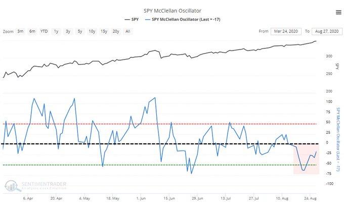
And speaking of unprecedented events, whether due to the impact of call buying or not, Sentiment Trader next shows just how far market breadth has collapsed, something we first touched on last week: “The S&P 500 set a 52-week high for a week straight. Every one of the sessions had a negative McClellan Oscillator. This has never happened before, using S&P stock data to 1998 or all NYSE securities back to 1962.”
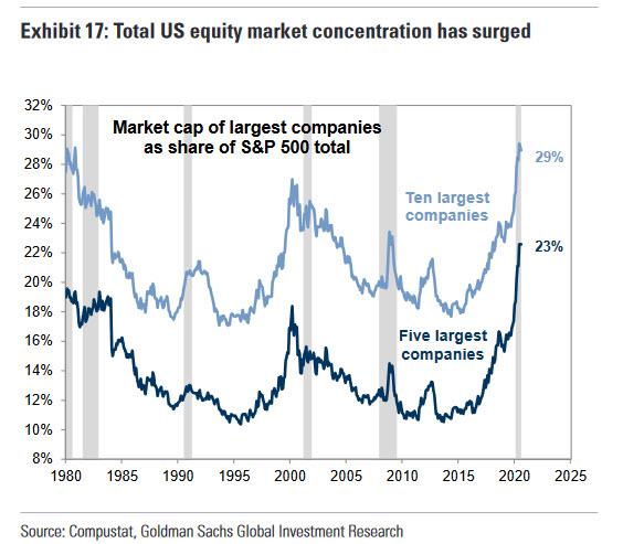
This is just one of many observations of market events that “have never happened before” in a market where a handful of stocks – the gigacap FAAMGs…
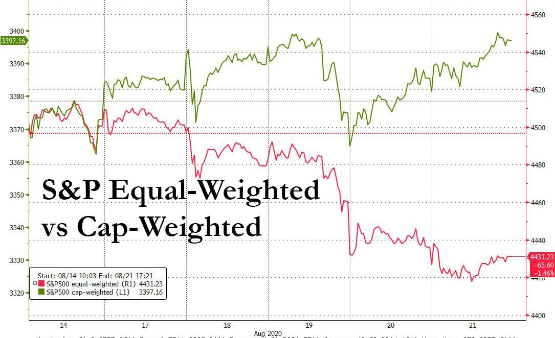
… now dominate all price action, so much so that last week the cap-weighted S&P500 hit a new all time high even as an equal-weighted index sank every single day.
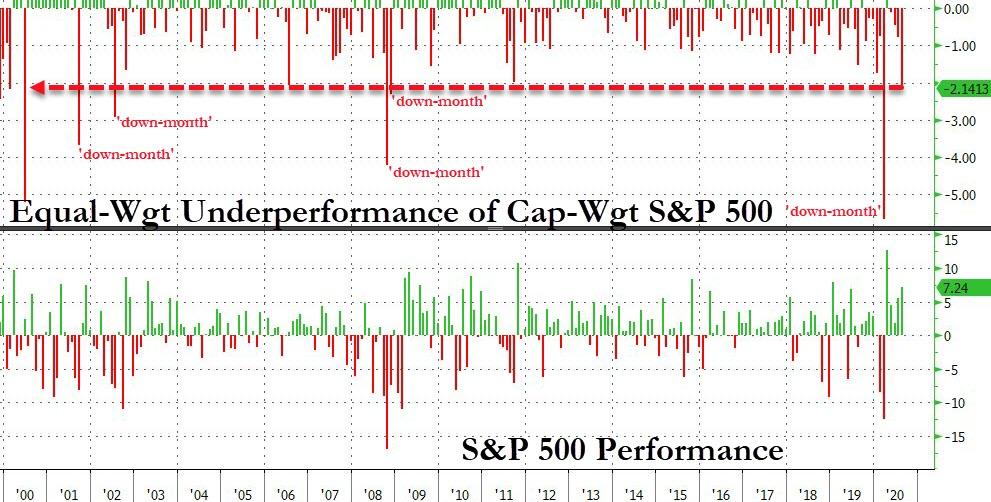
Picking up on this theme, Bloomberg’s Cameron Crise wrote that “this month represents the largest underperformance of the equal-weighted SPW versus the SPX in an equity up-month since June 2000 (210 bps at the time of writing.) It’s the ninth largest monthly SPW underperformance since 1990.” In other words, the equal-weighted index has gained just 5.1% in August with one trading day left, while the cap-weighted index is up 7.2%: this gap is the widest for an up month in two decades.
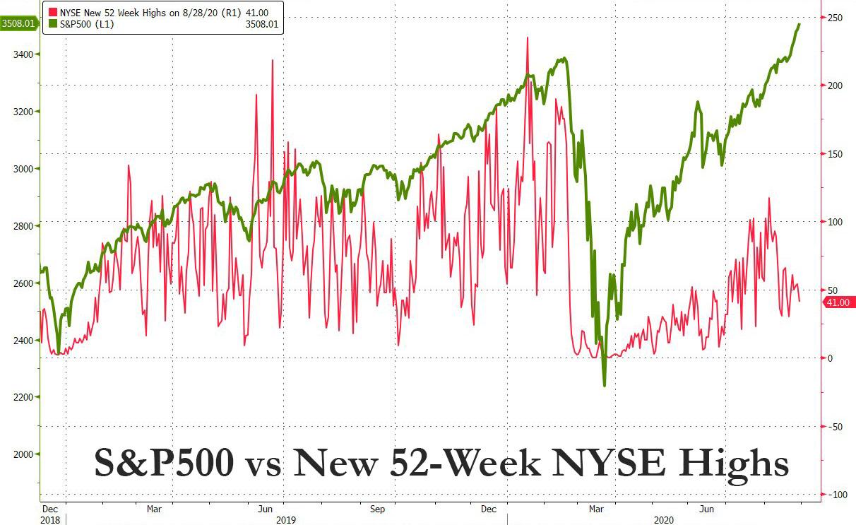
Underscoring the lack of breadth, just 41, or 1.3% of the 3,068 NYSE stocks hit a new 52-week high on Friday when the S&P500 closed at a record 3,508, yet another unprecedented divergence.
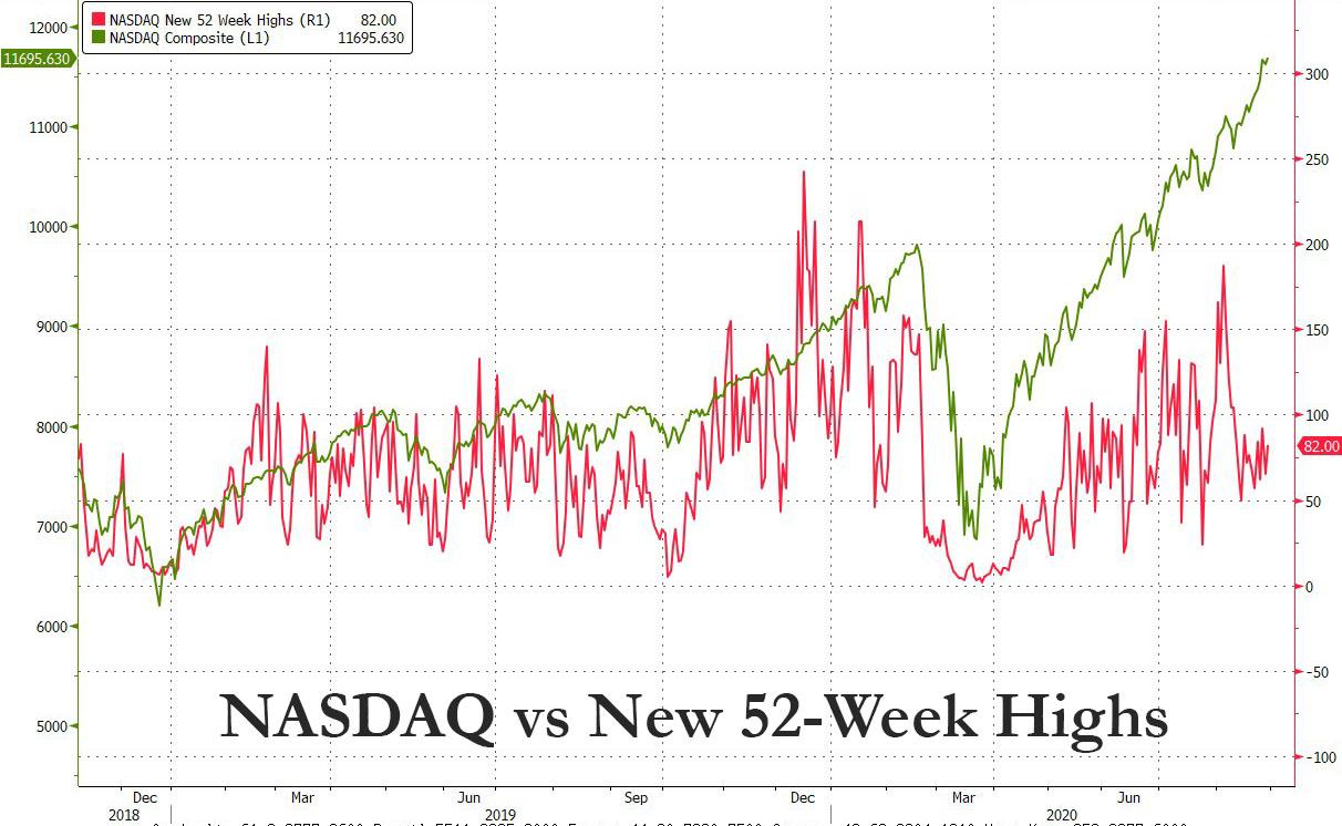
On the Nasdaq, it was just 82, or 2.4% of 3,450 issues traded.
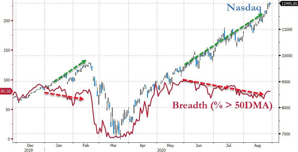
And an even more vivid decoupling, this time between the Nasdaq and the percentage of stocks trading above their 50 DMA.
This culminated last Friday in a session where all the upside was entirely due to Apple, which helped the Nasdaq notch a 0.4% gain to a new all time high; here is just how bad it was away from Apple, where only 29% of stocks on the Nasdaq managed to close up on Friday (and 31% on Thursday), which “was the lowest in history, by far with 805 up and 1878 stocks down.” Said otherwise, the Nasdaq closed not only green but at an all time high even as 70% of issues closed in the red. This was the 5th worst Advance/Decline day in the last 30 years.
As Bear Traps Report author Larry McDonalds notes, “the indexes don’t have much company at these rarefied levels. The minuscule number of equities at 52-week highs with the index right at the highs is unprecedented and shows just how weak current breadth is.”
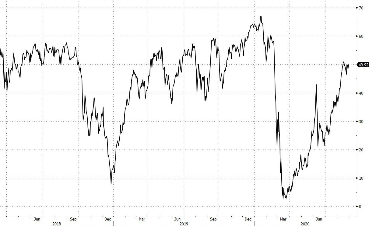
At the same time, the number of stocks trading above their 200DMA has also collapsed, from a relatively healthy 67% in February (just before the market crashed), to just half of the S&P500 currently.
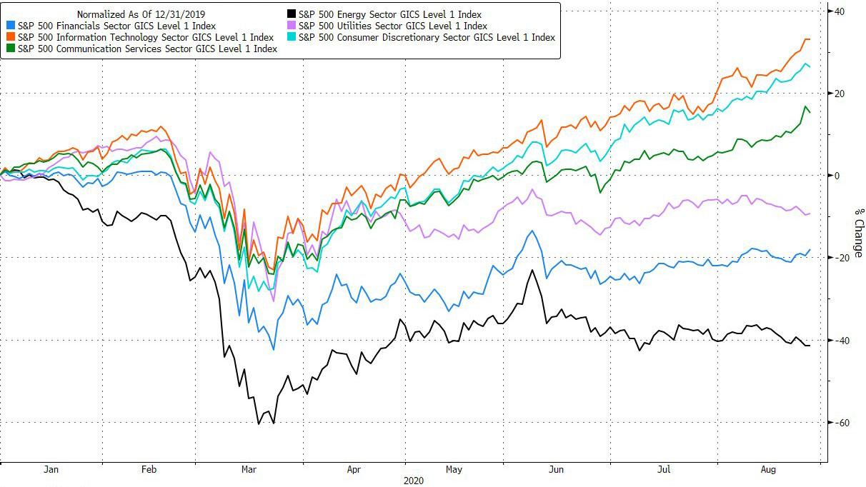
As hinted above, the biggest reason for so many of the market dislocations is the record concentration of just a handful of winners and a great majority of losers, i.e., growth vs value: “winners continue to win,” Lauren Goodwin, portfolio strategist at New York Life Investments told Bloomberg. “That will continue to be the case as long as the virus is the dominant economic story.”
This divergence between winners and losers is summarized below: it shows that three sectors – IT, Communications and Consumer Discretionary – are up in 2020, while Financials, Utilities and Energy are down anywhere between 5% and -40%.
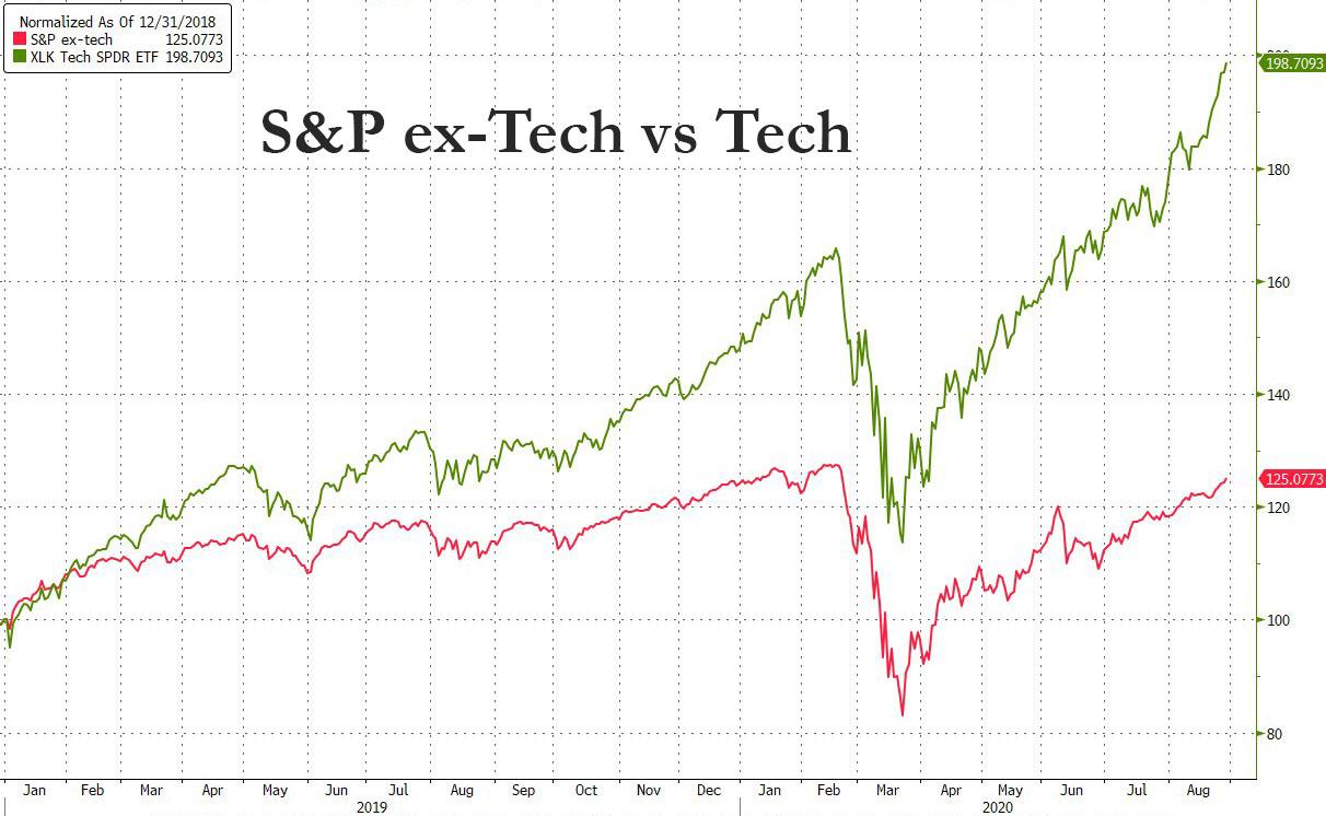
Perhaps a better visualization is the following chart of the performance of the S&P500 ex-tech vs the XLK tech ETF:
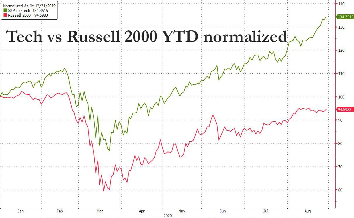
The chasm is even greater when looking at the return of the tech sector vs the Russell 2000 YTD: the former is up 34% YTD, the latter down more than 5%.
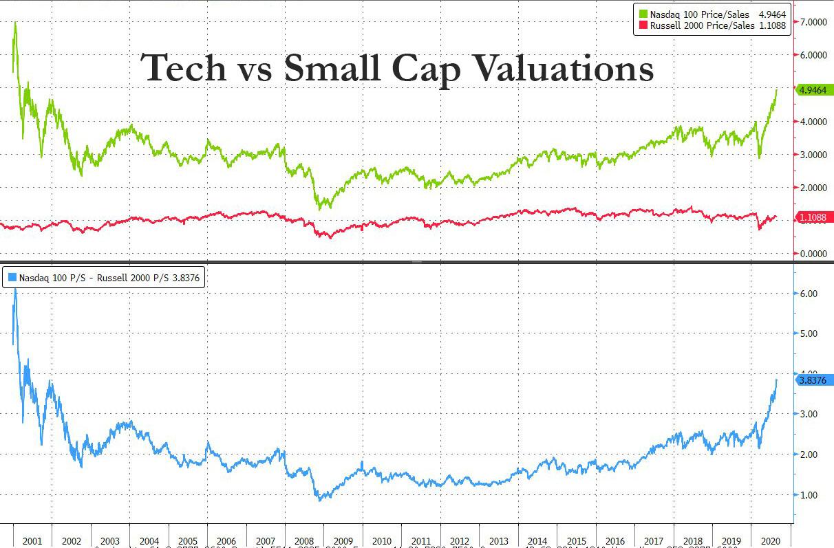
A look behind the number reveals a staggering valuation gap: the price/sales ratio on the Nasdaq 100 hit 5x, a level last seen during the dot-com bubble. Meanwhile, the similar valuation metric for small caps – plagued by pessimism about a broad-based economic rebound – remains just above 1, one of the widest gaps ever.
As Bloomberg notes, for the year, returns in the Nasdaq and Russell 2000 are separated by more than 42 percentage points, “a chasm in fortunes that will be all but impossible to ford in 2020.”
Here are some more observations on what the widening valuation gap might be saying about the fate of large and small companies, consider what it would take to get the Nasdaq price-sales multiple back to normal: index members sport a combined market value of $13.4 trillion, roughly 5 times their annual sales. To squeeze the multiple back to historical normalcy – 2.3 times sales – their revenue would have to double to roughly $6 trillion a year. That’s a $3 trillion revenue grab that equates to half the domestic product of small business in America.
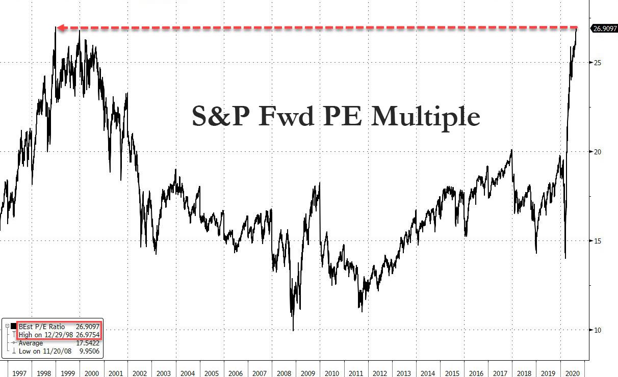
Yet even as a chasm grows between the market’s internals, the broader market – piggybacking on the soaring market cap of the gigacaps – storms ever higher, and the outcome is multiple expansion the likes of which have never been seen before. On Friday, in addition to closing at a new all time high, the S&P also closed at a 26.9097 P/E multiple relative to consensus forward earnings estimates. The previous record high was 26.9754 set on Dec 29, 1998. Stocks are within fractions of an all time high P/E multiple, up nearly 100% from the March lows.
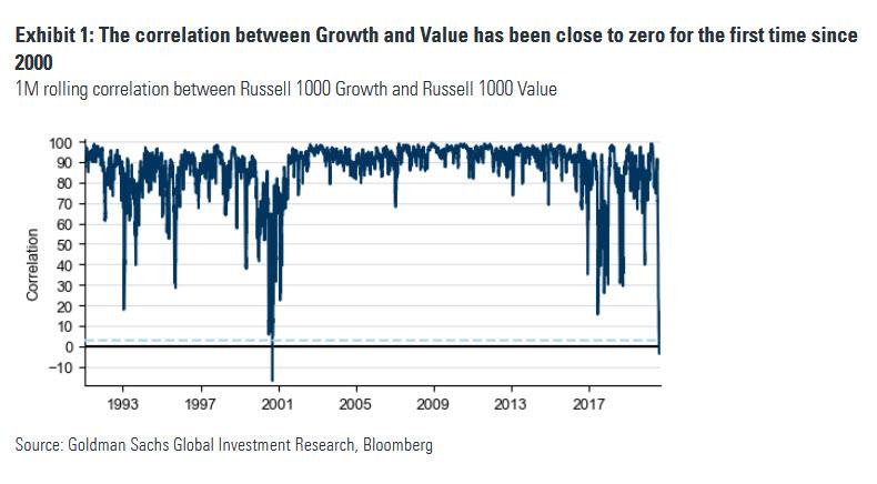
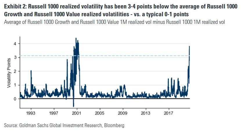
Another way of visualizing the market’s divergence is in the correlation between growth and value stocks, which as the following Goldman chart has collapsed to zero for the first time zine 2000.
According to Goldman, this collapse in correlation between growth and value has also led to a plunge in realized volatility for the S&P500:
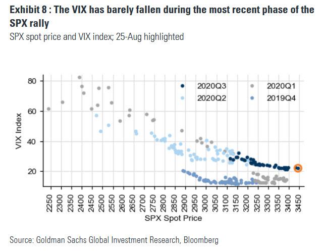
Yet even as realized vol has slumped, implied vol tracked by the VIX has remained surprisingly elevated having barely fallen during the recent phase of the market rally…
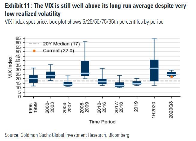
… and remains well above its long-run average despite very low realized vol in recent months.
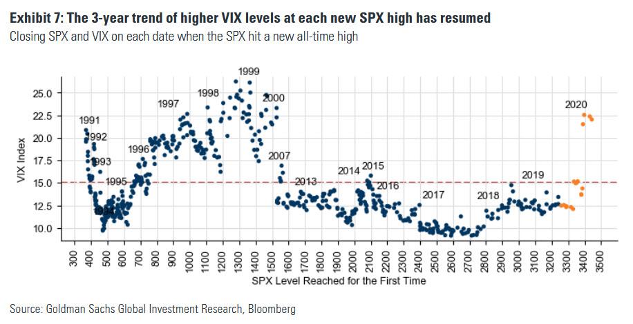
According to Goldman, the S&P’s new highs in February were the first such days in which the VIX closed above 15 since 2015. Six months later, the SPX is back at new all-time highs, and this time the VIX is in the 20’s – the highest VIX level at a new SPX high since Mar-2000. As Goldman’s Rocky Fishman says “this late 1990’s-like trend of higher vol at market highs, which has been ongoing since 2017, can reflect growing uneasiness about SPX valuations (in addition to virus-related risk).”
“It’s extraordinarily unusual for the VIX to stay above 20 for an extended period of time without a crisis situation going on,” said Michael Kelly, head of multi-asset at PineBridge Investments LLC in an interview with Bloomberg.
It is worth noting that – as in the case of the Apple example where the skew is at historic levels – one reason why the VIX remains elevated is not due to traditional put hedging but because retail daytraders have been piling into calls as the following chart from Logica clearly shows.
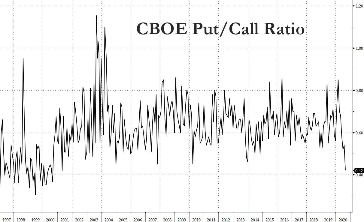
The result is also a collapse in the CBOE put call ratio, which is now below levels observed during the 2008 crash.
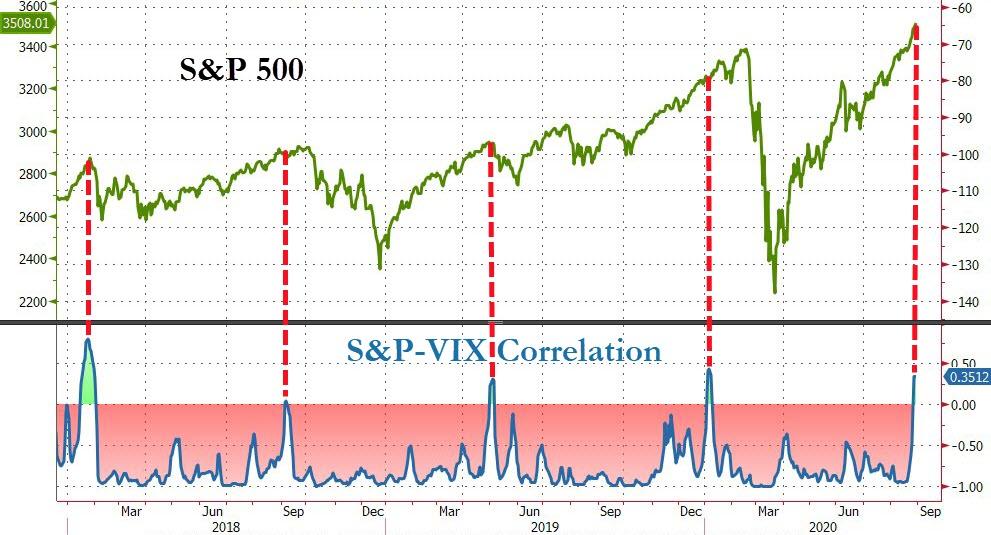
Whatever the cause, as Pictet’s Julian Bittel points out, when markets rise alongside the VIX as is the case now, and leading to a positive correlation between the S&P and VIX, “bad things happen.”
To this point, this past Wednesday was the first time in two decades the VIX rose more than 5% as the S&P 500 rose over 1% to a record according to Sundial Capital Research president Jason Goepfert (stocks tend to decline a median 1.2% in the following month when that happens, he added). At the same time, the Nasdaq rose 2.1% accompanied by a more than 10% increase in the Cboe NDX Volatility Index.
“This might be the weirdest market I’ve ever seen,” Goepfert said, adding he’s seen market oddities for weeks, and so far “they haven’t mattered.”
He then added what we have been pointing out for weeks: “the move in the volatility measure may be due to investors chasing the stock rally.”
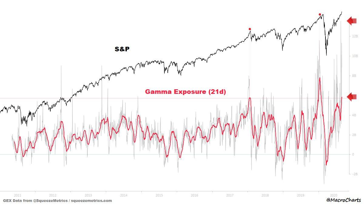
One reason why no conventional indicator seem to matter is because it now appears that gamma has become a primary driver in the market’s latest meltup. As MacroCharts notes, the “21DMA in the Top 20 days in data history (0.85%), just passed the JAN 2018 peak value and is still climbing, with JAN 2020 now in sight.”
“We are seeing more ‘upside panic'” in the Nasdaq, said Susquehanna derivatives strategist Chris Murphy.
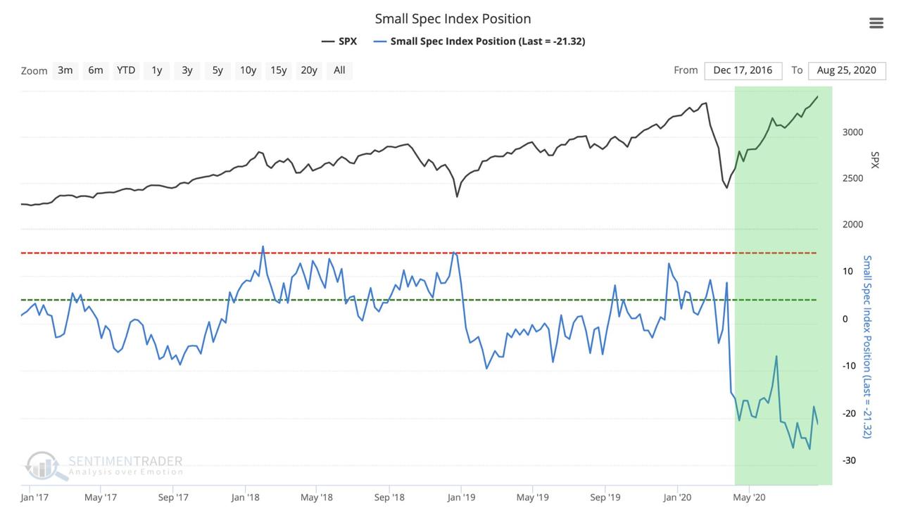
This move has become self-reinforcing, because at every new thrust higher in the market, a new layer of institutional shorts piles in. As the following chart from Yuriu Matso shows, Emini speculators “have NEVER been this bearish in the history of the ES futures trading!” And as he adds, “what is surprising is that they continue to stubbornly expect the SPX to top despite the fact that the index continues to print new all time highs every trading session.”
All these are clear symptoms of an abnormal market, of a market that reflexively rewards winners with even more buying, while punishing the losers with even more selling, a byproduct of the Fed’s recent interventions and nationalization in the bond market. So what does the Fed do? It changes its policy framework and doubles down on the same failed policies that brought us here. Rabobank strategist Philip Marey summarized it best:
While the Fed’s step to make the inflation target ‘more’ symmetric may benefit the wages of the average American somewhere beyond 2022, it does not really address the deeper problem with the role the Fed is playing in the US economy. It could be argued that the Fed’s policies have become part of the problem, instead of the solution. At least this should be a topic for debate in the FOMC, instead of talking a whole year about whether to use an average or not.
The much deeper problem for the US economy is the asymmetric impact of Fed policies on households and businesses. The Fed’s monetary and regulatory policies have contributed to a form of capitalism where the rewards are going to the 1% and the risks are borne by the 99%.
And the punchline: “The current crisis response has made it painfully clear again that the Fed’s policies benefit high income individuals and large corporations, while small businesses and low income individuals bear the burden. While the Fed likes to see itself as part of the solution to America’s economic problems, it should ask itself whether it is also part of these problems.“
Unfortunately, as long as stocks keep rising, an outcome cheered by both the broader population and thus by politicians, nothing will ever change and all appeals to stop the madness – despite these clear signs that all market conventions have now broken – will fall on deaf ears.
via ZeroHedge News https://ift.tt/3bg5FMM Tyler Durden
