Stockman Warns “Buckle Up!”, May’s Soaring CPI Print Was No ‘Transitory’ Blip
Authored by David Stockman via Contra Corner blog,
The Fed’s destructive money-pumping has many victims, but chief among these is the Wall Street financial narrative itself.
It emits not a whiff about the patent absurdity of the Fed’s monthly purchase of $120 billion of treasury and GSE debt under current circumstances; and treats with complete respect and seriousness the juvenile word game known as “thinking about thinking about tapering” by which the clowns in the Eccles Building fearfully attempt to placate the liquidity-intoxicated speculators on Wall Street.
So it’s not surprising that today’s 5.0% CPI reading was made inoperative within minutes after the BLS release by a chorus of financial pundits gumming about “base effects” and ridiculing outliers like soaring used car prices (up 29.7% YoY), which, of course, Bloomberg reporters never see the inside of anyway.
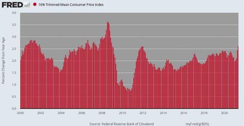
Then again, that’s why we look at the two-year stacked CAGRs, which smooth the ups and downs of the worst lockdown months last spring; and also why we use the 16% trimmed mean CPI, which eliminates the highest 8% and lowest 8% of items in the overall CPI each month (both sets of deleted outliers are different each month).
In the present instance, therefore, off-setting the used car prices in the highest 8% of items during May is the -5.0% YoY drop in health insurance costs (if you believe that BLS whopper) and the -5.3% drop in sporting event prices, which, of course, have been largely zero since last April.
In any event, the 16% trimmed mean CPI for May was up by 4.7% annualized versus the April number and was higher by 2.62% on YoY basis.
Still, the more salient point is that on a two-year stacked basis the plain old CPI—used car prices and all—leaves not a scintilla of doubt: Consumer inflation is accelerating and rapidly.
During the last eight months the growth rate for the two year stack has risen from 1.48% to 2.55% per annum. And we don’t recall a word in May 2019 about that year’s reading being particularly deflationary. It was actually up 1.83% from May 2018.
Per Annum CPI Increase, Two-Year Stack:
-
October 2020: 1.48%;
-
November 2020: 1.59%;
-
December 2020: 1.78%;
-
January 2021: 1.92%;
-
February 2021: 1.99%;
-
March 2021: 2.07%;
-
April 2021: 2.23%;
-
May 2021: 2.55%.
Still, according to the Fed apologists there’s nothing troubling about the above because the Fed is now only trying to hit its 2.00% inflation target “averaged over time”.
Let’s see. Here are the CPI growth rates going back to May 2014. It turns out you have to average back seven years before you have a shortfall from the 2.00% target!
CPI Increase per Annum To May 2021 From:
-
May 2018, 3-Yr, average: 2.31%;
-
May 2017, 4-Yr. average: 2.42%;
-
May 2016, 5-Yr. average: 2.31%;
-
May 2015, 6-Yr. Average:2.10%;
-
May 2014, 7-Yr. Average: 1.81%
You get the scam. These mendacious fools will just keep averaging back in time until the get a number that’s a tad under 2.00%, smack their lips loudly and then pronounce the current inflation to be “transitory”.
And they will also toss out any inflation index that undercuts their MOAAR inflation mantra—like all of the data reported above!
So we will say it again: The CPI is a highly imperfect general price measure owing to its one-sided treatment of quality (hedonic) improvements, wherein some reported prices are adjusted downward for improved product features like airbags and more powerful PCs, put few prices are adjusted upward for the junkie toys, towels, kitchenware, appliances and furniture that comes out of China.
But with the 8% highest and 8% lowest prices dropped out monthly to filter out the short-run noise, the 16% trimmed mean version of the CPI at least purports to be a fixed basket price index, not a variable weight deflator like the Fed’s beloved PCE deflator.
In short, the 16% trimmed mean CPI puts paid to the “transitory” scam. Come hell or high water, this serviceable inflation measure has been rising at 2.00% per annum since the year 2000, and even more than that during the 1990s.
Thus, during the 112 months since the Fed formally adopted inflation targeting in January 2012, it has risen by 2.03% per annum and by 2.15% per annum since January 2000.
Equally significantly, there have been only a handful of times during the 256 monthly readings since January 2000 when the year-over-year measure dropped materially below 2.00%.
YoY Change, 16% Trimmed Mean CPI, 2000-2021
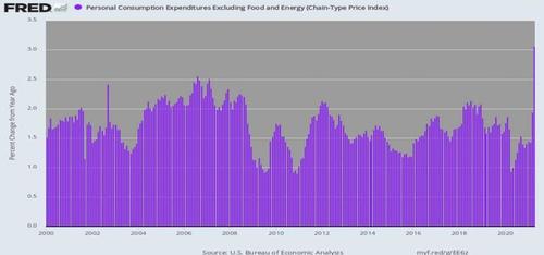
For want of doubt, here is the Fed’s preferred short-ruler—-the core PCE (personal consumption expenditure deflator less food and energy). And the Fed’s case for its insane money-pumping essentially boils down to the dueling information covered by the red bars above and the purple bars below.
As it happens, the one-year change in the core PCE deflator is 3.1% and the stacked two-year gain is 1.99% per annum. That latter is apparently not close enough to 2.00% for government work, meaning that the Fed needs to get more years into its average.
Even then, you have to be trained in the medieval theology of counting angels on the head of a pin to ascertain the purported earth-shaking “shortfall” from target. Compared to April 2021, here are the multi-year CAGRs on an April-to-April basis:
-
2019-2021: 1.99%;
-
2018-2021: 1.89%;
-
2017-2021: 1.92%;
-
2016-2012: 1.86%:
-
2015-2021:1.82%
That’s right. For the five year-pairs shown above, the average CAGR for the core PCE deflator was 1.90%. It seems that “lowflation” amounts to that which you need a magnifying glass to ascertain— 10 basis points of shortfall.
Of course, our monetary bean counters are not done “averaging”, either. If you go back to January 2012 when the Fed officially adopted inflation targeting, the core PCE deflator is up by 1.69% per annum, and since January 2000 it has risen by 1.75% per annum.
So there you have it. For want of 25-31 basis points of annual inflation—-averaging back to the beginning of the current century—you have a camarilla of central bankers giving deer in the headlights an altogether new meaning. That is to say, they are apparently not even thinking about thinking about tapering their massive bond-buying fraud owing to the barely detectable differences between purple and red bars of these dueling charts.
As we said a few days back, would that they had applied the 25th Amendment to the Federal Reserve Board.
These sick puppies are in urgent need of palliative care.
YoY Change In Core PCE Deflator, 2000-2021
They are also in need of a dose of realism, and on that score there are three figures in the May CPI report which tell you all you need to know. To wit, compared to May 2020, durable goods prices were up by 10.3%, nondurables were higher by 7.4% and services less energy gained 2.9%.
In fact, in the recent history of these three figures lays a stinging refutation of the entire “lowflation” scam promulgated by the Fed money printers and their acolytes and shills on Wall Street and in Washington, too.
On this matter, the Donald was right, even if by accident or for the wrong reasons. What we are referring to, of course, is the “Shina” factor.
Beijing’s form of state-controlled printing press capitalism has systematically drivendown the cost of manufactured goods and especially durables by, in effect, draining the rice paddies of China’s great interior and herding its latent industrial work force into spanking new factories which paid wages less than meager. And CapEx costs were rock bottom, too, owing to $50 trillion of central bank-fueled domestic debt and the greatest cheap capital-driven malinvestment spree in human history.
The result was an intense, multi-decade long deflation of manufactured goods as the high labor costs embodied in US and European manufacturers were steadily squeezed out of global prices levels as production shifted to China and its East Asian supply chain.
That impact is patently obvious in the composition of the CPI among the three components which were flashing warning lights in today’s inflation report.
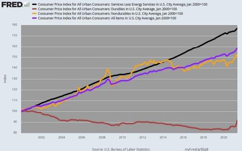
Composition of CPI By Major Components, 2000-2021
In the first place, the core of domestic inflation lies in the 58.8% weight of the CPI consisting of mainly domestically supplied services. The 2.9% YoY gain reported for May for CPI services less energy was essentially par for the course.
That is, during the last 21 years (since January 2000) this component (black line) has risen by 2.71% per annum, and since January 2012 it has gained a similar 2.63% per annum.
Needless to say, if there is any part of the inflation rate that the Fed can most powerfully impact, it is domestically supplied services like health care, education, housing, entertainment, travel and foods services. So where’s the “lowflation” in that part of the CPI basket?
Alas, we don’t have lowflation in services at all, but a stubborn 2.6%-3.0% upward price drift in domestic service components which account for nearly three-fifths of the household budget.
By contrast, the durable goods component (brown line) accounts for 11.1% of the CPI, and it’s been an anchor to the windward for more than two decades. As of May 2021, prices were still 8% below their January 2000 level.
The truth is, the alleged lowflation on the top line CPI has been heavily attributable to the deflationary durable goods sector, but, alas, that era is apparently over. The Chinese rice paddies have been drained on a one-time basis and its labor force is now actually shrinking, while the Donald’s ill-timed tariff barriers have forced production to move to higher cost venues, albeit not necessary the USA of A.
Either way, the anchor to the windward is largely gone, meaning that rising durable goods prices going forward will no-longer weigh as heavily on the CPI.
It should be further noted that during the past two-decades nondurable prices have also held-down the CPI top line—again in large part owing to the “Shina” factor and downward pressures from cheap apparel, footwear, home furnishings and the like.
During the past 21 years, the nondurables component (yellow line) of the CPI rose by 1.99% per annum, which is as close as you please to the target, but was also on anchor on the overall CPI top-line ( purple line) which increased by 2.19% per annum.
Alas, during the period since January 2012, nondurables rose by just 0.63% per annum owing to flat-lining energy and commodity prices, thereby pulling the overall CPI down to 1.80% per annum, where it too fell awry of the Fed’s sacred 2.00% target.
But here’s the thing. A smattering of surging nondurable goods prices in the May 2021 report are a stark reminder that the times they are a changin’.
On a YoY basis, these components suggest that “lowflation” in durables may have passed its sell-by date and that the 7.4% YoY gain in nondurables overall may be lifting, not suppressing, the CPI top-line going forward.
YoY Change In Major Nondurables Components:
-
Energy commodities: +54.5%;
-
Apparel: +5.6%;
-
Home furnishings and supplies: +3.7%;
-
Footwear: +7.1%;
-
Food away from home: +4.0%
-
Household furnishings and operations: +4.6%.
In sum, the chart above captures the one-time history of the Fed’s phony “lowflation” narrative—an aberrant condition that is now fading fast. Sooner or latter they will run out of excuses and back inflation reports to average down. And that, in turn, means tapering of the Fed’s great bond-buying fraud—the lynch pin of the greatest bond and stock bubble in recorded history.
Do we think that will trigger the greatest financial asset value collapse in modern times?
Why, yes, we do!
Tyler Durden
Sat, 06/12/2021 – 10:35
via ZeroHedge News https://ift.tt/3gfwzs4 Tyler Durden


