Have We Been Looking At The Wrong Yield Curve?
Authored by Simon White, Bloomberg macro strategist,
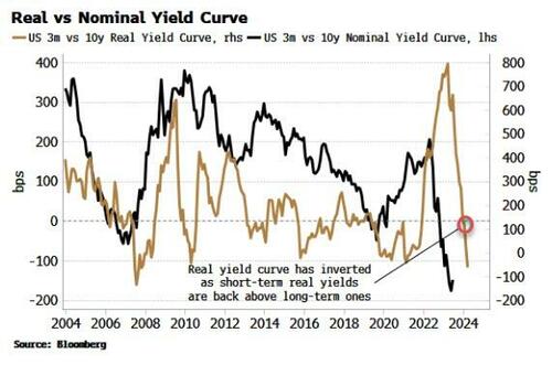
The nominal yield curve is the predominant focus of attention, but in an inflationary environment the real yield curve is key to understanding the market and the current rally in risk assets.
There was a time in the not-too-distant past when using the yield curve as a leading economic indicator was fairly niche. Sure, people were aware it tended to invert before recessions, yet there was nothing like the attention lavished on it nowadays.
But the nominal yield curve is a red herring. Not only is an inversion neither a necessary nor a sufficient condition for a recession, the obsessive focus on it has obscured what has been of ultimate importance for investors in recent months: the positive backdrop for markets.
Further, the nominal curve inverted over a year ago, but the opportunity cost of using that as a signal to reduce equity exposure has been high. On top of that, even though the curve remains deeply inverted, this gives us little visibility on exactly when the next recession will hit, how deep it will be and, most importantly, what happens to risk assets.
In an elevated-inflation environment the nominal curve is inadequate, and it’s the real yield curve that has the greater utility.
It has only just inverted after flattening sharply, telling us that short-term real yields are back to being more restrictive than their longer-term counterparts. This gives us valuable insight into liquidity conditions and therefore the environment for stocks and other assets.
As an investor, the liquidity you should pay most attention to is excess liquidity (the difference between real money growth and economic growth).
Central-bank liquidity does not capture the full picture. Firstly, commercial banks – not just central banks – create liquidity when they issue loans. But even more importantly, standard measures make no allowance for how liquidity actually flows. The economy and inflation soak it up, and any portion left over, i.e. the “excess”, is available to support risk assets. Central-bank liquidity does not make these distinctions and thus gives no consistently reliable leading information about the market.
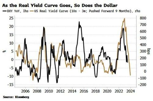
Which is why the real yield curve is important, as we find that its inverse leads excess liquidity. The chart below shows a flattening real yield curve typically precedes rises in excess liquidity, and vice-versa, by about 3-6 months.
This is a fascinating relationship, and counter-intuitive at first, as it seems to suggest liquidity increases as its price rises.
But it becomes clearer when we consider the role of the dollar. One of the best guides to the ups and downs of the US currency is the real yield curve. The dollar is driven at the margin by the real return of foreign buyers of US yields. The flattening of the real yield curve last year presaged lower demand for dollars and foreshadowed its current downtrend.
A falling dollar has been one of the biggest drivers of rising excess liquidity this year. The excess-liquidity indicator is global and dollar denominated, so a decline in the US currency drives it higher as non-US currencies strengthen. Latterly its rise has been turbocharged by falling inflation, “freeing up” even more liquidity to support risk assets.
When the real yield curve began to flatten in October last year, it was a harbinger that market conditions underpinned by excess liquidity were soon about to change, and provide a powerful tailwind for risk assets that’s still in play today. The nominal yield curve only told us that recession risk was rising, which was of little practical help to investors.
In an inflationary environment, the nominal curve has become a “stopped watch”. Not only has it been unhelpful in timing the next recession, it has given us no information on the interplay with inflation, global currencies, true liquidity conditions and therefore the outlook for risk assets.
Moreover, the next recession is likely to be of an inflationary nature; therefore we should not expect stocks in nominal terms to sell off as much as would normally be expected, further inhibiting the usefulness of the nominal curve for investors.
No relationship is perfect (if it was, I’d keep it to myself!), and rarely are effects mono-causal. There are other influences at work in the pass-through between the real yield curve, the dollar and excess liquidity. But the real yield curve offers a more complete framework for understanding the underlying market dynamics.
Most importantly, it is better poised than the nominal yield curve to highlight when probably the single biggest endogenous risk for markets is about to become a problem: a resurgence in inflation. Falling inflation is currently driving the flattening in the real yield curve and, along with the weaker dollar, the rise in excess liquidity. A re-acceleration in price growth would despoil the sweet spot risk assets currently enjoy.
Inflation in the US should not give any nasty upside surprises in the next few months, but building stimulus in China and the steady rise in oil are likely to tilt the risks at some point.
Thus, to better provide an early warning the stock rally is at risk, tracking the real yield curve will prove more fruitful than its limelight-stealing cousin.
Tyler Durden
Tue, 07/25/2023 – 08:45
via ZeroHedge News https://ift.tt/EHRo9Na Tyler Durden


