Authored by Sven Henrich via NorthmanTrader.com,
Exhausted by the wild swings in markets? By tweets, daily newsflashes, central banks speeches, etc, all of which cause markets to move up and down on a dime leaving wide open gaps to the upside and downside?
Welcome to 2019. And 2018. It’s been a wild ride over the past 2 couple of years and it doesn’t look to change anytime soon. So one best have a stoic approach to markets or psychology can get the best of you.
Hence I thought it might be best to go through a little mental exercise for everyone to consider.
I posted 2 mystery charts as I called them on twitter and asked whether they would be considered bullish or bearish.
To me it’s an interesting exercise because there’s no bias associated with them as not enough information is provided as to context or time, but I wanted to get a sense of perception and I very much appreciate everyone’s responses.
This was not meant to be an exercise for people to be right or wrong, but rather highlight a couple of key lessons to be mindful of.
Firstly here are the charts.
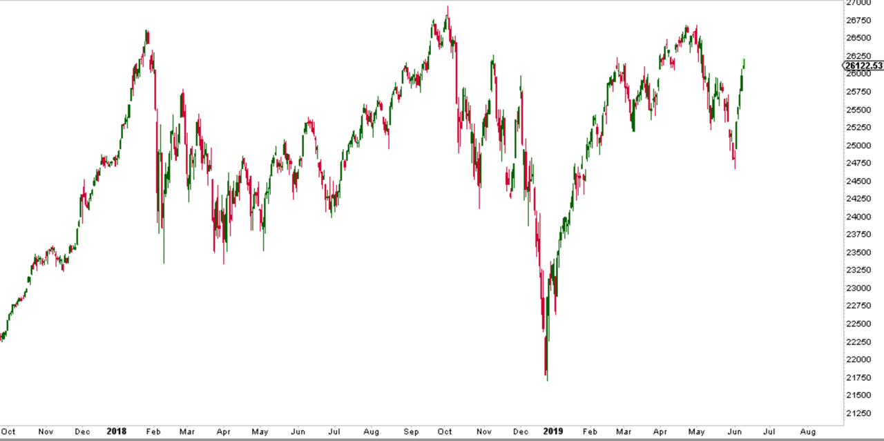
Mystery chart #1:
Mystery Chart: Bullish or bearish? pic.twitter.com/aamn6xNiPr
— Sven Henrich (@NorthmanTrader) June 10, 2019
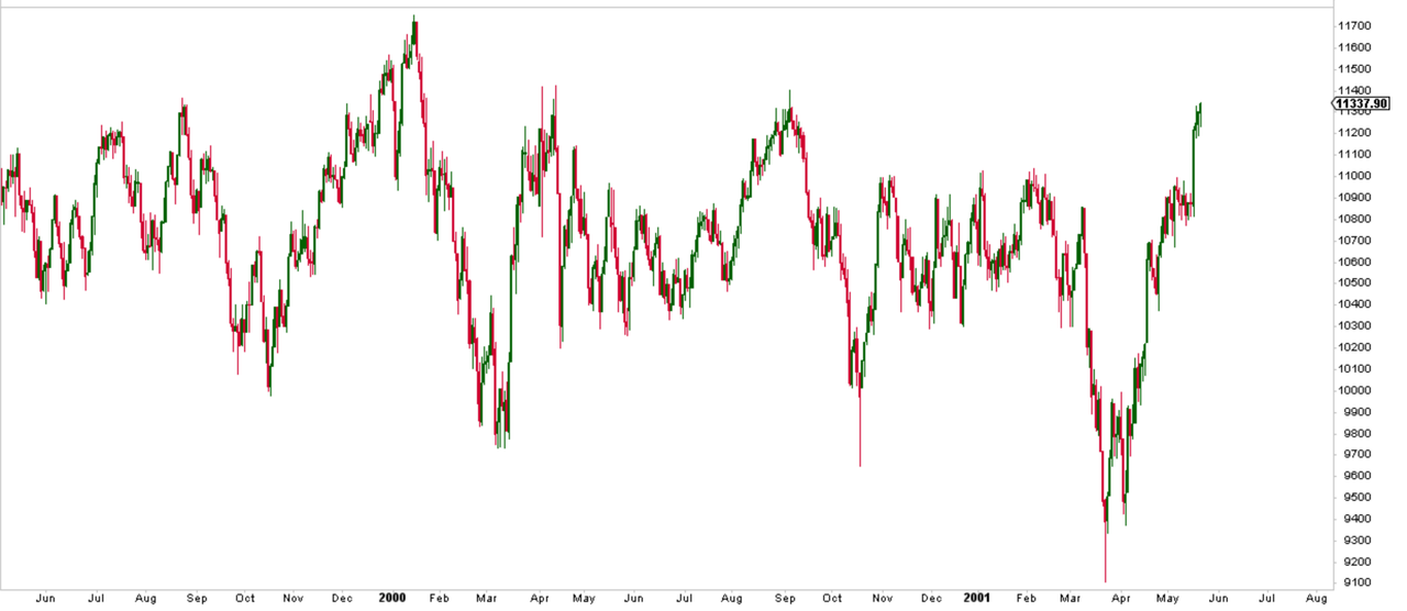
What’s that chart show us? Wild price swings up and down. It’s a daily chart and the chop is brutal, especially that rally at the end there. Massive. And relentless. Bullish or bearish?
Mystery chart #2:
Mystery Chart #2: Bullish or bearish? pic.twitter.com/9E8kcNL973
— Sven Henrich (@NorthmanTrader) June 10, 2019
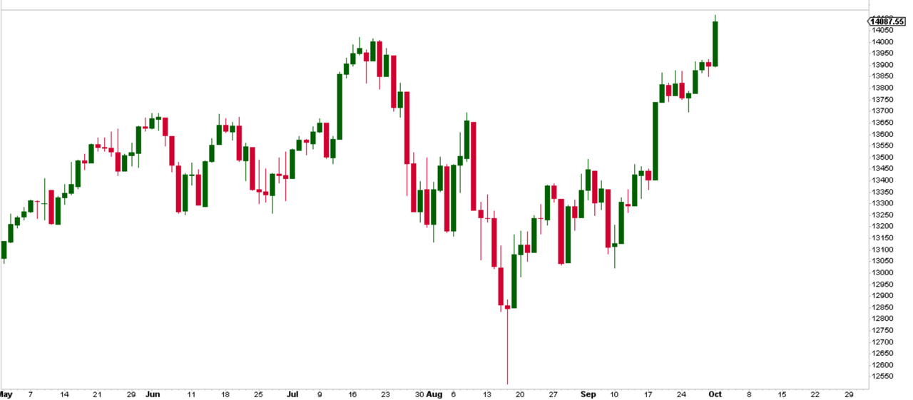
This chart too is a daily chart, also wild price swings and making new highs. Bullish or bearish?
The most striking aspect of all the responses I received on both charts is that there was zero consensus. Some are bullish, some are bearish, some want more information and are on the fence. Fair enough.
Ok, enough already of the gibbering what are the charts?
Well, both are the $DJIA, just from different periods of the past.
Mystery chart 1 is the $DJIA from May 1999 through May 2001, 2 years:
Right through the tech bubble which peaked in March of 2000. Awe-inspiring rallies and scary drops and 2 years of chop sprinkled in between. Everybody’s opinion didn’t matter as the chart went nowhere for 2 years.
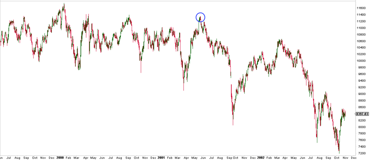
But then it did matter. That last rally? It was the end, and $DJIA dropped nearly 40% from there, but with more sharp rallies in-between:
By now you probably guessed mystery chart #2, yes $DJIA in 2007:
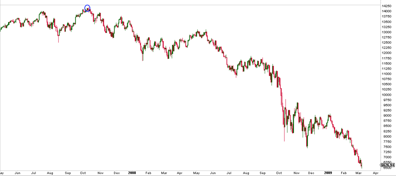
Massive moves up and down and a new high in October. Was it bullish? Of course not, hindsight is wonderful, but if you’re in thick of things rallies can be deceiving:
The point of all this? Wild price swings and massive rallies at the end of a cycle can be massively deceiving.
Now, nobody can call a top in advance and in our current period there are many arguments that can be made for new highs to come still despite slowing macros.
Who knows, the Fed alone may blow these markets to kingdom come:
The Fed, by its catering to markets, has 2 choices now:
1. Disappoint markets and risk a major sell-off
2. Blow the biggest bubble known to man— Sven Henrich (@NorthmanTrader) June 10, 2019
Nobody can be certain of anything in such an environment, but observe what’s happening with price.
And here we can observe wild price swings, massive gyrations up and down with a lot of chop in between.
No market is alike, but we can note similarities one of which is particularly aggressive rallies at the end either making new highs or not.
What did buyers know that chased the final rallies in May 2001 and October 2007? The hindsight answer is: Nothing. Just because they chase them doesn’t mean they know what they’re doing. Aggressive rallies at the end of a cycle can produce new highs, but on their own they have no predictive value as to where stocks are going.
None of these final rallies in 2001 and 2007 ended with a sudden bang. They just got overbought and then produced a few down days, nothing dramatic at all. But know these final rallies came in context of exuberant investor behavior amid slowing macro and a Fed keen to keep any recession talk at bay, yet having stopped their rate hike cycle. Sound familiar?
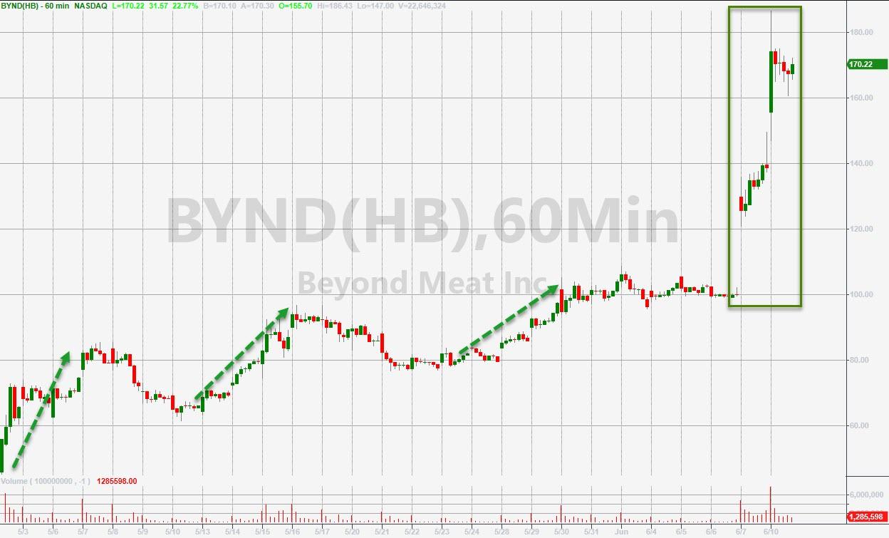
Are there signs of exuberant investor behavior? You tell me:
Beyond me(at) why people chase into stocks like this other than a short massacre, but then this happens during every bubble.
As to the Fed now expected to cut rates aggressively at 50 year lows in unemployment with $SPX hitting 1.8% off of all time highs today?
Rate cuts here are a risky proposition. While investors have chased into stocks on Jay Powell’s comments last week consider the historicity here:
At the beginning of 2000 the Fed Funds rate was at 6.5%, they then were forced to cut by 525 basis points. From the recession low of 2002 the Fed raised interest rates by 400 basis points before being forced to cut by 500 basis points to zero. In this cycle they barely managed to raise rates by 225 basis points before now being forced to cut again with rates still below 1993 rates. Which also implies they only have 225 basis points to play with here unless they go to negative. Less than half of the ammunition they had during the last 2 recessions implying the Fed needs to be judicious and strategic with any rate cuts.
As for investors chasing jubilantly into coming rate cuts:
CREDIT SUISSE: “Many investors believe that disappointing data is a positive for stocks as it gives the Fed cover to cut rates. Our work refutes this argument. Weak readings and lower yields should be a headwind regardless of Fed action.” pic.twitter.com/6hindoon2m
— Carl Quintanilla (@carlquintanilla) June 10, 2019
Bottom line: We are at a unique point in history here, one marked by wild price gyrations in the face of a slowing macro environment. Investors are again believing the Fed will make all troubles go away and perhaps they will again. At the same time, price, in context of declining macro, is acting in ways not inconsistent with previous topping patterns during which the most aggressive rallies were the ones to be most cautious of.
That’s at least what the mystery charts strongly suggest.
* * *
For the latest public analysis please visit NorthmanTrader. To subscribe to our market products please visit Services.
via ZeroHedge News http://bit.ly/2I8ImYm Tyler Durden
