Playing Fast And Loose With Numbers
Authored by Joakim Book via The American Institute for Economic Research,
Journalism is hard. To portray the world accurately to a layman audience without delving into the complexities and nuances of the universe we inhabit, writers must always simplify, explain, and make difficult content relatable for their readers. You can do this well and comprehensively, and you can do it poorly.
Often, writers simplify and give concrete examples with the best of intentions, even though I don’t put it past some of the activist writers out there to fudge what they portray and fidget with the details. But what really strikes a nerve with me is when writers end up misleading so grossly that their readers walk away with a completely twisted view of the world. The late Hans Rosling was a master at pricking the bubbles that these mistakes had created in our heads.
I have summarized his perhaps most valuable advice to Always Be Comparing Thy Number; never let numbers stand alone; always have readily available comparisons that let you answer the crucial questions: is that a lot? What was it last year? Ten years ago? Do informed researchers think it’s a lot?
Most of us don’t walk around with easily comparable frameworks for what’s a large and small number in areas we know nothing about – how many people normally die in car accidents or from medical errors, how long the Amazon River is or how much ice there is in the world. Implicitly or explicitly, we rely on fact-checking journalists to tell us in the process of covering the crucial topic they’re writing about.
Too often, they don’t. And not only do they neglect their professional role, they tend to make our misunderstandings worse when they actually engage in contrived comparisons. In any story that includes climate change this tendency seems to have gone completely haywire (maybe the covidocracy can give it a run for its money).
Far from being settled, climate science is tricky: we don’t know well what happens to global temperatures when atmospheric CO2 doubles (“climate sensitivity”); we can’t properly model clouds and cloud formation, crucial for how much of the sun’s incoming heat will be reflected away; the range for best-guesses as to what the global temperature rise over the coming century will be is vast (maybe 1° Celsius – maybe 5° Celsius) – so vast, in fact, that it hardly warrants a quantification.
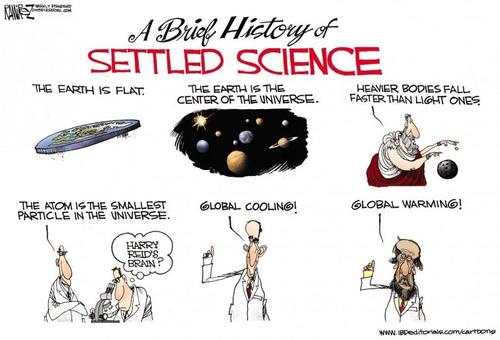
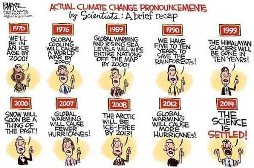
Yet, the science is “settled,” we hear, and we must “listen to the scientists.”
The Sea Level Rise, the Olympic Swimming Pools, and the Football Fields
But the worst crime are the subtle throwaway lines that journalists tuck onto their coverage of impending doom that give a completely mistaken impression about the future of the world.
Let’s start with the Amazon.
The Amazon forest is huge. So huge, in fact, that few of us can even fathom how mind-bogglingly huge it is: numbers just won’t do it justice – does anyone have a reference point for what 5.5 million square meters look like? The main Amazon River, not considering its countless tributaries, is some 6,400 km long: traveling at a comfortable 20 km/h (12.5 mph), it would take you a good two weeks of traveling day and night – probably more because of weather, currents, and debris. The area of the forest itself is the size of all U.S. states west of the Mississippi (minus Alaska): from the Gulf to the Canadian border, the Pacific to the Mississippi, all covered in forest.
In addition to that, we have the Cerrado, an area south and east of the Amazon the size of the U.S. east of the Mississippi, that’s technically tropical savannah but few of us would hesitate calling it forested.
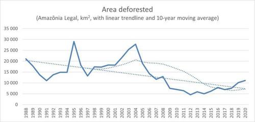
When the scientific journal Nature has a headline that reads “deforestation rate in 2020 is the greatest of the decade,” they’re not lying. The BBC even trumped them a little by slapping “deforestation ‘surges to 12-year high’” on unsuspecting readers. So, we get the impression that Brazilian deforestation is really bad:
Source: INPE, Brazil’s National Institute for Space Research
Here I overlaid a simple trendline and a ten-year moving average for illustration. The 11,000 km2 deforested last year was indeed the highest since 2008, but is dwarfed by what routinely came before it. More importantly, we must ask: is it a lot? If your target rate of deforestation – in the poorest areas of a relatively poor country, mind you – is zero (which it shouldn’t be), it looks like things are not just terrible but going the wrong way. A longer, and wider, perspective tells you otherwise.
It didn’t take long before BBC’s science editor, David Shukman, brought up the familiar “football field-per minute” metric. The area deforested last year was around 1,552,320 standard British football fields, or over 4,000 of them each day, for just under 3 football fields a minute. While Shukman and countless others have tried to make the topic visually understandable for a layperson – we can imagine the size of three adjacent football fields – our imagination is quickly swamped by a “massively large area that I can’t even grapple with.” Quickly, when we scale those minutes to hours and days, we get the impression that huge areas of this important forest is melting away faster than ice cream on a hot summer’s day.
But we already know that the Amazon forest alone is some 5,500,000 m2 large, the portion within Brazil’s borders some 4,000,000 m2. What was deforested last year, then, was less than 0.3% of the Brazilian forest left standing. Now, does it still sound like an incredibly vast amount? If we estimate that farmers and loggers deforest a similar amount in the next few years, and we ignore potential runaway feedback processes for a minute, Brazilians have enough forest for 360 years. We know enough about economic development and Kuznets curves to know that Brazilians won’t mindlessly deforest the Amazon for that long.
Yet, the picture the reader carries with them is one of runaway deforestation rather than a mild return to longer-term trend.
The world of ice isn’t much better.
Here we don’t employ the unhelpful and unscientific metric of football fields per minute, but Olympic swimming pools to gauge the amount of meltwater – or sea meter equivalents to compare amounts of ice (mostly in Antarctica and the Greenland Ice Sheet, or ‘GIS’).
The Guardian, always ready to deliver alarmism, reported that the GIS lost a record 530 billion metric tons of ice in 2019. Again, we’re faced with a number we can’t relate to. Is that a lot? The journalist kindly calculated that it’s about 1 million tons of ice per minute, but that still doesn’t quite cut it – where can I store a million tons of ice? Enter the swimming pools. Think seven of them, in some gigantic swimming facility, filled to the brim with Greenland ice. OK, I can somewhat picture that amount of ice. But then we add seven more pools the next second; and seven more, the next. Quickly we run into the same problem we did with the football fields: this is just a massive amount of ice that’s melting. The images flash before our eyes: an ice-free world, the extra water in the oceans sweeping over our cities and drowning us all, Day After Tomorrow-style.
For some unfathomable reason, the journalists forgot to report how incredibly large the GIS is – not to mention Antarctica at something like 10x its volume. The ice sheet that covers 80% of Greenland is a dome of permanent ice, 1.7 million m2 and some 2-3 km thick at its peak. Comparing it in size to U.S. states, it’s something like the area of Texas, California, New Mexico, Arizona, and Montana combined, covered in kilometers of ice. Estimates put it at 2.85 million cubic kilometers of ice, from which we last year lost about 530 km3. That’s 0.02% of the ice sheet. Unless I displaced a few zeros somewhere – which wouldn’t even change my argument – the GIS has enough ice left to fill more Olympic swimming pools than the dollar values of all the assets in the world (where each dollar’s value represents one Olympic swimming pool of ice). It’s, um, a lot.
A listener to British statistician and economist Tim Harford’s show More or Less wondered about a figure he had heard in the media of 70 meters of sea level rise if all of Antarctica melted. Bethan Davies at University of London helps explain that if all the ice in the West Antarctica, East Antarctica, and Antarctic Peninsula ice sheets were to melt, we’d be looking at something like 58 meters rise in global sea levels. In her defense, Davies quickly dispelled any notions of that happening: zero, nada, zilch. Antarctica’s vast ice sheets probably will contribute to sea level rises over the next century, but nothing like the 50+ meters that scary hypothetical calculations like those conjure up – with walls of ocean water suddenly battering down our coastal lands.
Still, journalists keep talking about a future without ice, about ice-free summers in the Arctic, and casually throwing in “sea level rise if x were to melt completely” as if x was in any danger of melting away entirely over anything but geological time frames. This places the completely wrong ideas in their readers’ heads and gravely misinforms the public about the world.
Doctors abide by the “First, do no harm” promise. Maybe journalists should too.
Tyler Durden
Fri, 04/23/2021 – 19:00
via ZeroHedge News https://ift.tt/3ni7SwU Tyler Durden


