Impeachment Becomes A Psychodrama Of The Press
Authored by Conrad Black via The New York Sun,
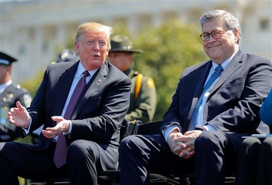
We are living through a phantasmagoric psychodrama generated by the dishonest national political press. This is the press whose Joe Scarborough of MSNBC did not show some of President Trump’s responses to his enemies because of “concern” for the president’s family, as he “seems to have lost his mind.”
This is a new frontier in American journalism, where a television news commentator who hates the president wishes to spare the president’s family a rerun of his entirely rational denunciations of his enemies.

The House of Representatives began considering impeachment because an anonymous Democrat and former political associate of Vice President Biden received a hearsay account of a conversation between President Trump and President Volodymyr Zelensky of Ukraine, in which Mr. Trump encouraged the newly elected leader to find out if Mr. Biden and his son had done anything inappropriate in Ukraine. The president quickly made the transcript of the conversation public.
Partisan Democrats and formerly sensible commentators have portrayed Mr. Trump’s request as a demand for incriminating evidence on Mr. Biden, failing which he would not resume U.S. aid to Ukraine. In other words, this was a solicitation for a benefit of value to Mr. Trump’s 2020 reelection campaign. The reference to a resumption of aid was 500 words earlier in the transcript, and not connected at all to the Biden question.
When Mr.Biden was mentioned, it was to request to know what happened — a neutral request for the facts. Yes, Mr. Trump said the appearance of the former vice president’s son $50,000-a-month sinecure as a director of a Ukrainian gas company, along with the elder Biden’s boast of having a Ukrainian prosecutor fired, was “horrible.” And so it was. But there may be uncontroversial explanations. If the Biden allegations are unfounded, Americans will want to know. If the facts are corrupt in themselves, Americans — and Democrats especially — will want to know that, too.
In reality, the whole episode is nonsense, a farce. House Speaker Nancy Pelosi won’t hold a vote on a formal impeachment inquiry because she couldn’t win the vote. If there were such an inquiry, where the Republicans called and examined witnesses and subpoenaed documents, it would collapse as quickly as the Russian collusion fraud did when former special counsel Robert Mueller stumbled through his congressional inquiry.
House Intelligence Committee Chairman Adam Schiff — who is usually lying when his lips aren’t moving and always is when they are — says we will not be hearing from a non-whistleblowing leaker, to give his hearsay evidence of a conversation that any person in the world can read and see has no legal implications whatever. But the investigation indomitably continues. It is like the last government of the German Third Reich, meeting in the week following the death of Hitler on the few thousand acres they still governed on the Danish border, discussing agriculture and immigration.
With no evidence of wrongdoing by the president, the Trump-hating press is now scrambling after Rudolph Giuliani, formerly one of the nation’s toughest prosecutors, as if they can pin something on him while he acted as the president’s private attorney. With Hunter Biden in hiding, this ludicrous mockery must end. Pompous commentators who don’t like Mr. Trump but have learned to live with their underestimation of him cannot go on indefinitely with wagging heads and furrowed foreheads, discussing the president’s “crisis.”
Fox News, which is generally well-disposed to the president, published a poll last week that 51% of Americans believe the president should be impeached and removed from office.
Fox’s polls aren’t very accurate, though their news coverage and comment are quite professional. But this one is bunk. Between 40% and 50% of Americans may wish there were a reason to remove Mr. Trump, or hope that he won’t be reelected. That figure is insufficient to change congressional votes on an impeachment resolution, given that about 45% of the country is militantly pro-Trump and probably 10 million others will hold their noses and vote for his substantive performance despite his stylistic foibles.
But a substantial part of the anti-Trump vote is a levitation, sustained by the unprecedented hostility and dishonesty of almost all the national political press, which has been confirmed in independent studies by Harvard University and the Pew Research Center and others.
Not all the hostile press is shrill. My rational and moderate friend of many years, Fareed Zakaria of CNN, wrote in the Santa Cruz Sentinel on October 11 that he now favors “an impeachment inquiry” because Mr.Trump’s “efforts to pressure the new Ukrainian government, including his phone call with President Volodymyr Zelensky, were profoundly wrong;” and because of Trump’s “far more troubling . . . refusal to cooperate with the impeachment inquiry.”
Implicit in this explanation is the retreat away from the Trump-Zelensky telephone call, which is effectively conceded not to be probative evidence of any impropriety. Instead, Democrats are returning to the justification that impeachment is warranted based upon unspecified, unimaginable, and surely nonexistent evidence of presidential misconduct. The pitiful squeak that is meant to be a clinching argument is Mr. Trump’s refusal to cooperate with an impeachment inquiry based on an illusion.
The Democrats are stuck with this clunker. Maybe Speaker Pelosi wanted to humiliate the young Marxist congresswomen and Mr. Schiff and the porcine Jerry Nadler, who chairs the House judiciary committee. Maybe she wanted to get this out of the way now before it caused the Democrats more embarrassment, and before the long-awaited indictments of a number of prominent members of the previous administration for its unconstitutional confection and promotion of the Trump-Russian collusion fraud.
It is not for me to read Mrs. Pelosi’s mind, but she must have had some reason to let this anemic, spavined cat out of the bag. But this cat can’t purr and has no whiskers, let alone claws. In Monty Pythonese, “It’s a dead Cat!” (and it won’t even bounce).
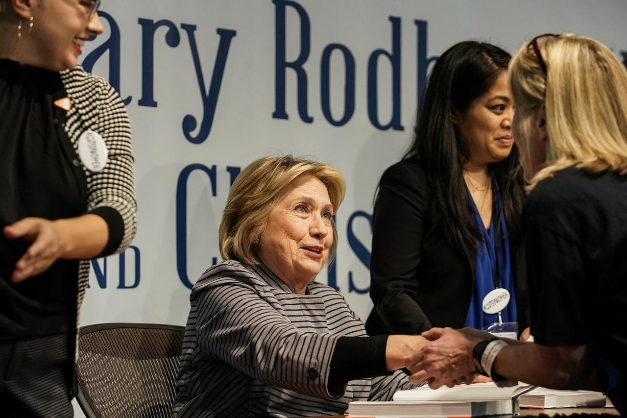
The Democrats’ presidential nomination candidates are a rag-tag of extremists, kooks, dolts, and bumbling geriatrics, (Hillary Clinton was back last week with her autocue squib that Mr. Trump’s “an illegitimate president”). But it is a national party because it has tens of millions of traditional supporters who are reasonable people. Their aversion to Trump enabled most of them to endure the bone-crushing defeat over the Russian fiction.
The allegation a few weeks ago of a 30-year-old act of sexual misconduct by Supreme Court Justice Brett Kavanaugh, which had most of the candidates screaming for his impeachment in the 24 hours before it was exposed as a completely unfounded charge, must have caused unease to many thoughtful Democrats.
But when this stinker implodes, after they have got the faithful to the edges of their chairs and exhumed John Dean and Carl Bernstein, the bloodless assassins of Richard Nixon, and the full gallery of their unctuous homelists and pietists who demean the occupation of commentator, sensible Democrats will disembark. The best way Democrats can serve their party now is to try to get a plausible semi-moderate like Senator Klobuchar of Minnesota, no world-beater but Walter Mondale in drag-she can lose with honor and dignity, and turn off the CNN-MSNBC-main network hate machine.
Mr. Trump can’t be removed from his office; he deserves and will gain reelection on his record; the Democrats will be back — both parties always are. But the sooner the country tunes out this dishonest, evil press putschism, the better for the whole country, especially the national political news outlets themselves.
Tyler Durden
Sat, 10/19/2019 – 16:00
via ZeroHedge News https://ift.tt/2MVvJkp Tyler Durden


