Submitted by John Hussman of Hussman Funds,
Investors who believe that history has lessons to teach should take our present concerns with significant weight, but should also recognize that tendencies that repeatedly prove reliable over complete market cycles are sometimes defied over portions of those cycles. Meanwhile, investors who are convinced that this time is different can ignore what follows. The primary reason not to listen to a word of it is that similar concerns, particularly since late-2011, have been followed by yet further market gains. If one places full weight on this recent period, and no weight on history, it follows that stocks can only advance forever.
What seems different this time, enough to revive the conclusion that “this time is different,” is faith in the Federal Reserve’s policy of quantitative easing. Though quantitative easing has no mechanistic relationship to stock prices except to make low-risk assets psychologically uncomfortable to hold, investors place far more certainty in the effectiveness of QE than can be demonstrated by either theory or evidence. The argument essentially reduces to a claim that QE makes stocks go up because “it just does.” We doubt that the perception that an easy Fed can hold stock prices up will be any more durable in the next couple of years than it was in the 2000-2002 decline or the 2007-2009 decline – both periods of persistent and aggressive Fed easing. But QE is novel, and like the internet bubble, novelty feeds imagination. Most of what investors believe about QE is imaginative.
As Ray Dalio of Bridgwater recently observed,
“The dilemma the Fed faces now is that the tools currently at its disposal are pretty much used up. We think the question around the effectiveness of QE (and not the tapering, which gets all the headlines) is the big deal. In other words, we’re not worried about whether the Fed is going to hit or release the gas pedal, we’re worried about whether there’s much gas left in the tank and what will happen if there isn’t.”
While we can make our case on the basis of fact, theory, data, history, and sometimes just basic arithmetic, what we can’t do – and haven’t done well – is to disabuse perceptions. Beliefs are what they are, and are only as malleable as the minds that hold them. Like the nearly religious belief in the technology bubble, the dot-com boom, the housing bubble, and countless other bubbles across history, people are going to believe what they believe here until reality catches up in the most unpleasant way. The resilience of the market late in a bubble is part of the reason investors keep holding and hoping all the way down. In this market cycle, as in all market cycles, few investors will be able to unload their holdings to the last of the greater fools just after the market’s peak. Instead, most investors will hold all the way down, because even the initial decline will provoke the question “how much lower could it go?” It has always been that way.
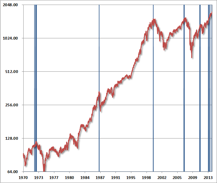
The problem with bubbles is that they force one to decide whether to look like an idiot before the peak, or an idiot after the peak. There’s no calling the top, and most of the signals that have been most historically useful for that purpose have been blaring red since late-2011.
As a result, the Shiller P/E (the S&P 500 divided by the 10-year average of inflation-adjusted earnings) is now above 25, a level that prior to the late-1990’s bubble was seen only in the three weeks prior to the 1929 peak. Meanwhile, the price/revenue ratio of the S&P 500 is now double its pre-bubble norm, as is the ratio of stock market capitalization to GDP. Indeed, the median price/revenue ratio of the S&P 500 is actually above the 2000 peak – largely because small cap stocks were much more reasonably priced in 2000 than they are today (not that those better relative valuations prevented wicked losses in small caps during the 2000-2002 decline).
Despite the unusually extended period of speculation as a result of faith in quantitative easing, I continue to believe that normal historical regularities will exert themselves with a vengeance over the completion of this market cycle. Importantly, the market has now re-established the most hostile overvalued, overbought, overbullish syndrome we identify. Outside of 2013, we’ve observed this syndrome at only 6 other points in history: August 1929 (followed by the 85% market decline of the Great Depression), November 1972 (followed by a market plunge in excess of 50%), August 1987 (followed by a market crash in excess of 30%), March 2000 (followed by a market plunge in excess of 50%), May 2007 (followed by a market plunge in excess of 50%), and January 2011 (followed by a market decline limited to just under 20% as a result of central bank intervention).
These concerns are easily ignored since we also observed them at lower levels this year, both in February (see A Reluctant Bear’s Guide to the Universe) and in May. Still, the fact is that this syndrome of overvalued, overbought, overbullish, rising-yield conditions has emerged near the most significant market peaks – and preceded the most severe market declines – in history:
1. S&P 500 Index overvalued, with the Shiller P/E (S&P 500 divided by the 10-year average of inflation-adjusted earnings) greater than 18. The present multiple is actually 25.
2. S&P 500 Index overbought, with the index more than 7% above its 52-week smoothing, at least 50% above its 4-year low, and within 3% of its upper Bollinger bands (2 standard deviations above the 20-period moving average) at daily, weekly, and monthly resolutions. Presently, the S&P 500 is either at or slightly through each of those bands.
3. Investor sentiment overbullish (Investors Intelligence), with the 2-week average of advisory bulls greater than 52% and bearishness below 28%. The most recent weekly figures were 55.2% vs. 15.6%. The sentiment figures we use for 1929 are imputed using the extent and volatility of prior market movements, which explains a significant amount of variation in investor sentiment over time.
4. Yields rising, with the 10-year Treasury yield higher than 6 months earlier.
The blue bars in the chart below depict the complete set of instances since 1970 when these conditions have been observed.
Our investment approach remains to align our investment outlook with the prospective market return/risk profile that we estimate on the basis of prevailing conditions at each point in time. On that basis, the outlook is hard-defensive, and any other stance is essentially speculative. Such speculation is fine with insignificant risk-limited positions (such as call options), but I strongly believe that investors with a horizon of less than 5-7 years should limit their
exposure to equities. At this horizon, even “buy-and-hold” strategies in stocks are inappropriate except for a small fraction of assets. In general, the appropriate rule for setting investment exposure for passive investors is to align the duration of the asset portfolio with the duration of expected liabilities. At a 2% dividend yield on the S&P 500, equities are effectively instruments with 50-year duration. That means that even stock holdings amounting to 10% of assets exhaust a 5-year duration. For most investors, a material exposure to equities requires a very long investment horizon and a wholly passive view about market prospects.
Again, our approach is to align our outlook with the prospective return/risk profile we estimate at each point in time. That places us in a defensive stance. Still, we’re quite aware of the tendency for investors to capitulate to seemingly relentless speculation at the very peak of bull markets, and saw it happen in 2000 and 2007 despite our arguments for caution.
As something of an inoculation against this tendency, the chart below presents what we estimate as the most “optimistic” pre-crash scenario for stocks. Though I don’t believe that markets follow math, it’s striking how closely market action in recent years has followed a “log-periodic bubble” as described by Didier Sornette (see Increasingly Immediate Impulses to Buy the Dip).
A log periodic pattern is essentially one where troughs occur at increasingly frequent and increasingly shallow intervals. As Sornette has demonstrated across numerous bubbles over history in a broad variety of asset classes, adjacent troughs (say T1, T2, T3, etc) are often related to the crash date (the “finite-time singularity” Tc) by a constant ratio: (Tc-T1)/(Tc-T2) = (Tc-T2)/(Tc-T3) and so forth, with the result that successive troughs come closer and closer in time until the final blowoff occurs.
Frankly, I thought that this pattern was nearly exhausted in April or May of this year. But here we are. What’s important here is that the only way to extend that finite-time singularity is for the advance to become even more vertical and for periodic fluctuations to become even more closely spaced. That’s exactly what has happened, and the fidelity to the log-periodic pattern is almost creepy. At this point, the only way to extend the singularity beyond the present date is to envision a nearly vertical pre-crash blowoff.
So let’s do that. Not because we should expect it, and surely not because we should rely on it, but because we should guard against it by envisioning the most “optimistic” (and equivalently, the worst case) scenario. So with the essential caveat that we should neither expect, rely or be shocked by a further blowoff, the following chart depicts the market action that would be consistent with a Sornette bubble with the latest “finite time singularity” that is consistent with market action since 2010.
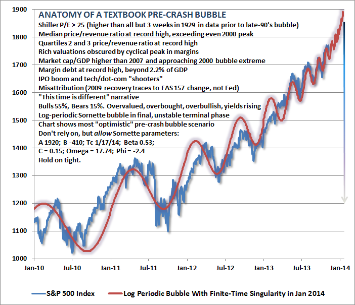
To be very clear: conditions already allow a finite-time singularity at present, the scenario depicted above is the most extreme case, it should not be expected or relied on, but we should also not be shocked or dismayed if it occurs.
Just a final note, which may or may not prove relevant in the weeks ahead: in August 2008, just before the market collapsed (see Nervous Bunny), I noted that increasing volatility of the market at 10-minute intervals was one of the more ominous features of market action. This sort of accelerating volatility at micro-intervals is closely related to log-periodicity, and occurs in a variety of contexts where there’s a “phase transition” from one state to another. Spin a quarter on the table and watch it closely. You’ll notice that between the point where it spins smoothly and the point it falls flat, it will start vibrating uncontrollably at increasingly rapid frequency. That’s a phase transition. Again, I don’t really believe that markets follow math to any great degree, but there are enough historical examples of log-periodic behavior and phase-transitions in market action that it helps to recognize these regularities when they emerge.
Risk dominates. Hold tight.


via Zero Hedge http://feedproxy.google.com/~r/zerohedge/feed/~3/B_0XVe8QLF0/story01.htm Tyler Durden


