Meet The Firm Whose $95 Billion In Assets Keeps Iran's Ayatollah In Power

Bloomberg may be in hot water for scuttling an article that “might anger China” as exposed over the weekend, but that was only after winning investigative prizes for its series of reports exposing the epic wealth of China top ruling families in 2012: a topic that has received prominence at a time when the forced wealth redistribution plans of developed and developing nations, usually originated by these same uber-wealthy families, is all the rage. Another country, whose oligarchic wealth had largely escaped press scrutiny, was Iran. At least until today, when in a six month investigation culminating in a three-part report on the assets of the Iranian Supreme Leader Ayatollah Ali Khamenei, Reuters exposed Setad, an Iranian company that manages and sells property on order from the Imam.

In a nutshell, the company has built up its wealth by seizing thousands of properties from Iranian citizens. According to the investigation, Setad’s assets are worth $95 billion – 40 percent more than Iran’s total 2012 oil exports. It is this confiscated “wealth” that has allowed the Iranian clergy, and especially the Ayatollah, to preserve their power over the years.

In a little more than a nutshell, Reuters explains just who Setad is:

Pari Vahdat-e-Hagh ultimately lost her property. It was taken by an organization that is controlled by the most powerful man in Iran: Supreme Leader Ayatollah Ali Khamenei. She now lives alone in a cramped, three-room apartment in Europe, thousands of miles from Tehran.


The Persian name of the organization that hounded her for years is “Setad Ejraiye Farmane Hazrate Emam” – Headquarters for Executing the Order of the Imam. The name refers to an edict signed by the Islamic Republic’s first leader, Ayatollah Ruhollah Khomeini, shortly before his death in 1989. His order spawned a new entity to manage and sell properties abandoned in the chaotic years after the 1979 Islamic Revolution.


Setad has become one of the most powerful organizations in Iran, though many Iranians, and the wider world, know very little about it. In the past six years, it has morphed into a business juggernaut that now holds stakes in nearly every sector of Iranian industry, including finance, oil, telecommunications, the production of birth-control pills and even ostrich farming.


The organization’s total worth is difficult to pinpoint because of the secrecy of its accounts. But Setad’s holdings of real estate, corporate stakes and other assets total about $95 billion, Reuters has calculated. That estimate is based on an analysis of statements by Setad officials, data from the Tehran Stock Exchange and company websites, and information from the U.S. Treasury Department.


Just one person controls that economic empire – Khamenei. As Iran’s top cleric, he has the final say on all governmental matters. His purview includes his nation’s controversial nuclear program, which was the subject of intense negotiations between Iranian and international diplomats in Geneva that ended Sunday without an agreement. It is Khamenei who will set Iran’s course in the nuclear talks and other recent efforts by the new president, Hassan Rouhani, to improve relations with Washington.

Unlike developed nations, where the first priority of the super rich is to flaunt their wealth, Iran’s supreme leader lives a spartan lifestyle and has not been found to abuse the massive monetary holdings of Setad. However, as Reuters points out, “Setad has empowered him. Through Setad, Khamenei has at his disposal financial resources whose value rivals the holdings of the shah, the Western-backed monarch who was overthrown in 1979.

Logically, the next question is just how did Setad accumulate its vast asset holdings. The answer, just as logically, is simple: confiscation.

How Setad came into those assets also mirrors how the deposed monarchy obtained much of its fortune – by confiscating real estate. A six-month Reuters investigation has found that Setad built its empire on the systematic seizure of thousands of properties belonging to ordinary Iranians: members of religious minorities like Vahdat-e-Hagh, who is Baha’i, as well as Shi’ite Muslims, business people and Iranians living abroad.


Setad has amassed a giant portfolio of real estate by claiming in Iranian courts, sometimes falsely, that the properties are abandoned. The organization now holds a court-ordered monopoly on taking property in the name of the supreme leader, and regularly sells the seized properties at auction or seeks to extract payments from the original owners.

Just like in the US where the 1% effectively have molded the status quo into a wealth preservation mechanism, with profound control over not only the capital markets and the regulatory framework but over all three branches of government (simply note how many bankers have gone to prison for the systemic crash of 2008), so in Iran the Ayatollah has shaped society in a way that will ultimately benefit first and foremost him, as well as not only preserve his wealth but facilitate even greater accumulation of confiscated assets under any and all pretexts.

The supreme leader also oversaw the creation of a body of legal rulings and executive orders that enabled and safeguarded Setad’s asset acquisitions. “No supervisory organization can question its property,” said Naghi Mahmoudi, an Iranian lawyer who left Iran in 2010 and now lives in Germany.


Khamenei’s grip on Iran’s politics and its military forces has been apparent for years. The investigation into Setad shows that there is a third dimension to his power: economic might. The revenue stream generated by Setad helps explain why Khamenei has not only held on for 24 years but also in some ways has more control than even his revered predecessor. Setad gives him the financial means to operate independently of parliament and the national budget, insulating him from Iran’s messy factional infighting.

Like every usurpation of power and wealth, Setad’s beginnings were humble and, to an extent, noble.

When Khomeini, the first supreme leader, set in motion the creation of Setad, it was only supposed to manage and sell properties “without owners” and direct much of the proceeds to charity. Setad was to use the funds to assist war veterans, war widows “and the downtrodden.” According to one of its co-founders, Setad was to operate for no more than two years.


Setad has built schools, roads and health clinics, and provided electricity and water in rural and impoverished areas. It has assisted entrepreneurs in development projects. But philanthropy is just a small part of Setad’s overall operations.

One can probably imagine that the founders of the Fed also had noble intentions. Instead they created a dormant century-old monster, intervening in the economy to preserve the wealth of the American financial oligarchy, and whose wealth-transfer capaci
ty has only emerged on the scene in the past five years. So it is not surprising that as absolute power corrupts absolutely, so it is in Iran as it is in the US:

Under Khamenei’s control, Setad began acquiring property for itself, and kept much of the funds rather than simply redistributing them. With those revenues, the organization also helps to fund the ultimate seat of power in Iran, the Beite Rahbar, or Leader’s House, according to a former Setad employee and other people familiar with the matter. The first supreme leader, Khomeini, had a small staff. To run the country today, Khamenei employs about 500 people in his administrative offices, many recruited from the military and security services.

The full Reuters article, the first of three, has much more detail on the asset holdings of the Setad, on its expropriation strategies, on the cover up to hide the full extent of the organization’s involvement in society, and much more, however the broad strokes will be largely familiar to those acquainted with the tactics of any and every oligarch – be they clergical, political or financial – when preservation of power through wealth and money (and confiscation thereof) is the only prerogative.

And while Iran’s wealth confiscation scheme may be extreme by Western standards, at least it is a honest daylight robbery, but what’s worse is that it pales in comparison to what goes on every month not in some enclave of despotic banana republicanism, but the US itself.

Because putting Setad’s $95 billion in estimated assets in context, these amount to just over 5 weeks of the Fed’s QE, which for those who are not worried about losing their “access journalistic” credentials and are willing to call a spade a spade, is merely asset confiscation and wealth transfer of the most insidious type: one where those whose assets are handed over to the wealthy, are oblivious of what has just happened and are in fact grateful for the privilege of having been robbed under the auspices of the “fairness doctrine” and for the pursuit of the “greater good.”


via Zero Hedge http://feedproxy.google.com/~r/zerohedge/feed/~3/QpPiA1YSNlA/story01.htm Tyler Durden

Meet The Firm Whose $95 Billion In Assets Keeps Iran’s Ayatollah In Power

Bloomberg may be in hot water for scuttling an article that “might anger China” as exposed over the weekend, but that was only after winning investigative prizes for its series of reports exposing the epic wealth of China top ruling families in 2012: a topic that has received prominence at a time when the forced wealth redistribution plans of developed and developing nations, usually originated by these same uber-wealthy families, is all the rage. Another country, whose oligarchic wealth had largely escaped press scrutiny, was Iran. At least until today, when in a six month investigation culminating in a three-part report on the assets of the Iranian Supreme Leader Ayatollah Ali Khamenei, Reuters exposed Setad, an Iranian company that manages and sells property on order from the Imam.

In a nutshell, the company has built up its wealth by seizing thousands of properties from Iranian citizens. According to the investigation, Setad’s assets are worth $95 billion – 40 percent more than Iran’s total 2012 oil exports. It is this confiscated “wealth” that has allowed the Iranian clergy, and especially the Ayatollah, to preserve their power over the years.

In a little more than a nutshell, Reuters explains just who Setad is:

Pari Vahdat-e-Hagh ultimately lost her property. It was taken by an organization that is controlled by the most powerful man in Iran: Supreme Leader Ayatollah Ali Khamenei. She now lives alone in a cramped, three-room apartment in Europe, thousands of miles from Tehran.


The Persian name of the organization that hounded her for years is “Setad Ejraiye Farmane Hazrate Emam” – Headquarters for Executing the Order of the Imam. The name refers to an edict signed by the Islamic Republic’s first leader, Ayatollah Ruhollah Khomeini, shortly before his death in 1989. His order spawned a new entity to manage and sell properties abandoned in the chaotic years after the 1979 Islamic Revolution.


Setad has become one of the most powerful organizations in Iran, though many Iranians, and the wider world, know very little about it. In the past six years, it has morphed into a business juggernaut that now holds stakes in nearly every sector of Iranian industry, including finance, oil, telecommunications, the production of birth-control pills and even ostrich farming.


The organization’s total worth is difficult to pinpoint because of the secrecy of its accounts. But Setad’s holdings of real estate, corporate stakes and other assets total about $95 billion, Reuters has calculated. That estimate is based on an analysis of statements by Setad officials, data from the Tehran Stock Exchange and company websites, and information from the U.S. Treasury Department.


Just one person controls that economic empire – Khamenei. As Iran’s top cleric, he has the final say on all governmental matters. His purview includes his nation’s controversial nuclear program, which was the subject of intense negotiations between Iranian and international diplomats in Geneva that ended Sunday without an agreement. It is Khamenei who will set Iran’s course in the nuclear talks and other recent efforts by the new president, Hassan Rouhani, to improve relations with Washington.

Unlike developed nations, where the first priority of the super rich is to flaunt their wealth, Iran’s supreme leader lives a spartan lifestyle and has not been found to abuse the massive monetary holdings of Setad. However, as Reuters points out, “Setad has empowered him. Through Setad, Khamenei has at his disposal financial resources whose value rivals the holdings of the shah, the Western-backed monarch who was overthrown in 1979.

Logically, the next question is just how did Setad accumulate its vast asset holdings. The answer, just as logically, is simple: confiscation.

How Setad came into those assets also mirrors how the deposed monarchy obtained much of its fortune – by confiscating real estate. A six-month Reuters investigation has found that Setad built its empire on the systematic seizure of thousands of properties belonging to ordinary Iranians: members of religious minorities like Vahdat-e-Hagh, who is Baha’i, as well as Shi’ite Muslims, business people and Iranians living abroad.


Setad has amassed a giant portfolio of real estate by claiming in Iranian courts, sometimes falsely, that the properties are abandoned. The organization now holds a court-ordered monopoly on taking property in the name of the supreme leader, and regularly sells the seized properties at auction or seeks to extract payments from the original owners.

Just like in the US where the 1% effectively have molded the status quo into a wealth preservation mechanism, with profound control over not only the capital markets and the regulatory framework but over all three branches of government (simply note how many bankers have gone to prison for the systemic crash of 2008), so in Iran the Ayatollah has shaped society in a way that will ultimately benefit first and foremost him, as well as not only preserve his wealth but facilitate even greater accumulation of confiscated assets under any and all pretexts.

The supreme leader also oversaw the creation of a body of legal rulings and executive orders that enabled and safeguarded Setad’s asset acquisitions. “No supervisory organization can question its property,” said Naghi Mahmoudi, an Iranian lawyer who left Iran in 2010 and now lives in Germany.


Khamenei’s grip on Iran’s politics and its military forces has been apparent for years. The investigation into Setad shows that there is a third dimension to his power: economic might. The revenue stream generated by Setad helps explain why Khamenei has not only held on for 24 years but also in some ways has more control than even his revered predecessor. Setad gives him the financial means to operate independently of parliament and the national budget, insulating him from Iran’s messy factional infighting.

Like every usurpation of power and wealth, Setad’s beginnings were humble and, to an extent, noble.

When Khomeini, the first supreme leader, set in motion the creation of Setad, it was only supposed to manage and sell properties “without owners” and direct much of the proceeds to charity. Setad was to use the funds to assist war veterans, war widows “and the downtrodden.” According to one of its co-founders, Setad was to operate for no more than two years.


Setad has built schools, roads and health clinics, and provided electricity and water in rural and impoverished areas. It has assisted entrepreneurs in development projects. But philanthropy is just a small part of Setad’s overall operations.

One can probably imagine that the founders of the Fed also had noble intentions. Instead they created a dormant century-old monster, intervening in the economy to preserve the wealth of the American financial oligarchy, and whose wealth-transfer capacity has only emerged on the scene in the past five years. So it is not surprising that as absolute power corrupts absolutely, so it is in Iran as it is in the US:

Under Khamenei’s control, Setad began acquiring property for itself, and kept much of the funds rather than simply redistributing them. With those revenues, the organization also helps to fund the ultimate seat of power in Iran, the Beite Rahbar, or Leader’s House, according to a former Setad employee and other people familiar with the matter. The first supreme leader, Khomeini, had a small staff. To run the country today, Khamenei employs about 500 people in his administrative offices, many recruited from the military and security services.

The full Reuters article, the first of three, has much more detail on the asset holdings of the Setad, on its expropriation strategies, on the cover up to hide the full extent of the organization’s involvement in society, and much more, however the broad strokes will be largely familiar to those acquainted with the tactics of any and every oligarch – be they clergical, political or financial – when preservation of power through wealth and money (and confiscation thereof) is the only prerogative.

And while Iran’s wealth confiscation scheme may be extreme by Western standards, at least it is a honest daylight robbery, but what’s worse is that it pales in comparison to what goes on every month not in some enclave of despotic banana republicanism, but the US itself.

Because putting Setad’s $95 billion in estimated assets in context, these amount to just over 5 weeks of the Fed’s QE, which for those who are not worried about losing their “access journalistic” credentials and are willing to call a spade a spade, is merely asset confiscation and wealth transfer of the most insidious type: one where those whose assets are handed over to the wealthy, are oblivious of what has just happened and are in fact grateful for the privilege of having been robbed under the auspices of the “fairness doctrine” and for the pursuit of the “greater good.”


via Zero Hedge http://feedproxy.google.com/~r/zerohedge/feed/~3/QpPiA1YSNlA/story01.htm Tyler Durden

Marc Faber Is Back: "It Will End Badly… We're In A Worse Position Than 2008"

"It will end badly," Marc Faber explains in this brief CNBC clip, "the question is whether we will have a minor economic crisis and then huge money printing or get into an inflationary spiral first." If you thought that "we had a credit crisis in 2008 because we had too much credit in the economy," then Faber notes "there is that much more credit as a percent of the economy now." Of course, as Bill Fleckenstein recently noted, as long as stocks are rising, investors remain blinded by the exuberance, but as Faber concludes, "we are in a worse position than we were back then," and inflation is already here…


On China's explosive credit growth:

"Look at China, its credit as a percent of the economy has increased by 50 percent in the last 4-1/2 years. This is the fastest credit growth you can imagine in the whole of Asia,"

On the inevitable endgame:

"It will end badly and the question is whether we will have a minor economic crisis and then huge money printing or get into an inflationary spiral first,"

On the hidden inflation impacts around the world:

"Why are so many product prices in Singapore and Hong Kong more expensive than in the U.S.? It's because when you have asset inflation and high property prices, shops have to pay higher rents, so they charge more for their products. So asset inflation can flow into consumer inflation,"


via Zero Hedge http://feedproxy.google.com/~r/zerohedge/feed/~3/_2BUFSrV2O8/story01.htm Tyler Durden

Marc Faber Is Back: “It Will End Badly… We’re In A Worse Position Than 2008”

"It will end badly," Marc Faber explains in this brief CNBC clip, "the question is whether we will have a minor economic crisis and then huge money printing or get into an inflationary spiral first." If you thought that "we had a credit crisis in 2008 because we had too much credit in the economy," then Faber notes "there is that much more credit as a percent of the economy now." Of course, as Bill Fleckenstein recently noted, as long as stocks are rising, investors remain blinded by the exuberance, but as Faber concludes, "we are in a worse position than we were back then," and inflation is already here…


On China's explosive credit growth:

"Look at China, its credit as a percent of the economy has increased by 50 percent in the last 4-1/2 years. This is the fastest credit growth you can imagine in the whole of Asia,"

On the inevitable endgame:

"It will end badly and the question is whether we will have a minor economic crisis and then huge money printing or get into an inflationary spiral first,"

On the hidden inflation impacts around the world:

"Why are so many product prices in Singapore and Hong Kong more expensive than in the U.S.? It's because when you have asset inflation and high property prices, shops have to pay higher rents, so they charge more for their products. So asset inflation can flow into consumer inflation,"


via Zero Hedge http://feedproxy.google.com/~r/zerohedge/feed/~3/_2BUFSrV2O8/story01.htm Tyler Durden

Guest Post: The Market In Pictures

Submitted by Lance Roberts of STA Wealth Management,

I recently posted a piece entitled "The Economy In Pictures" wherein I shared a series of economic charts using annualized trend analysis.  The purpose of the post was not to espouse a personal viewpoint on the health of the economy, or lack thereof, but to allow you to view the data and draw your own conclusions.  As I stated:

"With the economy now more than 4 years into an expansion, which is long by historical standards, the question for you to answer by looking at the charts below is:

'Are we closer to an economic recession or a continued expansion?'


How you answer that question should have a significant impact on your investment outlook as financial markets tend to lose roughly 30% on average during recessionary periods.  However, with margin debt at record levels, earnings deteriorating and junk bond yields near all-time lows, this is hardly a normal market environment within which we are currently invested.


Therefore, I present a series of charts which view the overall economy from the same perspective utilizing an annualized rate of change.   In some cases, where the data is extremely volatile, I have used a 3-month average to expose the underlying data trend.   Any other special data adjustments are noted below."

This week I bring you "The Market In Pictures"

There is currently a debate being waged on Wall Street.  On one side of the argument are individuals who believe that we have entered into the next "secular bull market"  and that the markets have only just begun what is an expected multi-year advance from current levels.  The other side of the argument reiterates that the current market advance is predicated on artificial stimulus and that the "secular bear market" remains intact, and the next major reversion is just a function of time. 

The series of charts below is designed to allow you to draw your own conclusions.  I have only included commentary where necessary to clarify chart construction or analysis.

*****

Valuation Measures

The following chart shows Tobin's "Q" ratio and Robert Shillers "Cyclically Adjusted P/E (CAPE)" ratio versus the S&P 500. James Tobin of Yale University, Nobel laureate in economics, hypothesized that the combined market value of all the companies on the stock market should be about equal to their replacement costs. The Q ratio is calculated as the market value of a company divided by the replacement value of the firm's assets.  Dr. Robert Shiller, also a Nobel Prize winning Yale professor, created CAPE to smooth earnings variations and volatility over time.  CAPE is calculated by taking the S&P 500 and dividing it by the average of ten years worth of earnings.  If the ratio is above the long-term average of around 16x, the stock market is considered expensive. Currently, the CAPE is at 24.42x, and the Q-ratio is at 1.00.

Tobins-Q-Shiller-PE-111113

My friend Doug Short regularly publishes Ed Easterling's valuation work.  Ed Easterling, Crestmont Research, has done extensive studies on valuation and resulting long term returns.

Crestmont-PE-11113

 The next two charts are variants on Robert Shiller's CAPE.  The first is just a pure analysis of CAPE as compared to the S&P 500.

PE-vs-Market-11113

The next chart shows the deviation of valuations from their long term average.

PE-Deviation-111113

Are stocks truly reflecting the economy?

S&P-500-GDP-111113

One of Warren Buffet's favorite valuation measures is Market Cap to GDP.  I have modified this analysis utilizing real, inflation adjusted, S&P 500 market capitalization as compared to real GDP.

S&P-500-MarketCap-GDP-111113

Since the stock market should be a reflection of the underlying economy, then the amount of leverage, or margin debt, in the market as a percentage of GDP could provide an important clue.

Margin-Debt-AsPct-GDP-111113

Deviation Measures

The following charts are measures of deviation from underlying trends or averages.  The greater the deviation from the long term trends or averages; the probability of a reversion back to, or beyond, those trends or averages increases.  The first chart is the deviation of earnings from the underlying long term growth trend of earnings.

S&P-500-Earnings-Deviation-111113

The next chart is the deviation in price of both the S&P 500 and Wilshire 5000 from the 36-Month moving average.  For more discussion on this chart read this.

S&P-500-Wilshire-Dev-36M-111113

The chart below is the same basic analysis but utilizing a 50-week moving average which is a more "real-time" variation.

S&P-500-Deviation-50WMA-111113

The volatility index (VIX) is representative of investors "fear" of a correction in the market.   Low levels represent investor complacency and no fear of a market correction.

S&P-500-Vix-111113

Just For Good Measure

This past week John Hussman tweeted this chart of the S&P 500 that lists all of the warnings signs of a crash that we are experiencing now.  

Hussman-SP500-Crash

"Anatomy of textbook pre-crash bubble. Don't rely on further blowoff, but don't be shocked. Risk dominates. Hold tight."

This analysis, along with the economic data I posted recently, tells us much about where we are within the current economic and market cycle.  While it is certainly easy to be swept up in the daily advances of the stock market casino, it is important to remember that eventually the "house always wins."  What has always separated successful professional gamblers from the weekend sucker is strictly the difference of knowing when to cash in your chips and step away from the table.


via Zero Hedge http://feedproxy.google.com/~r/zerohedge/feed/~3/vx6V271x7x0/story01.htm Tyler Durden

Obamacare Website Enrollment 90% Below Government Expectations

The administration had estimated that nearly 500,000 people would enroll in October, according to internal memos cited last week by Rep. Dave Camp (R., Mich.); but as WSJ reports, initial reports suggest that fewer than 50,000 people successfully navigated the troubled federal health-care website to enroll in private health insurance plans as of last week. The figures represent an improvement from the website’s first days. On Oct. 1, when it opened, only six people signed up for coverage, according to internal administration memos but remains 90% below expectations with only 4 months until seven million are expected to have signed up for private coverage when the open-enrollment period is set to end.


And on a quiet news day… (h/t @bondskew)


Via WSJ,

Initial reports suggest that fewer than 50,000 people successfully navigated the troubled federal health-care website to enroll in private health insurance plans as of last week, two people familiar with the matter said Monday.


The early tally falls far short of internal goals set by President Barack Obama’s administration in the months leading up to the opening of the HealthCare.gov site Oct. 1, and the low number has worried health insurers that are counting on higher turnout.


The administration had estimated that nearly 500,000 people would enroll in October, according to internal memos cited last week by Rep. Dave Camp (R., Mich.). An estimated seven million were expected to gain private coverage by the end of March, when the open-enrollment period is set to end.


Health and Human Services spokeswoman Erin Shields Britt said Monday she couldn’t confirm the enrollment numbers. She added, “We have always anticipated that initial enrollment numbers would be low and increase over time.”


In some cases, insurers have reported duplicated 834s and other data-integrity problems,


The initial federal numbers set for release this week are expected to show enrollment only through the end of October, so the figures are expected to be lower


Supporters of the law say they expect the largest share of enrollees to arrive late this year. When Massachusetts rolled out a similar statewide health overhaul in 2007, only 123 people signed up in the first month. That figure has been cited by Obama administration officials who have taken pains to play down expectations for the early enrollment numbers


Mr. Ulrich, who runs his own financial-planning firm, said he wanted to sign up by Dec. 15 but is hesitating because he also wants to review small-business plans. That part of the site isn’t yet working.


“I’ve got a month to make a decision, and I don’t even have the information available to me,” Mr. Ulrich said.


The tight timeline has health insurers worried.


The administration hasn’t said whether it will release demographic data such as ages when it announces the number of enrollees.


via Zero Hedge http://feedproxy.google.com/~r/zerohedge/feed/~3/YbW7QonL9Cw/story01.htm Tyler Durden

Next From The ECB: Here Comes QE, According To BNP

The latest myth of a European recovery came crashing down two weeks ago when Eurostat reported an inflation print of 0.7% (putting Europe’s official inflation below that of Japan’s 1.1%), followed promptly by a surprise rate cut by Mario Draghi which achieves nothing but sends a message that the ECB is, impotently, watching the collapse in European inflation and loan creation coupled by an ongoing rise in unemployment to record levels (not to mention the record prints in the amount of peripheral bad debt).

Needless to say, all of this is largely aggravated by the soaring EURUSD, which until a week ago was trading at a two year high against the dollar, and while helpful for Germany, makes the so-needed external rebelancing of the peripheral Eurozone countries next to impossible. Which means that like it or not, and certainly as long as hawkish Germany says “nein”, Draghi is stuck in a corner when it comes to truly decisive inflation-boosting actions.

But what is Draghi to do? Well, according to BNP’s Paul-Mortimer Lee, it should join the “no holds barred” monetary “policy” of the Fed and the BOJ, and promptly resume a €50 billion per month QE.

Why? Some preliminary perspectives from BNP:

Some economies in the eurozone are already in deflation. This has adverse effects on resource allocation (nominal rigidities in some prices mean that relative prices do not adjust enough) and, of course, sets in train adverse debt dynamics. It deters spending today, because things will be cheaper tomorrow. When significantly negative real interest rates are warranted, zero or negative inflation makes these impossible to achieve. Countries that are undergoing structural reform need lower real interest rates than they would otherwise have. Extremely low or negative inflation, therefore, militates against structural reform.


One fact sums up the parlous state of affairs: the eurozone has lower inflation than Japan (0.7% versus 1.1%).


At such low levels of inflation, deflation is a real danger. How big a threat is it? The inflation forecasting literature says that since the Great Moderation, the best way to forecast inflation over longer periods is a random walk. (Over short periods, judgemental forecasts, (eg, taking account of energy prices, tax increases etc) are preferable.) A random walk model says that decreases in inflation are as likely as increases. If we start from 0.7% inflation, the central forecast of a random walk model will be that inflation stays around its current level, ie, that deflation is less than 50% likely. Our own forecasts agree with this but also – like the ECB judges – indicate that inflation will remain at very low levels for a very long period.

Why has inflation in Europe proper not become outright deflation across the continent, especially when considering the record low rate of growth (in reality, contraction) of loans to private sector companies? The only silver lining are “inflation expectations” which are still anchored somewhere aroun the 2% area. However, that may not last.

If inflation expectations break down, then as rates are close to the zero bound, getting them back up again could be extremely difficult. In fact, it may be impossible. Don’t wait until you are drowning to think about looking for a lifejacket. That is one of the lessons of Japan, waiting until too late can leave you locked into an insoluble problem.


Why then did the hawkish members not want a rate cut? It is difficult to be sure but we suspect it is a combination of strategic and tactical considerations (our comments in parentheses):

  • Inflation expectations are stable; therefore there will be a gravitational pull upward in inflation over time. The ECB’s credibility will do the job. (Only if expectations hold up, which is questionable if inflation stays around 1% or below for a prolonged period, which seems likely even on an optimistic assessment.)
  • Core inflation is very stable in Germany, which shows that the lows for inflation elsewhere are cyclical not structural and as growth picks up inflation will come back to target. (Our perspective: There is no sign the output gap will close any time soon. The level of the output gap is likely to put downward pressure on inflation.)
  • The disinflation in the eurozone as a whole primarily reflects relative price changes of peripheral countries. As they regain competitiveness, their inflation will converge again on the German level. (We would argue this can take a very long time – how many years will it take to get Spanish unemployment back to pre-crisis levels? Also, if the gravitational pull of German inflation was so strong, how did the periphery lose competitiveness in the first place?)
  • The severity of the fall in inflation is overstated by developments in energy prices. (There is truth in this, but they were not singing from the same hymn-sheet when energy prices were rising.)
  • The rate cut will not do anything. (We agree.)
  • The sooner the rate cut ammunition is used up the closer we come to QE. (We agree, but see this as entirely beneficial.)
  • We might get lucky and inflation will just pick up. (Much less than a 50% chance in our view.)

What all this amounts to is that the hawks will continue to resist easing until either inflation expectations crack, by which time it will be too late to recover, or until German inflation sinks to the levels other countries are experiencing today. With full employment in Germany and a minimum wage on the horizon for 2015, that looks likely only in a very severe recession. In either case, what this boils down to is that the hawks will only support radical easing in a disaster scenario, by which time it will probably be too late and deflation will be entrenched. Presumably the ECB’s minutes will be published in Japanese.

Needless to say, all of the above is only correct and valid in the confines of a Keynesian macroeconomic framework where deflation is a bete noire and must be avoided at all costs, and instead the taxation on money also known as inflation is the only saving grace. We will refrain from the well-known philosophical refrain that the only reason the world is in its current inescapable predicament is due to a faulty economic framework which has advocated precisely more of the same for about a century and continue within the false dichotomy laid out as gospel.

So assuming the ECB does have to stimulate inflation what can it do? It is here that the BNP strategist gets excited:

Does the ECB have enough conventional ammunition left to narrow the output gap by enough to get inflation from less than 1% to close to 2%? No way. According to conventional models, it will struggle to stop inflation from decelerating further.


Where should rates be? Let’s consider the Taylor rule. It’s by no means infallible as a guide to where monetary policy setting should be, but it provides some sort of benchmark. First, let’s ask where real policy rates should be in equilibrium. We estimate trend growth to be about 1%, so that is a reasonable starting point, which would suggest a nominal equilibrium rate of 1.7% given current inflation.


But we are not in equilibrium. From 1.7% we have to subtract 0.5 times the output gap. We do not know how large this is, but let’s take the OECD figur
e of 4%, taking our Taylor rule rate down to -0.3%. However, we haven’t finished yet because inflation is below target. To stabilise inflation, deviations of inflation from target have to be met by a larger reduction in nominal rates otherwise the real rate would not fall and the economy would not stabilise and  bring inflation back up. The Taylor rule says subtract 1.5 times the inflation shortfall, which is 1% if we assume “below but close to 2%” means 1.7%, so we subtract another 1.5% points, giving us a Taylor rule appropriate rate of -1.8%.


Since this is in negative territory, only a deposit rate cut can deliver it. However, we doubt that the ECB would take the deposit rate so far into negative territory for fear of a variety of distortions and adverse effects that would result (see link here to my note on negative deposit rates earlier this year). Failing this, unorthodox monetary policies are called for, such as expanding the balance sheet.


As an aside, the Taylor rule may cast light on why the hawks do not want rate cuts. The Breugel think-tank (http://www.bruegel.org/nc/blog/detail/article/1151-15-percent-to-plus-4-… rule-interest-rates-for-euro-area-countries) recently calculated that the appropriate Taylor rule rate (based on an unemployment gap, that gives an appropriate rate higher than our estimates) in the eurozone varies between -15% (Greece) and +4% (Germany).  Unfortunately it would appear some ECB Board members are not voting in the interests of the eurozone as a whole. Of course, too low a rate is a problem for Germany, for asset prices and perhaps inflation. But macro-prudential measures should be used to offset adverse effects rather than forcing others to have massively too-high rates.

Which means, according to BNP, that the only realistic deus ex machina (ignoring that the Fed has so far failed to stimulate broad CPI-defined inflation for five years running) would be, you guessed it, QE. A lot of it.

How many government bonds would the ECB need to buy to achieve its past batting average? M3 is almost EUR 10trn, meaning that 1% of M3 is EUR 100bn. Credit to general government is almost EUR 3½trn and is up just 0.7% y/y. Taking M3 up from its September y/y rate of 2.1% to the old reference rate of 4½% would require about EUR 240bn of QE in 2014. Taking M3 to its average growth rate of 5.8% would require EUR 370bn. But there is also the cumulative shortfall relative to trend to make up – some EUR 1.2trn. We would not advocate closing all this in one year, but taking this into account, we would suggest EUR 50bn a month for purchases over the first year or two.

We see the attractions of QE as being:

  • Increasing the rate of monetary growth to reduce disinflationary pressures;
  • Reducing long-term rates and stimulating growth;
  • Being likely to reduce risk premia in the economy;
  • Being likely to boost asset prices, such as stocks and credit (namely, Japan);
  • Being likely to soften the EUR on the FX markets;
  • Being likely to stabilise inflationary expectations, which might otherwise sink;
  • Demonstrating the ECB’s commitment to price stability and to stick to its Treaty obligations; and
  • Reducing the quantity of government bonds on banks’ balance sheets while increasing their liabilities (deposits due to higher M3) would stimulate private credit by reducing crowding out.

Of course, there are downsides, too:

  • There would probably be legal challenges on the basis that the ECB was embarking on monetary financing of governments (though buying in the secondary market would circumvent this);
  • In some countries, such as Germany, there might be an atavistic adverse reaction;
  • The programme would not be self-extinguishing in the same way as LTROs were (a good thing, in our view);
  • Inflation expectations may rise (again, a good thing, but challenged somewhat by the experience of the US and Japan, where QE has hardly resulted in rampant inflation);
  • It could reduce the incentive for governments to carry on with fiscal consolidation because financing would be easier; and
  • Asset bubbles might result from it.
  • What assets would be bought?

The last question is one we believe will exercise the ECB a good deal. There is a question as to whether private debt markets would be deep and uniform enough across the eurozone to allow the scale of purchases required. When the ECB bought covered bonds, its programmes were limited in scope. (The first scheme in 2009-10 resulted in total purchases of EUR 60bn, equivalent to around 0.7% of annual eurozone GDP. The second programme in 2011-12 was smaller still, resulting in total purchases of EUR 16bn versus the initial target of EUR 40bn.)

Buying government bonds is the obvious route. However, buying only peripheral bonds would not seem to be an option. (It would, effectively, be the OMT, but without a programme and without conditionality.) So, buying across the spectrum of government bonds seems natural (with the proportions determined by the ECB’s capital key).


There would probably be objections to buying German Bunds, as:

  • Rates are already low;
  • Germany, and German business, has no problem financing itself; and
  • Financial and monetary conditions in Germany are already easy; why make them easier still?

We would respond that QE in a European context would work in a different way to the US:

  • In the US, lowering the risk-free rate lowers rates for private borrowers also;
  • Private bond finance (mortgages as well as corporate debt issuance) is stimulated and this benefits the economy;
  • In Europe, the private bond market is less developed and firms largely finance through banks;
  • Similarly, mortgage finance in the eurozone comes much more from banks than from mortgage bonds ;
  • Therefore, QE in Europe would not work in the same way as in the US;
  • Much more of the effect of ECB QE would come through the exchange rate;
  • It is those assets held by foreigners that the ECB should target in its purchases, encouraging a very low rate that makes the assets unattractive to current foreign holders; and
  • So, Bunds and OATs and the bonds of the other core countries are precisely the assets the ECB should buy.

Over 60% of German Bunds are held by non-residents; the proportion of foreign holdings of OATs is also high. Therefore, buying these assets would not only benefit the economies of the issuer of the securities, but also the countries of the holders. The benchmark status of the Bund would lower all yields in the eurozone and need not bring about spread widening – substitution and a search for yield would be likely to narrow spreads.

Telling a Weimar-PTSD’ed Germany that the ECB is coming and will almost exclusively monetize just Germany’s bonds? Good luck.

In conclusion:

We would expect the ECB to exhaust other channels before resorting to QE – cutting the refi rate below 25bp, and maybe opting for a negative deposit rate to try to get the exchange rate down. It may engage in forward guidance more actively. However, the power of such measures looks limited. If we have further downward surprises to inflat
ion, as we had this month, there will be very little alternative, if the ECB is not to accept a magnified risk of deflation, other than to go for QE. Inflation data and inflation expectations will be crucial in determining what the ECB does over the coming months.


It is very unlikely that the hawks will agree to such measures until disaster is already at the door, so to get the right result for the eurozone, Mr Draghi will have to risk resignations. Otherwise, he should take Japanese lessons.

Of course, BNP is ultimately correct as the European experiment, which is doomed for the simple reason that Europe will never be able to achieve the kind of internal rebalancing it needs absent standalone currencies, will require every weapon in the ECB’s arsenal, and sooner or later the ECB, too, will succumb to the same monetary lunacy that has gripped the rest of the developed world in the ongoing “all in” bet to reflate or bust. All logical arguments that outright monetization of bonds are prohibited by various European charters will be ignored: after all, there is “political capital” at stake, and as Mario Draghi has made it clear there is no “Plan B.”

Which means the only question is when will Europe join the lunaprint asylum: for the sake of the systemic reset we hope the answer is sooner rather than later.


via Zero Hedge http://feedproxy.google.com/~r/zerohedge/feed/~3/uOwU9o64l20/story01.htm Tyler Durden

Volume-less, Bond-less Day Pushes Dow To Another Record High

Isn't it intriguing that with the cash bond market closed, every other risk-asset-class in the world dies a horrible death of volume-less list-less price action? Today's only activity – bearing in mind the absence of the bond-market's almost ubiquitous POMO leveraging idiocy – was from the US open to the European close. From that point on FX markets (JPY crosses) and stocks went dead-stick pinned to VWAP (but managed new highs in the Dow). There was some divergences… HY credit (via ETFs) dropped rather notably to its lowest in almost a month; VIX was banged back under 12.5% – its lowest in almost 3 months; and crude oil prices jerked higher. Treasury futures indicate a 1-3bps yield rise on the day, the USD leaked lower (led by EUR strength), and PMs went nowhere fast treading water with modest losses. Stocks closed at record highs as the dash-for-trash remains front-and-center: "most shorted' names have tripled the market's 1.4% gain in the last 2 days!


"Most Shorted" stocks are up 4.3% from Thursday's close… triple the return of the market…


Stocks went nowhere fast today…


with futures pinned to VWAP after Europe closed… withvolume 35% below average…


Trannies topped the equity tables today as the early squeeze ramped them back near their highs…


Treasury futures imply a small 1-3bps yield rise on the day… (with the long-end underperforming)


Credit markets remain decidedly unimpressed…


There was no JPY carry to drive stocks…


VIX was banged lower – below 12.5% for its lowest close in 3 months…


Oil jumped, copper flatlined, and PMs oscillated aftae rovernight weakness…


Charts: Bloomberg


via Zero Hedge http://feedproxy.google.com/~r/zerohedge/feed/~3/JhOuTS6nv0Y/story01.htm Tyler Durden

John Hussman Asks "What Is Different This Time?"

Submitted by John Hussman of Hussman Funds,

Investors who believe that history has lessons to teach should take our present concerns with significant weight, but should also recognize that tendencies that repeatedly prove reliable over complete market cycles are sometimes defied over portions of those cycles. Meanwhile, investors who are convinced that this time is different can ignore what follows. The primary reason not to listen to a word of it is that similar concerns, particularly since late-2011, have been followed by yet further market gains. If one places full weight on this recent period, and no weight on history, it follows that stocks can only advance forever.

What seems different this time, enough to revive the conclusion that “this time is different,” is faith in the Federal Reserve’s policy of quantitative easing. Though quantitative easing has no mechanistic relationship to stock prices except to make low-risk assets psychologically uncomfortable to hold, investors place far more certainty in the effectiveness of QE than can be demonstrated by either theory or evidence. The argument essentially reduces to a claim that QE makes stocks go up because “it just does.” We doubt that the perception that an easy Fed can hold stock prices up will be any more durable in the next couple of years than it was in the 2000-2002 decline or the 2007-2009 decline – both periods of persistent and aggressive Fed easing.  But QE is novel, and like the internet bubble, novelty feeds imagination. Most of what investors believe about QE is imaginative.

As Ray Dalio of Bridgwater recently observed,

“The dilemma the Fed faces now is that the tools currently at its disposal are pretty much used up. We think the question around the effectiveness of QE (and not the tapering, which gets all the headlines) is the big deal. In other words, we’re not worried about whether the Fed is going to hit or release the gas pedal, we’re worried about whether there’s much gas left in the tank and what will happen if there isn’t.”

While we can make our case on the basis of fact, theory, data, history, and sometimes just basic arithmetic, what we can’t do – and haven’t done well – is to disabuse perceptions. Beliefs are what they are, and are only as malleable as the minds that hold them. Like the nearly religious belief in the technology bubble, the dot-com boom, the housing bubble, and countless other bubbles across history, people are going to believe what they believe here until reality catches up in the most unpleasant way. The resilience of the market late in a bubble is part of the reason investors keep holding and hoping all the way down. In this market cycle, as in all market cycles, few investors will be able to unload their holdings to the last of the greater fools just after the market’s peak. Instead, most investors will hold all the way down, because even the initial decline will provoke the question “how much lower could it go?” It has always been that way.

The problem with bubbles is that they force one to decide whether to look like an idiot before the peak, or an idiot after the peak. There’s no calling the top, and most of the signals that have been most historically useful for that purpose have been blaring red since late-2011.

As a result, the Shiller P/E (the S&P 500 divided by the 10-year average of inflation-adjusted earnings) is now above 25, a level that prior to the late-1990’s bubble was seen only in the three weeks prior to the 1929 peak. Meanwhile, the price/revenue ratio of the S&P 500 is now double its pre-bubble norm, as is the ratio of stock market capitalization to GDP. Indeed, the median price/revenue ratio of the S&P 500 is actually above the 2000 peak – largely because small cap stocks were much more reasonably priced in 2000 than they are today (not that those better relative valuations prevented wicked losses in small caps during the 2000-2002 decline).

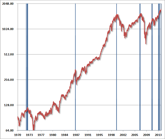
Despite the unusually extended period of speculation as a result of faith in quantitative easing, I continue to believe that normal historical regularities will exert themselves with a vengeance over the completion of this market cycle. Importantly, the market has now re-established the most hostile overvalued, overbought, overbullish syndrome we identify. Outside of 2013, we’ve observed this syndrome at only 6 other points in history: August 1929 (followed by the 85% market decline of the Great Depression), November 1972 (followed by a market plunge in excess of 50%), August 1987 (followed by a market crash in excess of 30%), March 2000 (followed by a market plunge in excess of 50%), May 2007 (followed by a market plunge in excess of 50%), and January 2011 (followed by a market decline limited to just under 20% as a result of central bank intervention).

These concerns are easily ignored since we also observed them at lower levels this year, both in February (see A Reluctant Bear’s Guide to the Universe) and in May. Still, the fact is that this syndrome of overvalued, overbought, overbullish, rising-yield conditions has emerged near the most significant market peaks – and preceded the most severe market declines – in history:

1. S&P 500 Index overvalued, with the Shiller P/E (S&P 500 divided by the 10-year average of inflation-adjusted earnings) greater than 18. The present multiple is actually 25.


2. S&P 500 Index overbought, with the index more than 7% above its 52-week smoothing, at least 50% above its 4-year low, and within 3% of its upper Bollinger bands (2 standard deviations above the 20-period moving average) at daily, weekly, and monthly resolutions. Presently, the S&P 500 is either at or slightly through each of those bands.


3. Investor sentiment overbullish (Investors Intelligence), with the 2-week average of advisory bulls greater than 52% and bearishness below 28%. The most recent weekly figures were 55.2% vs. 15.6%. The sentiment figures we use for 1929 are imputed using the extent and volatility of prior market movements, which explains a significant amount of variation in investor sentiment over time.


4. Yields rising, with the 10-year Treasury yield higher than 6 months earlier.

The blue bars in the chart below depict the complete set of instances since 1970 when these conditions have been observed.

Our investment approach remains to align our investment outlook with the prospective market return/risk profile that we estimate on the basis of prevailing conditions at each point in time. On that basis, the outlook is hard-defensive, and any other stance is essentially speculative. Such speculation is fine with insignificant risk-limited positions (such as call options), but I strongly believe that investors with a horizon of less than 5-7 years should limit their
exposure to equities. At this horizon, even “buy-and-hold” strategies in stocks are inappropriate except for a small fraction of assets. In general, the appropriate rule for setting investment exposure for passive investors is to align the duration of the asset portfolio with the duration of expected liabilities. At a 2% dividend yield on the S&P 500, equities are effectively instruments with 50-year duration. That means that even stock holdings amounting to 10% of assets exhaust a 5-year duration. For most investors, a material exposure to equities requires a very long investment horizon and a wholly passive view about market prospects.

Again, our approach is to align our outlook with the prospective return/risk profile we estimate at each point in time. That places us in a defensive stance. Still, we’re quite aware of the tendency for investors to capitulate to seemingly relentless speculation at the very peak of bull markets, and saw it happen in 2000 and 2007 despite our arguments for caution.

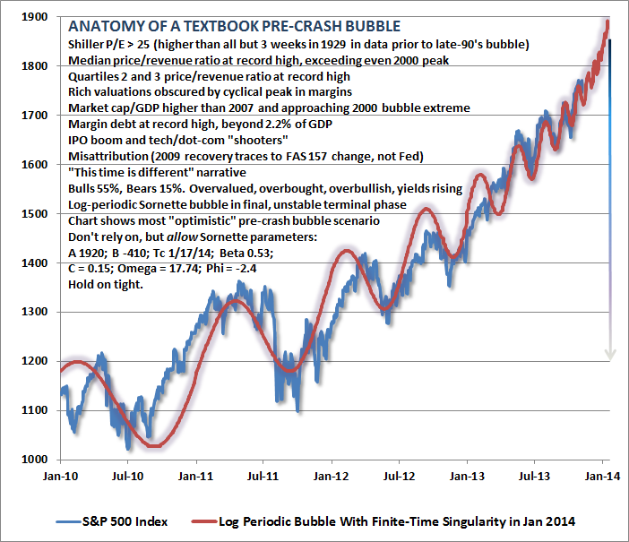
As something of an inoculation against this tendency, the chart below presents what we estimate as the most “optimistic” pre-crash scenario for stocks. Though I don’t believe that markets follow math, it’s striking how closely market action in recent years has followed a “log-periodic bubble” as described by Didier Sornette (see Increasingly Immediate Impulses to Buy the Dip).

A log periodic pattern is essentially one where troughs occur at increasingly frequent and increasingly shallow intervals. As Sornette has demonstrated across numerous bubbles over history in a broad variety of asset classes, adjacent troughs (say T1, T2, T3, etc) are often related to the crash date (the “finite-time singularity” Tc) by a constant ratio: (Tc-T1)/(Tc-T2) = (Tc-T2)/(Tc-T3) and so forth, with the result that successive troughs come closer and closer in time until the final blowoff occurs.

Frankly, I thought that this pattern was nearly exhausted in April or May of this year. But here we are. What’s important here is that the only way to extend that finite-time singularity is for the advance to become even more vertical and for periodic fluctuations to become even more closely spaced. That’s exactly what has happened, and the fidelity to the log-periodic pattern is almost creepy. At this point, the only way to extend the singularity beyond the present date is to envision a nearly vertical pre-crash blowoff.

So let’s do that. Not because we should expect it, and surely not because we should rely on it, but because we should guard against it by envisioning the most “optimistic” (and equivalently, the worst case) scenario. So with the essential caveat that we should neither expect, rely or be shocked by a further blowoff, the following chart depicts the market action that would be consistent with a Sornette bubble with the latest “finite time singularity” that is consistent with market action since 2010.

To be very clear: conditions already allow a finite-time singularity at present, the scenario depicted above is the most extreme case, it should not be expected or relied on, but we should also not be shocked or dismayed if it occurs.

Just a final note, which may or may not prove relevant in the weeks ahead: in August 2008, just before the market collapsed (see Nervous Bunny), I noted that increasing volatility of the market at 10-minute intervals was one of the more ominous features of market action. This sort of accelerating volatility at micro-intervals is closely related to log-periodicity, and occurs in a variety of contexts where there’s a “phase transition” from one state to another. Spin a quarter on the table and watch it closely. You’ll notice that between the point where it spins smoothly and the point it falls flat, it will start vibrating uncontrollably at increasingly rapid frequency. That’s a phase transition. Again, I don’t really believe that markets follow math to any great degree, but there are enough historical examples of log-periodic behavior and phase-transitions in market action that it helps to recognize these regularities when they emerge.

Risk dominates. Hold tight.


via Zero Hedge http://feedproxy.google.com/~r/zerohedge/feed/~3/B_0XVe8QLF0/story01.htm Tyler Durden

John Hussman Asks “What Is Different This Time?”

Submitted by John Hussman of Hussman Funds,

Investors who believe that history has lessons to teach should take our present concerns with significant weight, but should also recognize that tendencies that repeatedly prove reliable over complete market cycles are sometimes defied over portions of those cycles. Meanwhile, investors who are convinced that this time is different can ignore what follows. The primary reason not to listen to a word of it is that similar concerns, particularly since late-2011, have been followed by yet further market gains. If one places full weight on this recent period, and no weight on history, it follows that stocks can only advance forever.

What seems different this time, enough to revive the conclusion that “this time is different,” is faith in the Federal Reserve’s policy of quantitative easing. Though quantitative easing has no mechanistic relationship to stock prices except to make low-risk assets psychologically uncomfortable to hold, investors place far more certainty in the effectiveness of QE than can be demonstrated by either theory or evidence. The argument essentially reduces to a claim that QE makes stocks go up because “it just does.” We doubt that the perception that an easy Fed can hold stock prices up will be any more durable in the next couple of years than it was in the 2000-2002 decline or the 2007-2009 decline – both periods of persistent and aggressive Fed easing.  But QE is novel, and like the internet bubble, novelty feeds imagination. Most of what investors believe about QE is imaginative.

As Ray Dalio of Bridgwater recently observed,

“The dilemma the Fed faces now is that the tools currently at its disposal are pretty much used up. We think the question around the effectiveness of QE (and not the tapering, which gets all the headlines) is the big deal. In other words, we’re not worried about whether the Fed is going to hit or release the gas pedal, we’re worried about whether there’s much gas left in the tank and what will happen if there isn’t.”

While we can make our case on the basis of fact, theory, data, history, and sometimes just basic arithmetic, what we can’t do – and haven’t done well – is to disabuse perceptions. Beliefs are what they are, and are only as malleable as the minds that hold them. Like the nearly religious belief in the technology bubble, the dot-com boom, the housing bubble, and countless other bubbles across history, people are going to believe what they believe here until reality catches up in the most unpleasant way. The resilience of the market late in a bubble is part of the reason investors keep holding and hoping all the way down. In this market cycle, as in all market cycles, few investors will be able to unload their holdings to the last of the greater fools just after the market’s peak. Instead, most investors will hold all the way down, because even the initial decline will provoke the question “how much lower could it go?” It has always been that way.

The problem with bubbles is that they force one to decide whether to look like an idiot before the peak, or an idiot after the peak. There’s no calling the top, and most of the signals that have been most historically useful for that purpose have been blaring red since late-2011.

As a result, the Shiller P/E (the S&P 500 divided by the 10-year average of inflation-adjusted earnings) is now above 25, a level that prior to the late-1990’s bubble was seen only in the three weeks prior to the 1929 peak. Meanwhile, the price/revenue ratio of the S&P 500 is now double its pre-bubble norm, as is the ratio of stock market capitalization to GDP. Indeed, the median price/revenue ratio of the S&P 500 is actually above the 2000 peak – largely because small cap stocks were much more reasonably priced in 2000 than they are today (not that those better relative valuations prevented wicked losses in small caps during the 2000-2002 decline).

Despite the unusually extended period of speculation as a result of faith in quantitative easing, I continue to believe that normal historical regularities will exert themselves with a vengeance over the completion of this market cycle. Importantly, the market has now re-established the most hostile overvalued, overbought, overbullish syndrome we identify. Outside of 2013, we’ve observed this syndrome at only 6 other points in history: August 1929 (followed by the 85% market decline of the Great Depression), November 1972 (followed by a market plunge in excess of 50%), August 1987 (followed by a market crash in excess of 30%), March 2000 (followed by a market plunge in excess of 50%), May 2007 (followed by a market plunge in excess of 50%), and January 2011 (followed by a market decline limited to just under 20% as a result of central bank intervention).

These concerns are easily ignored since we also observed them at lower levels this year, both in February (see A Reluctant Bear’s Guide to the Universe) and in May. Still, the fact is that this syndrome of overvalued, overbought, overbullish, rising-yield conditions has emerged near the most significant market peaks – and preceded the most severe market declines – in history:

1. S&P 500 Index overvalued, with the Shiller P/E (S&P 500 divided by the 10-year average of inflation-adjusted earnings) greater than 18. The present multiple is actually 25.


2. S&P 500 Index overbought, with the index more than 7% above its 52-week smoothing, at least 50% above its 4-year low, and within 3% of its upper Bollinger bands (2 standard deviations above the 20-period moving average) at daily, weekly, and monthly resolutions. Presently, the S&P 500 is either at or slightly through each of those bands.


3. Investor sentiment overbullish (Investors Intelligence), with the 2-week average of advisory bulls greater than 52% and bearishness below 28%. The most recent weekly figures were 55.2% vs. 15.6%. The sentiment figures we use for 1929 are imputed using the extent and volatility of prior market movements, which explains a significant amount of variation in investor sentiment over time.


4. Yields rising, with the 10-year Treasury yield higher than 6 months earlier.

The blue bars in the chart below depict the complete set of instances since 1970 when these conditions have been observed.

Our investment approach remains to align our investment outlook with the prospective market return/risk profile that we estimate on the basis of prevailing conditions at each point in time. On that basis, the outlook is hard-defensive, and any other stance is essentially speculative. Such speculation is fine with insignificant risk-limited positions (such as call options), but I strongly believe that investors with a horizon of less than 5-7 years should limit their exposure to equities. At this horizon, even “buy-and-hold” strategies in stocks are inappropriate except for a small fraction of assets. In general, the appropriate rule for setting investment exposure for passive investors is to align the duration of the asset portfolio with the duration of expected liabilities. At a 2% dividend yield on the S&P 500, equities are effectively instruments with 50-year duration. That means that even stock holdings amounting to 10% of assets exhaust a 5-year duration. For most investors, a material exposure to equities requires a very long investment horizon and a wholly passive view about market prospects.

Again, our approach is to align our outlook with the prospective return/risk profile we estimate at each point in time. That places us in a defensive stance. Still, we’re quite aware of the tendency for investors to capitulate to seemingly relentless speculation at the very peak of bull markets, and saw it happen in 2000 and 2007 despite our arguments for caution.

As something of an inoculation against this tendency, the chart below presents what we estimate as the most “optimistic” pre-crash scenario for stocks. Though I don’t believe that markets follow math, it’s striking how closely market action in recent years has followed a “log-periodic bubble” as described by Didier Sornette (see Increasingly Immediate Impulses to Buy the Dip).

A log periodic pattern is essentially one where troughs occur at increasingly frequent and increasingly shallow intervals. As Sornette has demonstrated across numerous bubbles over history in a broad variety of asset classes, adjacent troughs (say T1, T2, T3, etc) are often related to the crash date (the “finite-time singularity” Tc) by a constant ratio: (Tc-T1)/(Tc-T2) = (Tc-T2)/(Tc-T3) and so forth, with the result that successive troughs come closer and closer in time until the final blowoff occurs.

Frankly, I thought that this pattern was nearly exhausted in April or May of this year. But here we are. What’s important here is that the only way to extend that finite-time singularity is for the advance to become even more vertical and for periodic fluctuations to become even more closely spaced. That’s exactly what has happened, and the fidelity to the log-periodic pattern is almost creepy. At this point, the only way to extend the singularity beyond the present date is to envision a nearly vertical pre-crash blowoff.

So let’s do that. Not because we should expect it, and surely not because we should rely on it, but because we should guard against it by envisioning the most “optimistic” (and equivalently, the worst case) scenario. So with the essential caveat that we should neither expect, rely or be shocked by a further blowoff, the following chart depicts the market action that would be consistent with a Sornette bubble with the latest “finite time singularity” that is consistent with market action since 2010.

To be very clear: conditions already allow a finite-time singularity at present, the scenario depicted above is the most extreme case, it should not be expected or relied on, but we should also not be shocked or dismayed if it occurs.

Just a final note, which may or may not prove relevant in the weeks ahead: in August 2008, just before the market collapsed (see Nervous Bunny), I noted that increasing volatility of the market at 10-minute intervals was one of the more ominous features of market action. This sort of accelerating volatility at micro-intervals is closely related to log-periodicity, and occurs in a variety of contexts where there’s a “phase transition” from one state to another. Spin a quarter on the table and watch it closely. You’ll notice that between the point where it spins smoothly and the point it falls flat, it will start vibrating uncontrollably at increasingly rapid frequency. That’s a phase transition. Again, I don’t really believe that markets follow math to any great degree, but there are enough historical examples of log-periodic behavior and phase-transitions in market action that it helps to recognize these regularities when they emerge.

Risk dominates. Hold tight.


via Zero Hedge http://feedproxy.google.com/~r/zerohedge/feed/~3/B_0XVe8QLF0/story01.htm Tyler Durden