Authored by Lance Roberts via RealInvestmentAdvice.com,
A Run For The Highs
Friday wrapped up the first quarter of 2019, and it was the best quarterly performance since 2009. As shown in the chart below, if you bought the bottom, you are “killing it.”
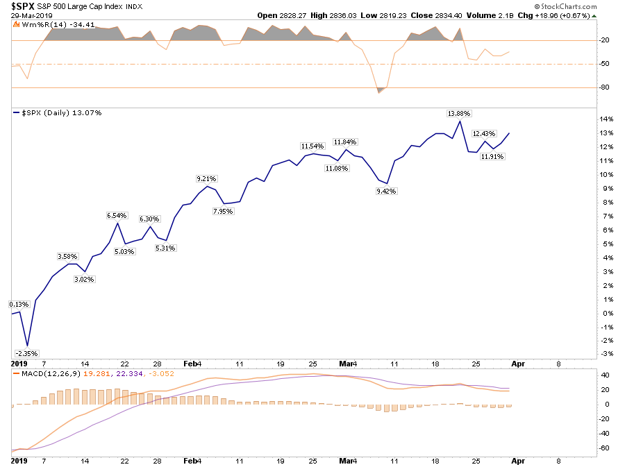
However, you didn’t.
Despite all of the media “hoopla” about the rally, the reality is that for most, they are simply getting back to even over the last year.
That is, assuming you didn’t “sell the bottom” in December, which by looking at allocation changes, certainly appears to be the case for many.
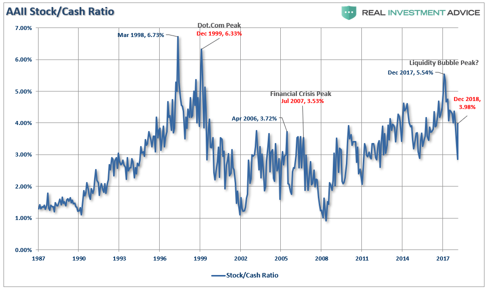
If we deconstruct the ratio we can see the rotation a bit better

Not surprisingly, historically speaking, investors had their peak stock exposure before the market cycle peak. As the market had its first stumble, investors sold. When the market bounces, investors are initially reluctant to chase it. However, as the rally continues, the “fear of missing out or F.O.M.O” eventually forces them back into the market. This is how bear market rallies work; they inflict the most pain possible on investors both on the bounce and then on the way back down.
However, for the moment, we are still in the midst of a bear market rally. This will be the case until the market breaks out to new highs. Only then can we confirm the previous consolidation is complete and the bull market has been re-established.
The good news is on a very short-term basis, the market IS INDEED bullishly biased and coming off an extremely strong first quarter rally. The current momentum of the market is strong as bullish optimism has regained a foothold.
But, as we noted for our RIA PRO Subscribers last week, (Free 30-Day Trial with Code: PRO30) complacency has moved back to extremes which suggests that a further rally isn’t “risk free.”
“The graph below is constructed by normalizing VIX (equity volatility), MOVE (bond volatility) and CVIX (US dollar volatility) and then aggregating the results into an equal-weighted index. The y-axis denotes the percentage of time that the same or lower levels of aggregated volatility occurred since 2010. For instance, the current level is 1.91%, meaning that only 1.91% of readings registered at a lower level.

“Beyond the very low level of volatility across the three major asset classes, there are two other takeaways worth pondering.
The peak -to- trough -to- peak cycle over the last year was measured in months not years as was the case before 2018.
Secondly, when the index reached current low levels in the past, a surge in volatility occurred soon after that. This does not mean the index will bounce higher immediately, but it does mean we should expect a much higher level of volatility over the next few months.”
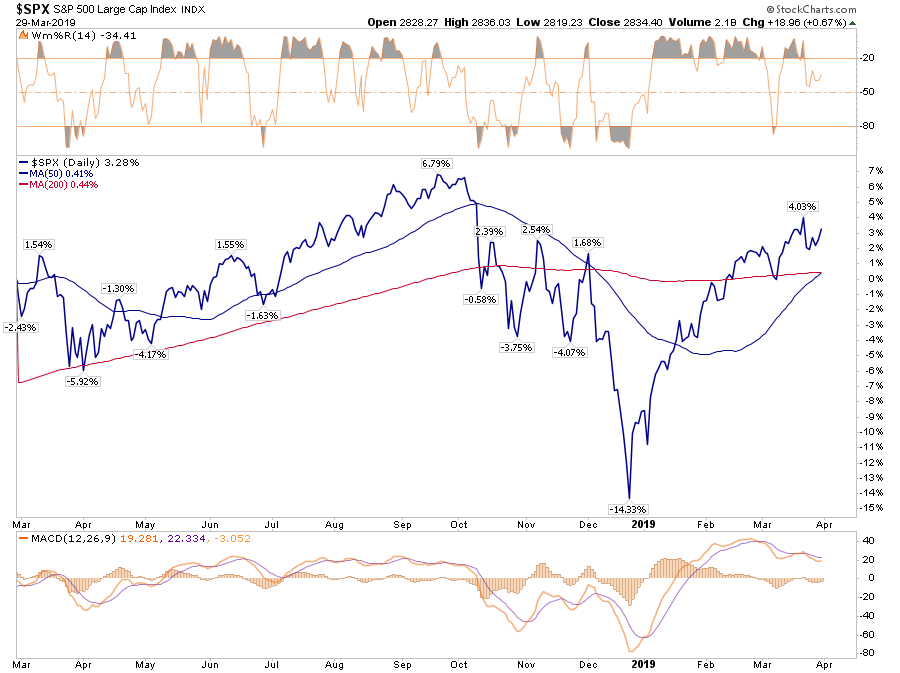
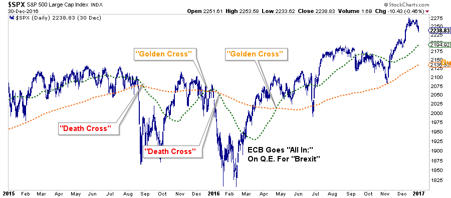
Nonetheless, the markets are close to registering a “golden cross.” This is some of that technical “voodoo” where the 50-day moving average (dma) crosses above the longer-term 200-dma. This “cross” provides substantial support for stocks at that level and limits downside risk to some degree in the short-term.
Over the next couple of weeks, you are going to see a LOT of commentary about “the Golden Cross” buy signal and why this means the “bull market” is officially back in action. While “golden crosses” are indeed bullish for the markets, they are not an infallible signal. The chart below shows the 2015-2016 market where investors were whipsawed over a 6-month period before massive Central Bank interventions got the markets back on track.
The next chart shows the longer-term version of the chart above using WEEKLY data. The parameters are set for a slightly longer time frame to reduce the number of “false” indications. I have accentuated the moving averages to have them more clearly show the crosses.
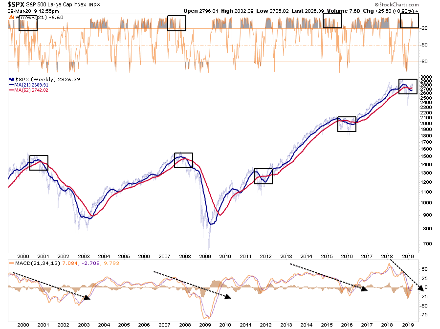
The one thing that you should notice is the negative “cross over” is still intact AND it is doing so in conjunction with an extreme overbought weekly condition and a “negatively diverging” moving average divergence/convergence (MACD) indicator. This combined set of “signals” has only been seen in conjunction with the previous market peaks.(As noted, the corrections of 2012 and 2015-16 were offset by massive amounts of Central Bank interventions which are not present currently.)
From a portfolio management standpoint, what should you do?
In the short-term the market remains bullishly biased and suggests, with a couple of months to go in the “seasonally strong” period of the year, that downside risk is somewhat limited.
Therefore, our portfolio allocations:
-
Remain long-biased towards equity risk
-
Have a balance between offensive and defensive sector positioning
-
Are tactically positioned for a trade resolution (which we will sell into the occurrence of.)
However, the analysis also keeps us cautious with respect to the longer-term outlook. With the recent inversion of the yield curve, deteriorating economic data, and weaker earnings prospects going forward, we are focused on risk management and capital controls. As such we are:
-
Continuing to carry slightly higher levels of cash
-
Overweight bonds
-
Have some historically defensive positioning in portfolios.
-
Continue to tighten-up stop-loss levels to protect gains, and;
-
Have outright hedges ready to implement when needed.
Ignore The Yield Curve…They Said
In the World War II real-time strategy (RTS) game Company of Heroes, released on September 12th, 2006, the engineer squad would sometimes say:
“Join the army they said. It’ll be fun they said.”
Since then, the statement has become a common meme on the internet to espouse the disappointment derived from various actions from doing the laundry to getting a job.
Well, the latest suggested action, which will ultimately lead to investor disappointment, is:
“Ignore the yield curve they said. It’ll be fun they said.”
Last week, Mark Kolanovic of J.P. Morgan stated:
“Historically, equity markets tended to produce some of the strongest returns in the months and quarters following an inversion. Only after [around] 30 months does the S&P 500 return drop below average,”

While the statement is not incorrect, it is advice that will ultimately lead to disappointment.
In 1998, for example, as the bull market was running hot. There was “no recession in sight,” and investors were repeatedly advised to ignore the yield curve because “this time was different.”
After all, at that moment in history, it was perceived to be a “new paradigm.” The internet was changing the world and making old metrics, like earnings, relics of the past. It was even suggested at the time that “investing like Warren Buffett was like driving Dad’s old Pontiac.”
Over the next two years, that advice held true as bullish optimism seemed well founded. It was in early 2000 that Jim Cramer issued his Top 10-Stock Picks for the next decade.
The problem is that no one ever said “sell.”
While it was great that gains were made during the period between the initial yield curve inversion and the peak of the market, all of those gains, plus much more, were wiped out in the ensuing decline. Values in portfolios were returned to where they were roughly a decade earlier by the time the decline was officially over.
Since the majority of mainstream financial advice never suggest selling, investors had no clue that if they had gone to cash in 1998, they saved themselves both a lot of grief and years of losses needing to be recovered.
It was just an anomaly.
That was the belief at the time. Following the “Dot.com” crash, the entire tragic event was considered an anomaly; a once-in-a-100-year event which would not be replicated anytime again soon.
But just 4-years later, in 2006, investors were once again told to ignore the yield curve inversion as it was a “Goldilocks economy” and “sub-prime mortgages were contained.” While many of the individuals who had told you to stay invested leading up to 2000 peak were mostly gone from the industry, a whole new crop of media gurus and advisors once again told investors to “ignore the yield curve.”
For a second time, had investors just sold when the yield curve inverted, the amount of damage that would have avoided more than paid off for the small amount of gains missed as the market cycle peaked.
This quad-panel chart below shows the 4-previous periods where 50% of 10-different yield curves were inverted. I have drawn a horizontal red dashed line from the first point where 50% of the 10-yield curves we track inverted. I have also denoted the point where you should have sold and the subsequent low.

As you can see, in every case, the market did rally a bit after the initial reversion. However, had you reduced your equity-related risk, not only did you bypass a lot of market volatility (which would have led to investor mistakes anyway) but ended up better off than those trying to just ride it out.
That’s just history
Oh, as we noted last week, we just hit the 50% mark of inversions on the 10-spreads we track.
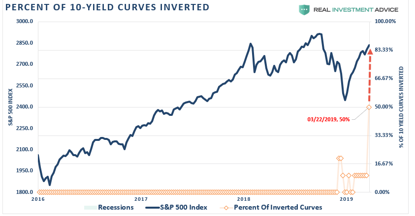
This time is unlikely to be different.
More importantly, with economic growth running at less than 1/2 the rate of the previous two periods, it will take less than half the amount of time for the economy to slip into recession.
While I am not suggesting you sell everything and go to cash today, history is pretty clear that you will likely not miss much if you did.
What Can You Do?
I don’t disagree that the markets could certainly rise from here, in the short-term. I answered this question last week:
“Are we going to hit new highs you think, or is this a setup for the real correction?”
The answer is “yes” to both parts.
The mainstream media’s advice is simply:
“Since you don’t know when a bear market will start, you just have to ride it out.”
This is the problem with the mainstream media and the majority of the financial advice in the world today.
It is not required that you know precisely when one market cycle ends and another begins.
Investing isn’t a competition. It is simply a game of survival over the long-term. While it is critically important we grow wealth while markets are rising, it is NOT a requirement to obtain every last incremental bit of gain there is. Staying too long at the poker table is how you leave broke.
We wrote in early 2018 the bull market had come to its conclusion for a while. That correction process is still intact as shown in the chart below.
There are three important things worth pointing out:
-
The top panel is GAAP earnings (what companies REALLY earn) and nominal GDP.
-
The black vertical line is when the markets begin to “sniff out” something is not quite right.
-
The red bars are when “expectations” are disappointed.
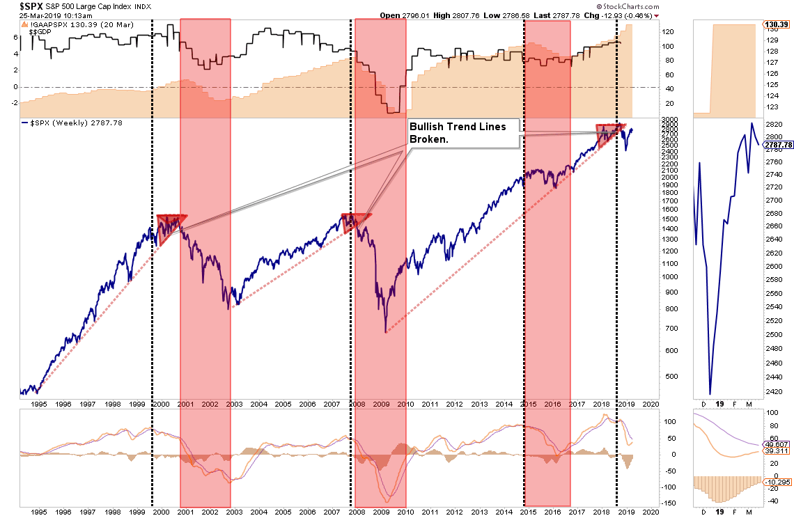
Pay attention to these longer-term trend changes as historically they signify bigger issues with the market.
It is unlikely this time is different. There are too many indicators already suggesting higher rates are impacting interest rate sensitive, and economically important, areas of the economy. The only issue is when investors recognize the obvious and sell in the anticipation of a market decline.
The yield curve is clearly sending a message which shouldn’t be ignored and it is a good bet that “risk-based”investors will likely act sooner rather than later. Of course, it is simply the contraction in liquidity that causes the decline which will eventually exacerbates the economic contraction. Importantly, since recessions are only identified in hindsight when current data is negatively revised in the future, it won’t become “obvious” the yield curve was sending the correct message until far too late to be useful.
While it is unwise to use the “yield curve” as a “market timing” tool, it is just as unwise to completely dismiss the message it is currently sending.
via ZeroHedge News https://ift.tt/2FO8qH6 Tyler Durden