Authored by Chris Hamilton via Econimica blog,
Charts and Words… blah blah blah…
The Problem:
The Fed and major central banks believe they are fighting a deflationary spiral battling ongoing misses to their inflation targets. But in truth their misguided policies are contributing to a depopulation spiral. They are forcing low interest rates that only exacerbate overcapacity for a consumer base among whom growth is fast decelerating. The cheap money is causing rapid asset appreciation absent like wage growth. Asset holders (primarily older and wealthy) are reaping the rewards while those with little or no assets (young, poor, those of childbearing ages) are paying higher rents, insurance, medical care, schooling, etc. etc. This inequitable inflationary pressure is pushing birth rates to all time lows and cutting off present and future demand…and this is met with even more of the medicine that made the patient sick in the first place.
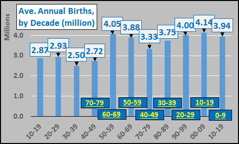
From a US perspective, there has essentially been no bottom up US population growth since 1950. Chart below shows average annual US births per decade (including births from all sources, legal and illegal). Lower boxes show current age of the population borne during each decade. Births have essentially been flat for seven decades.
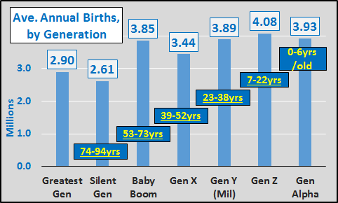
Average annual births per each generation and current age of each group, below. Again, births by generation have been flat since the completion of WWII.
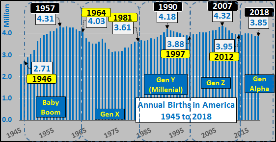
Below, annual births highlighting each generation. From the early ’50’s to present, births have been remarkably flat, given the tripling of the total population.
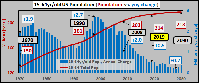
15 to 64 year old population (red line) and year over year change (blue columns). Average annual growth, per period below, has decelerated 50% but will decelerate nearly 80% over the next decade. Average growth, per period:
-
1970 – 2009, +1.93 million
-
2010 – 2018, +0.98 million
-
2019 – 2030, +0.36 million
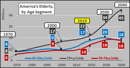
Through 2030, the working age population is estimated to grow by less than 4 million versus 19 million more 65+ year olds. The result is that the US is currently at full employment with little further labor force growth available, detailed HERE and HERE.
Population growth has shifted to the 65+ year old segment of the population. Average annual growth of the 65+ year old population, per period:
-
1970 – 2009, +0.46 million
-
2010 – 2018, +1.4 million
-
2019 – 2030, +1.7 million
75+ year olds have an 8% labor force participation rate…65 to 74 year olds just a 27% labor force participation rate. This elderly population growth translates into only minimal labor force growth.
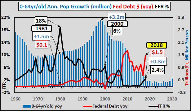
The chart below shows 0 to 64 year old annual US population growth (blue columns), federal funds rate (black line), and annual US federal debt (Treasury issuance, red line). The interplay of decades of interest rate cuts, decelerating population growth, and surging issuance of federal debt should be fairly plain. From 2020 through 2030, I update the 0-64yr/old population growth based on actual observed declining births versus continually incorrect Census estimates for rising births (detailedHERE). The minimal working age growth versus massive elderly growth will require negative interest rates and a federal debt doubling or tripling. The impact of these actions will be a further collapse in fertility rates and births, requiring even more of the same failed solutions! Of course the US isn’t alone or the worst off (global situation detailed HERE).
The Solution (?!?):
Delaying the inevitable economic deceleration due to demographics and decelerating population growth via debt and inflation seems to be the rationale to creatively buy assets (aka, cheat for the “greater good”).
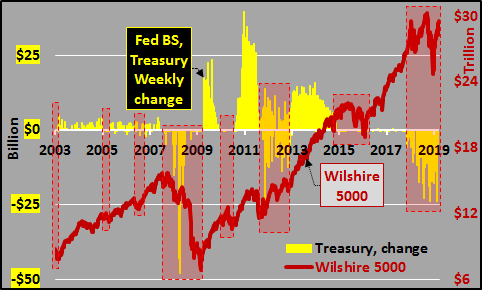
Chart below shows annual net Treasury issuance versus the Wilshire 5000 (representing the market cap of all publicly traded US equities) from 2003 through 2018. Seems to be a strong coincidence, correlation, and/or causation of rising asset valuations with rising Federal Reserve asset purchases. Likewise, seems increasing volatility or asset declines ensue during periods of Federal Reserve inactivity or outright declines in Treasury holdings.
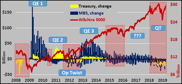
But QE wasn’t just Treasury’s and the chart below includes MBS (mortgage backed securities) to provide a better view of Fed purchases and sales on the equity market.
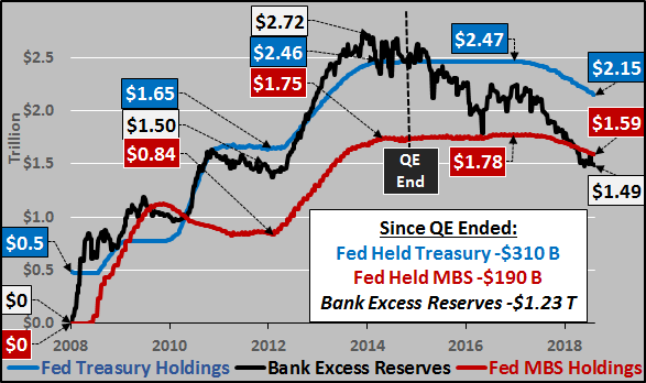
But to attempt to see the full picture alongside the Federal Funds rate and federal debt, the chart below details the Federal Reserve holdings of Treasury’s (blue line), MBS (red line), versus far more rapidly declining Bank Excess Reserves (black line). This difference in the Fed’s balance sheet versus bank excess reserves is what I term direct monetization.
So, one very messy chart including stacked change in Fed holding of Treasury’s (yellow columns), MBS (blue columns), and Monetization (black columns) versus Wilshire 5000 (red line).

To narrow in, the next charts detail the Feds changing duration holdings and the impact on applicable interest rates. First, under 1 year Treasury’s (red line) held by Federal Reserve versus the impact on 3 month Treasury yields (blue shaded area).

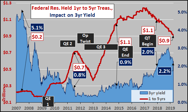
1 to 5 year Treasury’s (red line) held by Federal Reserve versus the impact on 3 year Treasury yields (blue shaded area).
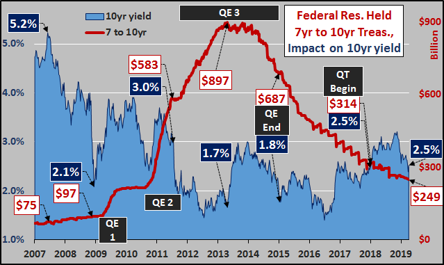
7 to 10 year Treasury’s (red line) held by Federal Reserve versus the impact on 10 year Treasury yields (blue shaded area).
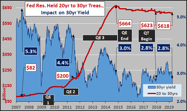
20 to 30 year Treasury’s (red line) held by Federal Reserve versus impact on the 30 year Treasury yields (blue shaded area).
Looking at the impact of changing durations held by the Federal Reserve on the Wilshire. (red line below).
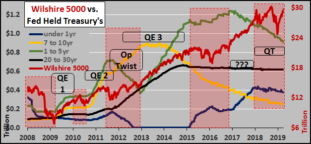
But what drove the Wilshire since 2017? As the chart above shows, while the Fed holdings of under 1 year debt were rising rapidly, Fed holdings of 1 to 10 year debt were decreasing even more rapidly and long term holdings were unchanged. Add to this rising rates, and what drove equities higher is a very good question?
So, I’ve a funny feeling that while all sources of traditional Treasury buying were forsaking US debt (foreigners, Federal Reserve, and slowing IG surplus purchasing…chart below), this left nearly all net purchasing up to domestic buyers. Exactly while equities were screaming higher, unfazed by the domestic trillions supposedly moving into Treasury bonds?!?
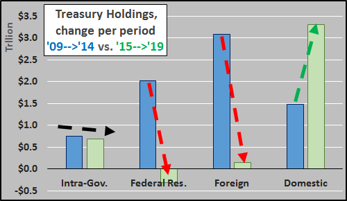
Since QE ended, a single buyer has saved America from an interest rate Armageddon and/or market meltdown. The Treasury details this buyer as “Other Investors”.
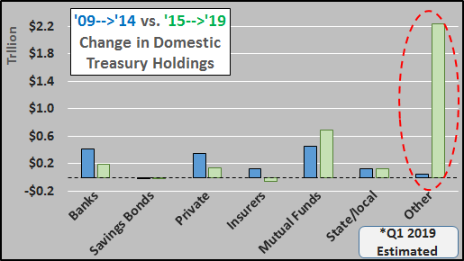
As the above charts detail (with data taken from the March, 2019 Treasury Bulletin); it is not foreigners, not the Fed, not the IG trust funds, not banks, not private buyers, not insurers, not mutual funds, not saving bonds, not state/local pensions that are buying US Treasury bonds. Just “other investors”?!? What “other” is left I really haven’t been able to figure out? Who was sitting on trillions in cash (since it didn’t impact the equity market via liquidations) that plowed into Treasury’s (particularly 7 to 10 year yields) since QE ended while all other sources ceased adding or net sold? Seems more than just coincidence.

Again, what’s the correlation of rising holdings of “other investors” Treasury’s and the Fed’s balance sheet on the asset valuations (Wilshire 5000)? Aside from during QE1, amid periods of “other investor” increasing holdings, assets struggle…during flat to down periods, assets soar.
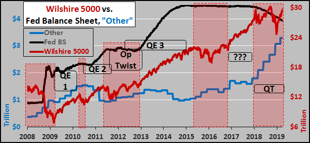
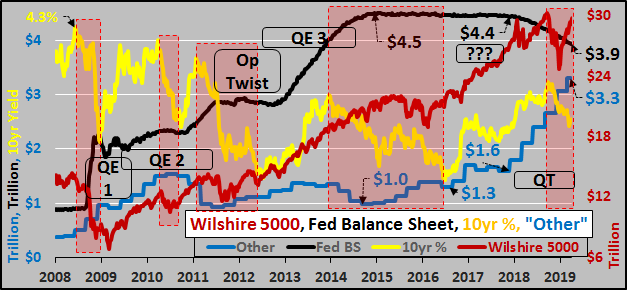
Below, a very busy but very interesting chart from 2008 til present. 10yr Treasury yield in yellow, Wilshire 5000 in red, Fed’s balance sheet in black, and “other investors” in blue. Given the bond market is supposed to be “the smart money”, the red shaded boxes show 10 year Treasury high to low yields…you make any correlations with the other variables you like, particularly “other investors” surging Treasury demand since QE ended.
I’ve a bad feeling that the US is following in the footsteps of Bernie Madoff (who likewise had a “problem” that his Ponzi had run out of more buyers…so he came up with a “solution”). I see the US has a similar problem, they have run low on consumer growth and are now reliant on massive quantities of cheap federal and corporate debt issuance to keep economic “growth” alive…and I see a “solution” that an unidentifiable buyer has been created to allow the ongoing deluge of new debt without concern about free-market interest rates. I fear the “solution” is far worse than the problem ever was…and the solution is spawning systemic problems beyond the capability of our current system to handle.
via ZeroHedge News http://bit.ly/2PgpAjx Tyler Durden