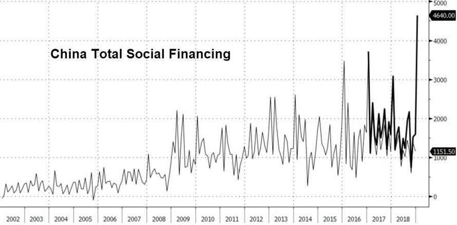
For several months at the start of 2019, analysts, pundits and the media argued that the year was shaping up as a mirror image of 2016, and specifically a repeat of the Shanghai Accord in January 2016 which resulted in a global credit explosion emanating from China and meant to arrest the global bear market. To be sure, in January of 2019 we saw a similar “gargantuan” credit tsunami out of China after the injection of an unprecedented 4.64 trillion yuan in January.
However, several months later, it appears that China’s determination to reflate at all costs fizzled, Europe failed to piggy back on China’s spike in the credit impulse, and suddenly comparisons to 2016 were quietly scrubbed. This is how Horseman Global’s Russell Clark explained the shift in sentiment:
Markets turned around in 2016 when it became obvious that the Chinese policy of cutting capacity and pushing up commodity prices was the real deal. This was Chinese policy to create inflation internally to the benefit of corporates and the financial sector. However, it seems these polices have been reversed, and share prices of Chinese steel companies and banks are beginning to reflect these problems again. If the US dollar stays strong, and China cannot create inflation internally, then they are going to be forced to devalue. Many of the long positions of the fund began to reflect this at the end of April, including mining stocks and currencies.
As a result, Clark writes that “the likelihood of sustained inflation is beginning to disappear” and “deflation again looks more likely, just as it did from 2011 to 2016.”
So if 2016 is not the appropriate comp for 2019, what is? Well, in a far more unpleasant – for the bulls – shift in the narrative, the year that is now discussed as the most likely comparison to what is taking place now, is 2018.
But is that also going to end up being a false comp?
To help answer this question, JPMorgan’s Nikolaos Panagirtzoglou has dedicated his last two “Flows and Liquidity” weekly reports to dissecting first the three biggest similarities and then the three biggest differences between 2019 and 2018.
Starting with the similarities, he observes that the current market environment to be in a similar state of flux to that seen during the last three quarters of 2018, caused by
- elevated trade war risks,
- dollar strengthening, and
- a deteriorating inversion at the front end of the US curve that was signaling a Fed policy mistake.
Meanwhile, in the optimistic, or “differences” column, Panagirtzoglou writes that we find that “there are three main differences between the current environment and last year:
- bond yields are falling this year rather than rising,
- the US repatriation flow is much reduced and
- there is less growth divergence between US and non-US economies.
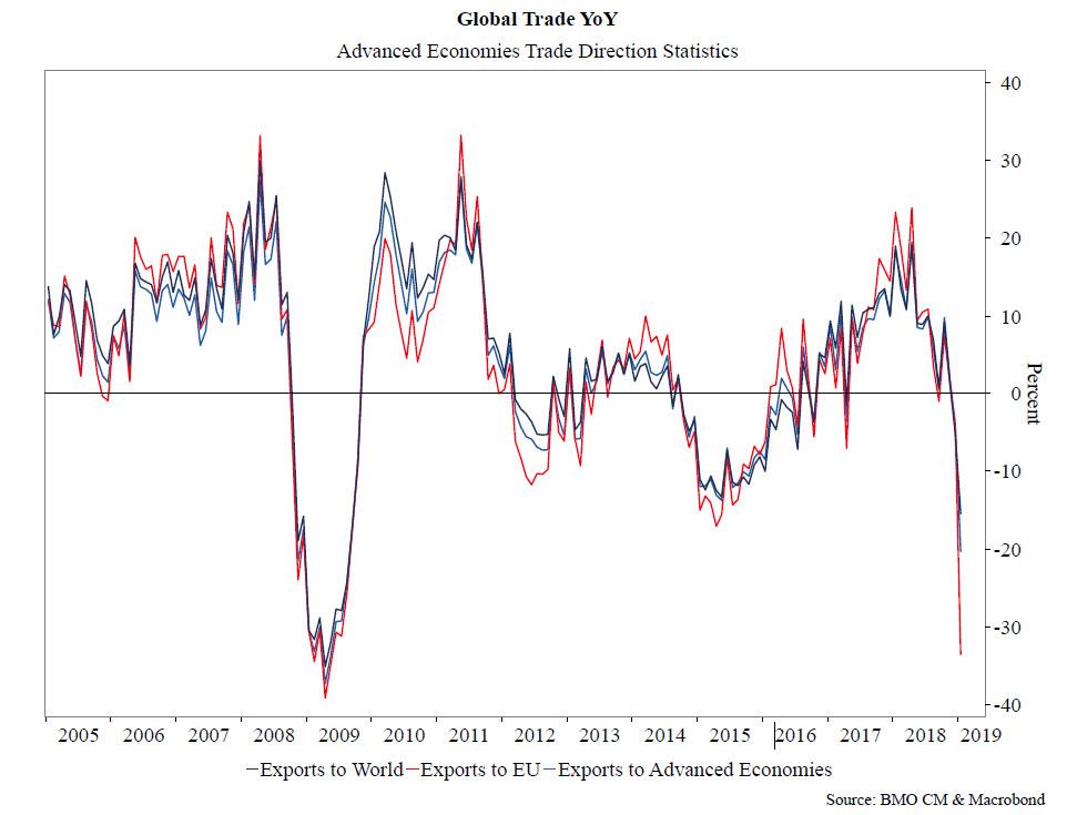
Drilling down first on the similarities, the JPM strategist writes that while “global merchandise trade volumes posted a rare decline in the fourth quarter of last year”, the recent re-escalation of trade wars “risks another leg down in global trade volumes later this year, which if it materializes, would represent the most severe cumulative retrenchment in global trade since the Lehman crisis.” To be sure, we showcased this ominous development two weeks ago, in “Global Trade Collapsing To Depression Levels” where we showed the following striking chart:
Separately, forward looking indicators of global merchandise trade, such as the new export orders component of the global manufacturing PMI, looked vulnerable even before the re-escalation of the past two weeks. This is shown in the next chart, “which shows that the New Export Orders index of the Global Manufacturing PMI has been persistently weak, hovering below the 50 level since last September with little signs of a pickup in the most recent release for the month of April. The next monthly reading for May due on June 3rd will reveal the impact that the recent escalation of trade war risks had on this forward looking indicator of global trade.”

Additionally, uncertainty also hurts trade also via businesses postponing investment. While it is difficult to quantify uncertainty or its impact on trade, the proxy for uncertainty JPM has used before is the one constructed by Baker, Bloom and Davis (www.policyuncertainty.com). To a large extent, their proxy quantifies newspaper coverage of policy-related economic uncertainty as well as disagreement among economic forecasters. This uncertainty proxy shown below has been rising steeply over the past year and is still flashing red, raising the risk of persistent capex weakness.

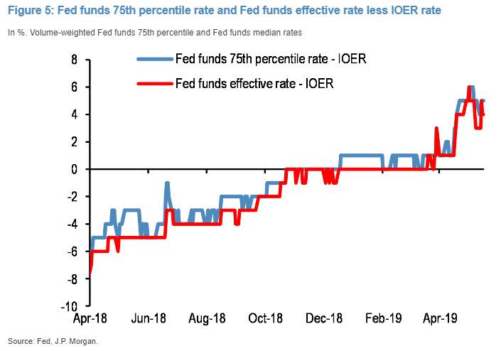
The second comparable factor, i.e. dollar strength, started intensifying since April, and according to JPMorgan is driven by the Fed’s Quantitative Tightening (QT). Up until the end of March, the Fed’s QT or balance sheet shrinkage was masked as it was offset by the decline of the US Treasury’s account balance at the Federal Reserve. As Panagirtzoglou notes, as the Treasury account balance normalized in April, the Fed’s balance sheet shrinkage manifested abruptly via a sharp $170bn decline in dollar reserves within three weeks. This caused abrupt tightening in the reserve and dollar liquidity space, pushing the Fed funds rate to well above the Fed’s effective policy rate, i.e. the Interest on Excess Reserves (IOER) rate. While a previous spike in both the median and 75th volume-weighted percentiles of the Fed funds rate to 3bp above the IOER rate around first quarter-end was quickly unwound, these rates spiked again over the past four weeks to 3bp-6bp above the IOER rate creating a more persistent and concerning upmove (Figure 5). In turn, this persistent upmove is raising questions about whether dollar reserves are in tight territory already.
JPM also notes that during May, the dollar got an additional boost from the eruption of trade war risks and the announcement of additional tariffs, similar to what happened in April/May 2018. And similar to last year, this positive dollar impulse is already hurting EM, with EM assets trading particularly weak vs. their DM counterparts over the past month.
The third, and final, similarity is the worsening of Fed rate cut expectations and the inversion at the front of the US curve. Last year, JPMorgan first – correctly – argued that the inversion at the front end of the US yield curve, since it first emerged in April 2018 between the 2- and 3-year forward points of the 1m OIS rate, was “a bad omen for equity and risky markets more broadly last year.” This indicator had been worsening since April 2018 not only by turning progressively more negative, but also by shifting forward between the 1- and 2-year forward points since mid-November. And this worsening continued up until the end of last year. With the Fed pivoting at the beginning of January, Fed rate cut expectations at the front end of the US curve got stabilized during the first quarter of this year at around zero (no rate cut) for 2019 and around 25bp by the end of 2020.

However, in the aftermath of the March 20th FOMC meeting, these Fed rate cut expectations saw a steep deterioration declining further into negative territory. As in April, JPM once agian argued at the time that this bad omen was resurfacing creating downside risk for risky markets. It certainly did, and the S&P tumbled into a very brief bear market before posting a near record rebound in the first 4 months of 2019.
* * *
Enough for the similarities; how about the differences? To address this, the JPM strategist writes that in his client conversations, has has been discussing three key differences in particular.
The first, and arguably most important one, is that bond yields are falling this year rather than rising. During the first three quarters of last year, before the risky market correction erupted in Q4 2018, the yield on the Global Agg Bond index had risen by 52bp. However, it was instead down by 22bp in the first four months of this year before risky markets started correcting in May. The difference is even more striking if one focuses on US bond yields. The yield on the US Agg Bond index was up by 76bp during the first three quarters of last year and was down 30bp in the first four months of this year.
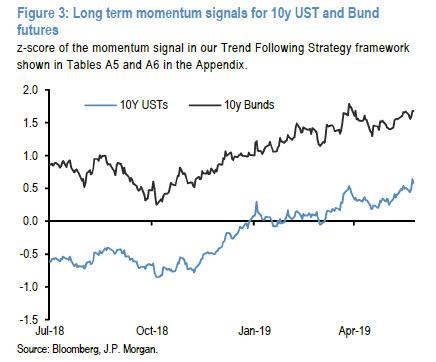
What may explain this difference in bond market performance this year vs. last year? According to JPM, both retail and institutional flows played a role. Retail investors stopped buying bond funds after the February 2018 equity market correction helping to push yields up during Q2 and Q3 of last year. But retail investors started becoming strong buyers of bond funds from the beginning of 2019, most likely in response to strong equity market gains that mechanically increased their equity weights and in turn made them underweight in bonds. And this retail flow helped to push bond yields significantly lower this year. At the same time momentum traders such as CTAs have been likely exacerbating this bond momentum as shown by the decline of bond futures momentum signals during the summer of 2018 and their steady reversal since Q4 of last year.
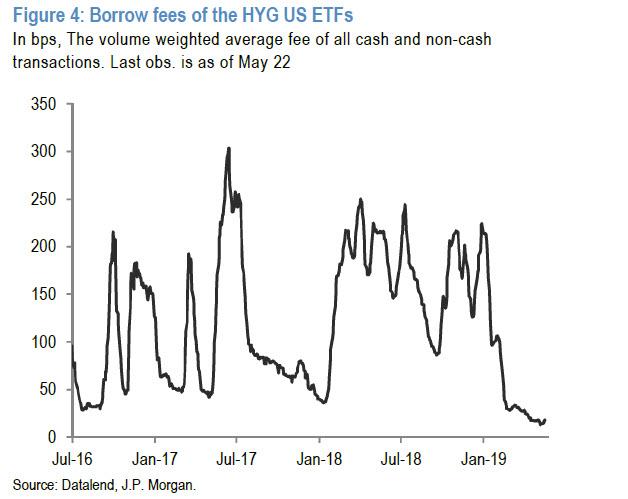
In addition, the strong bond fund flows this year are boosting credit and US HY in particular. The biggest US HY ETFs saw a collapse in the borrow fee this year in contrast to a persistently high borrow fee during most of last year. This is another important difference to last year, which as JPM warns, “makes US HY credit look more vulnerable currently relative to last year.”
What does this difference in bond market performance this year vs. last year mean? One suggested proposal is that this year’s strong bond market performance is currently creating easier financial conditions relative to last year, especially in the US where 30-year mortgage rates (at 4% currently) are down by 50bp YTD compared to a 100bp increase between January and October last year. So it is less likely, the argument goes, this time to see a repeat of the Q4 2018 correction given that current financial conditions are so much easier than the tight financial conditions and high bond yields prevailing in September 2018 ahead of the Q4 correction.
JPM does not buy this argument, and points out that a casual inspection of the Chicago Fed’s Adjusted National Financial Conditions Index (shown below), which adjusts for the state of the business cycle and the level of inflation to isolate a financial-only element of conditions, shows that US financial conditions were even easier in September 2018 , ahead of the Q4 correction, than they are at the moment. In other words, the picture of Figure 5 is not consistent with the idea that higher bond yields had caused tight financial conditions by September 2018, potentially inducing the Q4 correction.

The conclusion: while the JPM strategist accepts that falling bond yields is one important difference to last year “we do not believe that this difference is enough of a reason to change the balance of risks for risky markets from negative to positive.
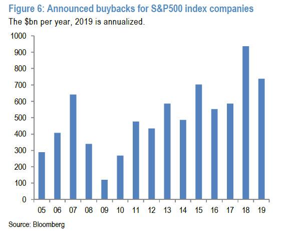
A second key difference to last year is the US repatriation flow. The US repatriation flow was an important factor last year boosting both US equity and bond markets, the former via more US share buybacks and the latter via reduced net issuance of US HG corporate bonds. As a reminder, JPM had previously estimated that of the $430bn that was repatriated last year according to US Flow of Funds, around 2/3rds or $276bn was used for increased US share buybacks, with the rest split between corporate bond withdrawal and capex. Assuming the US repatriation flow is largely behind us, this creates downside risk to US share buybacks and capex growth this year relative to last year and upside risk to US corporate bond issuance. Indeed, announced US share buybacks in the first five months of the year are tracking a pace that is more than 20% below the pace for the same period of last year
And US HG corporate bond net issuance is flat YTD relative to the same period of last year at $115bn. I.e. the strong annual decline in net issuance seen last year does not appear to be repeated this year, again pointing to much reduced US repatriation flow.
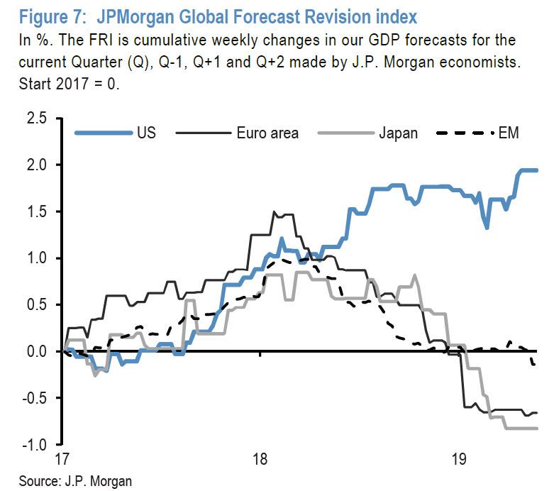
A third, and final, difference is the divergence between US and non-US growth. Boosted by the fiscal stimulus, the US economy had entered a sugar-high phase last year decoupling from the weakness seen in Europe, Japan and EM, which were suffering from their structurally higher sensitivity to the downturn of the global manufacturing cycle. This is shown in the chart below of JPM’s Forecast Revision Indices (FRI) for the US, Euro area, Japan and EM. The US FRI was rising last year while the other three regions FRIs were falling. In contrast, this year, all four FRIs are exhibiting a similar flat pattern.
Last year this growth divergence had been reflected in the performance of US vs. non-US equities as seen in the next chart. But this year a similar relative performance gap has been opening between US and non-US equities despite less divergence in the FRIs across regions. In other words, while JPM acknowledges that less growth divergence between US and non-US economies is an important difference to last year, this has not reflected in the relative performance of US vs non-US equities. As a result US equities outperformed strongly in dollar terms this year similar to the first three quarters of last year. In JPMorgan’s – or at least the opinion Nikolaos Panigirtzoglou, if not that of Marko Kolanovic – “this makes US equities more vulnerable than their non-US counterparts to an equity correction from here, similar to September 2018.”

Putting all this together, JPMorgan finds that in addition to three key similarities, there are also three key differences of the current environment to last year: bond yields are falling this year rather than rising, the US repatriation flow is much reduced and there is less growth divergence between US and non-US economies.
But, as the bank’s “bad cop” strategist summarizes, “these differences do little in altering the state of flux and the downside risk for risky markets emanating from similarities to last year such as elevated trade war risks, dollar strengthening, a deterioration in the inversion at the front end of the US curve and the strong outperformance of US equities relative to their non-US counterparts.”
In short, JPMorgan has once again covered all the bases, with the bank’s official or “house” call still for the S&P rising to 3,000, a call that has been pounded during almost every major market uptick by the bank’s head quant Marko Kolanovic. And yet, at the same time JPMorgan’s far more skeptical, if not permabearish analyst Nikolaos Panigirtzoglou is there to take the under, and with each passing week sees the most likely outcome as one of further market weakness. While this is bad news for anyone hoping for consistency in JPM’s calls, at least it will make for an entertaining cage match between the Greek and Croatian quants.
And if Morgan Stanley is right in warning that the longer we go without a trade war resolution, the more likely that the market outcome is a crash, then we eagerly look forward to whether JPM’s Croatian “Gandalf” will blame his co-worker for manipulating market sentiment and unleashing “FUD”, which once again results in the market failing to reach his overly optimistic S&P target.
via ZeroHedge News http://bit.ly/2JEzefX Tyler Durden