LendingTree has revealed a new study that identifies certain US metropolitan areas with the highest student loan balances.
The study’s release comes at a time when total student loan debt has reached $1.6 trillion, set to unravel in the next economic downturn. The study gives an eye-opener to the cities where millennials will suffer the most significant financial distress when the crisis unfolds.
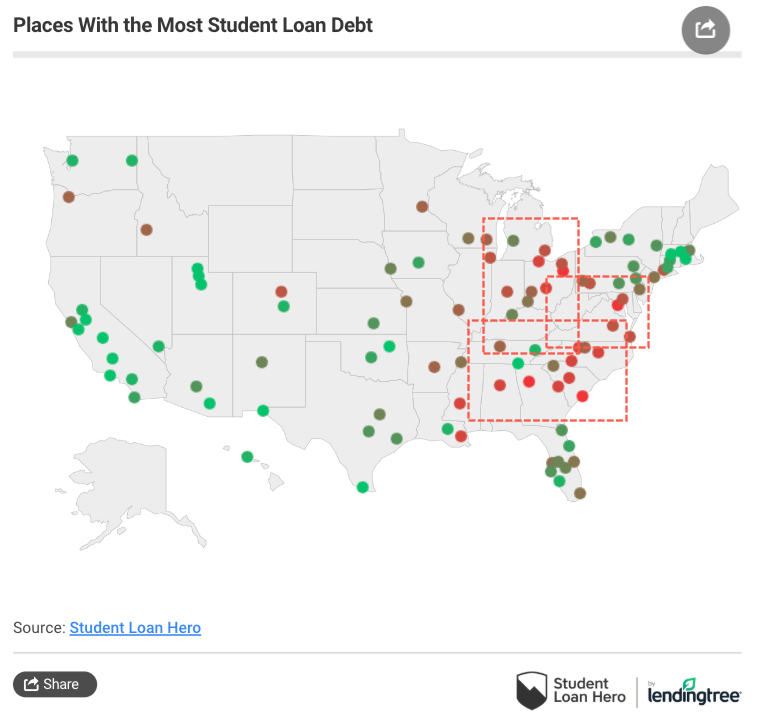
About 70% of the cities and surrounding areas with the highest median loan balances are located in the South, including large balances in Georgia, Alabama, Louisiana, and the Carolinas. These areas are known for widespread deindustrialization, high opioid addiction, and weak economic activity.
LendingTree’s map shows high concentrations of student loan balances in the South, Rust Belt, and Mid-Alantic.
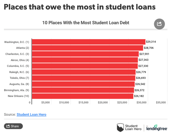
Borrowers in Washington, DC, carry the most student debt median balance of $29,314. And about 15% of those borrowers owe more than six figures, the highest percentage among the 100 metros surveyed.
Atlanta and Charleston, SC, have the second and third highest balances, averaging both around $28,000.
1. Washington, D.C. (Median balance: $29,314)
Roughly half of the people over the age of 25 in the Washington, D.C., metro have a postsecondary degree — that’s significantly higher than the 28% of all Americans who’ve earned a bachelor’s or higher.
Even more significant: Nearly 1 out of 4 have professional or graduate degrees, more than double the national rate of 10.5%. This helps explain why Washington also has the highest percentage of student debt holders who owe more than $100,000.
But that doesn’t necessarily mean these borrowers are in financial crisis, as most completed their degrees and are earning accordingly. While 22% of Americans left college before finishing, the same is true for only 16.5% of those residing in and around the nation’s capital.
2. Atlanta (Median balance: $28,706)
Atlanta is another highly educated city — 37% of Atlanta residents ages 25 and older have completed at least a four-year education, and nearly 14% have a graduate or professional degree, which is higher than the nation as a whole (10.5%).
However, that doesn’t completely explain why about 13% owe more than $100,000, well above the 8.7% average of the metros we reviewed. The area is home to a plethora of higher learning institutions, including the Georgia Institute of Technology, Georgia State University, Emory University, Morehouse College and Spelman College. Perhaps the need for so many professors helps to explain why Atlanta is more educated — and in more student debt — than the nation as a whole.
Unfortunately, 1 in 5 Atlanta residents left college before finishing a degree, which is in line with the rest of the country.
3. Charleston, S.C. (Median balance: $27,591)
The first of two South Carolina metros among our top five overall, Charleston placed third by a narrow margin. Still, the average borrower here has 4.6 loans, more than any of the 99 other metros we studied.
More students going to college also equals more student loans overall: About 34% of the metro area’s population has at least a bachelor’s degree, trumping the national average of 28%.
4. Akron, Ohio (Median balance: $27,363)
High balances brought Columbia into the top five of metros with the most education debt. About 45% of borrowers in the metro area had at least $50,000 in student debt — and more than 13% of were staring at a six-figure hole.
Interestingly, while the fellow Palmetto State cities of Columbia and Charleston ranked high on the list, Greenville, S.C., did much better, coming in at 39th overall for median education debt.
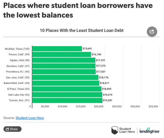
And metro areas with the lowest median balances were mostly west of the Mississippi River. College graduates in California, Texas, and Utah had some of the tiniest balances in the country.
Student debt is the fastest-growing consumer debt in the country, with $1.6 trillion outstanding, cracks are already starting to appear with 22% of borrowers defaulting.
The economic downturn which started in the summer of 2018, has already manifested into a broad industrial slowdown that is already starting to spread into other parts of the economy.
Millennials will be most impacted in the next recession, and thanks to LendingTree’s study, the exact metro areas of this financial stress are now known.
via ZeroHedge News https://ift.tt/2KalWFA Tyler Durden
A CIA-written Bill called the Intelligence Authorization Act (SB 3153) would criminalize whistleblowers and reporters.
Section 733 Sense of Congress on WikiLeaks:
“It is the sense of Congress that WikiLeaks and the senior leadership of WikiLeaks resemble a non-state hostile intelligence service often abetted by state actors and should be treated as such a service by the United States.”
The Bill is also known as the Damon Paul Nelson and Matthew Young Pollard Intelligence Authorization Act for Fiscal Years 2018, 2019, and 2020 (H.R. 3494).
“House Intelligence Committee Chairman Adam Schiff is once again putting the interests of the intelligence agencies in concealing their misdeeds ahead of protecting the rights of ordinary Americans by criminalizing routine reporting by the press on national security issues and undermining congressional oversight in his Intelligence Authorization bill,” Daniel Schuman, policy director, of Demand Progress said.
He added:
“Schiff’s expansion of the Intelligence Identities Protection Act beyond all reason will effectively muzzle reporting on torture, mass surveillance, and other crimes against the American people — all at the request of the CIA. Schiff is clearly the resistance to the resistance, and he should drop this provision from his bill.”
Ron Paul clarifies the real reason for this bill:
“The measure is designed – in the CIA’s own words – to prevent the kind of transparency that was provided by Wikileaks. It is a war on the free press!”
via ZeroHedge News https://ift.tt/2KbOiQ9 Tyler Durden
Should it come as any surprise? And yet the details are shocking and outrageous. A whistleblower working for Apple has revealed to The Guardianthat its popular voice activated spying device helpful virtual assistant Siri, now in millions of households, “regularly” records people having sex, and captures other “countless” invasive moments which it promptly sends to Apple contractors for their listening pleasure “quality control”:
Apple contractors regularly hear confidential medical information, drug deals, and recordings of couples having sex, as part of their job providing quality control, or “grading”, the company’s Siri voice assistant, the Guardian has learned.
We’ve long pointed out that according to Amazon’s Alexa terms of use, the company collects and stores most of what you say to Alexa (or perhaps what you groan) – including the geolocation of the product along with your voice instructions.
However, what’s not disclosed or at least not well known up to this point is that a “small proportion” of all Siri recordings of what consumers thought were private settings are actually forwarded to Apple contractors around the world, according to the new report. Supposedly this is to ensure Siri is responding properly and can continue to distinguish dictation. Apple says, according to The Guardian, the data “is used to help Siri and dictation… understand you better and recognise what you say”.
But an anonymous current company insider and whistleblower told The Guardian: “There have been countless instances of recordings featuring private discussions between doctors and patients, business deals, seemingly criminal dealings, sexual encounters and so on. These recordings are accompanied by user data showing location, contact details, and app data.”
Contradicting Apple’s defense that these sultry samples are “pseudonymised recordings,” Apple employees can know precisely who is having sex and where, and what time the deed was done.
Apple’s formal response to the Guardian investigation was as follows:
A small portion of Siri requests are analysed to improve Siri and dictation. User requests are not associated with the user’s Apple ID. Siri responses are analysed in secure facilities and all reviewers are under the obligation to adhere to Apple’s strict confidentiality requirements.
Just trust us, Apple appears to be saying. Most of what can be deemed sensitive data is captured through so-called accidental activations by “trigger words,” according to the report, with the highest rates of such occurrences via the Apple Watch and HomePod smart speakers.
“The regularity of accidental triggers on the watch is incredibly high,” the company whistleblower explained. “The watch can record some snippets that will be 30 seconds – not that long but you can gather a good idea of what’s going on.”
The insider continued, “you can definitely hear a doctor and patient, talking about the medical history of the patient. Or you’d hear someone, maybe with car engine background noise – you can’t say definitely, but it’s a drug deal… you can definitely hear it happening. And you’d hear, like, people engaging in sexual acts that are accidentally recorded on the pod or the watch.”
Apple Watch Series 4. Image source: Bloomberg
Further less than comforting is just how many across the globe have access to these private moments: “There’s not much vetting of who works there, and the amount of data that we’re free to look through seems quite broad,” the contractor continued. “It wouldn’t be difficult to identify the person that you’re listening to, especially with accidental triggers – addresses, names and so on.”
“Apple is subcontracting out, there’s a high turnover. It’s not like people are being encouraged to have consideration for people’s privacy, or even consider it. If there were someone with nefarious intentions, it wouldn’t be hard to identify [people on the recordings].”
The evidence continues to mount: Siri is a blackmailer’s dream come true… or spy agency, or voyeur, or political adversary, or just plain pervert.
via ZeroHedge News https://ift.tt/2YplrNb Tyler Durden
Over the period from 1915 to 2014 the return on U.S. equities was an annualized 11.5 percent, while the return on government bonds averaged 4.3 percent. The longer-run average S&P 500 return is nearer 9 percent, but during the past decade it has exceeded 14 percent. U.S. bonds have also rallied, returning around 2 percent. Yields across most developed countries have fallen to record lows, with the 10-year obligations of Germany, Japan, and Switzerland (among others) offering a negative nominal yield to maturity.
Despite their lower long-run return, the great advantage of bonds and other fixed-income securities, relative to equities, is that they pay, assuming there is no default, regular interest in the form of coupons. For pension funds and other institutions, which need to maintain a steady stream of payments to their plan beneficiaries, these coupons allow the cash flows from assets to match liabilities. Equities, by contrast, may or may not pay dividends (which, in any case, are often variable), and that uncertainty is compounded by the tendency of equity markets to rise and fall, at times dramatically.
Setting aside their inherent volatility, equities have proved an outstanding inflation hedge. Fixed-income securities pay a stream of fixed coupons, and then, at maturity, the principal is repaid to the investor. Equities, unlike most bonds, are, hopefully, perpetual investments. They do not mature at a fixed date in the future; instead, they give the investor a stake in the performance of a business over time. If the price of the goods that a firm sells should rise, all other things equal, equity investors benefit as higher prices are reflected in the profitability of their investment. Retained profit increases the capital value, while higher dividends increase income.
Back in the 1960s, as inflation crept into developed economies, the price of goods and services rose. Central banks responded by raising short-term interest rates. Confronted by this headwind, fixed-income investments performed poorly, and capital values declined. This led some investment managers into temptation. In order to keep pace with inflation over the long run, they invested an increasing share of their assets in equity markets.
While this was a good long-term solution to the problem of inflation, it left pension fund managers exposed to a cash flow shortfall. The variable income from dividends (especially during an inflationary recession) did not always cover the costs of meeting their obligations to pensioners; the unpalatable solution was to meet these cash flow requirements by liquidating assets.
Deflation and debt
So what does all this have to do with the negative interest rates seen in many bond markets today? Well, the problem of the mismatch between the cash flow from assets and that from liabilities prompted a deluge of prudential regulation to ensure that pension funds were able to fulfill their obligations to their customers. The politically popular solution was to mandate that pension funds invest a substantial percentage of their assets in cash or liquid securities, such as fixed-income government bonds.
Today most developed countries are grappling with the demographic challenges of an aging population and low fertility rates. Pensioners are living longer, and the working-age population is shrinking. For governments that provide public pensions, this is a near and present danger, since they pay their pension obligations from current tax receipts. The shortfall between tax receipts and public pension obligations will continue to rise.
The funding problem for private sector pension funds should be more manageable. Employees (and their employers) pay regular contributions. Pension funds should, by this method, accumulate sufficient assets to meet future obligations.
Sadly, there is a catch: these pension funds are obligated to invest a significant percentage of their assets in fixed-income government securities. While these bond investments produce a positive inflation-adjusted return, all is relatively well; as soon as their yields dip below the level of inflation, trouble begins to brew.
There may be trouble ahead
Today, if you are a “lucky” employee, you may be enrolled in a “defined-benefit scheme.” On maturity this scheme will pay you a fixed percentage of your final salary (or some variation on that measure) in the form of a pension. If you are a less “lucky” worker, your company scheme will be a “defined-contribution scheme.” This will invest your contributions (and contributions made by your employer) into assets that will, hopefully, generate sufficient returns to ensure you can receive a steady stream of income in retirement.
“And there’s the rub”: most central banks target inflation of around 2 percent, as a direct result of quantitative easing; however, many of their own governments’ bonds yield less than that inflation rate. This is not so true in the U.S., but it is absolutely the case in Switzerland, Japan, and much of the Eurozone. In this environment, pension fund managers should, for prudential reasons, forsake bonds in favor of higher-yielding assets; and yet, their fiduciary duty is at odds with their domestic regulatory requirements to keep a high percentage of assets in liquid cash, near-cash, and fixed-income securities.
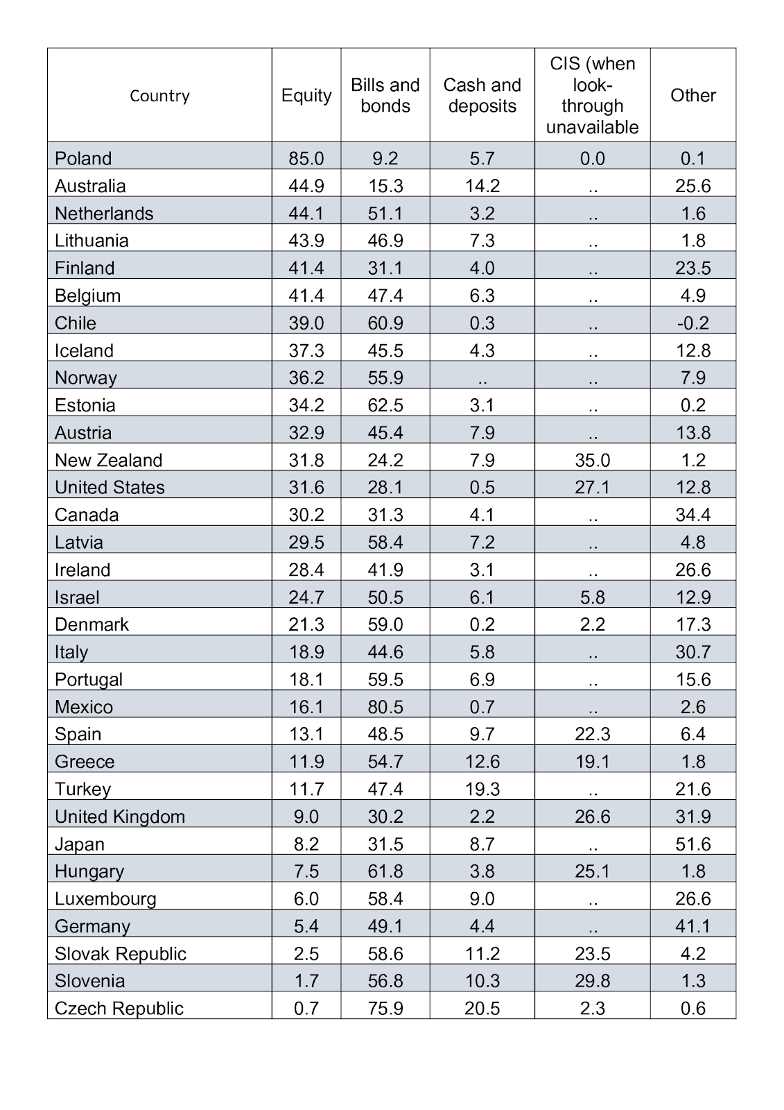
How much government paper fund managers are obliged to hold varies from country to country; the rules are complex. A more useful guide is to be found in the table below. Taken from the 2018 OECD Pension Fund Survey, it shows the breakdown of investments by country and asset class.
Source: OECD
According to other OECD data, 12 out of 34 reporting countries saw pension fund assets decline between 2017 and 2018, with total assets declining by 3.9 percent. Back in February 2018, Citibank estimated that the funding shortfall for the 20 largest economies in the OECD was $78 trillion, around 1.8 times the GDP of those countries. In January 2019, Swiss Re estimated that the funding shortfall across the OECD was increasing by around 5 percent per annum, meaning that the underfunding liability could swell to $400 trillion by 2050.
In real terms, stocks have returned more than seven times as much as bonds over the 1915–2014 period. We know that inflation averaged 3.2 percent; nonetheless, bonds managed to produce a positive real return of 1.1 percent versus a real return from equities of 8.3 percent.
An analysis of current government bond yields and inflation shows a very different picture. The table below, which focuses on the assets under management (AUM) of the pension funds (PFs) of the top 12 OECD countries (amounting to 95 percent of the OECD total) shows the weighted-average yield using 10-year bond yields from July 12, 2019.
The table is overly simplistic; please forgive ridiculous assumptions, such as the idea that the pension assets of each country are invested only in bonds of 10 years’ maturity, or that those bonds are of their own country alone. I further assume that current yields and inflation rates prevail for the next 12 months, arriving at a weighted-average nominal bond yield of 1.37 percent, and a real yield of −0.28 percent. Remove U.S. pension assets from the table, and the weighted nominal yield falls to 0.48 percent while real yields dip to −1.30 percent.
Pension Fund Target Returns
While pension fund managers have adjusted their target returns downward over the past two decades, the average expected return remains above 6 percent per annum. A classic 60 percent/40 percent portfolio of stocks and bonds has delivered 8.3 percent over the 1915–2014 period, so a 6 percent target might be considered conservative. Nonetheless, with bond yields delivering less than half their long-run average, pension fund managers are confronted with a dilemma. They can increase their equity allocation in order to meet their long-term return objective, but this creates solvency-risk issues since they may have to liquidate equity-capital investment at low valuations in order to meet their income obligations.
There are alternatives: They can invest in higher-yielding, but more volatile, long-dated bonds, or in higher-yielding, higher-risk bonds of less creditworthy issuers; or they can allocate to alternative investment strategies such as private equity or hedge funds. All of these options (with the exception of certain hedge fund strategies) increase investment and liquidity risk.
The inertial alternative, which has been the choice of the majority of funds, is to continue underperforming, hoping for a reversion to long-run average rates of return. Minimum-funding rules differ from country to country but generally permit a cyclical period of underfunding to last for around seven years. This allows pension funds to meet their near-term obligations by borrowing from future returns.
A cyclical dip in fixed-income returns can be tolerated on the grounds that interest rates will normalize. In the post–financial crisis environment, however, low interest rates are now the norm, and quantitative easing has caused long-dated yields to become artificially depressed. Unless interest rates are permitted to normalize, the underfunding gap will widen far more quickly. Swiss Re assumes a 5 percent annual shortfall, taking the developed-country pension fund deficit to $133 trillion within a decade. If we assume the shortfall is a more severe 7 percent, the underfunding deficit balloons to $164 trillion, roughly twice the size of world GDP today.
Negative-yielding bonds are a relatively new phenomenon, and a normalization of interest rates may be in the offing. If so, bond and stock prices will fall substantially and the world economy will head into a debt-laden recession. If, as I expect, central banks avert the near-term crisis by keeping interest rates artificially low and continue to expand their balance sheets by the purchase of their governments’ obligations, they are, in the long run, impoverishing their own people.
All they have contrived is to defer the day of reckoning. Solutions are available, but none are politically palatable; meanwhile the misallocation of capital could drive the trend rate of economic growth inexorably lower.
via ZeroHedge News https://ift.tt/2Ok6wEf Tyler Durden
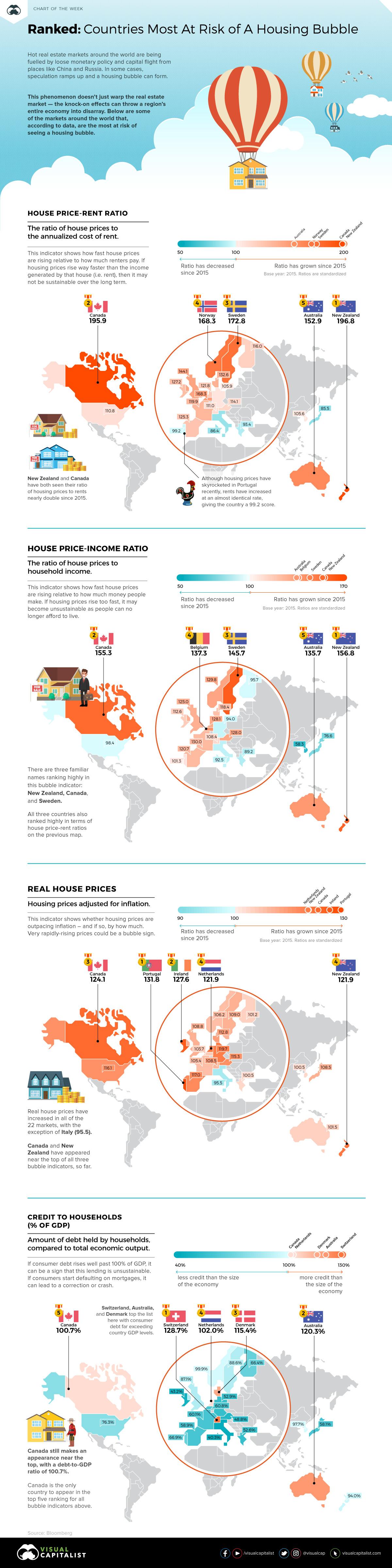
With a decade-long bull market and an ultra low interest rate environment globally, it’s not surprising to see capital flock to housing assets.
For many investors, real estate is considered as good of a place as any to park money – but what happens when things get a little too frothy, and the fundamentals begin to slip away?
In recent years, experts have been closely watching several indicators that point to rising bubble risks in some housing markets. Further, they are also warning that countries like Canada and New Zealand may be overdue for a correction in housing prices.
Key Housing Market Indicators
Earlier this week, Bloomberg published results from a new study by economist Niraj Shah as he aimed to build a housing bubble dashboard.
It tracks four key metrics:
House Price-Rent Ratio
The ratio of house prices to the annualized cost of rent
House Price-Income Ratio
The ratio of house prices to household income
Real House Prices
Housing prices adjusted for inflation
Credit to Households (% of GDP)
Amount of debt held by households, compared to total economic output
Ranking high on just one of these metrics is a warning sign for a country’s housing market, while ranking high on multiple measures signals even greater fragility.
Housing Bubble Risks, by Indicator
Let’s look at each bubble risk indicator, and see how they apply to the 22 countries covered by the housing dashboard.
It should be noted that most of the measures here are shown in an index form, using the year 2015 as a base year. In other words, the data is not representative of the ratio itself—but instead, how much the ratio has risen or fallen since 2015.
1. House Price-Rent Ratio
When looking at housing prices in comparison to rents, there are four countries that stand out.
New Zealand (196.8) and Canada (195.9) have seen ratios of housing prices to rents nearly double since 2015. Meanwhile, Sweden (172.8) and Norway (168.2) are not far behind.
Elsewhere in the world, this ratio is much more in line with expectations. For example, in Portugal—where house prices have skyrocketed over recent years—rents have increased at nearly the same rate, giving the country a 99.2 score.
2. House Price-Income Ratio
There are three familiar names at the top of this bubble indicator: New Zealand (156.8), Canada (155.3), and Sweden (145.7).
In places where rents are lagging housing prices, so are the levels of household income. For how long will people afford to buy increasingly expensive houses, if their incomes continue to lag?
3. Real House Prices
Real house prices have increased in all of the 22 markets, with the exception of Italy (95.5).
For this indicator, there are five markets that stand out as having fast-rising prices: Portugal (131.8), Ireland (127.6), Netherlands (121.9), Canada (124.1), and New Zealand (121.9). The latter two (Canada/New Zealand) have appeared near the top of all three bubble indicators, so far.
4. Credit to Households (% of GDP)
Exceedingly high debt ratios point to a strain on consumer finances – and when finances are strained, the chance of a default increases.
Switzerland (128.7%), Australia (120.3%), and Denmark (115.4%) top the list here with consumer debt far exceeding country GDP levels. However, Canada still makes an appearance in the top five with a debt-to-GDP ratio of 100.7%.
via ZeroHedge News https://ift.tt/32UdoeO Tyler Durden
Democrats in Washington are trying to push through a bill to raise the federal minimum wage, but around the country dozens of cities and states raised the wage floor at the beginning of the year. And like clockwork, small businesses across the country are already struggling with some of the issues that conservatives warned about. To wit, many businesses, particularly restaurants, which are notoriously low-margin businesses, have been forced to lay off employees, even after raising prices to meet the new wage requirements.
In other words, just like it did in Seattle, a higher minimum wage is hurting the poorest and most vulnerable workers – in other words, its hurting the same people it was supposed to help.
In a piece published this week, WSJ takes us to the Bay Area, where the owner of a restaurant called Patatas Neighborhood Kitchen, situated in the small city north of Oakland. After the city of Emeryville raised its minimum wage from $15 to $16.30 this year, the restaurant’s owner was forced to lay off six of his 10 employees and eliminate the dinner shift.
The economy is booming in the Bay Area, but at Patatas Neighborhood Kitchen, located in this small city just north of Oakland, owner Marcos Quezada recently eliminated the dinner shift and laid off six of his 10 workers.
He struggled with the decision but felt he had no choice after Emeryville increased its hourly minimum wage in July from $15 to $16.30, the highest in the U.S. “I just didn’t see how I was going to survive it,” said Mr. Quezada, who opened the eatery in 2017.
There’s no question that the cost of living in the Bay Area is higher than almost anywhere else in the US. But after several minimum-wage hikes in recent years, business owners are finding themselves stuck between a rock and a hard place.
Proponents say a minimum-wage increase was desperately needed in the hometown of Pixar Animation Studios, where the median rent for a one-bedroom apartment is $2,840, the median home price is more than $560,000, and a salad costs more than $15.
“The Bay Area is more expensive than any other part of the country,” said María Moreno, community organizer with the Restaurant Opportunities Center of the Bay, an advocacy group.
But local businesses say several increases in Emeryville’s minimum wage over the past few years have left them nervous about their financial viability.
To offset the cost of higher wages, restaurants have had to raise prices. But they’re getting to the point where another round of price hikes might jeopardize their business.
But the wage hikes aren’t over yet. Across California, the state minimum wage, currently $12, is set to rise by $1 a year through 2022. The CBO projects that higher wages will lift 1.3 million Americans out of poverty. But it will also destroy 1.3 million jobs.
The city of Emeryville, with its minimum wage higher than the state’s baseline, has become a proving ground for these policies, and already they’re showing signs of strain.
Emeryville first raised its minimum wage above the statewide floor in 2015, to $12.25 an hour, setting it to automatically increase every year since. Mayor Ally Medina, a Democrat, said the ordinance was meant to help workers cope with the Bay Area’s high living costs.
Sheena Luu, a barista at Polaris Cafe, said Emeryville’s minimum wage makes it possible for her to afford $1,500 in rent for her studio apartment. She also works at coffee shops in two nearby cities, earning about $13 an hour. “If I didn’t have it, I would have to cut back,” she said of the higher pay in Emeryville.
Some local business owners lobbied the city council for temporary exemptions from the new minimum wage laws. But ultimately, the council decided not to grant them, because such a measure wouldn’t be politically feasible.
Business owners in Emeryville recently pressured the city council to temporarily exempt about two dozen small restaurants from the wage increase.
But the council on Tuesday night voted 5-0 to keep the $16.30 floor in place. The city council also agreed to convene a working group to help small businesses better cope with the higher costs.
“I just did not feel comfortable telling workers they were not getting a pay increase they expected,” said Ms. Medina.
Meanwhile, citizens of Emeryville must now get used to paying some of the highest prices outside of Hawaii. Retailers and other industries with lots of minimum wage workers have adapted to the wage hikes, but restaurants, with their thin margins, are different.
The flip side can be seen on the menus at Rudy’s. Co-owner Doug Smith said he has raised the price of the cafe’s signature Deuces Wild special – two pancakes or two pieces of french toast, two eggs and two bacon slices or sausages – to $14.50 from $11 in 2015, and the Crunchy Asian Salad to $15.50 from $10. But that still isn’t enough to cover increased labor costs, he added.
But might there possibly be a middle ground? Another mechanism for setting higher wages that doesn’t make it too onerous for businesses to operate, forcing them to lay off workers?
A few days before the Emeryville story appeared in WSJ, the paper published another piece about how restaurants are being forced to “sweeten pay packages” for employees since record-low unemployment and a shortage of teenagers looking for after-school jobs has left them with a shortage of workers. It’s also becoming increasingly difficult for these mostly fast-food and fast-casual restaurants to find and retain workers, as the quit rate for food-and-service jobs is at a record high.
Many restaurants are raising wages by their own volition, whether or not they’re situated in a state or city that has been hiking wages.
It almost sounds like the free market is doing a pretty efficient job of setting wages in the labor market – but no amount of empirical evidence, it seems, will stop the social justice warriors (mostly white kids who grew up in the middle or upper-middle class) from demanding higher wages for low-wage workers. They clearly don’t realize – or they’re refusing to accept – that what they’re really doing is taking jobs and hours away from these same workers whom they’re supposedly trying to help.
via ZeroHedge News https://ift.tt/2Yl43gL Tyler Durden
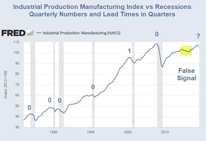
Manufacturing output contracted in both the first and second quarters of this year, according to the Federal Reserve’s report on industrial production. That was the first back-to-back decline since the soft patch in 2015 and 2016 — and one of the key factors, along with trade frictions and slowing global growth, driving the Federal Reserve to lower interest rates next week.
Manufacturing isn’t the economy, as Goldman Sachs economists pointed out in a report last week. Its share of gross domestic product has fallen to 10%, according to Goldman’s calculations.
Baum Disputes Goldman Claim
Baum disagrees with Goldman Sachs, and so do I, for even more reasons.
Here are some of Baum’s reasons.
Unlike the services sector, manufacturing tends to be cyclical. Manufacturers can choose to postpone capital investment projects when the future doesn’t look bright, but the public still needs teachers, nurses and firefighters, even in recession.
“In real terms, growth in manufacturing has kept up with growth in the rest of the economy over the last 70 years,” according to a 2017 study by economists at the St. Louis Fed. Its “share of real GDP has been fairly constant since the 1940s, ranging from 11.3% to 13.6%.” So the often touted “shrinking share” is really a function of the change in the price level.
Four of the 10 components in the Conference Board’s index of leading economic indicators are manufacturing-related. Ranked in order of importance, they are: average weekly hours in manufacturing; the ISM new orders index, which was added in 2012, replacing the ISM vendor deliveries index; manufacturers’ new orders for consumer goods and materials; and manufacturers’ new orders for non-defense capital goods excluding aircraft.
Things can always change, but it seems safe to say that as manufacturing goes, so goes the nation. Judging from a century of data, it seems safe to say that what happens in manufacturing doesn’t stay in manufacturing. Instead, it has spilled over to the economy at large. So ignore the small yet significant manufacturing sector at your own peril.
One thing that we cannot stress often enough is that the manufacturing sector is far more important to the economy than its contribution to GDP would suggest. Since GDP fails to count all business spending on intermediate goods, it simply ignores the bulk of the economy’s production structure. However, this is precisely the part of the economy where the most activity actually takes place.The reality becomes clear when looking at gross output per industry: consumer spending at most amounts to 35-40% of economic activity. Manufacturing is in fact the largest sector of the economy in terms of output.
Sure enough, in GDP accounting, consumption is the largest component. However, this is (luckily) far from the economic reality. Naturally, it is not possible to consume oneself to prosperity. The ability to consume more is the result of growing prosperity, not its cause. But this is the kind of deranged economic reasoning that is par for the course for today: let’s put the cart before the horse!
In addition to what Tenebrarum states, please note that government transfer payments including Medicaid, Medicare, disability payments, and SNAP (previously called food stamps), all contribute to GDP.
Nothing is “produced” by those transfer payments. They are not even funded. As a result, national debt rises every year. And that debt adds to GDP.
Manufacturing’s Share of GDP is Hugely Underestimated
Thus, in addition to Baum’s excellent comments on the the cyclical nature of manufacturing, manufacturing’s share of GDP as attributed by economists is simply wrong.
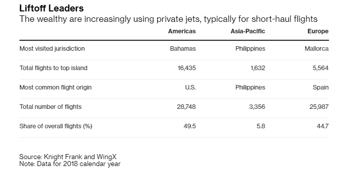
Private jets are exclusive modes of transportation that are growing increasingly popular with the world’s super-rich, according to Bloomberg. And they’re being used to go everywhere, from the Bahamas, Puerto Rico and the Cayman Islands.
Flights on private jets were up about 10% last year and flights to the islands in the Americas numbered almost 30,000. This helped make the islands in the Americas the number one destination for non-commercial aviation.
Knight Frank partner Alasdair Pritchard said: “Private jets are the path of least resistance for travel. If you can afford it and then experience it, you wouldn’t go back.”
Private jets remain one of the “trophy assets” for the super rich, in addition to super-yachts, that can have price tags up to $50 million. Maintaining and managing a private jet can be “almost as expensive as buying one,” between fuel costs and a team needed to manage the aircraft.
More than 66% of arrivals to the Bahamas originated in the U.S. or Canada. With Miami and the U.S. mainland just an hour away, the proximity of private flight origins in the Bahamas highlights how the rich like to use private jets for short trips. In Europe, they are used similarly, where aircraft often land in places like Mallorca, Ibiza and Sardinia – the three most popular island destinations for private jets.
Joe Stadler, head of ultra-high-net-worth clients at UBS Group AG, said:
“All the people who fly private tell me they wouldn’t from London to Hong Kong. To do that one-day trip, they will go private. Increasing use of private jets is a function of how crowded public airports are now. The more crowded they are, the more delays there are, and the more cumbersome it is to fly from A to Z.”
The Philippines, Maldives and Bali marked the top destinations in the Asia Pacific region. That region saw private aircraft arrives rise more than 80%, indicative of the wealth boom in China, a country that minted a new billionaire every other day.
The super rich buy private jets not only for convenience, but also for privacy. Oprah Winfrey said that she bought a jet after a fan had confronted her at an airport. For those not willing to buy, they can still own part of a jet or acquire timeshares through companies like VistaJet and NetJets. About 33% of those who own private jets are worth more than $500 million.
Recall, in March of this year, we wrote about how some private jet managers were scamming the ultra rich out of millions by charging them for services they didn’t need and food they didn’t eat.
via ZeroHedge News https://ift.tt/2YuIAlw Tyler Durden
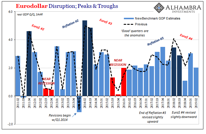
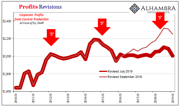
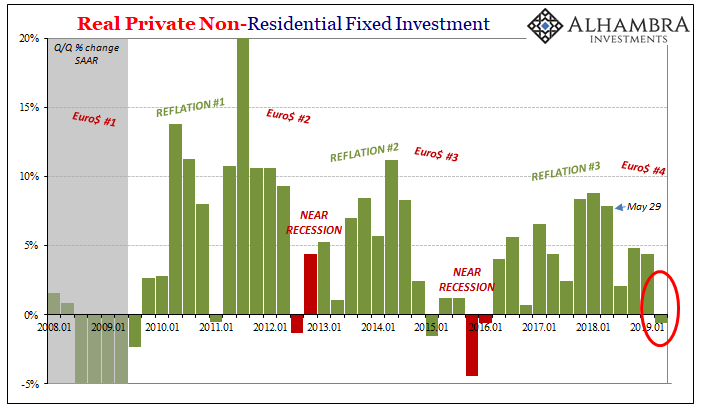
You can see it in the GDP numbers, even before they were revised. Globally synchronized growth was always less impressive than what it was made out to be. It’s as true overseas as in the US. The upswing was endlessly hyped, but there was so much less behind it in reality.
Reflation #2 was a whole lot better than Reflation #3, not that the second one made the difference. In this disparity, though, you can see why the bond market was never fooled. Globally synchronized growth never had a chance. It was even more empty than the 2014 predictions for overheating.
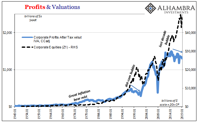
One big reason, in the American part of the system anyway, has been corporate profits. The Euro$ #3 downturn wasn’t just a manufacturing recession, more importantly it was also a profit recession. Small wonder the labor market slowed down following 2014. Even as the unemployment rate fell, however you want to measure hiring there was a clear lull (another reason why the LABOR SHORTAGE!!! was only ever present in anecdotes).
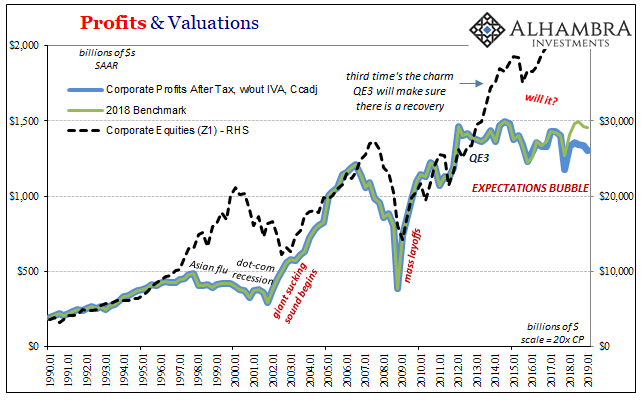
How much profits would have recovered from Euro$ #3 would have dictated the ultimate intensity of Reflation #3. Initial estimates have been suggesting that there was at least some rebound, small as it may have been.
The latest benchmark revisions to GDP, however, erase those hopes. Profits may never have recovered at all – interrupted yet again by “something.”
The GDP aggregate for corporate bottom lines is now thought to be a whole lot less especially over the last year and a half since Euro$ #4 showed up. The trend unleashed by Euro$ #3 may have been countered by renewed growth throughout 2016 and 2017.
At best, depending on the specific series, whatever little positive there might have been during Reflation #3 has now largely disappeared with 2018’s estimates trimmed substantially.
More than the headline GDP revisions, this new set of profit data really exposes the economy’s vulnerabilities heading further into the fourth downturn. Federal Reserve Chairman Powell and the FOMC have already singled out business investment as cause for downside concern. That’s not going to get any better with this sort of profit picture.
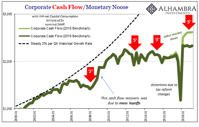
It is, though, the labor market which is most susceptible to this (more) ugly condition. The foundation for a second half rebound, even just keeping the economy afloat without getting worse, is predicated on a strong labor market. Companies that are booking less bottom-line income aren’t going to be hiring at the same pace.
This data underscores the concerns already showing up in the labor market data (apart from the unemployment rate).
Companies that are making less profits hire less (and maybe start to layoff some), workers sense that downward tilt and as consumers become more cautious in their spending. There’s the explanation for the housing data; a real lack of confidence.
It also explains why businesses are increasingly shy and even cutting back from capex. You don’t make as many new capital-intensive commitments if you aren’t making as much profit. In the same way you don’t add to staff, you might even cut back on capital expenditures the more this condition lingers.
Again, the revisions suggest even more forcefully the underlying economic vulnerabilities very different from the fundamental strength underlying Powell and his more optimistic (or less pessimistic) viewpoint.
This cannot just be a concern for the economy, either. Since profits are the basis for equity investing (in theory, don’t laugh), the fundamental stock condition looks more and more like the late nineties than anything resembling the early eighties.
Valuations are way, way out of line except in comparison to the dot-coms – precisely because like the late nineties there has been no profit growth. Investors have been betting, and continue to bet, that the economy eventually booms. The E part of PE, the thinking goes, will rise to meet the exceedingly high level of P at some point.
These revisions suggest it’s more rationalizing than rational. After all, 2014 was five years ago already. The longer this disconnect continues, does it make it more likely or less that E will shoot upward to justify current P? There was a small case to be made when 2018 profits were slightly higher than 2017 – that the positive trend might continue and then amplify as the Fed might be right about the inflation breakout and economic acceleration.
Going the other way in 2018 instead just confirms the next interruption. And that’s before getting to whatever full condition of Euro$ #4’s downturn might be in 2019. At the very least, it’s another couple years squandered.
Share prices rebounding from the landmine are staking everything on rate cuts to be the answer – even the initial bet on QE3 and QE4 hasn’t panned out. These vulnerabilities are a lot deeper than 25, 50, or even 75 bps on fed funds.
via ZeroHedge News https://ift.tt/2K0QfA5 Tyler Durden
It’s the electric future utopia that we were all promised: entitled assholes stealing your electricity because they can’t read their futuristic car’s range indicator.
Here’s one “green energy” Earth-saving scenario to chew on: Your landscaper comes to your door early one morning asking you to move your car so that they can service your lawn. Except, your car is the in driveway. So you venture outside to see someone else’s Tesla, sitting on your lawn, with an extension cord running across your grass and plugged into the side of your home.
According to WPBF ABC, this is exactly what happened to Phil Fraumeni, who has lived at his house in Lake Worth, Florida for 20 years.
“It was plugged into my electric outlet on my house,” Fraumeni told the local news.
The car wasn’t stolen and the owner was later tracked down. He was told by the owner that he was visiting a friend in the neighborhood when the Tesla’s battery died.
“From what the boy said from midnight the night before, so 12 hours it was charging,” Fraumeni said.
Ultimately, Fraumeni was a good neighbor about the situation. He didn’t press charges and didn’t even charge the owner for the electricity.
via ZeroHedge News https://ift.tt/2YmYw5b Tyler Durden


