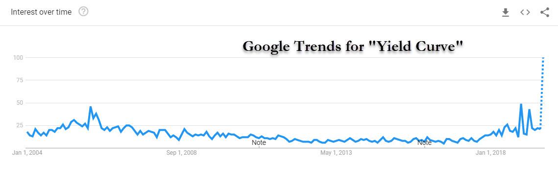
Now that the 2y-10y yield curve has declined below 0bps several times in the last couple of weeks, closing at -0.020 on Friday, discussion of inverted curves and what they mean for recession risk has become elevated. So elevated, in fact, it has just hit a record high on Google Trends.
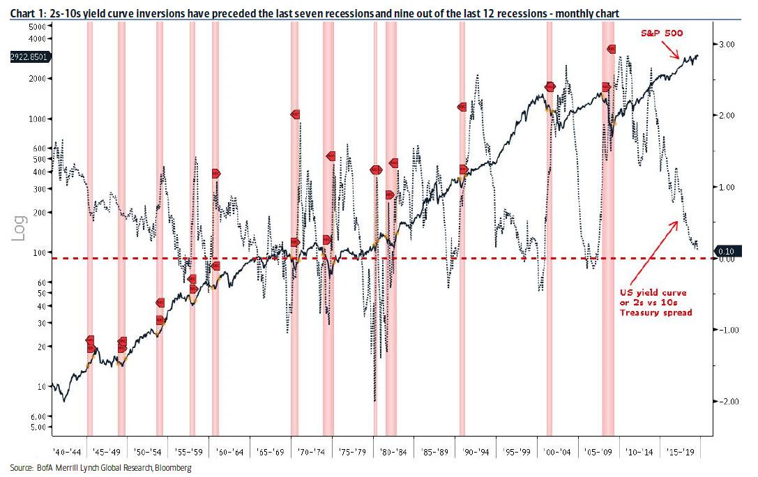
Yet while the popular focus on the 2y-10y slope is understandable – after all, that is the one yield curve that reportedly has the best recession predictive power, as 2s10s yield curve inversions have preceded the last seven recessions and nine out of the last 12 recessions…
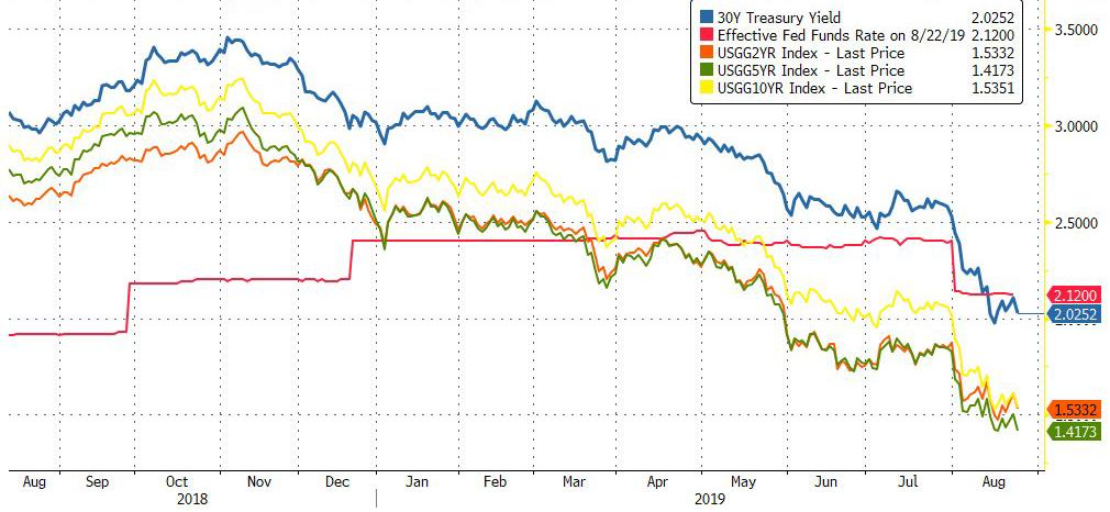
… several other curve slopes are inverted and have been for a few months, including 3mo-10y, 3mo-5y and 2y-5y. In addition, other market curves are inverted such as 2y-10y and 2y-5y on both the LIBOR swaps curve and the Fed funds OIS curve. Perhaps the simplest chart of all is the following: it shows that every single point on the yield curve, including the 30Y Treasury, is now below the Fed Funds rate.
The problem, as Bank of America notes, is that determining which curve is most meaningful is more than a matter of checking which ones inverted prior to past recessions, because most curves do that historically. What’s more telling is the extent to which a curve slope has any power to predict future growth.
So what is the right metric to compare yield curves? Considering that the curve slope that provides the most insight into future growth is the curve that matters most, Bank of America strategists followed in the footsteps of a Federal Reserve study (Engstrom and Sharpe) to test each curve’s ability to predict year-ahead GDP growth, S&P returns, and bond yields. Like the Fed study, BofA found that it is not the 2s10s, but rather the near term path of Fed policy over 1 year provides the most powerful signal (chart below).
The punchline: the 3-month rate 1-year forward (1y3m) versus the current 3-month rate dominates all other curves in its power to predict GDP growth, and it does a surprisingly good job. The flatter the curve, the worse the outlook for growth. It is also very respectable – compared to other indicators – in its ability to forecast stocks and bond yields.
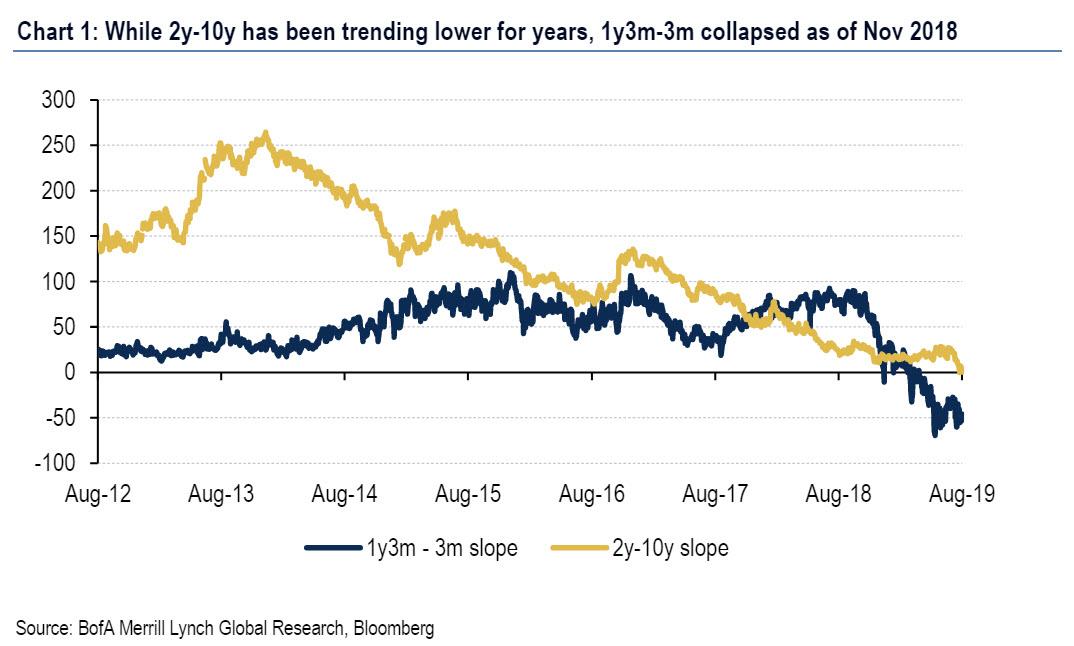
The intuition behind why this particular slope works so well is simple: it purely reflects the market’s outlook for Fed policy and is impacted by very little else. In other words, the 1y3m – 3m curve can only invert if the market prices the central bank policy rate to decline over the next year, as is the case today. Meanwhile, the slopes that use longer rates such as 2y-10y incorporate a longer path of forward-looking Fed policy and produce a less powerful signal for near-term growth. If the market outlook for Fed policy action is easing, which implies 1y3m-3m inversion, clearly there must be reason for the market’s concern (and the latest stumble in the Universe of Michigan consumer confidence index).
In other words, just as studies have shown that orange juice futures help predict Florida weather, the market’s pricing of Fed policy is a relatively good predictor of year-ahead GDP growth, and as can be seen in the chart below, what it is predicting is the worst economic slump since the global financial crisis.

What does this mean?
As Bank of America explains, there is good news and bad news here. The good news is that the Treasury 2y-10y has failed to make new decisive lows and has hugged the unchanged line for the past 2 weeks; The bad news is that this curve doesn’t matter as much.
As BofA points out, the 1y3m-3m slope began to tilt downwards in November 2018 and has remained inverted since March of this year. The data tell us that this is the signal to watch. If the Fed keeps cutting, as is the widespread consensus call and is also priced in by the market, it may or may not help this curve become upward sloping again. It depends on whether the market prices the Fed to continue cutting. The bigger problem is that when it comes to control over the yield curve that matters, the Fed no longer has any: after the July cut this year, the 1y3m-3m curve inverted more, as the market priced even more Fed cuts.
* * *
As an appendix, Bank of America caveats that it is important to point out that the predictive power of any yield curve for future growth is limited, with about 40% of variability in 1-year ahead GDP explained by the slope of 1y3m-3m since 1972. The bigger problem for BofA is that while its own results suggest a major recession is dead ahead (see Chart #2), the bank’s economics team is still calling for continued US growth – though slower – throughout 2020, with about a 1 in 3 probability of recession next year. As such the BofA credit strategists had to find a way to mitigate the dire conclusion their own work created, and they did just that saying that they “view the inversion of 1y3m-3m as flagging downside risks around our base case outlook, especially if it were to decline significantly from here, which would require the market to price in a deeper cutting cycle.”
In other words, it is up to the Fed to prove to the market that it is still in control, because as of this moment, Powell no longer has control over the one yield curve that matters the most.
via ZeroHedge News https://ift.tt/2P9CS4W Tyler Durden