Authored by Richard Baker via Kitco,
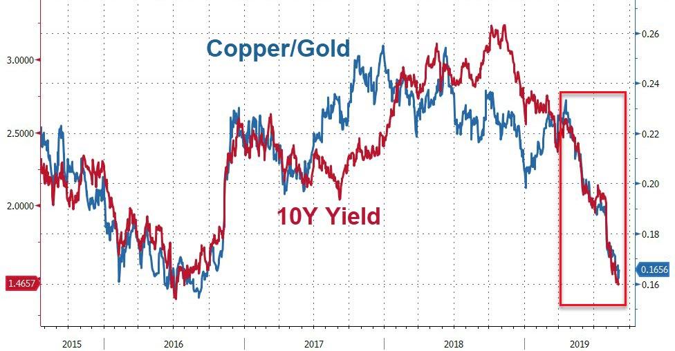
Jeffrey Gundlach, CEO of DoubleLine Capital LP (DoubleLine), noted in his 2017 forecast that the copper-to-gold ratio was a “fantastic” indicator of interest rates. I have since written a number of Kitco commentaries on the stunning relation of the U.S. 10-year Treasury yield with copper and gold prices. High-fidelity yield models are often possible on a short- and even longer-term basis. During times when the copper-gold ratio diverges from the 10-year yield, the rise or fall of the former usually portends a rise or fall of the latter. (Kitco commentary July 1, 2019).
Source: Bloomberg
Since this spring, Treasury yields and the copper-to-gold ratio have plummeted. How is the Gundlach indicator performing now?
Jeffrey Mayberry, Co-Portfolio Manager of the DoubleLine Strategic Commodity Fund, has studied the relationship in great depth and makes this important observation:
The ratio’s absolute level is irrelevant. What matters is its direction – and whether the yield on the 10-year Treasury moved in the same direction or diverged. In past episodes of divergence, the 10-year yield has eventually tended to follow suit of copper-gold (“The Power of Copper-Gold: A Leading Indicator for the 10-year Treasury Yield,” Jeffrey Mayberry, DoubleLine Funds)
Loren Fleckenstein, one of the crew at DoubleLine®, invited me to Los Angeles last month to further discuss and explore the copper-gold ratio tie to interest rates. Their two-level office space on the 18th floor of the Wells Fargo Building has sweeping views of the faraway Hollywood sign to the northwest and Los Angeles City Hall to the northeast. Located atop Bunker Hill, it is across the street from the Museum of Contemporary Art and the famous “Angel’s Flight” funicular railway. A creative and innovative environment with a top-of-the-line trading floor on the second tier.
I met with Jeffrey Sherman, Deputy Chief Investment Officer of DoubleLine, Jeffrey Mayberry and Loren Fleckenstein to show them my latest models and analysis tools applied to the copper-gold indicator. Below is an update of two of the charts in that presentation.
Correlation Map Indicates Strong Persistence
A correlation map is a powerful technique for detecting changing directional behavior between two market variables. Figure 1 is the 3-month (Y-axis) and 1-month (X-axis) rolling Pearson correlations of the copper-to-gold ratio (CGR) and the U.S. 10-year Treasury yield.
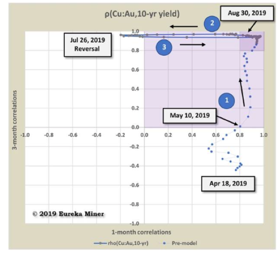
Figure 1 – Copper-to-Gold Ratio & 10-year U.S. Treasury yield Correlation
The correlation trajectory of Figure 1 begins April 18, 2019 during a period of divergence between the ratio and yields. Starting in the lower-right quadrant, 3-month correlations are negative; and 1-month, positive. The positive short-term correlations eventually pull the longer-term positive as the trajectory enters the upper-right quadrant on May 10.
From this point forward, the correlations of each time period increase positively (arrow #1) until both exceed +0.8. When short- and longer-term correlations have the same sign, we say the relation exhibits “persistent” correlation (shaded upper-right quadrant indicates positive persistence). Data concentrated in the +0.8 by +0.8 box indicates “high persistence density” (darker shaded area).
Construction of a high-fidelity yield model is possible for cases of positive correlation persistence with improving accuracy given high persistence density.
Figure 1 indicates weakening of the 1-month correlation (arrow #2) which briefly turned negative until a July 26th reversal. A quick return to the +0.8 box in late-August (arrow #2) follows.
In terms of Mr. Mayberry’s definition, the relationship has moved from weak divergence to a strong directional behavior between interest rates and the copper-gold ratio – a correlation journey from mid-April to late-August.
High-Fidelity 3-Month Yield Model
Figure 2 is a 3-month regression model of 10-year U.S. Treasury yields based on the ratio of copper and gold prices as of Friday’s close, August 30.
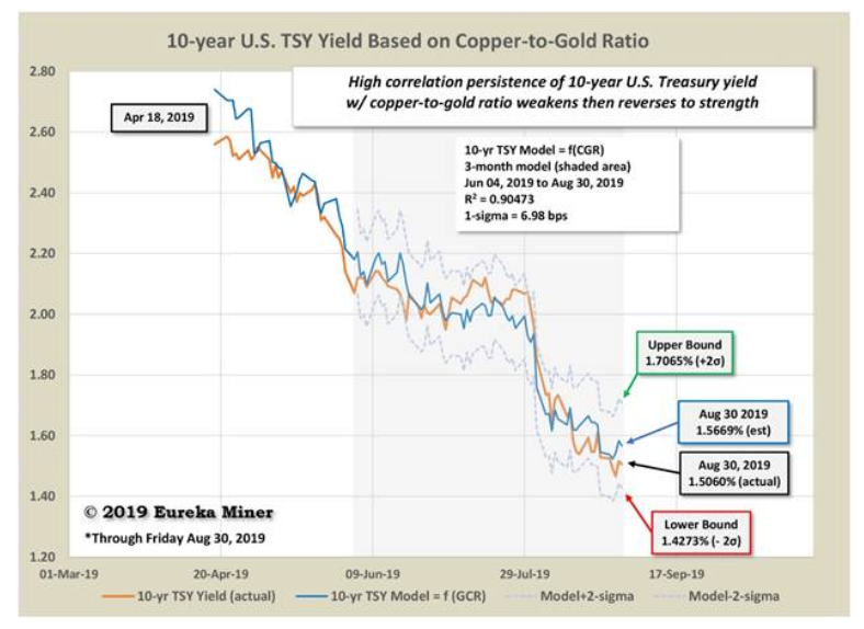
Figure 2 – U.S. 10-year Treasury yield model based on Comex copper & gold prices
Reassuringly, the high correlation persistence shown in Figure 1 results in the high-fidelity model of Figure 2. The R2, or “goodness-of-fit,” is a respectable 0.905 with a statistical error less than 7 basis points (bps). The model also provides upper and lower 2-standard deviation (2-s) bounds for yields. The lower bound of 1.427% is a sobering reminder of how far yields have fallen and may continue to drop.
Ongoing geopolitical concerns, slowing global growth and uncertainty about U.S./China trade relations have caused a decrease in the CGR and decline in U.S. Treasury yields. As market participants run to safe havens like gold and U.S. Treasurys, they typically retreat from “risk-on” assets like copper. Rising gold and declining copper prices lower the CGR while higher bond prices produce lower yields. At last week’s close, the CGR was at a lowly 0.01668 or, in reciprocal, an historically elevated 599 pounds per ounce. The 10-year Treasury plumbed 1.506%, only 6 bps above the August 28 three-year low.
Hats off to the DoubleLine team for discovering a leading market indicator with proven performance in troubled markets. The market events since spring provide further testament to that record.
via ZeroHedge News https://ift.tt/2LqUlkq Tyler Durden