This Is Where The World Is On The “Corona Curve” At This Moment
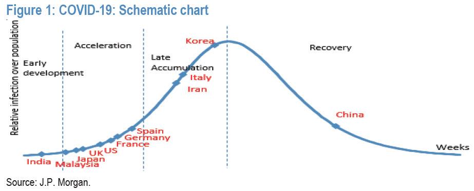
Two weeks ago, we wrote that “with 1.7 billion people in the world under quarantine (and India about to make that 3 trillion) and desperate to find out where on the coronavirus “curve” they are to calculate how much more pain there is, JPM has made an attempt at a (very nonscientific) visual representation of where on the curve the main covid outbreaks in the world currently stand.”
Furthermore, this is how we laid out the good news/not so good news/bad news on March 24:
-
The good news, China has is now well into the recovery phase, although since any and every number out of China is a lie, we would ignore any reports that the covid pandemic in China is easing especially after a spate of recent indications that China is openly manipulating its infection numbers. Also good news: Korea is almost “over the hump”, and absent new clusters emerging in the next few days, should be in recovery.
-
The not so good news: both Italy and Iran are in the “late accumulation” phase. If they fail to halt the breakout at this point as the recovery phase approaches, it will get very ugly as much of the local population could then be infected. Behind Italy and Iran is the rest of Europe, with Spain, Germany, France, the UK all in the acceleration phase. The onus in on them to execute successful lockdowns.
-
Finally, the bad news: both the US and India are at the very start of the curve and things will get much uglier in the coming weeks before they get better.
Long story, short, this is how the global “corona curve” looked as of March 24.
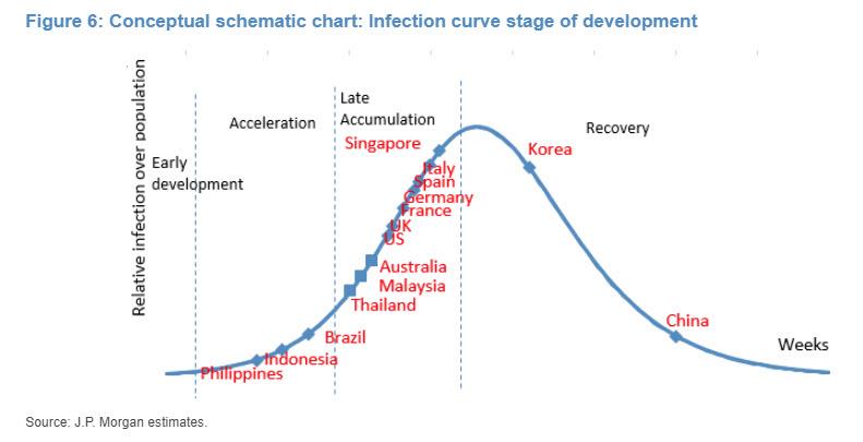
Fast forward to today when we we again have some good and bad news, oh and a graphic update of where on the curve the world is.
First, the bad news: putting the past two weeks in context, back on March 24 there were roughly 350,000 global cases, with 15,000 deaths. As of today, there are now 1.2 million cases and rising by 80,000 every day, with roughly 67,000 deaths and rising by about 8,000 per day.
Now the good news: with every passing day, the world – most of which is currently on lock down – gets closer to the infection inflection point, and as the updated “corona curve” chart shows, all the nations that were in the exponential rise phase (acceleration), are now moving into the stage of infection growth rate slowdown (accumulation), suggesting that a pea for most countries is now just a matter of time, at which point the number of new cases will start slowing down aggressively.
This means that while US cases continue to soar, the light at the end of the tunnel is now visible. One caveat: the giant populations off Brazil, Indonesia and Phillippines are only now enterting the acceleration phase, meaning that the number of global cases could soar in the coming weeks.
Finally, here is how the virologists over at JPM summarize where the world currently stands:
From an epidemiology modelling perspective, an assumption that 0.1-0.2% of the global population (or 8-16 million people) is subject to initial exposure to infection and that ~10% of the susceptible are subject to being infected could be a highly conservative pandemic scenario, in our view. In the case of COVID-19, reported infections are now above 1 million, which suggests that over 0.1% of the global population (under the assumption of a 10% conversion from test to infection) could be in the infection group.
Three key things we have learned so far are that COVID-19 can be asymptomatic and have up to two weeks of latency, and that there are limited test-kit supplies. Thus, if we assume that reported infections represent only about one-third to one-quarter of total infections, 0.4-0.5% of the global population might be initially exposed to COVID-19. Considering a four- to five-week virus cycle and global efforts to reduce new contacts via strong social distancing and city lockdown, the global infection cycle, which currently looks to be in the middle of the exponential rise (acceleration), could be gradually moving into the stage of infection growth rate slowdown (accumulation).
Translation: finally some good news as the bank concludes it might be reasonable to “gradually map out the potential global curve peak within two months.” The risk is that any indication of a slowdown in new cases will also lead to an early relaxation of stricter social distancing practices, as this could drive an infection curve rebound, something which is already happening in Japan, where today there were a record 118 new cases . And since China has been rushing to reopen its economy to avoid an all out economic depression and did away with “social distancing” long ago, one can be certain that China’s real numbers are exponentially higher than the political propaganda that Beijing is reporting to the outside world
Tyler Durden
Sat, 04/04/2020 – 16:05
via ZeroHedge News https://ift.tt/2yCovOZ Tyler Durden