Just One Chart
Authored by Sven Henrich via NorthmanTrader.com,
Nasdaq green for the year. What crisis? The Fed’s got this. Only took $2 trillion in balance sheet expansion in four weeks and all is well again.
Non. Sense.
Indeed I can show you just one chart that suggests, if history repeats, that this entire rally will make ways to new lows.

Before I do discuss this chart however appreciate this: The Fed is creating the largest asset price distortion known to man, totally decoupling prices from reality again. They already did so in the Fall of 2019 with their ill advised repo and balance sheet expansion program, but now have expanded their balance sheet by over $2 trillion in just 4 weeks:
For added historic context: The Federal Reserve has increased its balance sheet by $2.6 trillion since the August 2019 lows. That’s a near 70% increase in just 8 months representing 12% of US GDP. The Fed balance sheet expansion of $2 trillion in the past 4 weeks represents over 9% of US GDP.
Don’t anybody think or even try to tell me or anybody else that these monumental numbers do not have an impact on asset prices. Indeed the numbers are becoming so absurd and historically incomparable they lack any context to use to make adequate comparisons. I suspect not even the Fed has the slightest clue as to the side consequences they are unleashing here. All of this comes with zero rates sprinkled on top of it, as well as ongoing repo and of course the additional announced loan and rescue programs announced. Who can keep track of it all?
It’s a liquidity bonanza unlike any ever seen. Hence it’s no surprise that Wall Street is once again the following the Fed train:
Never forget. pic.twitter.com/FQQY6P5sHq
— Sven Henrich (@NorthmanTrader) April 14, 2020
That’s all you get from Wall Street these days. Chase the Fed in the belief the Fed will again remain in control, even though it had lost control for the harrowing weeks when the global stock market simply collapsed between February and March.
But nobody has learned their lesson. Not the Fed, not Wall Street and certainly not investors.
Nobody has learned a thing as the distortions that have led investors off the cliff are once again being formed, but even more extreme this time around.
Consider the following:
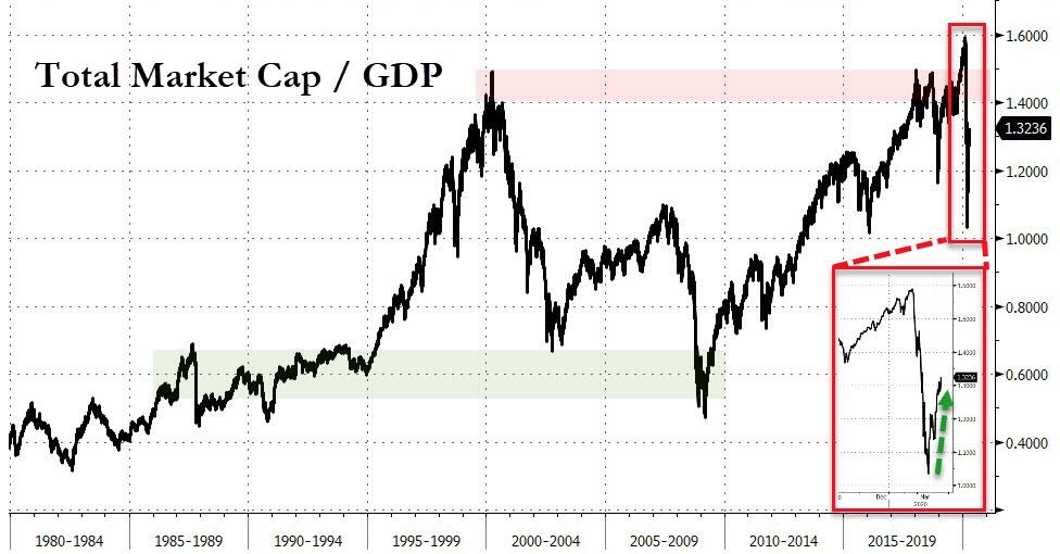
US equity prices are once again valued at 132% market cap to GDP as the tech sector is again green on the year while the entire economic structure is collapsing around us.
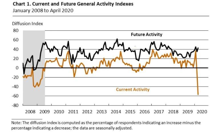
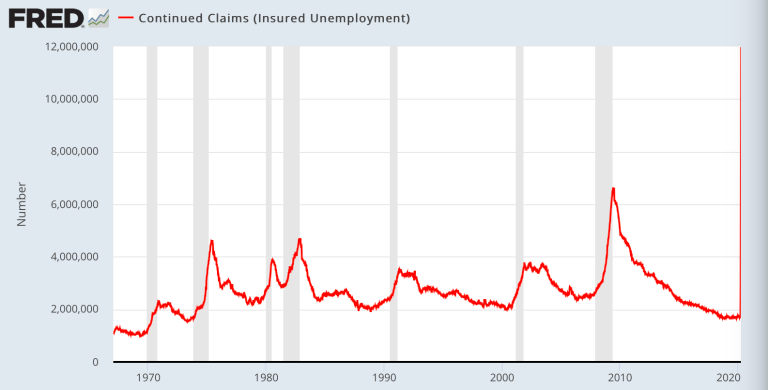
Economic activity falling to levels worse than the 2009 crisis:
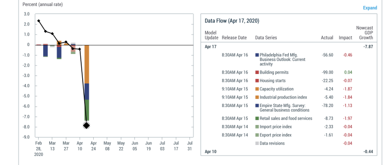
As is Q2 GDP, here the latest New York Fed Nowcast projecting a Q2 GDP of -7.8% likely to get worse with projections of -20% to -30% making the rounds:
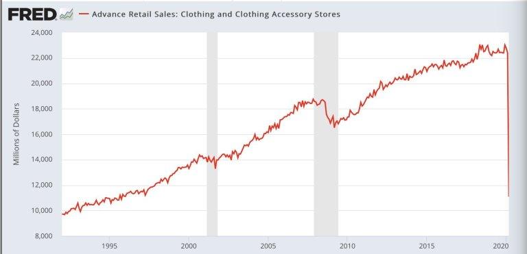
Clothing sales anyone?
Everything is going vertical either to the upside or the downside and all of it represents they greatest economic shock in our lifetimes:
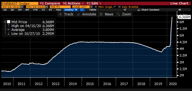
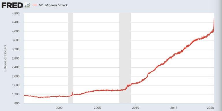
M1 money supply:
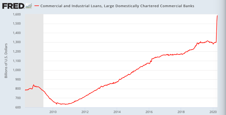
Commercial Loans:
But according to some none of this matters. Nothing matters. The Fed has our back hence we can justify this:
January 3rd 2020: “What if I told you that by April we’d have 22M unemployment claims, -20% GDP growth, -8% retail sales and over 35,000 Americans dead from a deadly virus and $NDX would still be green on the year?”
— Sven Henrich (@NorthmanTrader) April 17, 2020
Sure you get $AMZN to benefit from the entire retail sector being shut down and $NFLX benefitting from Americans sitting at home binge watching TV. But this does not an economy make.
Indeed the entire country on a federal, state and corporate level is needing bailouts. The entire country can’t sustain itself on its own 2 feet only a few weeks into a crisis:
Bailout nation.
It’s almost as if the entire system is broke and can’t function without artificial liquidity injections and debt based bailouts. https://t.co/0YKPBhmvDB— Sven Henrich (@NorthmanTrader) April 18, 2020
And with this backdrop you want to justify a market valued at 132% market cap to GDP?
Surely you’re joking right? There are some that claim that markets are forward looking and see better things ahead. Nonsense. These markets saw nothing coming and ran right into disaster and now they’re simply jumping on the Fed liquidity train again, the very train that got them trapped in the first place.
No lesson has been learned. How do we know that? Because the very same mistakes are again repeated and driven to new and even more historic extremes.
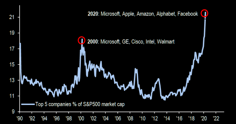
Again the entire market is driven by a handful of stocks:
While the broader markets is again showing pronounced relative weakness:
Indeed most telling: Equal weight again is lagging massively:
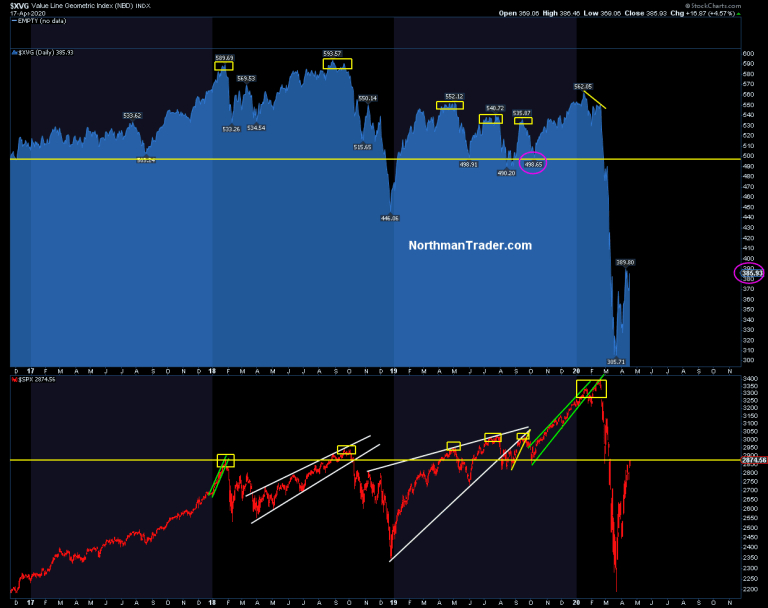
While $SPX made it back to the October 2019 lows $XVG equal weight has barely moved in the last week and remains far below the October 2019 lows. The message? It’s again a market driven by just a handful of stocks. Which means we are again staring at a vastly distorted and dislocated market.
This is the best market $2 trillion in central bank intervention can buy. A distorted overvalued market completely disconnected from the fundamental picture.
Nasdaq green on the year. Those condemned to unemployment salute you:
No, all this is has the whiff of the last crisis except worse:
This crisis is following the same script as the last one 12 years ago:
The poor get poorer, the middle class shrinks, the big boys get bailed out and the bottom 90% gets settled with all the new record debt.
And then central bankers get “Hero” magazine covers.— Sven Henrich (@NorthmanTrader) April 17, 2020
Screaming tech stocks in some cases making new all time highs, bailed out hedge funds with millions of Americans unemployed and standing in food bank lines.
What a planet. No, what’s happening here is the Fed creating another circus with money chasing again the same stocks they did during the bubble run of 2019 while ignoring the message of the broader market, yields and a historic collapse in fundamentals to boot, which brings me to just one chart:

The chart that says the lows are not in. The chart that says that the Fed’s hand won’t last the round. And it’s a simple technical chart, one that has shown us the roadmap already years ago.
Look closely:
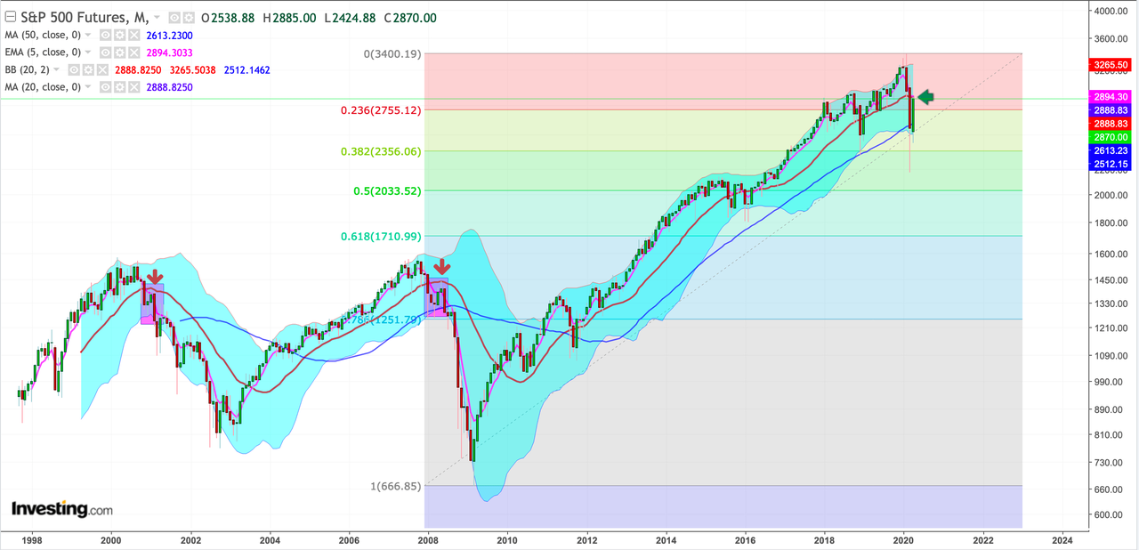
What happened in 2000 and 2007? Markets topped and broke their uptrends and experienced a very steep correction from the upper monthly Bollinger band to below the lower monthly Bollinger band. In doing so S&P 500 futures broke below their monthly 20MA.
Guess what happened in both cases? $SPX rallied back toward the monthly 20MA and that was the end of the line. The bear market rally. The rally that brought optimism back, the rally that said the worst was over, the rally that said the sell-off was over, the rally that said that the lows were in. You know the very things we are hearing now.
And in 2007 and 2000 these 20MA tags then saw markets not only give up all the gains of the rally, but that’s when the real bear markets began and significant new lows were to come.
And guess what? On Friday, during monthly OPEX on the heels of the biggest central bank intervention known to man we hit precisely that 20MA fulfilling the very same script.
And look even closer:
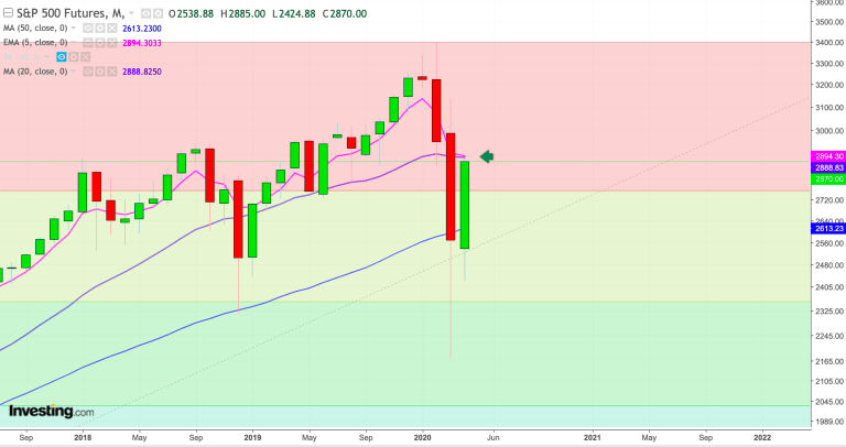
That monthly 20MA coincides perfectly with the monthly 5 EMA another key MA offering confluence resistance. Coincidence?
Doubtful. This was a key technical tag.
But the month is not over. But what appears clear here is that how the month closes is critically important. If the Fed can maintain control and entice investors to keep chasing a fundamentally not justified multiple expansion then we should see price close above these two MAs by the end of April.
Should the Fed lose control and fundamentals will start dominating the price action then we should see the month close below these two MA’s. In 2000 and 2007 it was the month after the 20MA tags that the price action showed significant retraces. If we see a replay then May could shape up to be a very difficult month for bulls.
Who will win out here? We can’t know yet. But we have a clearly defined technical line in the sand. The fundamental and valuation picture is clear: Markets are now again vastly overvalued here, but the Fed is again distorting the asset price valuation picture.
From our perch the bullish chart patterns outlined in $SPX (pattern 1, pattern 2) and $RUT have played out. Now a different set of signals is suggesting something else altogether may be shaping up. We will know more by month end whether bears are able to regain control, no doubt a tall order given the ungodly sums of liquidity thrown at these markets. Yet the Fed hardly can afford failure. Imagine losing control over a market after throwing in over $2 trillion in liquidity in just a month.
Investors have a choice to make: Believe they can chase a highly valued, internally vastly divergent market amid economic carnage in the hopes of the Fed retaining control or they can be aware that just one chart suggests an entirely historic script could play out, one that suggests not to chase, but rather take advantage of the current strength in markets and perhaps choose a different course of action.
* * *
For the latest public analysis please visit NorthmanTrader. To subscribe to our market products please visit Services.
Tyler Durden
Sun, 04/19/2020 – 13:55
via ZeroHedge News https://ift.tt/3bnk5tE Tyler Durden