Visualizing America’s Energy Use, in One Giant Chart
Have you ever wondered where the country’s energy comes from, and how exactly it gets used?
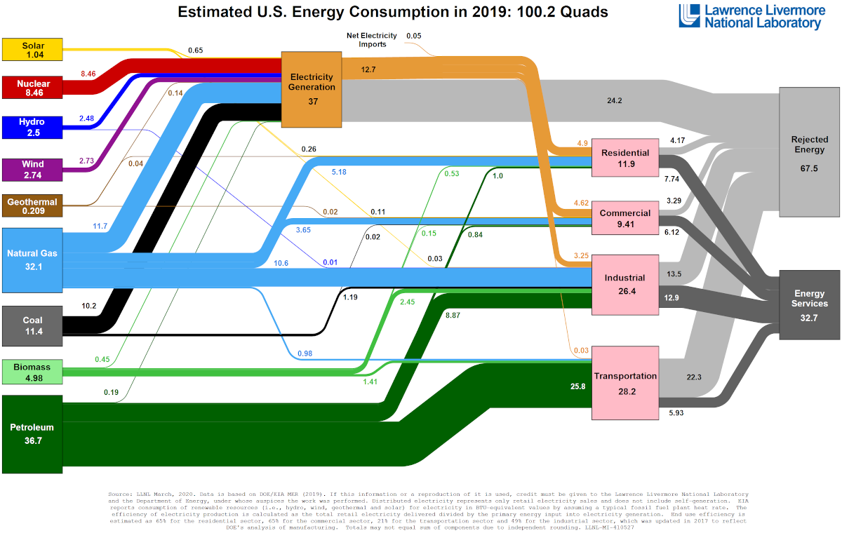
Well now, thanks to Visual Capitalist’s Jeff Desjardins, we have the answer as The Lawrence Livermore National Laboratory (LLNL) crunches the numbers every year, outputting an incredible flow diagram that covers the broad spectrum of U.S. energy use.
The 2019 version of this comprehensive diagram gives us an in-depth picture of the U.S. energy ecosystem, showing not only where energy originates by fuel source (i.e. wind, oil, natural gas, etc.) but also how it’s ultimately consumed by sector.
In Perspective: 2019 Energy Use
Below, we’ll use the unit of quads, with each quad worth 1 quadrillion BTUs, to compare data for the last five years of energy use in the United States. Each quad has roughly the same amount of energy as contained in 185 million barrels of crude oil.
Interestingly, overall energy use in the U.S. actually decreased to 100.2 quads in 2019, similar to a decrease last seen in 2015.
It’s also worth noting that the percentage of fossil fuels used in the 2019 energy mix decreased by 0.2% from last year to make up 80.0% of the total. This effectively negates the small rise of fossil fuel usage that occurred in 2018.
Energy Use by Source
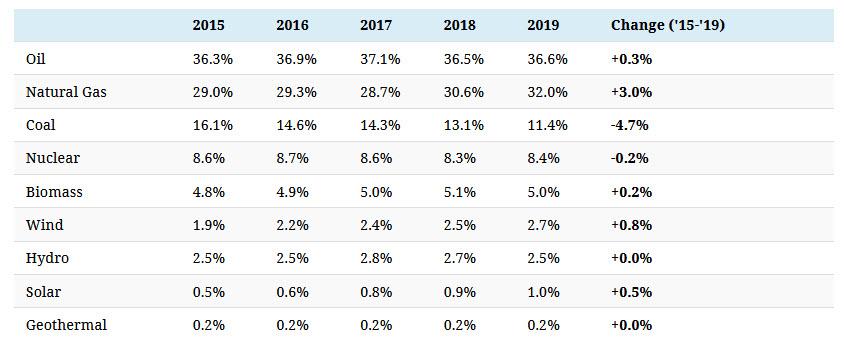
Which sources of energy are seeing more use, as a percentage of the total energy mix?
Since 2015, natural gas has grown from 29% to 32% of the U.S. energy mix — while coal’s role in the mix has dropped by 4.7%.
In these terms, it can be hard to see growth in renewables, but looking at the data in more absolute terms can tell a different story. For example, in 2015 solar added 0.532 quads of energy to the mix, while in 2019 it accounted for 1.04 quads — a 95% increase.
Energy Consumption
Finally, let’s take a look at where energy goes by end consumption, and whether or not this is evolving over time.
Residential, commercial, and industrial sectors are all increasing their use of energy, while the transportation sector is seeing a drop in energy use — likely thanks to more fuel efficient cars, EVs, public transport, and other factors.
The COVID-19 Effect on Energy Use
The energy mix is incredibly difficult to change overnight, so over the years these flow diagrams created by the Lawrence Livermore National Laboratory (LLNL) have not changed much.
One exception to this will be in 2020, which has seen an unprecedented shutdown of the global economy. As a result, imagining the next iteration of this energy flow diagram is basically anybody’s guess.
We can likely all agree that it’ll include increased levels of energy consumption in households and shortfalls everywhere else, especially in the transportation sector. However, the total amount of energy used — and where it comes from — might be a significant deviation from past years.
Tyler Durden
Thu, 05/07/2020 – 23:25
via ZeroHedge News https://ift.tt/2Lcu2yu Tyler Durden


