Deaths Vs. Economic Pain: Cable News’ Imbalanced Picture
Tyler Durden
Wed, 05/20/2020 – 22:15
Submitted by Kalev Leetaru of RealClearPolitics
Almost three months ago, COVID-19 became an inextricable part of American life. As the economy ground to a halt and unemployment soared, television news channels have focused the majority of their attention on the health impacts of the disease, while paying far less attention to the devastating economic harms, including historic job losses. A closer look at how channels are presenting the coronavirus crisis reveals stark differences, from CNN’s ever-present infections dashboard to Fox News’ periodic scrolling updates, offering clues to the increasingly partisan reaction to the pandemic.
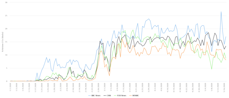
The timeline below shows the percentage of daily airtime on BBC News, CNN, MSNBC and Fox News mentioning “COVID-19” or “coronavirus” or “virus” since the start of this year, using data from the Internet Archive’s Television News Archive processed by the GDELT Project. (Click to enlarge, or view the live data here.)
All four channels started covering the pandemic on Jan. 18, but BBC has consistently devoted a greater portion of its airtime to it. CNN’s coverage volume has remained largely unchanged since early March, while BBC and MSNBC have both slightly decreased their mentions over the course of this month. Fox News is a notable outlier, steadily decreasing its coverage since April 26.
In contrast, since March “unemployment” or “unemployed” or “jobless” or “job losses” have received just 10%-20% of the attention paid to “death” or “deaths” or “died” or “infection” or “infections.”
Yet the visual nature of television news means that the channels aren’t limited to just periodic verbal mentions of these term and related statistics. In CNN’s case, every day since March 20, the channel has displayed an on-screen infographic with live COVID-19 infection and death counts for a total of eight hours a day, seven days a week, for nearly two months now.
A typical version of CNN’s dashboard can be seen in the clip below.
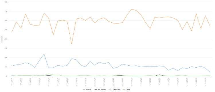
Since April 3, GDELT has also analyzed the on-screen text of MSNBC, Fox News and BBC, allowing for a similar search of their on-screen health counts. However, as the graph below shows, other than CNN, only MSNBC displays the text “Johns Hopkins” (the source of the data) daily on-screen for any length of time and it is shown only a fraction of the time CNN does.
MSNBC has used several iterations of its COVID-19 dashboard, from this early version that looks very similar to CNN’s tracker.
To this later more streamlined version.
Fox News has occasionally run the CNN tracker by virtue of playing clips from CNN.
And it has also displayed the native Johns Hopkins dashboard.
However, Fox has also developed its own dashboard, at least one version of which can be seen in the clip below, sourced to “WHO, CDC, ECDC, NHC, DXY,” relying on official government figures directly rather than Johns Hopkins’ compilation.
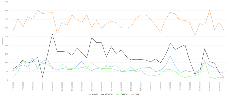
So how are the other stations reporting COVID-19 infection and death counts if they aren’t relying on the eight-hours-a-day dashboard model adopted by CNN? The timeline below shows mentions of “death” or “deaths” in the on-screen text of the four channels over the same time period. While CNN has the most mentions, BBC News comes in second, with Fox News and MSNBC nearly equal in third/fourth place.
Rather than a dedicated dashboard, BBC appears to communicate death counts primarily through brief unsourced updates in its chyron text at the bottom of the screen, such as “The death toll in the UK is now at 34,636” or “Number of confirmed Covid-19 deaths in the UK rises by 494 to 33,186,” as seen below.
Similarly, Fox News appears to primarily mention death counts in the scrolling text at the very bottom of the screen, as seen at the start of this clip.
In contrast, the timeline below shows the total seconds of airtime each day on the four channels mentioning “unemployment” or “unemployed” or “job losses” over the same time period. In contrast to the three-to-10 hours a day each station spends displaying the latest health statistics, job losses are seen for just five-to-10 minutes on most days.
In the end, no matter what channel viewers tune into, they are confronted with many hours a day of live death counts compared to just minutes a day about lost livelihoods and ruined lives, perhaps explaining why many officials in Washington – and, to some extent, at the local level — seem in little rush to reverse the economic devastation that they and the white-collar class have largely been insulated from to date.
via ZeroHedge News https://ift.tt/3cR1kj0 Tyler Durden


