3 Reasons Treasury Rates Can Still Hit 0%: Part I, Inflation Vs Deflation
Tyler Durden
Tue, 08/04/2020 – 20:05
Authored by Eric Basmajian via EPBMacroResearch.com,
-
Deflation remains the more credible risk, not inflation. The output gap suggests core inflation could sink below 0.5% in the coming years.
-
FX hedged Treasury yields remain higher than yields at home. This will increase foreign appetite for US rates.
-
From a longer-term secular standpoint, economic growth will fall into a new regime, sub 2% which will weigh on bond yields.
-
Further stimulus from the fiscal side will delay the full extent of the deflationary output gap but will not change the end result in the final analysis.
-
As part of your balanced portfolio, long-term Treasury bonds are still a valuable holding as the path to 0% remains a probable scenario.
The inflation vs. deflation debate remains one of the more hotly contested ideas in the marketplace today. The inflation hawks argue precious metals are a one-way street higher while cash is trash, and bonds are worthless. The deflationary crowd continues to play with the multi-decade trend arguing that interest rates are not done falling, and more gains are left with nominal Treasury bonds.
In this three-part series, I am going to highlight the main reasons behind why I believe that the path to 0% interest rates is more probable than an inflationary rise to higher yields. Three main factors support the conclusion for lower long-term rates, including:
-
a more credible risk of deflation compared to inflation,
-
high and positive FX-hedged Treasury yields,
-
and a continued decline in trend economic growth.
Each part will cover one of these factors in detail.
While I reside in the disinflationary camp, I am not one to argue that an inflationary outcome should be disregarded. A blanket denial of the potential for inflation is unwise, but an over-exaggeration of the risks with faulty analysis of historical macroeconomic trends is more dangerous.
The best path forward for the long-term, prudent investor is to start with a portfolio that is relatively balanced to each risk, inflation, and deflation. Depending on which risk is more probable over the next 12-36 months, tilting the portfolio from a balanced stance to an overweight stance in favor of the more likely outcome allows an investor to capitalize on the developing opportunity while allowing the possibility of the opposing scenario.
A comprehensive review of macroeconomic trends firmly suggests that deflation or disinflation, not inflation, is a more credible risk. Many of the common inflationary arguments we hear today are repeats of decade-old analysis that came about during the first round of Quantitative Easing “QE” or “money printing,” which proved incorrect in assessing the direction of inflation and bond yields.
In part I, we’ll review many of the common inflationary theses while arguing that deflation or disinflation is still a more credible threat.
Having a balanced portfolio with bonds, gold, stocks, and commodities always makes sense, but it is still premature to rid your strategy of disinflationary bets such as Treasury bonds altogether.
Deflation, Not Inflation, Is The Bigger Risk
Inflation is a highly consensus view among analysts. Typically this takes the form of “deflation now, but inflation later,” acknowledging the severe demand shock caused by the COVID lockdowns across the global economy. The “inflation later” part of the puzzle usually makes reference to Federal Reserve policy actions, including “printing” money and what is now a ubiquitous chart of money supply growth.
The Federal Reserve cannot “print” spendable dollars but rather purchase assets using reserves.
The inflation crowd has made frequent use of the following chart of money supply growth, quick to point out the record level.
Decades ago, with profoundly different circumstances which will be outlined below, significant increases in money supply growth gave reason to be worried about rising inflation. Today, there quite literally exists no correlation between money supply growth and inflation.
M2 Money Stock, Year over Year:
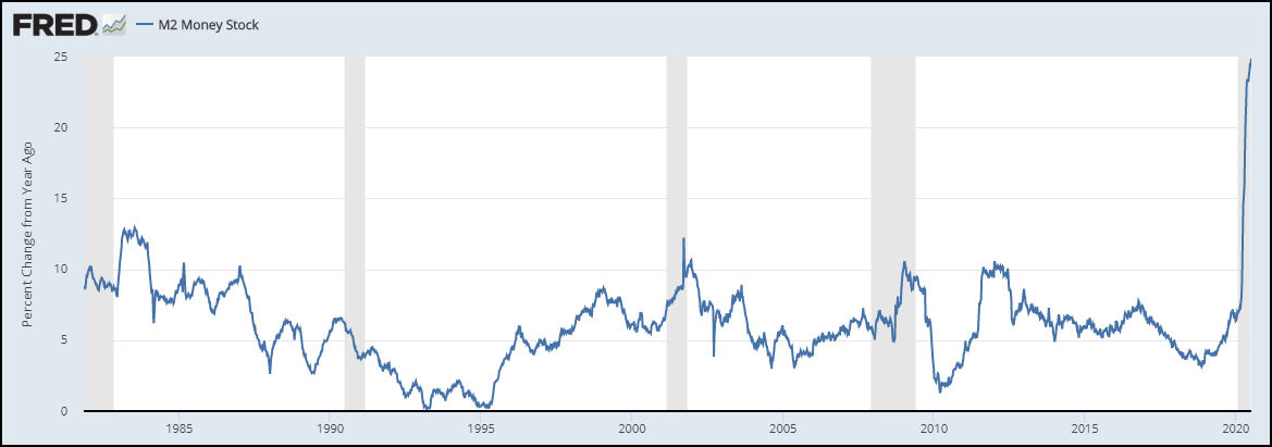
The Federal Reserve quadrupled the size of its balance sheet over the last ten years before the COVID crisis, and the result was below average inflation and a decline in market-derived inflation expectations. Despite what should be considered a well-established fact now, the same arguments for rising Federal Reserve assets and inflation have reemerged.
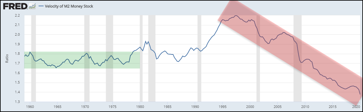
It is incomplete to present an argument regarding money supply growth and inflation without presenting a long-term chart of the velocity of money. To argue that a rise in money supply growth in insolation will cause inflation assumes that the rate at which money changes hands in the economy is stable.
Velocity, noted below, has collapsed and will decline further in Q2 2020, which negates the inflationary impact of rising money supply growth.
Velocity will undoubtedly rise in Q3 and possibly Q4 of 2020 as a pent-up demand recovery takes hold, but multi-decade secular trends must be respected and understood.
It is easy to suggest that the velocity of money will suddenly break the near 30-year trend and start rising, along with a continued increase in money supply growth, but why? Putting money in the hands of consumers to spend on basic necessities such as rent, food, and clothing are not high-velocity uses of capital and will not meaningfully change the long-run trajectory of the ratio.
Velocity Of M2 Money Stock:
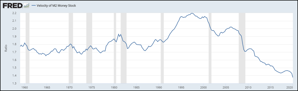
High velocity uses of capital stem from productive investment into plant & equipment, products or properties that generate a lasting income stream.
In order for the growth in money supply to have an increased chance of generating lasting inflation, the velocity of money has to be at least stable.
Another consideration in the new era of QE is that the relationship between money supply and reserves in the banking system has meaningfully changed. Looking at the growth rate in money supply and jumping to an inflationary conclusion disregards the fact that the reserve multiplier is far from stable, and completely altered.
The chart below is the reserve multiplier or the ratio of broad money supply to total reserves in the banking system.
Reserve Multiplier:

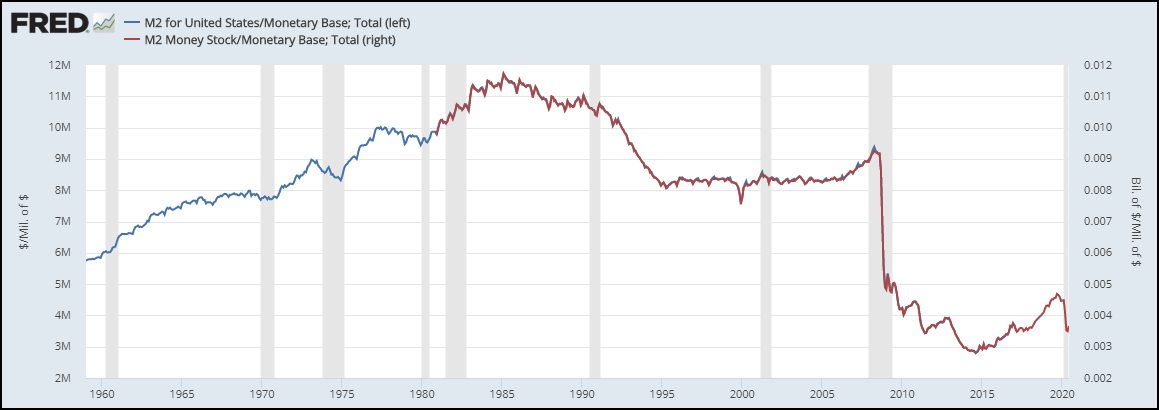
Another ratio that is assumed to be stable in the traditional money supply arguments is the relationship between broad money supply and the monetary base controlled by the Federal Reserve. The ratio of M2 money supply to the monetary base or the “money multiplier” is also highly unstable and has steadily declined over the last few decades.
The money multiplier rose through the 1960s, 1970s, and peaked in the 1980s, a stark contrast to the recent multi-decade decline.
The money multiplier ratio shows the ability and desire of private sector banks to turn high powered base money into broad spendable dollars.
Money Multiplier:

Dr. Lacy Hunt, in his Q1 2020 Quarterly Review, wrote about both the money multiplier and the velocity of money.
Two critical equations define the U.S. monetary structure. First, M2 = MB x m where MB stands for the monetary base and m stands for the money multiplier (known as little m). Second, GDP equals M2 multiplied by the velocity of money, or GDP = M2 x V and V is GDP divided by M2. It is important to note that both m and V are complex variables and their operation in determining economic activity is opaque. Our understanding is that the essence of m is that the banks and their customers must reach an agreement that a new loan will be profitable to both. Prior to reducing reserve requirements to zero, swings in currency and time deposits could change m, but that is no longer the case. As long as the required reserve ratio remains zero, total reserves and excess reserves are identical. Swings in Treasury deposits still have a role, albeit minimal. It appears that the key to V is whether a new loan is productive in the sense that it generates an income stream to pay principal and interest. It becomes apparent therefore that the Fed has extremely limited capacity to alter m or V.
As a result of the weakening economy and high levels of public and private debt, banks are likely to maintain their reluctance in extending high quantities of new loans. Similarly, the capacity for borrowers to demand new loans for productive investment will remain low.
The relationship between the monetary base and the money supply is unstable and currently in a declining trend. The relationship between money supply growth and inflation measured by either the Consumer Price Index or the Personal Consumption Expenditure Index is highly unclear.
The chart below shows the relationship between the year over year growth rate in money supply and the year over year change in Core CPI, adjusted for a 12 and 18-month lag.
Money Supply Growth Vs. Core CPI Inflation Rate:

Source: Federal Reserve, BLS, EPB Macro Research
Economists Stephen G. Cecchetti and Kermit L. Schoenholtz of the Money, Banking, and Financial Markets blog complied a more comprehensive chart of money supply growth and the core PCE inflation rate. They concluded:
During the early period, when inflation temporarily rose above 10 percent, there was a positive relationship: increases in money growth were associated with higher inflation two years later. For the most recent decade, the period when the Fed’s balance sheet exploded, the two are nearly uncorrelated (see the red dashed line). In other words, at low levels of inflation, inflation appears to be unrelated to money growth. (While we do not show it here, another implication of this chart is that the velocity of money—the ratio of nominal GDP to money—is unstable.)
Money Supply Growth Vs. Core PCE Inflation Rate:
Source: Money, Banking, and Financial Markets
Cecchetti and Schoenholtz went on to note the lack of relationship between the size of the Federal Reserve’s balance sheet and long-term market-derived inflation expectations in a chart I recreated below.
Fed Balance Sheet Vs. Market Derived Inflation Expectations:
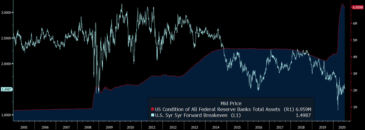
Source: Bloomberg
Using the rate of money supply growth as the base of an inflationary argument has demonstrated poor results over the last ten years due to a multi-decade decline in the velocity of money and an unstable (currently falling) relationship between reserves, broad money and the monetary base (reserve multiplier and the money multiplier.)
While money supply growth is an unreliable determinant of inflation, the economic output gap has demonstrated a sound relationship to core inflation, particularly over the past two decades, when economic volatility dropped to record lows.
The output gap is a measure of the potential growth in an economy relative to actual growth. When an economy is growing below trend potential, the difference is called the “output gap.”
The output gap is measured by using “potential GDP” and actual or projected GDP.
Potential GDP is published by the Congressional Budget Office “CBO” through a calculation of potential labor force growth and potential productivity growth.
The chart below shows nominal GDP in black, potential GDP in blue, and projected GDP through 2030 in red.
US GDP Vs. Potential GDP (Billions):
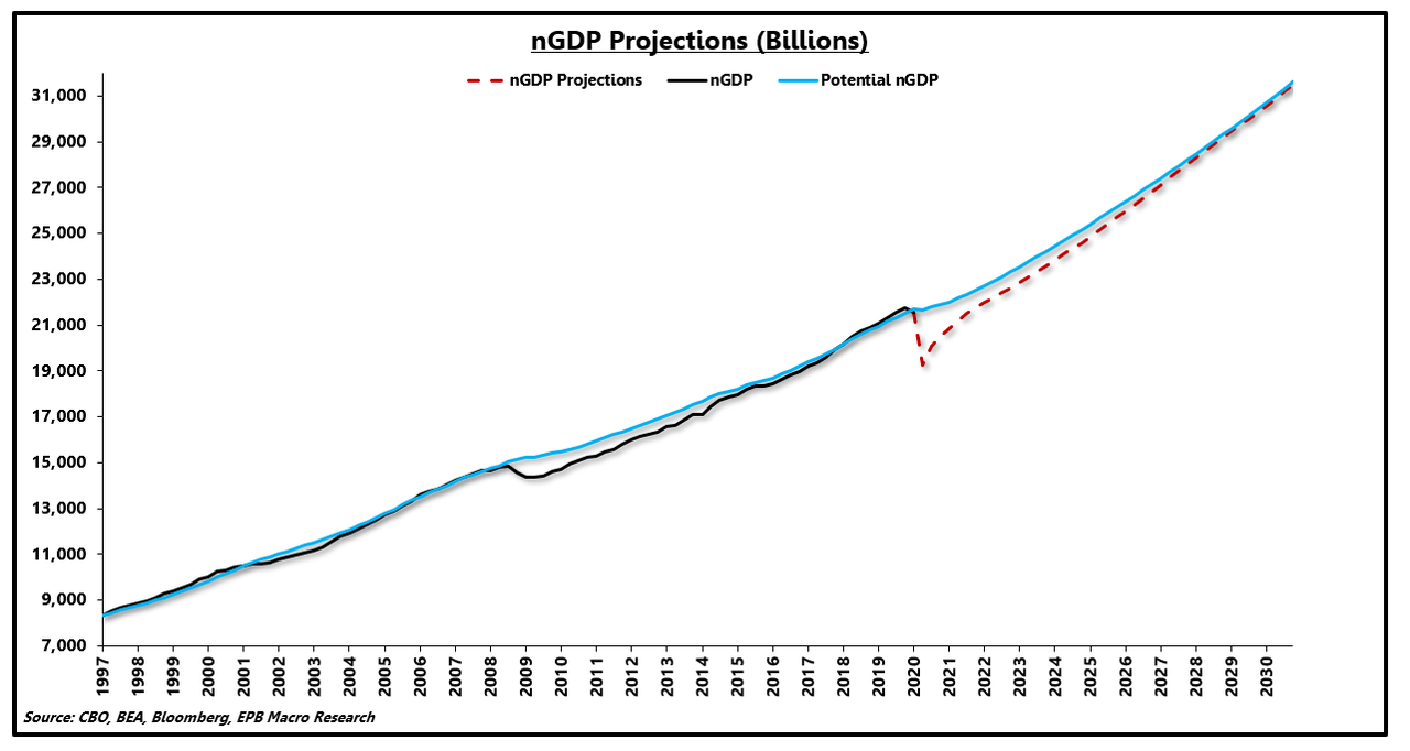
Source: Bloomberg, CBO, BEA, EPB Macro Research
The difference between potential GDP and actual or projected GDP is the “output gap,” graphed below. A negative output gap is deflationary because the economy has unutilized capacity, driving down the price of goods and services. Too many workers will drive down wages.
Using the projected estimates from the CBO, the output gap will reach nearly $2.5 trillion and will last through 2030.
The output gap after the 2008 recession lasted for roughly 39 quarters.
Using the projected GDP estimates from the CBO, the deflationary output gap is not only expected to be the largest in modern history but last more than 44 quarters, through 2030.
The chart below shows the output gap as a percentage of GDP.
US Output Gap (% Of GDP):
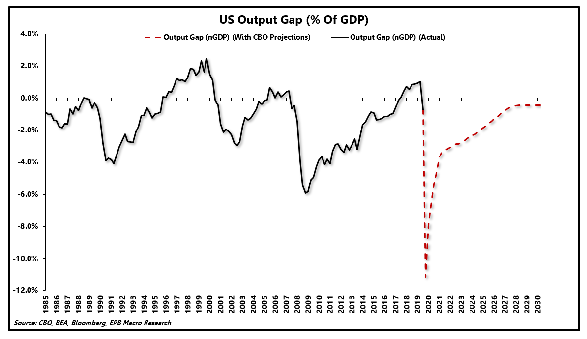
Source: Bloomberg, CBO, BEA, EPB Macro Research
Over the past ~20 years, the output gap has demonstrated a strong correlation with core inflation. Typically, it takes about a year for underutilized capacity to flow through to consumer inflation.
The correlation between the output gap and core inflation has increased in recent years as overall economic volatility has compressed due to the increased use of automatic stabilizers such as government transfer payments as well as a general shift away from the more cyclical manufacturing sector.
Economic Volatility:
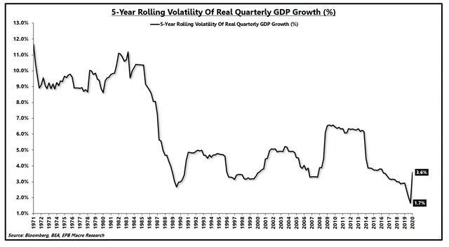
Source: Bloomberg, BEA, EPB Macro Research
At the trough in growth, the US economy will have an output gap of roughly -11% and a four-quarter average of approximately -7.7%.
Using the output gap for a point estimate of core inflation can be extremely imprecise and highly dependent on the variables in the analysis. Still, directionally the relationship makes a strong case for record low core inflation over the coming years.
US Output Gap (% Of GDP) (4-Quarter Lag) & Core CPI:
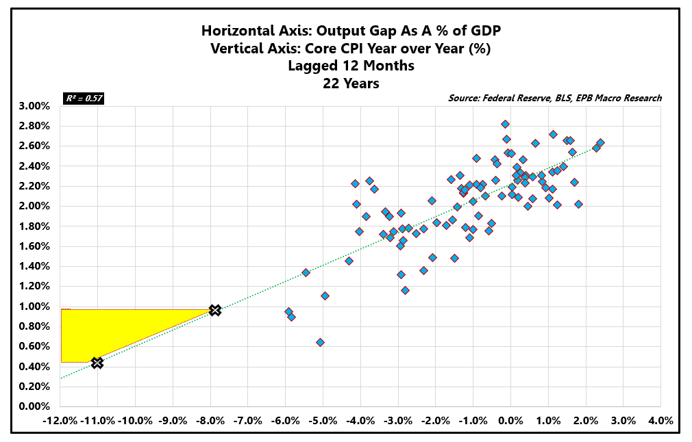
Source: Bloomberg, CBO, BEA, BLS, EPB Macro Research
Using the output gap to determine the inflation bias over the coming 12-36 months is likely to have more success than arguments centered around the growth rate in money supply with variables that are far different than the 1970s, a common inflationary reference point.
In the 1970s, the output gap was mild and oscillating between positive and negative. Over the last 15 years, the economy has been in a persistently negative output gap and expected to remain there through 2030 based on estimates from the CBO.
US Output Gap 1960-1980 | US Output Gap 2005 – 2030:
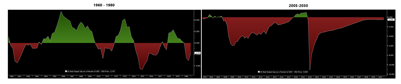
Source: Bloomberg
From 1960-1980, the velocity of money was extremely stable, while the last two decades have shown a downward trend in velocity that hasn’t been experienced since the 1920-1930 period.
Velocity Of M2 Money Stock:
As noted above and presented again below, the money multiplier was stable and rising from 1960-1980 compared to unstable and falling sharply today.
Money Multiplier:
Lastly, total non-financial debt in the economy (government, household, and business) as a percentage of GDP was extraordinarily stable and below 140% from 1960-1980 compared to rising and north of 260% today, breaching critical thresholds discussed here.
Total Non-Financial Debt To GDP Ratio:

Source: Z.1 Financial Accounts, Bloomberg, EPB Macro Research
High levels of public and private debt hinder economic growth and exert disinflationary pressure on the economy.
Summary & Part II
Money supply growth is an important variable, but it must be used in context to explain future impacts to price inflation. Over the last decade, using the money supply growth or Federal Reserve balance sheet expansion to forecast inflation has been a losing proposition due to the consistent decline in velocity and the changing relationships highlighted by the reserve multiplier and the money multiplier.
Commodity prices and other measures can provide a shorter-term indication regarding the direction of inflation, but the outlook over the next 12-36 months is most consistently identified by the output gap and long-term secular forces.
Most of the arguments for higher inflation fail to consider rapidly changing relationships in the economy that more often than not stem from an extreme condition of overindebtedness.
As mentioned at the start of this note, disregarding the possibility for inflation is unwise, and holding a portfolio with inflation-sensitive assets is a prudent decision for the conservative investor, particularly while short-term inflation indicators such as commodity prices are trending higher.
The bias in the economy is still for deflation/disinflation, and holding an overweight investment in Treasury bonds continues to generate strong risk-adjusted returns as well as dampen the volatility of a balanced portfolio by offering a negative correlation to equity prices on average.
In part II, we’ll take a look at another force that will keep downward pressure on US interest rates; FX-hedged Treasury yields.
Many investors seek to make simple comparisons between US bond yields and foreign bond yields without adjusting for the cost of hedging the currency risk. This is a critical variable and one that we will tackle in the next part of this series.
* * *
via ZeroHedge News https://ift.tt/30tlOdZ Tyler Durden