“Horrendous” Market Breadth “Stinks To High Heaven”, Screams Imminent Risk-Off
Tyler Durden
Sun, 08/23/2020 – 10:35
With the S&P500 closing at a new all time high just shy of 3,400 on Friday, one may be tempted to think that there is a raging bull market (if one sparked by trillions in Fed liquidity, and certainly not due to economic fundamentals). Alas, one couldn’t be further from the truth. In fact, the series of consecutive record highs last week have been entirely on the back of just a handful of stocks as market breadth has collapsed to levels that typically precede major downward market crashes.
While we previously discussed the unprecedented market cap concentration of just a handful of companies (spoiler alert: it’s the FAAMGs with AAPL surpassing the $2 trillion barrier last week, and then adding a quick $100 billion in market cap on Friday on no news and merely due to a surge in call buying ahead of Monday’s stock split record date, which pushed the stock within inches of $500/share) consider that all of last week’s record highs in the S&P were set on negative breadth, meaning that there were more decliners than advancers.
It gets better: as the traditionally bullish and cheerful Bloomberg commentator Andrew Cinko writes, “Friday was even more outlandish in terms of narrowness” as it wasn’t a market of stocks on Friday, but just one single stock that moved the market (guess which one):
- 87% of DJIA point gain came from Apple: (index +191pts vs AAPL’s contribution 167pts)
- 103% of S&P 500 increase (11.7 vs 12.0)
- 148% of Nasdaq Composite (46.9 vs 69.7)
- 105% of Nasdaq 100 (78.1 vs 81.8)
As Cinko explains, extending an analogy we first made last week…
THe S&P500 is now the S&P5 pic.twitter.com/v7HJyNAJ8Y
— zerohedge (@zerohedge) August 21, 2020
… it’s really the S&P1 and the reason for Friday’s dismal move “is simply math with Apple’s market cap so immense it is slowly but surely becoming the American stock market.”
That realization may prompt the index’s managers to make some sort of capitalization-weighted adjustment to give the little guys a chance, though such mathematical manipulations don’t change the fact that Apple and its mega-cap tech peers are eating the world.
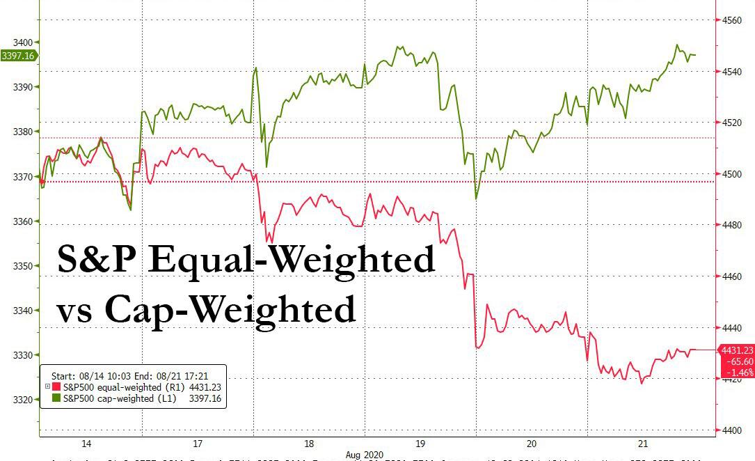
Meanwhile, as we first discussed in “This Is What The S&P Would Look Like Without The 5 Megacap Tech Stocks“, Cinko notes that “we already have a solution in the equal-weighted S&P 500, which sank 1.54% last week versus a 0.72% rise for the cap-weighted version” which alone makes more sense given the negative breadth and the impact of just one stock.
As an aside, while it’s beyond the scope of this article to discuss last week’s berserk move in AAPL stock, we will note that the put-call skew in AAPL has absolutely imploded in recent days as a result of an unprecedented surge in call buying which due to positive gamma, is single-handedly pushing AAPL stock to daily record highs, which in turn leads to more call buying, pushing the stock even higher, and so on.
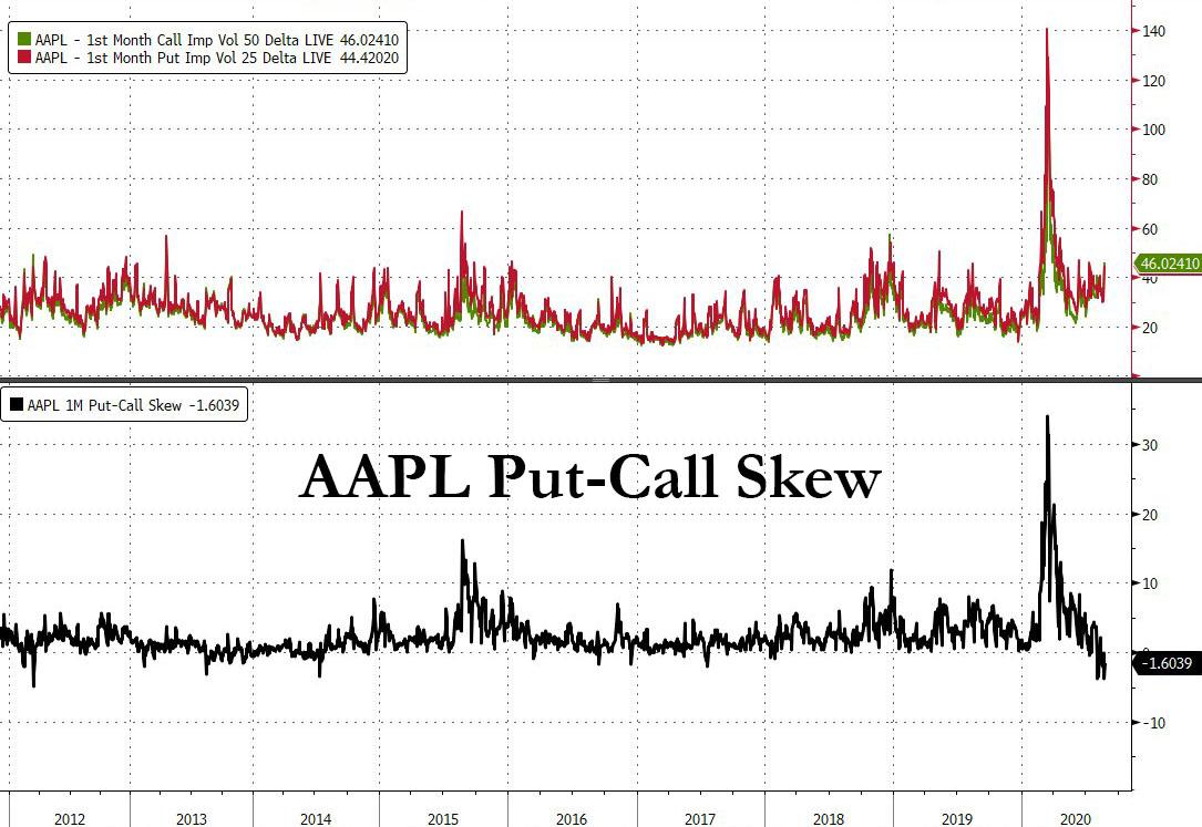
As a reminder, as we described first one month ago in “Goldman spot a historic inversion in the market“, “Negative skew is a relatively rare statistic for large cap names such as AMZN (where three month skew is currently at all-time lows), implying crowding in long AMZN calls.” Just replace AMZN with AAPL and you know all there is to know about what is pushing not just AAPL but the entire market higher.

But wait, there’s more.
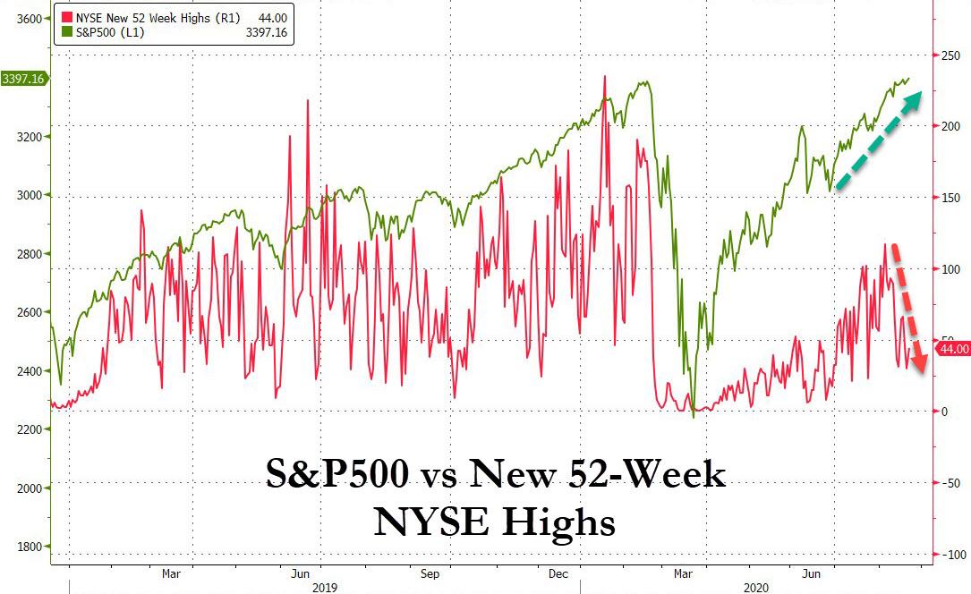
As Larry McDonald writes in his latest Bear Traps report, “just 44, or 1.4% of the 3,068 NYSE issues traded hit new 52-week highs; on the Nasdaq, it was 137, or 4.0% of 3,450 issues traded. The indexes don’t have much company at these rarefied levels. The minuscule number of equities at 52-week highs with the index right at the highs is unprecedented and shows just how weak current breadth is.”
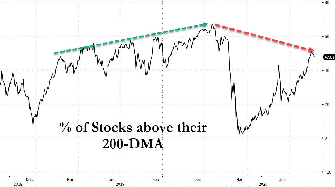
It gets worse: as McDonald further notes, the number of stocks trading above their 200DMA has also collapsed, from a relatively healthy 67% in February (just before the market crashed), to just 47% currently.
And while we observed above that all the upside in the market on Friday was entirely due to Apple, which helped the Nasdaq notch a 0.4% gain to a new all time high, here is just how bad it was away from Apple, where only 29% of stocks on the Nasdaq managed to close up on Friday (and 31% on Thursday), which according to McDonald “was the lowest in history, by far with 805 up and 1878 stocks down.”
Said otherwise, the Nasdaq closed not only green but at an all time high even as 70% of issues closed in the red. This was the 5th worst Advance/Decline day in the last 30 years.
What about the S&P? Here, Bloomberg’s Andrew Cinko again provides some perspective, writing that when “looking back for a five-day S&P 500 gain of 0.72% or more with median five-day breadth of 34% or less shows 24 other periods. But they do cluster, and the chart below shows only those occurrences for 1999/2000, 2003, 2008, 2010, 2014/2015 and this year.”
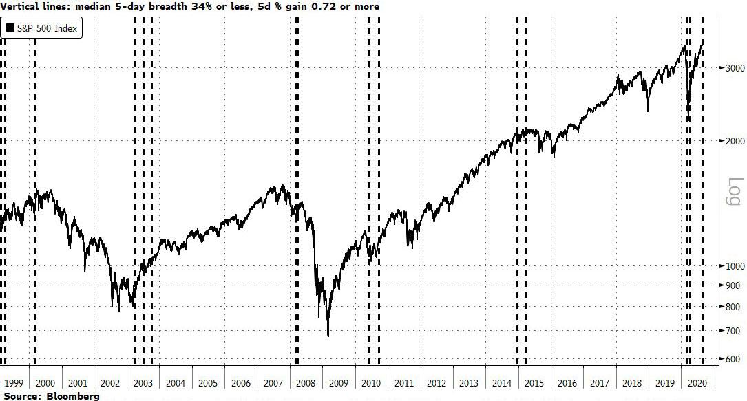
One can bucket the occurrences like this:
- Post-bear market rallies that stalled: 2003, 2010
- Bubble trouble: 1999/2000, 2008
- Economic growth scares after a long run: 2014/2015
The problem, as Cinko notes, is that 2020’s pandemic-induced economic crash and the fastest recovery ever from a bear market might not fit into any one of the above buckets (especially with the Fed now explicitly egging on the market). It also means that, according to the Bloomberg strategist, “history is of no guide as to what to expect next in our current situation. Though I suppose one thing is clear from the chart, especially since 2010 onward: The easy ride higher is over for the time being, and churning price action is likely in store for investors until the next direction (up or down) becomes clearer.“
There is less confusion when looking at the next chart courtesy of the BearTrapsReport, which highlights the top 10 large net-decliner days when the S&P 500 still closed positive: “This shows that market leadership is not only fleeting, but the index is being completely carried by a few names. Historically this points to an imminent risk-off phase in the market.”
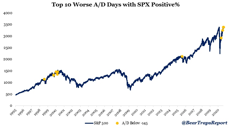
Some more detail on the worst A/D days when the S&P closed positive (chart above):
- #1, or the worst day since 1995, was July 17th, 2015. The S&P peaked the day after before pulling back -12.5% into the Yuan devaluation.
- #2 was February 23rd, 2000, a month before the dot-com peak.
- #3 was this Thursday.
- #4 was May 11th, 2020, market pulled back -5% in the next 3 days.
- #5 was March 17th, 2000, a week before dot-com peak.
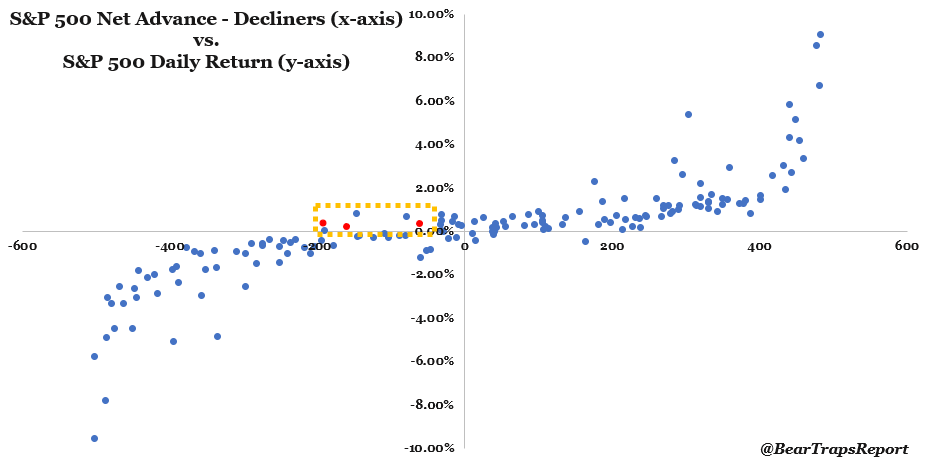
What does the chart above mean:
This week we had 3 days where the S&P 500 closed positive and the advance-decline line was negative. Since 1995, there was only 1 other week where this occurred in June 1997. However, this week is not comparable in our view, as the negative a/d numbers were pretty close to zero (-6, -37, -35) that’s vs. (-161, -193, -61) this week. This week’s a/d numbers were very significant in terms of size relative to history. Since 1995 there has been 287 days when SPX closed positive and the a/d was negative. However, Thursday’s -193 was the 3rd lowest ever. Tuesday’s was #7 on the list.
In short, while on every previous occasion when stocks inched higher led by just a handful of stocks, the market tumbles shortly thereafter, what is especially notable is that the last time we had a cluster of such negative A/D days with the S&P closing at all time highs was just days before the dot-com bubble burst.
via ZeroHedge News https://ift.tt/3gmrX0d Tyler Durden