Key Charts: Technicals Keep “Firing Warning Signs” On A Big Structural Level
Tyler Durden
Thu, 09/10/2020 – 11:35
Authored by Sven Henrich via NorthmanTrader.com,
We’ve just come out of a summer period where nothing seemed to matter with markets relentlessly accelerating high to suddenly everything mattering as we just saw the most aggressive correction off of all time highs in the Nasdaq since the 2000 bubble.
A lot of people have written to tweeted @ me in July and August with phrases such as “technical no longer matter”. My response: Technicals still do matter and they matter greatly and there are four charts I want to highlight that show an orchestra of relevance here everyone should pay close attention to in my view.
On Tuesday I had a chance to discuss 3 of these charts in a segment on CNBC Power Lunch. As the segment ran against the clock it was short in time, hence I want to take the opportunity to expand on context of these charts a bit here in this post.
For reference here’s the clip from Tuesday to set this up:
First off let’s recognize we just had a sizable correction off of the megaphone trend line I’ve been highlighting.
This was the original chart I outlined in Bear Capitulation and Panic Buying which pointed to upside risk and resistance:
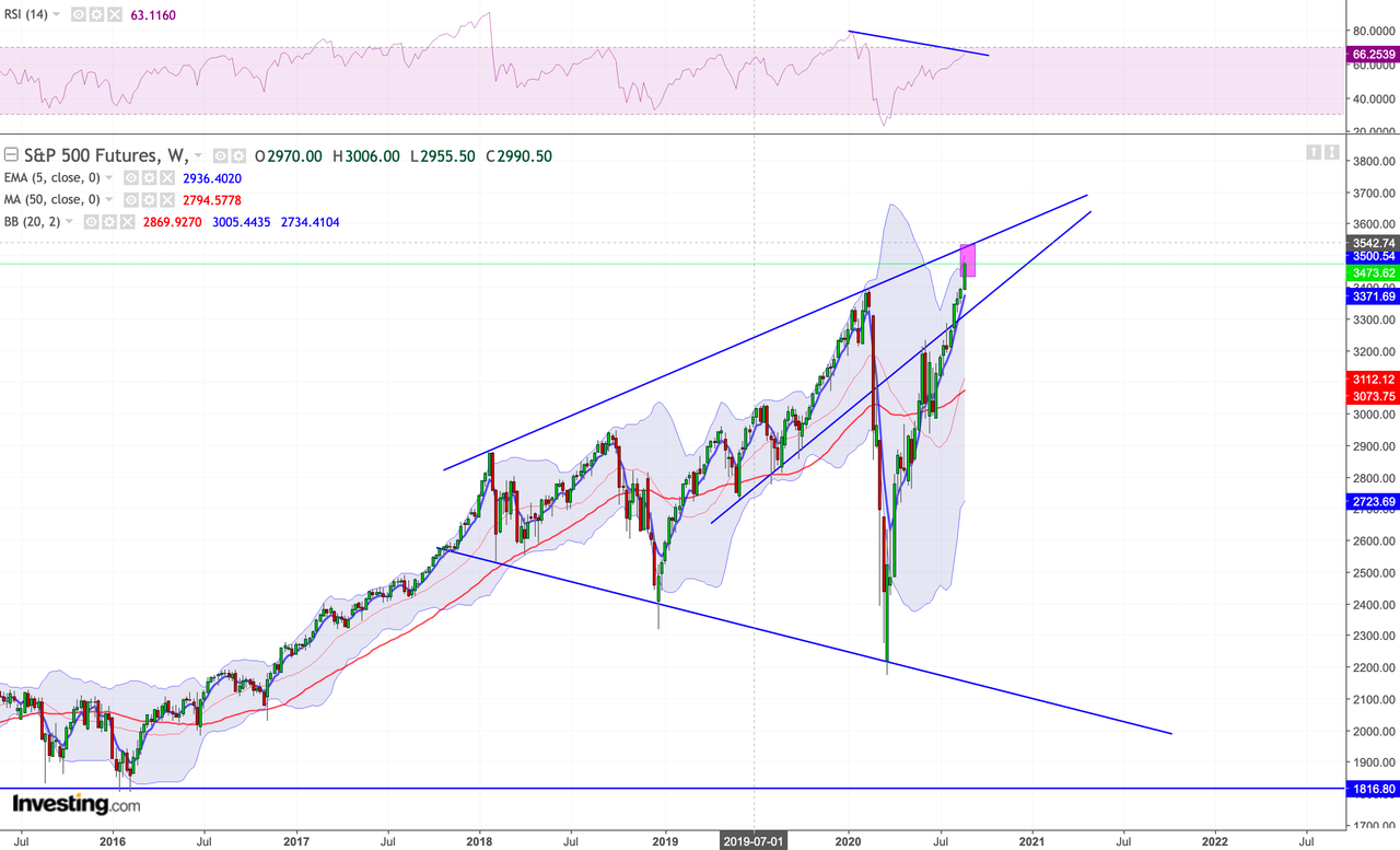
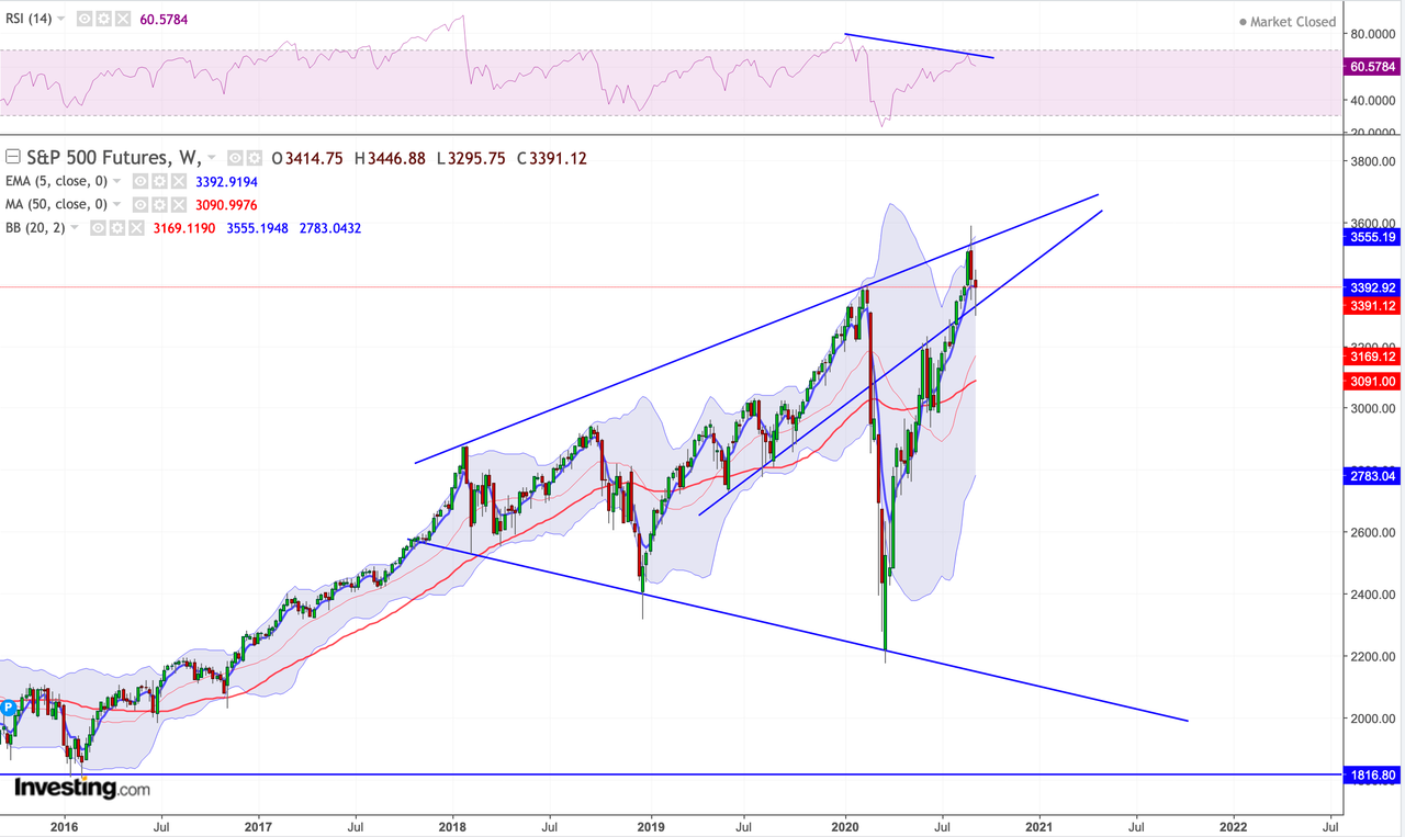
Here’s the updated chart:
Technicals matter on the upside as well as to the downside. This resistance zone mattered big time as the throw over last week may have forced capitulation, but it was violently rejected and $ES was thrown back inside the megaphone pattern. A furious run from the March lows. Note all of these upper trend line tags have come on the heels of intervention. The January 2018 top on the heels of tax cuts, the early 2020 tag on the heels of hundreds of billions of Fed repo interventions and of course this run here on the heels of $3 trillion in Fed intervention. None came on a fundamental improvement of the economy or growth.
2019 saw flat earnings growth, 2020 is seeing negative earnings growth.
But technicals matter on the downside as well. As you can see the March lows coincided with a tag of the lower trend line and this week’s $ES lows have so far defended the rising trend line that was initial resistance in June and is for now support.
Hence the view that there was confluent support that permitted for a long bounce trade into this correction:
Technicals still work: Lovely bounce play signaled in advance.
But also note the trend is broken. pic.twitter.com/dQnVzGwi6H— Sven Henrich (@NorthmanTrader) September 9, 2020
Yes technicals still work.
Just don’t call me a permabear:
Did you see the bull flag nearly 5 hours ago? pic.twitter.com/sVJFFhxwRb
— Sven Henrich (@NorthmanTrader) September 10, 2020
And since technicals matter I want to highlight these other key charts.
I’ve kept harping about the value line geometric index as a measure of equal weight and it keeps screaming caution and is highly suggesting that all new highs on $SPX and $NDX were literarily driven by those key techs stocks that have jumped to historic valuations:
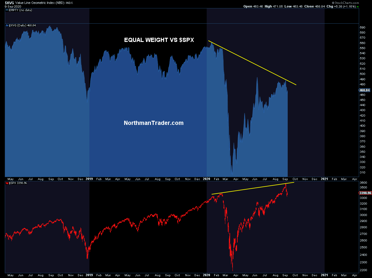
Even during the recent run above the June highs and to new all time highs $XVG couldn’t even get to its June highs. This is how distorted these markets have become. And note the pronounced weakening that took place way before Covid. The February readings were much lower than the 2018 readings. So small caps, banks, etc, all had shown a negatively divergent market. Unless this equation changes I still consider the broader market to show signs of a bear market rally off of the March lows and the panic buying into high cap tech stocks has provided the illusion of all being well.
And there’s one chart that support this view and that is the $VIX. In August, with $VIX trading at 22 I highlighted this compression pattern on the $VIX suggestive of another breakout coming:
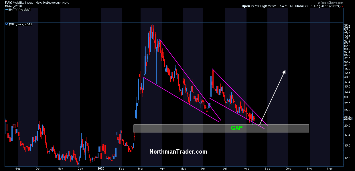
And the breakout has come to fruition:
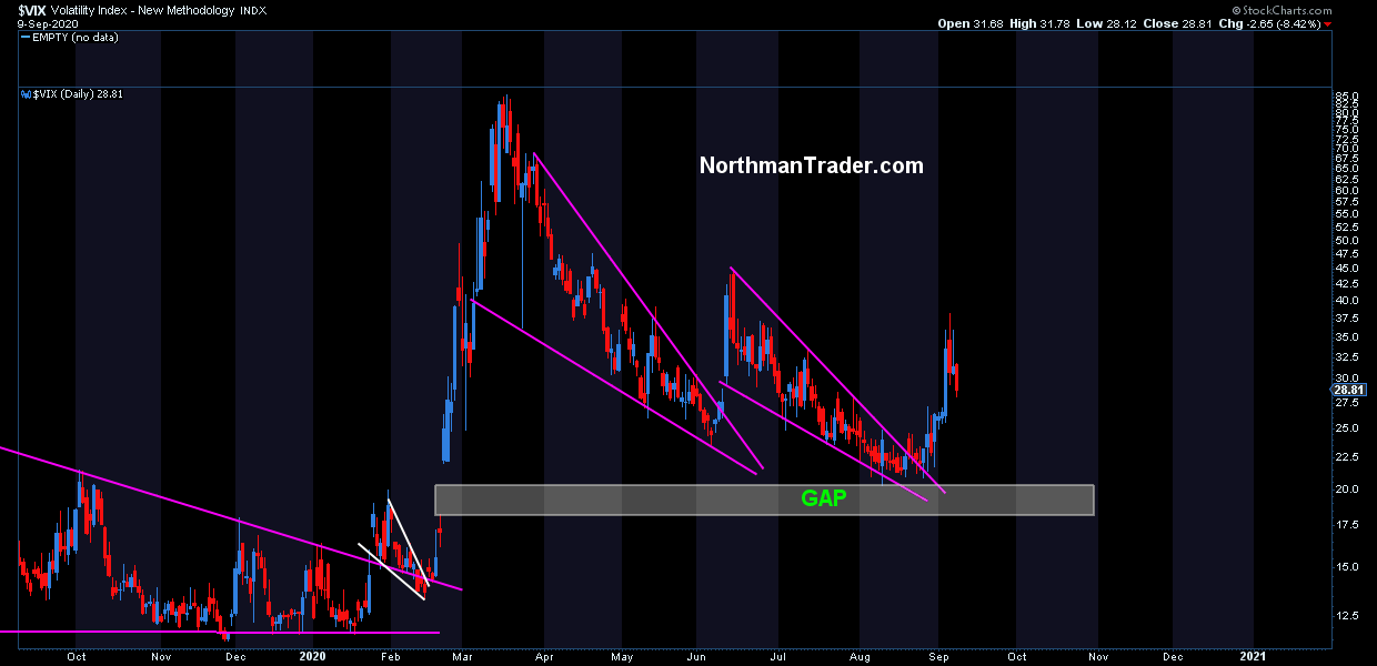
It hasn’t reached my 46 target yet, but did manage to break to 38 last week. Whether it reaches the 46 target remains to be seen, but the larger point to highlight: With trillions in interventions and new all time highs on $SPX and $NDX $VIX should’ve have been able to fill its February gap at above 17.5. It hasn’t. Why not? The $DJIA has filled its February gap, so has the $SPX and $NDX obviously. The $VIX hasn’t and that is notable. Things are not calm is the main message.
No, these high volatility readings are supportive of the bear rally argument and the consecutive pattern spikes risk the building of a much larger volatility pattern that could spike far above 46 in due time.
So the $VIX remains a key chart to watch, which brings me to the final chart I discussed in the CNBC interview, and perhaps the most important chart of all: The US dollar.
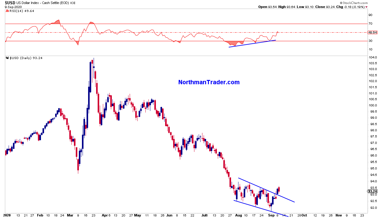
To the extent much of the rally has been dependent on a declining dollar the technical pattern above shows a recent breakout of the dollar out of a falling wedge pattern, a very clean pattern that has formed during the summer months and has come on a positive divergence.
If the current technical market bounce off of short term oversold conditions can’t force the dollar lower, but rather sees it perhaps retesting the pattern and then move on higher any bounce rally may prove short lived as a major dollar rally is probably least expected at this time as most participants see a long term declining dollar as a given with ongoing Fed intervention and are positioned as such.
Given this backdrop the confluence of historic overhead resistance that was rejected, a questionable internal picture of equal weight, a continued stubborn high volatility index and a potential bullish pattern in the dollar (not to mention valuations and forward multiples) make these 4 charts key to watch in the weeks ahead and make any rallies either of the lower high or even new high kind very questionable.
Technicals still do matter and they keep firing warning signs on a big structural level.
* * *
For the latest public analysis please visit NorthmanTrader. To subscribe to our market products please visit Services.
via ZeroHedge News https://ift.tt/3bJEHgF Tyler Durden