US Household Wealth Hits A Record High After Biggest Quarterly Jump on Record… There Is Just One Catch
Tyler Durden
Mon, 09/21/2020 – 12:57
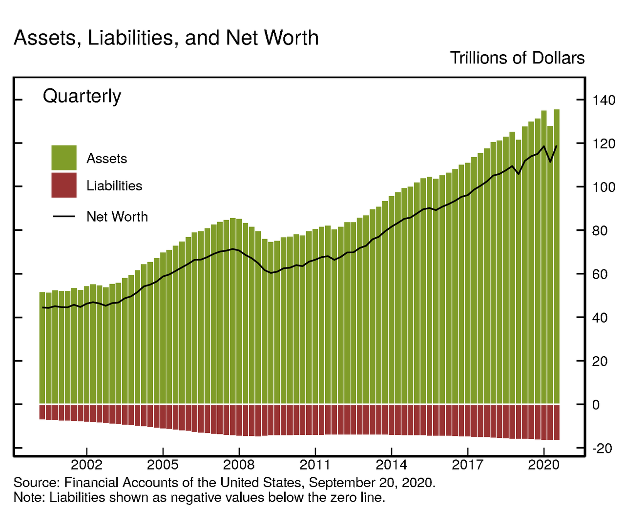
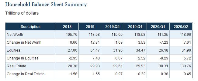
In the Fed’s latest Flow of Funds report released at noon today, the Fed unveiled the latest snapshot of the US “household” sector as of June 30 2018. What it showed is that one quarter after the biggest drop in household net worth on record when $8 trillion was wiped out, the net worth of households and nonprofit organizations rebounded by $7.6 trillion to $119.0 trillion, the biggest quarterly increase in history.
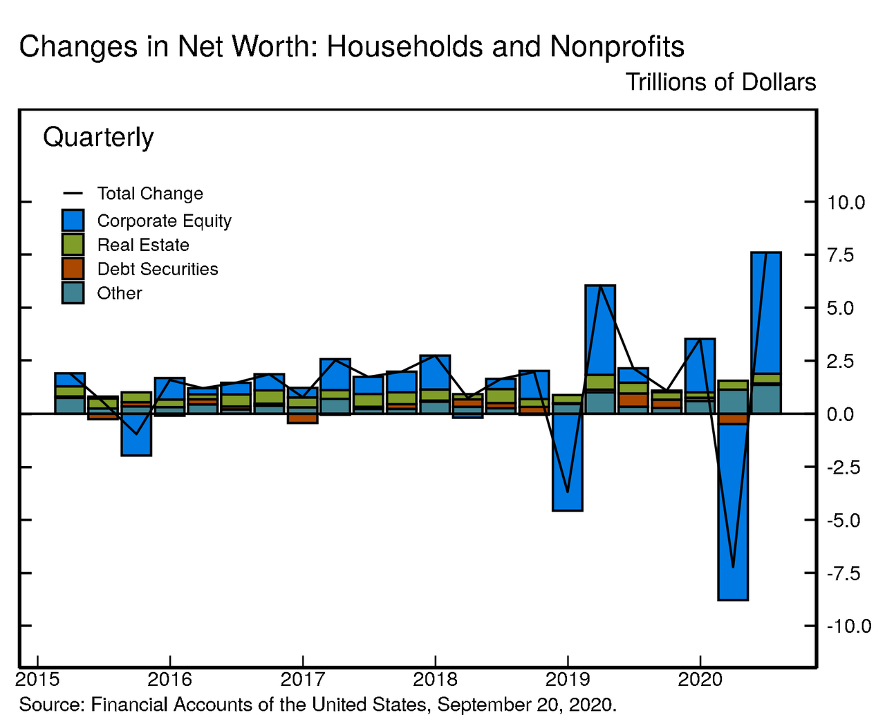
The second quarter increase in net worth was roughly equal to the $7.2 trillion decline recorded in Q1, leaving net worth about equal to its level at the end of 2019. As usual, the biggest swing factor was in the value of market-linked securities: in Q2, the value of directly and indirectly held corporate equities increased by $5.7 trillion due to the rebound in corporate equity prices (which plunged by $8.3 trillion in Q1 2020). The high rate of personal saving also contributed to the increase in net worth, while the value of real estate held by households increased modestly.
Looking at the big picture, real estate ($30.8 trillion) and directly and indirectly held corporate equities ($31.9 trillion) were among the largest components of household net worth. Household debt (seasonally adjusted) was $16.1 trillion, another modest increase.
Household debt grew at a 0.5% SAAAR in the second quarter of 2020. Home mortgages increased 3.0%, about in line with previous quarters. Non-mortgage consumer credit, however, declined 6.6%, primarily owing to a contraction in credit card balances.
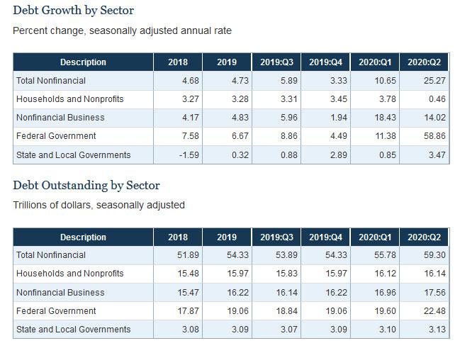
At the same time, nonfinancial business debt expanded rapidly at an annual rate of 14.0%, with a notable expansion in depository loans associated with the PPP program and robust corporate bond issuance. Federal debt also rose by a record amount, owing to the fiscal stimulus. State and local debt increased 3.5%.
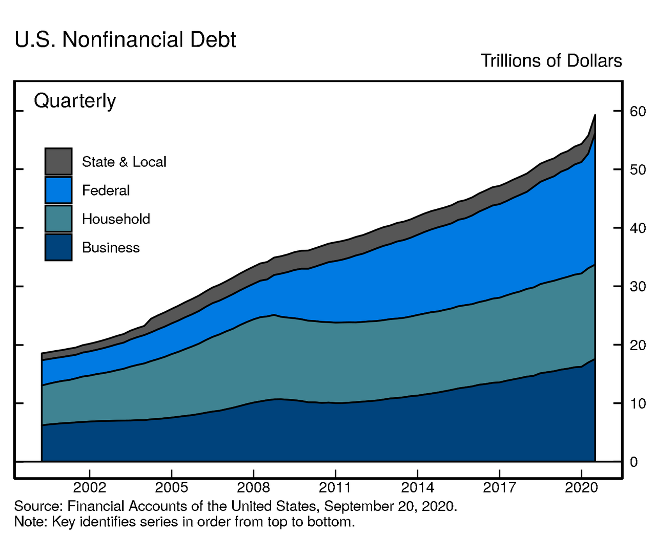
Naturally, the contraction in GDP in Q2, together with the record expansion in federal debt, led to a jump in the ratio of nonfinancial debt to GDP to 300%.

Naturally, with total nonfinancial debt now 3x US GDP, it makes sense to take a closer look at what’s going on here.
Looking at the various components of nonfinancial business debt, nonmortgage depository loans to nonfinancial business increased $134 billion. The Small Business Administration reports that about $521 billion of PPP loans were authorized through June 30.2 Excluding PPP loans, however, nonmortgage depository loans declined notably. The decline likely reflected a partial payback of the lines of credit that many firms had tapped in Q1, together with reduced origination of new loans outside of PPP. While PPP loans are included in the Fed’s measure of debt, a large fraction of them is expected to be forgiven.
Excluding the roughly $0.5 trillion of PPP loans disbursed in Q2, nonfinancial business debt would have increased much more modestly, about 2%. This growth was driven by robust net issuance of corporate bonds. Bond issuance rebounded in Q2 after a temporary halt in March.
Overall, outstanding nonfinancial corporate debt was nearly $11.0 trillion. Corporate bonds, at roughly $6.4 trillion, accounted for 58% of the total. Nonmortgage depository loans were $1.3 trillion. Other types of debt include loans from nonbank institutions, loans from the federal government, and commercial paper.
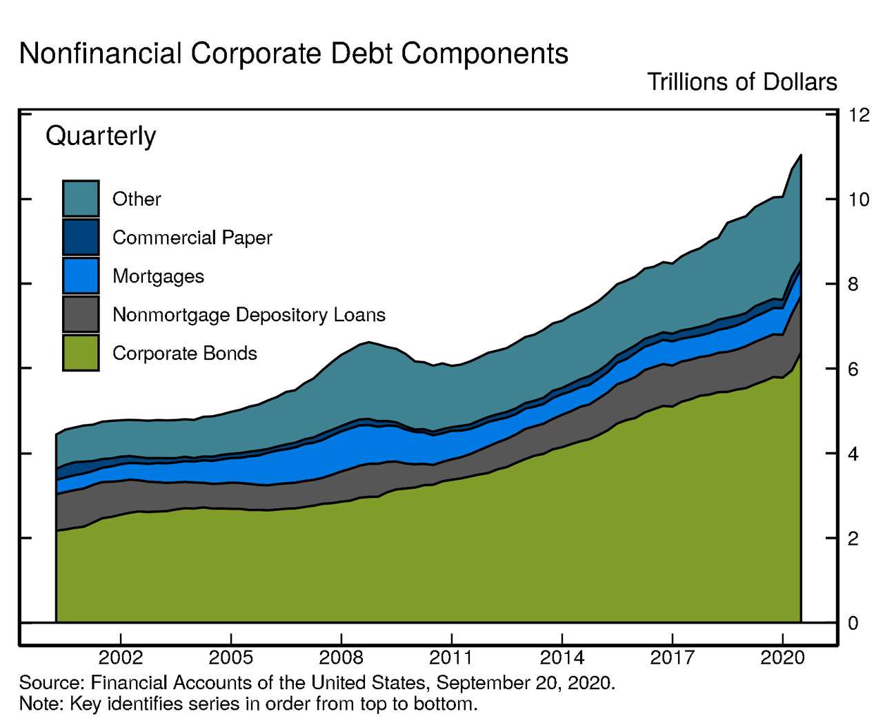
The nonfinancial noncorporate business sector is composed of mostly smaller businesses, which are typically not incorporated. Nonfinancial noncorporate business debt was $6.6 trillion, of which $4.5 trillion were mortgage loans and $1.7 trillion were nonmortgage depository loans.

The bottom line is that if one ignores the debt – which clearly will be monetized by the Fed before it all comes crashing down – US net worth both increased by the most on record and also hit a record high.
And while it would be great news if wealth across all of America had indeed risen as much as the chart above shows, the reality is that there is a big catch: as shown previously, virtually all of the net worth, and associated increase thereof, has only benefited a handful of the wealthiest Americans.
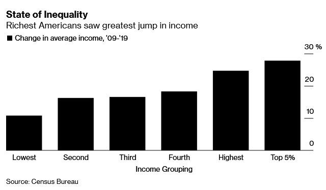
According to a record Census Bureau report, over the past decade, during an economic expansion that benefited most Americans, the richest made out the best. In fact, the CB found that the top 5% of households – those making $451,122 on average last year – have seen their inflation-adjusted incomes jump 28% since 2009.
The gain – which helped push inequality to the widest in decades – compares with a mere 11% rise for the bottom 20%, whose income rose to about $15,290 from roughly $13,800 a decade ago. Those in the middle groups – who made between $40,600 and $111,100 last year – saw their incomes rise between 16% to 18%, the data show.
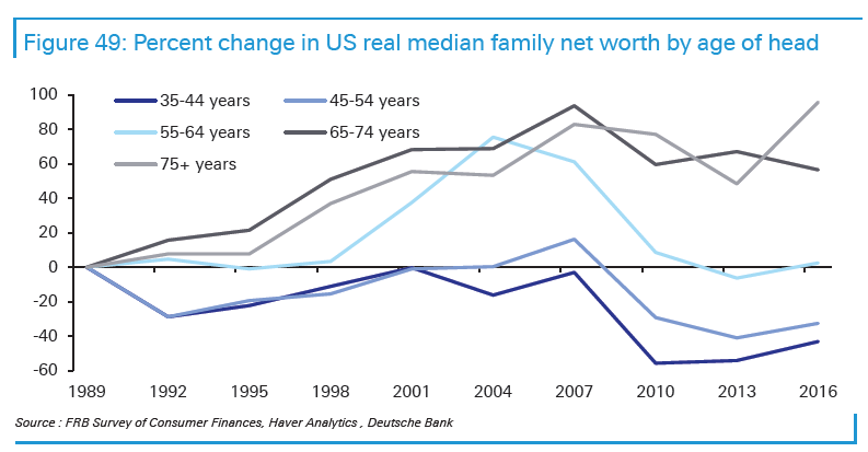
A separate breakdown of the change in net worth, as also discussed previously, one which looks at median net worth by age of head (of household) shows that the oldest Americans – those 65 and older – have seen gains in their net worth by over 60%. Everyone else is either flat or down!
This underscores just how endemic poverty is in America, even in times of economic expansion. While incomes have increased, so has the cost of living, with consumer prices rising 20% since 2009. Meanwhile, while financial assets – those which have grown the most in the past decade – soaring thanks to the Fed’s generous monetary policy and benefiting those who own financial assets, this turns out to be a tiny sliver of the population. In the CBO’s latest, if somewhat dated, Trends in Family Wealth analysis published in 2016, the budget office showed a breakdown of the net worth chart by wealth group, which sadly shows how the “average” American wealth is anything but, and in reality most of that $100 trillion belongs to just 10% of the US population. The distribution has only gotten worse since then.
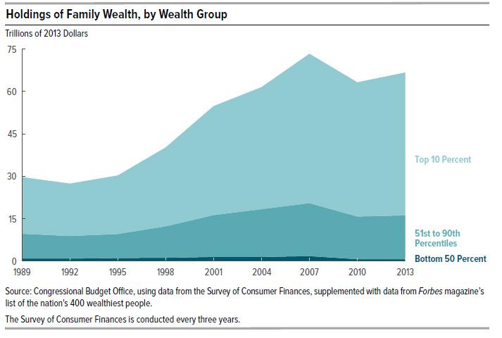
Here is how the CBO recently explained the wealth is distributed:
- In 2013, families in the top 10 percent of the wealth distribution held 76 percent of all family wealth, families in the 51st to the 90th percentiles held 23 percent, and those in the bottom half of the distribution held 1 percent.
- Average wealth was about $4 million for families in the top 10 percent of the wealth distribution, $316,000 for families in the 51st to 90th percentiles, and $36,000 for families in the 26th to 50th percentiles. On average, families at or below the 25th percentile were $13,000 in debt.
In other words, roughly 75% of the $7.6 trillion increase in assets went to benefit just 10% of the population, who also account for roughly 76% of America’s financial net worth. It also means that just 10% of the US population is worth roughly $90 trillion, while half of the US population was virtually no wealth, and if anything it is deeply in debt.
Even worse, when looking at how wealth distribution changed since the 1980s, an even more dire picture emerges: family wealth grew at significantly different rates for different segments of the U.S. population. In 2013, for example:The wealth of families at the 90th percentile of the distribution was 54% greater than the wealth at the 90th percentile in 1989, after adjusting for changes in prices.
- The wealth of those at the median was 4 percent greater than the wealth of their counterparts in 1989.
- The wealth of families at the 25th percentile was 6 percent less than that of their counterparts in 1989.
- As the chart below shows, nobody has experienced the same cumulative growth in after-tax income as the “Top 1%”

The above is particularly topical at a time when either party is trying to take credit for the US recovery. Here, while previously Democrats, and now Republicans tout the US “income recovery” they may have forgotten about half of America, but one entity remembers well: loan collectors. As the chart below shows, America’s poor families have never been more in debt.
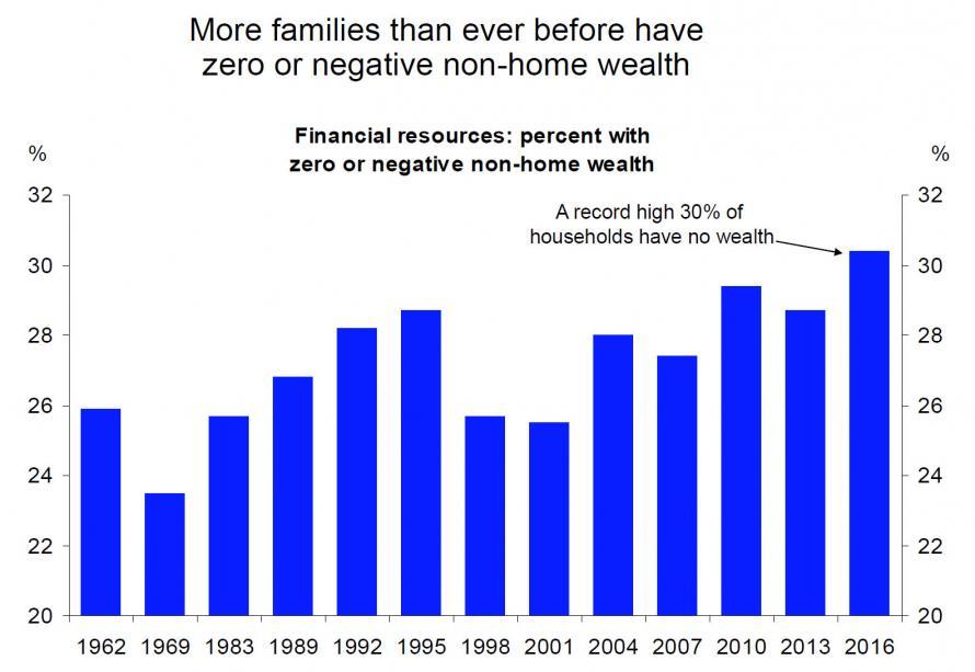
The share of families in debt (those whose total debt exceeded their total assets) remained almost unchanged between 1989 and 2007 and then increased by 50 percent between 2007 and 2013. In 2013, those families were more in debt than their counterparts had been either in 1989 or in 2007. For instance, 8 percent of families were in debt in 2007 and, on average, their debt exceeded their assets by $20,000. By 2013, in the aftermath of the recession of 2007 to 2009, 12 percent of families were in debt and, on average, their debt exceeded their assets by $32,000.
The increase in average indebtedness between 2007 and 2013 for families in debt was mainly the result of falling home equity and rising student loan balances. In 2007, 3 percent of families in debt had negative home equity: They owed, on average, $16,000 more than their homes were worth. In 2013, that share was 19 percent of families in debt, and they owed, on average, $45,000 more than their homes were worth. The share of families in debt that had outstanding student debt rose from 56 percent in 2007 to 64 percent in 2013, and the average amount of their loan balances increased from $29,000 to $41,000.

And there – as we say quarter after quarter- is your “recovery”: the wealthy have never been wealthier, while half of America, some 50% of households, own just 1% of the country’s wealth, down from 3% in 1989. And finally, America’s poor have never been more in debt.
via ZeroHedge News https://ift.tt/2RJicPR Tyler Durden