Authored by Sven Henrich via NorthmanTrader.com,
Are markets engaged in a major topping process? Last week I’ve raised the question of potential topping patterns being in the process of being formed if $SPX can’t recapture 2900 and move on to make new highs (Sins of the Past).

Let’s dig into this question a bit more deeply. Let me be the first to tell you to evaluate what I’m about to show you with caution and a healthy dose of skepticism, but in context of record debt levels, record BBB and junk debt levels, trapped central bankers, slowing growth and an escalating trade war between the 2 largest economies on the planet with asset prices artificially inflated by record buybacks and political jawboning we’re staring at least at a similar backdrop as we did in 2007/2008, except now debt is even higher.
We are here.
Grey areas = recessions pic.twitter.com/S6HgUUylF4— Sven Henrich (@NorthmanTrader) May 22, 2019
Oh, and credit card interest rates are at all time highs.
But don’t worry says Jay Powell, engaged in the required game of projecting confidence like his predecessors:
May 17 2007:
Bernanke: Subprime Mortgage Woes Won’t Seriously Hurt Economy
May 21, 2019:
Powell Says Leveraged Lending Isn’t Posing a Crash Threath/t @VolumeDynamicshttps://t.co/Zk4vwM9mCH
— Sven Henrich (@NorthmanTrader) May 21, 2019
‘We got this’ appears to be the message. After all Bullard and Evans are already talking QE and/or rate cuts/zero rates. It’s all theoretical of course. Wink wink.
Come on. We’re at the end of a bloated debt cycle propagated by easy money and it’s simply not producing growth anymore. Trade wars, blade wars, whatever, fact is growth peaked last year and it was all artificial because of the also artificial tax cuts.
Let’s just keep things real here. The data shows ZERO uptick in organic growth anywhere.
And the bond market has been screaming warnings since last year when it tagged its multi-year trend line. Long time readers are familiar with this macro chart:
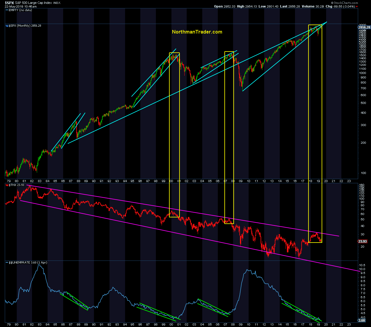
You can either believe unemployment remains at 50 year lows or you may not. 99.99% of history shows it won’t stay there.
Fact is often times the 10 year peaks before unemployment hits a cycle low. That’s what we saw in the last 2 cycles. And we just saw it again. And yes, they’ve done a good job ramping these markets back up following the December lows. But new highs are always a dangerous thing if they come on weakening participation. As I said last week: All things being equal 2019 stinks.
Given the broader backdrop it may be worthwhile to look at the bigger chart picture again to see if there is evidence that markets may be engaged in a major topping process. It’s always easy to get lost in the day to day noise and it’s always useful to go back and check for clues.
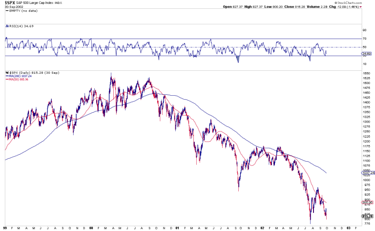
Don’t forget topping patterns are a protracted mess. Here’s 2000 for reference:
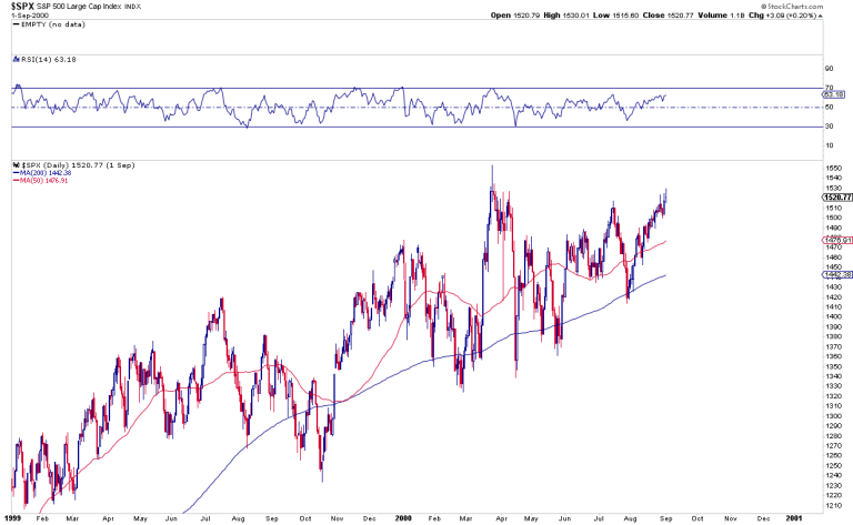
Look at that chop and these constant rallies even after the peak in March 2000. If you were in the thick of that action you had no inkling this was going to come:
But each vertical rally would’ve likely shaken everybody trying to short out or gotten people bullish again. Buy the dip dies hard. Yet selling these rallies would’ve been exactly the right thing to do.
And now we are here:
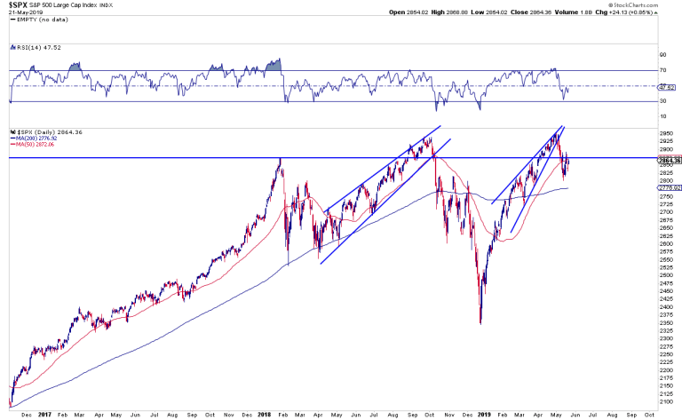
Massive moves up and down and up. Currently right below the January 2018 highs, after just a 5% correction. If this all seems familiar it should. Indeed the ghosts of the past may come back to haunt these markets in a big way, because this is a structure we’ve witnessed before.
Comparing the current structure of $SPX to the time period of 2006/2007 I present to you the ultimate ghost chart:
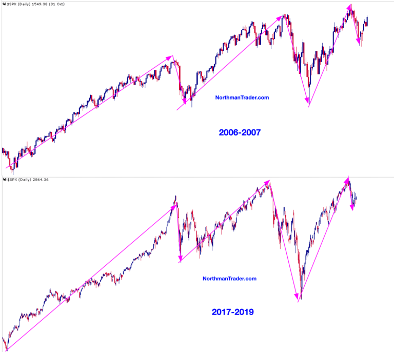

Oh I know, we’ve all seen analogs before on twitter that never meant anything, 1987, 1929, and even previous 2007/2008 analogs, but frankly I’ve never see one aligning in structure as close as this one.
Massive rally leading to a 10% correction, another rally to new highs, an even larger scarier correction followed by a near vertical move to slight new highs (on weakening participation), and then a smaller correction followed by an even smaller bounce which is exactly what we’ve just seen.
Now if this structure is on the money we are here:

How will we know when this analog becomes invalid?
Simply put, new highs. Then the analog may be dust and off the table. Get a China deal and we may make new highs in an instant. Given how sour sentiment is at the moment in regards to a deal it would likely spark a major relief rally.
But without a China deal it’s hard to see new highs with a protracted trade war putting the already fragile business cycle at further risk.
How will we know if this analog continues to apply? If we start dropping soon and proceed to drop below 2800 on $SPX. If the script follows we should see then another rally that then fails and ultimately proceeds take out the lows of December.
Seems unfathomable at this point, but then nobody, except the big short guys, was expecting a massive bear market coming at the “we are here” moment in 2007.
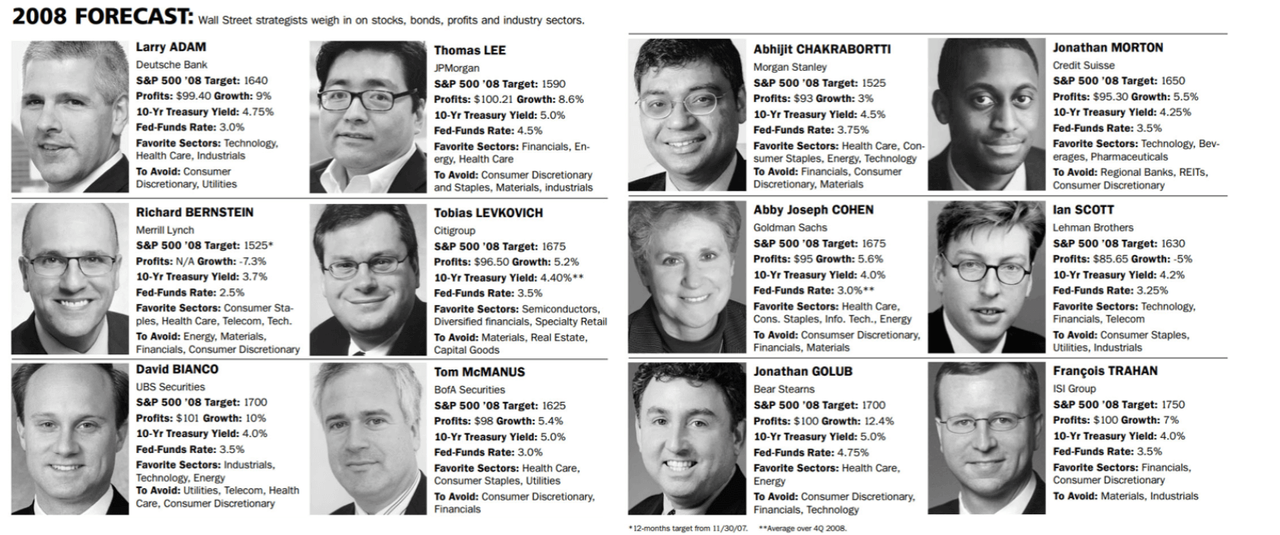
Yet currently Wall Street is predicting solid higher prices for the rest of the year.
To which I say – never forget:
For reference: $SPX closed near 800 in 2008.
I’m just saying: Neither the Fed or Wall Street will tell you to sell. Ever.
It bears repeating:
No central banker will ever give a heads-up about a coming downturn or crisis.
Their job, above all, is to maintain confidence no matter what.
Bernanke 2007: Subprime contained
Powell 2019: Leveraged lending no threat— Sven Henrich (@NorthmanTrader) May 21, 2019
We are on our own.
As I said at the outset of this post: View analogs with a healthy dose of caution. Analogs work until they don’t, but there’s little denying that the principle structure we’re seeing in markets, coupled with the economic macro backdrop of slowing growth, extreme debt levels and a Fed in risk denial mode are putting us at structural/technical risk of a major topping process. And, without new highs, the ghost chart may come to haunt us all.
* * *
For the latest public analysis please visit NorthmanTrader. To subscribe to our market products please visit Services.
via ZeroHedge News http://bit.ly/2Hwsn64 Tyler Durden