Rising Interest Rates: Why The Narrative Fails Against The Data
Authored by Lance Roberts via RealInvestmentAdvice.com,
Last Friday closed with the 10-year Treasury yield at 4.60%, a one-year high, and the doom commentary about rising interest rates was waiting before the bell even rang. Hyperinflation. Bond market breakdown. Paradigm shift. A 1981 fair-value retest. The Fed is about to “push the brrrr button” or pop “the everything bubble.” If you spent any time on social media over the weekend that followed, you saw a version of every one of those.
So I posted a short thread that Friday, making a simple point. Over time, yields track growth and inflation. The chart that drew the strongest pushback roughly showed that relationship, and a wave of responses argued that the framework is broken, debt is about to break the bond market, supply-side inflation has changed everything, and rates have nowhere to go but higher.
However, let’s slow down and look at what the data actually says. Some of those critiques are weak. A few are partially right. And one of them deserves a serious answer. I’ll work through them in order. After 30 years of watching market cycles, the pattern in this setup is more familiar than most commentary suggests.
Rising Interest Rates Follow A Framework That Has Held For Six Decades
Start with the basic identity behind rising interest rates. Of course, a bond yield is what an investor demands to hold a piece of paper for ten years. That demand has two main inputs: the opportunity cost of economic growth and the inflation rate that erodes the dollars being repaid. If real growth is 2.5% and inflation is 3.5%, then a 6% nominal yield breaks even before any term premium. The investor isn’t going to lend at 2% in a 6% nominal economy because that’s a guaranteed loss of purchasing power and a worse return than the broader economy offers.
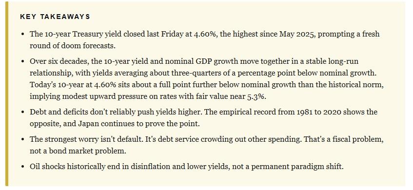
Importantly, that isn’t a theory I invented. It’s the framework Wicksell wrote about more than a century ago, and it shows up cleanly in the data when you plot yields alongside nominal GDP growth, which is just real growth plus inflation.
Notice how closely the two lines move together. Through the 1970s inflation spike, both lifted. Then, through the Volcker disinflation that began in 1981, both fell. After that, through 30 years of declining inflation and slower trend growth, both drifted lower. Through the COVID shock, both swung. And as inflation rebounded in 2022 and 2023, yields rebuilt the relationship. In short, rising interest rates have consistently mapped to rising nominal growth, and the reverse has been true on the way down.
However, the relationship deserves a more precise statement than “yields track nominal growth.” Over the full 1953 to 2026 monthly history, the 10-year yield has averaged about 0.77 percentage points below nominal growth. Not above, below. So the right way to think about the framework is that yields run slightly below the nominal economy in a stable long-run relationship, and the gap between them has fluctuated within a band rather than collapsing or exploding.
Where does that put us now? Real GDP grew at an annualized rate of 2.0% in Q1 2026. Headline CPI ran 3.8% year over year in April. Together, that puts nominal growth on a 6.04% pace. The 10-year at 4.60% sits about 1.7 percentage points below nominal growth, a gap roughly a full point wider than the long-run average. By the mean-reversion logic the framework implies, the fair value of the 10-year is closer to 5.3% than to 4.6%.
Therefore, yes, there is modest upward pressure on rates from here. However, that is a very different statement than “7% rates and a debt crisis.” It is a slow drift back toward a long-established relationship, not a paradigm shift.
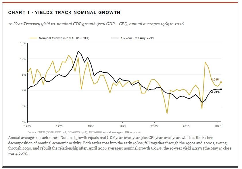
The Fisher Decomposition
Behind the chart above lies an economic principle nearly a century old that still does the heavy lifting in any serious discussion of long-term interest rates. In 1930, Yale economist Irving Fisher published The Theory of Interest, in which he proposed that any nominal interest rate can be cleanly decomposed into two parts. The first is a real return that compensates an investor for locking up capital. The second is an inflation premium that compensates the investor for the loss of purchasing power between the day the loan is made and the day it is repaid. The relationship, in its approximate form, is simple:
The equation looks trivial. The implications are not, because each component has its own economic anchor. Once you understand what anchors each one, you understand what can and cannot cause yields to permanently move to a new regime. That is the practical question every investor worried about rising interest rates is actually asking, even if they have not phrased it that way.
The real return on a long Treasury bond is anchored to the productive economy. Think of it as the opportunity cost of capital. If the real economy grows at 2.5% a year over the next decade, then on average, businesses are earning a 2.5% real return on capital deployed in real activity.
An investor with money to lend has a choice. They can place that capital in the real economy and earn approximately the real growth rate. Or they can lend it to the Treasury for ten years at a fixed yield. If the Treasury offers a real yield of 0.5% when real growth is running 2.5%, the investor is giving up 200 basis points per year for a decade. That trade does not hold up. Over time, capital migrates between the bond market and the real economy until the real component of yield lines up reasonably with the real return potential of the broader economy.
This gravitational pull is what economists call the natural rate of interest, often denoted as “R-Star” or “r*”. It moves slowly, anchored by productivity growth, labor force expansion, and savers’ time preferences. However, it is not a number set by the Federal Reserve, but rather one it estimates. Critically, it has been running around 0.5% to 1.0% in real terms for two decades, consistent with the U.S. trend real growth of roughly 1.8% to 2.0%. That has not changed.
The second component is more direct. If a bond pays a fixed nominal coupon and inflation runs at 4% over the life of that bond, every dollar the investor receives back is worth less than the dollar they originally lent. Therefore, bond buyers demand compensation for inflation on a point-for-point basis. If they expect inflation to average 3% over the next ten years, they want at least three percentage points added to whatever real return they require. If they expect 5%, they want five points. The framework is built on the assumption that bond buyers are not in the business of giving away purchasing power.
The word expected matters more than most casual observers appreciate. The Fisher equation is not about what inflation prints today. It is about what investors expect inflation to be over the bond’s remaining life. If headline CPI runs 4% in April but the bond market believes inflation will average 2.5% over the next decade, the 10-year yield will reflect that 2.5%, not today’s 4%. This is exactly why short-term inflation spikes do not always translate one-for-one into yield spikes. Markets are pricing the forward path, not the rearview mirror. So when commentary points to a hot monthly print and asks why yields are not breaking out, the Fisher framework is the answer.
Why The Two Pieces Add Up To Nominal Growth
Put the two components together. Nominal yield equals real return, which is anchored to real growth, plus expected inflation, which is anchored to the inflation outlook. Add the anchors together, and you arrive at something that, over the long run, looks remarkably like nominal GDP growth. Because real growth plus inflation equals nominal growth by definition.
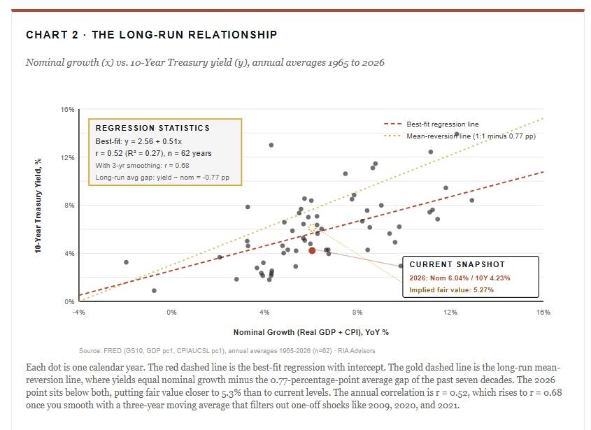
That is why Chart 1 shows what it shows. The 10-year yield and nominal GDP growth move together over decades because they measure the same economic forces from two different vantage points. The Treasury yield is the bond market’s pricing of growth and inflation over a 10-year horizon. Nominal GDP growth is the realized output of growth and inflation looking backward over a one-year window. Both are samples of the same underlying economy. They will not match perfectly month to month, because one is a forward-looking expectation and the other is a backward-looking realization. But over time, they have to converge, and they do. That convergence is illustrated in Chart 2, with each year as a single data point.
Why The Correlation Isn’t 1.0
The framework predicts that yields and nominal growth move together. The data confirms that they do. However, the year-to-year correlation is around 0.5 rather than 1.0, and the relationship shows visible deviations across decades. Both of those deserve an explanation that does not require throwing out the framework.
Four mechanisms account for most of the noise.
-
The term premium changes over time. Investors sometimes demand more or less compensation for the risk of holding long-duration paper, depending on the perceived volatility of inflation and the macro outlook.
-
Expected and realized inflation can diverge sharply, especially at turning points. In 1980, realized inflation was high, but expectations were already falling as the Volcker tightening took hold, so yields topped before headline CPI did. In 2021, the opposite happened. Realized inflation jumped, but markets initially treated it as transitory, so yields lagged the move.
-
Central bank balance sheet policy can hold yields down (quantitative easing) or push them up (quantitative tightening), independent of fundamentals.
-
Supply and demand for Treasuries from foreign reserve managers, pension funds, and bank balance sheets shift at the margin and produce real moves in yields without changing the underlying growth or inflation picture.
None of those mechanisms breaks the Fisher decomposition. They explain why the relationship is noisy at high frequency and stable at low frequency. When you smooth the data with a three-year moving average, which absorbs most of those frictions, the correlation between nominal growth and yields rises to 0.68. When you look at decade-over-decade averages, it rises further. The framework holds. The market just takes its time.
An Interesting Asymmetry Inside The Composite
One observation from the data is worth surfacing because it sharpens the doom debate. When you decompose the composite into its two pieces and run the correlations separately, CPI inflation alone correlates with the 10-year yield at r = 0.63. Real growth alone correlates at essentially zero, about -0.07. The inflation component is doing almost all of the explanatory work, and the real growth component is barely registering at the monthly frequency.
That looks puzzling for half a second, then resolves once you remember what bond buyers actually care about. They care about purchasing power first, and opportunity cost second. The inflation premium is the more reactive component, because every percentage point of expected inflation is a percentage point of nominal compensation the investor demands. The real return component, in contrast, is anchored to slow-moving fundamentals like productivity, demographics, and the stance of monetary policy. Those things do not change month-to-month. They change over the years and decades. So in any given year, bond yields move primarily with inflation expectations, and real growth shows up indirectly through the real-rate channel rather than directly through the nominal yield.
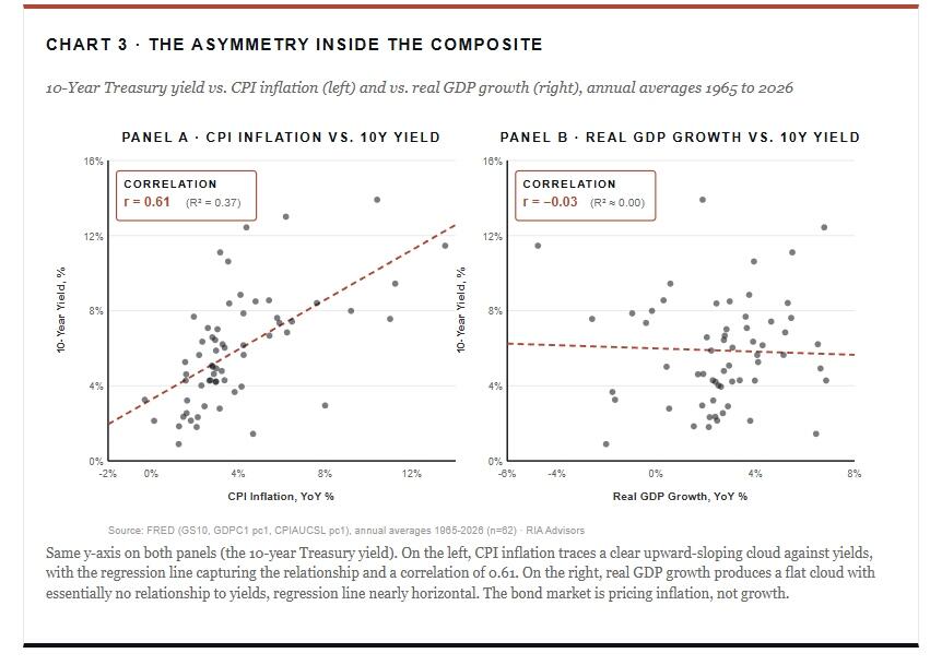
This asymmetry is useful for thinking clearly about what would actually break the framework. A regime shift in nominal yields, the kind the doom case is forecasting, would require a regime shift in inflation expectations. Not a one-year inflation spike. Not a quarter of hot prints. A permanent re-anchoring of what bond markets expect inflation to average over the next decade. That has happened exactly once in U.S. modern history, between 1968 and 1980, and it took twelve years of policy mistakes, oil shocks, and lost central bank credibility to produce it. The current setup, however uncomfortable, is not that.
Pull this together and apply it to the present moment.
- Real growth potential, by every credible estimate, including those of the Congressional Budget Office and the Federal Reserve staff, is around 1.8% to 2.0%.
- Long-run inflation expectations, as measured by the five-year forward breakeven and survey-based measures, are anchored near 2.4%.
- Add those two and the framework points to a steady-state 10-year yield in the neighborhood of 4.0% to 4.5%, plus a small term premium.
Today’s 10-year at 4.60% is right inside that range. Slightly elevated, perhaps, but not screaming regime shift.
This is where the doom case falters.
The doom case says yields are detaching from growth and inflation, that they will float higher due to debt, deficits, or supply-side forces, and that the long-run relationship is breaking down. For that claim to be correct, the Fisher decomposition has to fail. It has not failed in the United States in any sustained way over the seven decades of clean data we have. It is possible to bet against that, but it is important to be honest about what is being bet against. That bet is against a hundred years of one of the most robust regularities in financial economics, dating back to Fisher’s original work and confirmed by every subsequent empirical study.
The “Debt = Higher Rates” Argument Doesn’t Survive Contact With The Data
Now, for the most common pushback against the framework. The thread of responses ran along these lines.
“We print $2 trillion a year. The debt is exponential. Econ 101 supply and demand says rates have to keep going up.”
Or
“,,,with $39 trillion in debt and rates above 4%, the math doesn’t work. The Fed will either print or hyperinflate. There is no third option.”
Or more simply
“Are you sure debt has little to do with rates?”
Yes, I’m sure. Not because I’m dismissive of debt levels, but because the data over the last 45 years is unambiguous. Here is U.S. federal debt as a share of GDP, plotted against the 10-year yield, since the start of the modern era.
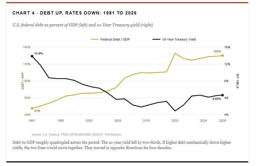
However, I want to be precise about what this does and doesn’t say. It doesn’t say debt is irrelevant. In fact, there’s a real literature on term premium, and large supply shocks at specific auctions can move yields on the day. The 2023 Treasury refunding episode is a clear example in which a shift in expected coupon issuance pushed the term premium higher for several months.
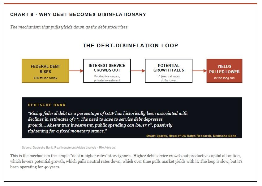
What it does say is that the simple “more debt equals higher rates” thesis fails the empirical test over any meaningful horizon. The reason is that the inflation-and-growth channel runs the other direction. Rising debt service crowds out productive investment, suppresses the marginal return on capital, and slows trend growth. In turn, lower trend growth means lower inflation, which means lower yields. The whole thing self-corrects, just not in the way the doom narrative wants.
If you want the cleanest counterexample to the “rising debt means rising interest rates” theory, look no further than Japan. I’ve made this case in prior work, but the comparison is worth refreshing with current numbers.
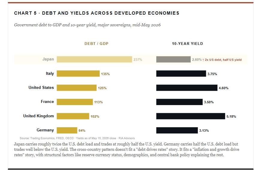
Yes, Japan’s 10-year is now at 2.6%, the highest since 1997. The bond vigilantes, the “doom crowd” that has been waiting for 30 years, did finally show up, just much later and much more politely than the script demanded. However, that’s not the point. The point is that Japan has been carrying more than 200% debt-to-GDP for over a decade. By the supply-and-demand-of-debt theory, Japanese yields should have spiraled long ago. They didn’t, because debt isn’t the dominant driver. In fact, inflation, growth, and central bank policy are.
Germany makes the same point in reverse. German debt-to-GDP is 64%, half the U.S. ratio. However, the Bund traded at 3.13% last Friday, well below the U.S. 10-year. If debt were the binding constraint, then Germany would have the lowest yield in the developed world. It doesn’t, because growth differentials, currency dynamics, and ECB policy matter more than the absolute size of the debt stack.
Rising Interest Rates And The Real Debt Service Question
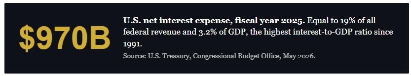
Here is where I want to give the doom side credit, because one of the responses to last Friday’s post hit on a genuine problem. The question was simple. “How much does it cost to service the national debt at 7% interest rates?” That’s the right question. In fact, the fiscal cost of carrying $39 trillion in debt at higher rates is real, and it’s accelerating.
The numbers, pulled directly from Treasury and CBO data through April 2026, look like this. Net interest in fiscal year 2025 ran $970 billion. That was the third-largest line item in the federal budget, behind only Social Security and Medicare, and ahead of national defense. Furthermore, the CBO projects fiscal 2026 net interest will cross $1 trillion. By 2036, under current law, it’s projected to be $2.1 trillion.
That isn’t nothing. That is a serious fiscal problem. However, it’s important to separate the two arguments. The argument that high debt service is a fiscal problem is correct. On the other hand, the argument that high debt service drives yields higher is not the same as the second one, and the second one doesn’t follow from the first.
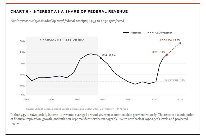
Here’s the part that matters for portfolio thinking. Historically, when interest costs have climbed toward unsustainable levels, the resolution has not come through a permanent rise in long-term yields. Instead, the resolutions have come through some combination of three things. First, financial repression, where the central bank caps long rates and inflation slowly erodes the real burden. That’s what happened after World War II. Second, recession, which crushes nominal growth, collapses inflation, and pulls yields down through demand destruction. That’s what happened in 1991, 2001, 2008, and 2020. Third, structural reform, which is politically rare and historically slow.
Notably, none of those resolutions involves yields ratcheting permanently higher to compensate for fiscal strain. Italy’s debt-to-GDP has been above 130% for a decade. Italian yields hit 7% during the 2012 eurozone crisis. Today, however, they’re 3.75%, well below the U.S. The mechanism that pulls yields back is the same mechanism that creates the fiscal stress in the first place: slower growth.
The doom narrative tends to skip this loop entirely. It assumes debt service rises, then yields rise, then debt service rises more, and the spiral takes the system out. However, that’s not how the loop has worked in any modern advanced economy. It’s how it worked in Argentina, but Argentina is not the comparison.
About That Oil Shock
Several of last Friday’s responses raised what, on its face, is the more interesting argument behind rising interest rates. Yields are rising because of supply-side inflation. Iran. The closed Strait of Hormuz. Gasoline at $4.50 a gallon. Electricity demand from AI data centers. Base metals, lubricants, and the physical economy. Rate cuts can’t fix supply bottlenecks. So we’re in a stagflationary regime, not a recessionary one, and yields are repricing accordingly.
Importantly, that argument has more weight than the simple “debt = rates” framing. The current setup really is supply-driven. For example, CPI jumped from 2.4% in February to 3.3% in March and 3.8% in April. Energy is up 17.9% year over year. Gasoline is up 28.4%. That’s not a demand-led rebound. Instead, that’s a price shock running through the system from the supply side.
However, here is the historical record on supply-side oil shocks. They don’t sustain. Every modern oil shock has followed the same arc.
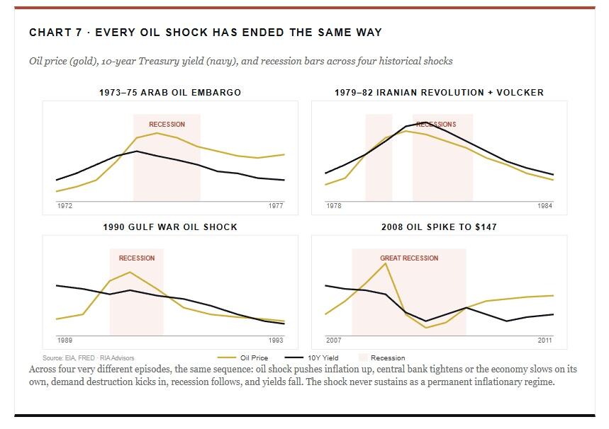
I want to be careful not to overstate this. For instance, the 1979 episode includes Paul Volcker deliberately driving the U.S. into a double-dip recession to break inflation expectations, which is a specific policy choice that may or may not repeat. Similarly, the 2008 oil spike happened inside an already-developing financial crisis. The histories aren’t identical.
However, what is common across all four is the demand destruction mechanism. Higher oil prices act like a tax on consumers. As a result, consumers cut discretionary spending. Businesses face higher input costs and slower revenue growth simultaneously. Earnings get squeezed. Capex slows. Hiring slows. Demand falls. Consequently, the inflation caused by the oil spike begins to unwind, sometimes within months of the price peak.
“The need to save to service debt depresses potential growth. Absent true investment, public spending can lower r*, passively tightening for a fixed monetary stance.”– Stuart Sparks, Deutsche Bank
If the current Iran situation persists for another 6 to 9 months, the lag effect on consumer balance sheets becomes the dominant story, not the headline CPI print. In fact, we’re already seeing the early signs. Real wages went negative in April for the first time since April 2023. Furthermore, consumer delinquencies are rising. The labor market is cooling. None of that is yield-bullish on a 12-month view, regardless of where the spot oil price is.
“Rates Are At Modern History Highs” Doesn’t Quite Survive A Long Chart
One of the responses worth addressing directly was the claim that yields have hit “the highest in modern history.” That’s a real argument, and partially true if you draw the window narrowly. For instance, UK 10-year gilts are at 5.18%, the highest since 2008. German Bunds are at 3.13%, the highest since May 2011. Japanese 10-year JGBs are at 2.6%, the highest since 1997. Indeed, yields have moved up globally.
However, the U.S. 10-year at 4.60% is well within its long-run range, not above it. The framing of “modern history highs” only works if you treat the 2010s as the normal baseline.
In fact, the 2010s were the anomaly.
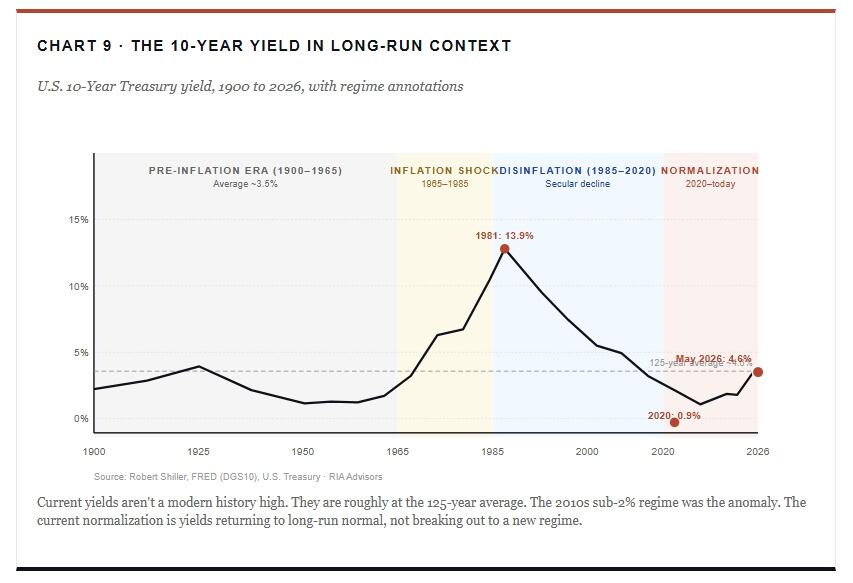
That re-framing matters. Critics arguing yields are at “modern history highs” are anchoring on the 2010s, which was the most artificially suppressed yield environment in modern U.S. history. Specifically, that period featured:
- an aging demographic,
- two rounds of QE,
- ZIRP, and
- then a global pandemic with another round of QE, and ZIRP.
Pulling yields out of that bucket and noting they’re “high” is like measuring temperature against an arctic baseline and concluding spring is a heat wave.
The honest framing is that we’ve spent the last six years normalizing.
The 2020 low at 0.9% was a once-in-a-century print driven by the pandemic shutdown. Therefore, anything heading back toward the long-run average is going to look elevated relative to that. Globally, yields have risen as monetary policy has normalized, inflation has reasserted itself, and central banks have stopped buying every duration auction. However, that doesn’t make today’s yields a regime shift. It makes them a regime reset.
Rising Interest Rates: What This Means For Investors
Stepping back from the framework and the rebuttals, here is the practical takeaway on rising interest rates.
- Yields can absolutely stay elevated.
- Yields can spike further if the Iran situation worsens or oil pushes through $120.
- The term premium can widen.
Clearly, the next six months are not going to be smooth.
However, the structural pull on yields is downward over a 12 to 24-month horizon, for three reasons.
- First, the framework. Nominal growth is the gravitational pull, and nominal growth is already softening as real wages turn negative and consumer credit metrics deteriorate.
- Second, the oil shock is a tax on the consumer, not a sustainable demand-led inflation. Notably, the 2008 parallel is the closest, and the 2008 setup ended in a 200-basis-point yield rally as the recession unfolded.
- Third, the debt-service problem is a fiscal problem that gets resolved through some combination of repression and recession, not through permanently higher long yields.
For portfolios, that points to a few practical implications.
- Long duration is reasonable to begin layering in at these yields, recognizing that the path could be choppy and that further short-term yield spikes are possible.
- Pure equity risk needs to acknowledge that earnings pressure from energy costs is building, particularly in consumer-discretionary names.
- Gold and commodity exposure make more sense as a hedge against the supply-shock tail than as a core inflation play.
- Cash is paying you to wait at the front end.
The binary framing some of last Friday’s critics offered, “either crash or hyperinflation, there is no middle scenario,” does not reflect how modern advanced economies typically resolve fiscal and inflation strain. In fact, the middle scenario, muddle through with volatility, is by far the most common outcome historically. So position for that as the base case, and stress-test for the tails.
Closing Thoughts
The 10-year at 4.60% isn’t a paradigm shift. It’s a yield doing what yields have done for 60 years: tracking the rate of nominal economic growth around it. Of course, the current setup includes a genuine oil shock, real fiscal pressure, and global yield repricing. However, those facts mean the simple “debt explodes, rates explode” thesis is incorrect. None of them means we’re heading into a Weimar paradigm. Instead, rising interest rates only mean we’re in a supply-led inflation that historically resolves through demand destruction, which in turn lowers yields.
If you want to bet against that pattern, then you’re betting against every modern oil shock and every modern debt cycle in advanced economies. Some bets are worth taking. However, that one has a poor base rate.
I’ll keep watching the data and remain honest when something in the framework breaks. But, in context, last Friday’s move doesn’t break it. In fact, it confirms it.
Tyler Durden
Fri, 05/22/2026 – 12:30
via ZeroHedge News https://ift.tt/JYlw45O Tyler Durden