The early effects of the reform program have triggered a surge in the Japanese stock market, accelerated by the anticipation of growth revival. So far, so good for the markets and traders. But how will Abenomics accommodate public debt of over 200% GDP, and will Abe’s radical policies inspire a long-term economic recovery in Japan? Saxo Capital Markets’ new infographic explores the efficacy of Japan’s prime minister’s dangerous experiment to stimulate economic growth.
(click image for large legible version)

Can Abenomics save the Japanese economy?
Abenomics is based on the untested formula of monetary easing, fiscal stimulus and structural reforms. In early 2013, Abe promised to increase public spending across Japanese infrastructure and renewable energy, committing $116 billion to reignite Japan’s struggling economy. This short-term stimulus aims to boost GDP and job creation by building business confidence and inspiring private investment.
A new inflation target of 2%, conceived by Abe and enacted by the Bank of Japan, prompted a massive quantitative easing programme worth $1.4 trillion. This stimulus measure was introduced with the aim of buying up government debt in a battle to counter deflation. Monetary easing has resulted in a weakening of the yen to the point of a rise in inflation. A devalued yen is a boon to Japanese exports, as manufacturers can sell more goods to a more receptive foreign market. As a result, the Nikkei stock index has rallied by gaining more than 40%, driving stock price increases and, consequently, invigorating business growth. Japan’s lower currency has dipped against the US dollar, with forecasts suggesting wages, prices, employment and business investment will all rise.
The third, and potentially most critical, strategy of Abenomics is the unrolling of proposed structural reforms. Abe’s move to revamp Japan’s healthcare field, energy policies and IT industry is an overhaul in key industry sectors to maintain economic growth beyond short-lived QE lifts and fiscal spending. To what extent does Japan’s financial stability hinge on these structural reforms? Abe’s decision to join negotiations on the Trans-Pacific Partnership (TPP), a regional free trade agreement, may be crucial to elevating the ratio of Japan’s international trade from 20% to 70%, under the free trade agreements.
A series of initiatives to lay the groundwork for future growth includes schemes to help Japanese engineering companies to sell more nuclear power plants and high-speed trains abroad as well as a domestic-based proposal to increase female numbers in the workforce.
For Abenomics to succeed, Japanese households will need to reverse the recent deflationary trend of excess saving and encourage consumers to spend more. In the infographic, Mads Koefed, Head of Macro Strategy at Saxo Bank, suggests that ‘the new experiment in Japan has boosted consumer sentiment and that has now resulted in consumers spending more of their money’. Will a more optimistic outlook translate into a revival for the world’s third largest economy? It is premature to gauge the success of Abenomics at this stage, and there are question marks over the proposed structural reforms. Fears remain over Japan’s alarming national debt, and an eventual rise in interest rates would add a greater burden on the government, undercutting reform measures. Will an offshoot of Abe’s remedies to Japan’s macroeconomic problems inflict a greater debt load?
Further problems await Japan: the unsustainable ratio of the elderly to the working population, fallout should fiscal stimulus fail, and snowballing costs for imports. This symptom of a weakened yen is exemplified by Japan’s post-Fukushima nuclear programme, which relies heavily on imports. Although Japan’s aggressive monetary easing programme has helped the yen devalue against the US dollar, Abe’s monetary easing plans threaten to distort the financial markets. The Bank of Japan’s purchases of financial assets have created significant uncertainty in the bond markets, with Japan’s 10-year government bond unexpectedly rising to a record high in May 2013.
Abe’s structural reforms carry with them several risks. The domestic agriculture sector could suffer from increased marketplace competition should tariffs on imports be removed. Any agreements with the TPP would mean greater dependency on government support among Japanese farmers, adding a further load on finances.
Finally in the infographic, Saxo have looked at the percentage of their clients, based in the UK, that hold a net-long position in the US dollar against the Japanese yen, compared to the number of those who are net-short USDJPY. The majority (83%) hold a net-long position, which reflects the position many traders take on the success of Abenomics.
Data published in late November indicates that household spending has risen 0.9% in October (from 2013 figures), but is this a long-term ascent, leading to stable economic growth?
Recent data suggests the Japanese economy is recovering from its deflationary cycle, with inflation at its highest for a half a decade. Japan’s consumer price index (CPI), which identifies the change in prices of consumer goods and services over a specific period, reveals an upward trend in consumer costs. Is this a sign of Abenomics in action? Next year’s consumption tax increase means the BOJ’s fiscal stimulus is expected to continue during 2014 to target the 2% inflation rate, despite the promising figures in the CPI release.
![]()
     |
via Zero Hedge http://feedproxy.google.com/~r/zerohedge/feed/~3/FEJezTYfw3g/story01.htm Tyler Durden
Metallic Money (Gold/Silver) vs. Credit Money: Know The Difference
Submitted by Charles Hugh-Smith of OfTwoMinds blog,
Longtime correspondent Jeff W. succinctly explains the difference between metallic money (gold and silver) and credit money.
You've probably read many articles about money–what it is (store of value and means of exchange) and its many variations (metal, paper, etc.). But perhaps the most important distinction to be made in our era is between metallic money and credit money.
Longtime correspondent Jeff W. succinctly explains the difference between metallic money (gold and silver) and credit money:
We use credit money every day. It’s the only kind of money we have. But because people in Europe and America have historically used metallic money for over 2,500 years, we still have cultural habits that come from the gold money era.
When the U.S. removed gold and silver coins from circulation in the 1930’s and 1960’s and replaced paper gold certificates and silver certificates with Federal Reserve notes, the paper money looked very much the same. But the thing that the paper money represented changed dramatically. The paper money now represents units of credit money that have no guaranteed relationship with the prices of gold or silve r or anything else.
Because the nature of credit money and metallic money are not well understood, and because money is so important in our lives, it is worthwhile to examine and discuss how these two kinds of money are different.
1. Tangible vs. intangible. A gold or silver coin is a physical object that has weight, volume and physical characteristics. Credit money is a record of the existence of a debt. Credit money exists in the intangible world of information and human relationships. Where Mr. A owes Mr. B a specified unit of money, and where that debt is recorded on paper or another recording medium, and where the record of that debt passes from one person’s possession to another as a medium of exchange, you have credit money.
Gold coins are minted; debts are recorded. The two forms of money could hardly be more dissimilar.
2. Old vs. oldest. Metallic money has been used by people for about 2,600 years. It has been used sporadically and in certain places. Credit money has been used for at least 5,000 years, when people first started recording debts on clay tablets, pieces of wood or ivory, etc., and trading those IOU’s as money. Before debts were recorded in writing, they were, in prehistoric times, discussed verbally, remembered, and sometimes traded in verbal transactions. This is how very primitive people still trade using debt today.
3. Persistent vs. ephemeral. Some gold coins more than 2,000 years old are still in existence today. But it would be very rare for any performing loans to be more than 100 years old, and many loans are of very short duration. Much of the U.S. Treasury’s debt issue is very short term, lasting only 90 days or one year. Where gold coins can last for thousands of years, debts are constantly coming into existence and going out of existence.
The U.S. debt holdings of the Federal Reserve are constantly churning and rolling over, whereas gold holdings in vaults can lie stationary and do not need to be replaced or rolled over.
4. Hard to create vs. easy to create. To create a gold coin, someone has to first mine the gold from the earth, refine it, mill it, stamp it into circular shapes and then stamp the governmental pattern on it. To create a piece of credit money, a debt has to be created and then a piece of paper printed or a record created on a computer. Anyone who has no intention of paying back his debt, such as the Federal government, can potentially issue debt in infinite amounts. There is an issue of whether that debt is worth anything, however.
5. Always good vs. sometimes good. A gold coin that is legal tender will always be accepted as money. With credit money, some of it is good and some of it is bad. In recent years Zimbabwe’s credit money went bad. Before that, the Weimar Republic’s credit money became worthless. All circulating debt has a mixture of good and bad. When a lot of it goes bad at the same time, it causes a crisis, where the “toxic debt” must be guaranteed or purchased by government or else banks and other financial institutions will go bankrupt.
6. Non-interest bearing vs. interest bearing. Most debt specifies interest payments as part of the loan agreement. The Federal Reserve notes we use as money are claims on interest-bearing debt owned by the Federal Reserve. Credit money has the quality that there is a continuing flow of interest payments away from the users of money in the general population and toward creditors. There is no such continued flow of wealth from debtors to creditors in a gold money system.
7. Does not need money supply expansion vs. needs expansion. Because interest payments are constantly flowing out from families, businesses and communities to financial centers and wealthy creditors, credit money results in economic sluggishness unless there is a constant expansion of the supply of credit money. Under a gold money system, people can function much better with a constant money supply because there is no leakage of interest payments. Each community can continue to circulate its own holdings of gold money without having to pay any of it out in the form of interest payments.
8. Government does not need to enable creating more debt vs. government must enable debt creation. In order to keep a credit money economy going, more debt must be continually created. Government and financial leaders who do not want to be blamed for a downward spiral of slowing economic activity must see to it that more debt is constantly being created. Under a gold money system, there is no pressure to constantly increase the burden of debt.
9. Not as bubble prone vs. more bubble prone. The fractional reserve method of banking encourages asset bubbles because new money is created as borrowers take out new loans. When people borrow money to buy bubble assets (e.g., houses 1981-2006), it creates enormous amounts of new money to feed the asset bubble. Many asset bubbles were also created during the gold money era due to fractional reserve banking, but where the unit of currency is guaranteed by government to be equal to a fixed weight in gold, the inflation threat is taken out of the picture and that restrains bubble creation somewhat.
To support the value of their currencies under a gold money system, governments must also often raise interest rates in order to encourage investors to sell gold in exchange for bonds paying good interest. Higher interest rates also discourage the formation of asset bubbles.
10. Does not enable ZIRP vs. enables ZIRP. A zero interest rate policy is impossibl e under a gold money system. The demand for gold would soon deplete government’s gold holdings to zero. Under a credit money system a policy of low interest rates and financial repression can be imposed for an indefinite period of time.
11. Does not increase lending activity vs. increases lending activity. Low interest rates and the ease with which credit money is created lead to increased lending activity and higher debt loads. Under a gold money system, debt will necessarily be created at a slower rate. By stepping up the pace of debt creation, a credit money system serves the interests of the banks.
12. Has no problem with debt saturation vs. has serious problems with debt saturation. Continually increasing debt leads ultimately to debt saturation. When a country’s people and businesses are saturated with debt, it makes it much more diffic
ult to continue to increase the debt load. That leads to stagnation and slowing economic activity in a credit money system. A gold money system does not tend to lead to debt saturation and has no similar problems with debt saturation.
13. Increases wealth disparities vs. does not increase wealth disparities. The higher debt load facilitated by a credit money system results in greater flows of wealth from the debtor class to the creditor class. The higher debt load leads to increased disparities in income, more very poor and very rich and fewer of the middle class.
14. Holds its value vs. does not hold its value. Gold-backed currencies have an excellent track record of holding their value. Credit money tends to inflation, the rate of which largely depends on how fast new debt is being created.
15. Government as a guarantor of savings vs. government provides no guarantee. One of the three functions of money is as a store of value. (The others are a medium of exchange and a unit of account.) When the U.S. government guarantees that 35 U.S. dollars will buy an ounce of gold, as it did in the years 1934-67, government aid savers by acting as a guarantor of that store of value.
When the U.S. went off the gold standard in 1971, it changed the relationship between citizens and their government when government no longer provided that guarantee.
16. Defaulters are bad vs. defaulters are only partly bad. In a gold money system, a person who takes out a loan and does not repay it is considered a bad person, almost a thief. He has robbed his creditors of the money they were rightfully owed. In a credit money system, however, the creation of new debt is so important that anyone who goes into debt is a hero of the economy.
That is why under a debt money system, it is considered more important that new debt be created (e.g., as student loans) than to worry about whether they will ever be paid back or to pin blame and guilt on loan defaulters.
Conclusion: As we see, it is no exaggeration to say that the transition from gold money to credit money changes everything. It changes every individual’s relationship with his own money, with government, and with banks. It changes the power relationships within society. It changes the patterns of ownership and wealth accumulation.
It is very important that citizens and investors understand the credit money system that they are trying to operate within. For people with over 2,500 years of experience with gold money, it is difficult to understand it and get used to it. But anyone who does understand it will be better off because of making better-informed decisions. We might as well get used to it because we shall likely have to live with a credit money system for a very long time.
Thank you, Jeff, for an insightful and extremely important overview of the critical differences between credit money and gold/silver. The key distinction of all these important distinctions is the ephemeral nature of credit-money (and any form of fiat currency). History teaches us that a financial-political crisis of sufficient magnitude reveals the underlying value of credit-money–i.e. zero–in a brief but cataclysmic loss of faith/trust.
As correspondent Harun I. observed in Why Is Debt the Source of Income Inequality and Serfdom? It's the Interest, Baby: "Governments cannot reduce their debt or deficits and central banks cannot taper. Equally, they cannot perpetually borrow exponentially more. This one last bubble cannot end (but it must)."
When the current bubble bursts, the difference between metallic money and credit money will be starkly visible: no one will trade gold or silver for any amount of paper/credit money, and the ephemeral financial instruments ("assets") that dominate today's financial system will be revealed for what they are: phantom promises of value.
Of related interest:
Gold: The Once and Future Money by Nathan Lewis
Could Bitcoin (or equivalent) Become a Global Reserve Currency?
November 7, 2013
![]()
| |
via Zero Hedge http://feedproxy.google.com/~r/zerohedge/feed/~3/UZmRcPmV2NU/story01.htm Tyler Durden
Tepco To Build Two Coal-Fired Plants In Fukushima
After being essentially nationalized as a result of the Fukushima explosion, and following years of denial finally admitting that TEPCO has lost control of the clean up effort of the Fukushima nuclear power plant corpse, one would think Tokyo Electric Power Company may have second thoughts about installing additional capacity around ground zero. One would be wrong.
Tokyo Electric Power Company will build 2 advanced coal-fired power plants in Fukushima. The utility says it wants to contribute to the prefecture’s recovery from the nuclear disaster.
The same prefecture, mind you, that TEPCO’s reckless disregard for safety standards and abject avoidance of repeated warnings about the potential threats to the Dai-Ichi NPP, was made into a ghost town. Very kind of TEPCO, three years after the explosion, to spend government money to “contribute to a recovery” from a disaster it created.
TEPCO’s Fukushima headquarters chief announced the project on Friday. Yoshiyuki Ishizaki said the coal-fired power generation systems will be built on the compounds of 2 existing power plants in Iwaki City and Hirono Town. Ishizaki said the planned facilities will use both gas and heat from coal to achieve the world’s highest level of power-generating efficiency.
Each facility will have a capacity of 500 megawatts and will be operational by the early 2020s.
TEPCO says the project will create up to 2,000 construction jobs per day, and its total economic benefit to the region will amount to 1.5 billion dollars.
Ishizaki said Japan has the top-of-the-line coal gasification technology. He added TEPCO will make sure the investment won’t affect nuclear compensation payments or delay the decommissioning of its Fukushima Daiichi nuclear plant.
What could possibly go wrong, besides everything of course. Then again, after providing infinite ammo for the anti-nuke lobby, it is only fair that in 7 years (assuming it is not a province of China by then), Tepco does everything in its power to crush the supporters of coal-power as well.
![]()
| |
via Zero Hedge http://feedproxy.google.com/~r/zerohedge/feed/~3/8dTC5bBtl2A/story01.htm Tyler Durden
Citi “Skeptical Of The Sustainability Of This Uptrend”
As the S&P 500 continues to make higher highs, Citi's FX Technicals group attempts to identify important levels to watch. As they have highlighted before, while they respect the price action and the fact that the markets are making higher highs, there is an underlying degree of skepticism surrounding the sustainability of this uptrend from a more medium term perspective. Important levels/targets on the S&P 500 converge between 1,806 and 1,833. A convincing rally through this range (weekly close above) may open the way for a test of the 1,990 area (coincidentally the Fed balance-sheet-implied levels for end-2014); however, at this stage they are watching closely over the coming weeks as we approach the New Year.
Via Citi's FX Technicals group:
As regular readers are aware, the chart of consumer confidence is among our favourite Techamental charts. Confidence is a key underlying factor to any economy/market and in this case the similarities in the way it trends and behaves in each cycle is quite telling.

In each of the three cycles, consumer confidence rose for exactly 4 years and 4 months and then turned down.
The recent prints have taken out what were support levels at 72.00-73.10 which further suggests lower levels will be seen.
As the overlay clearly shows, there is a serious disconnect between where confidence lies (and other factors
such as small business confidence and economic performance) and where the S&P 500 trades. The lower the confidence index, the less comfortable we are and would be with the sustainability of the stock market rally, even though we must respect the near term price action.
A closer look at the chart reveals some difference between the previous two major highs in 2000 and 2007 and may shed some light on which time period we should be more focused on in terms of price action on the S&P 500…
– 2000: The Consumer confidence index peaked in the month of January and again at the same level in May (i.e. double top at 144.70). The S&P 500 peaked in March. However the real move down in the S&P 500 was not seen until October so equities traded sideways for more than 6 months before turning lower.
– 2007: Consumer confidence peaked in July and the S&P 500 made a higher high in October. On this occasion we saw a quicker turn off the highs in both the consumer confidence and the S&P 500 as the reality set in that the credit crisis was worse than expected, especially by the time we got into early 2008 (Bear Sterns, inversion of yield curves, coordinated emergency rate cuts among major central banks etc)
– 2011: So far this year the consumer confidence number peaked in June and the equity market has continued to move higher. This makes is less similar to 2007 because under than comparison, we should have seen a stock market high in and around September but that did not happen. Could the pattern still be similar to 2000? The charts below make some comparisons.

Within the uptrend that took the S&P 500 to the 2000 high, there was a significant correction down of 22% in 1998 which was reversed by a bullish monthly reversal.
From that 1998 low at 923, the S&P 500 rallied 68.1% to 1,552.
Within the recent uptrend that started in 2009, we got a serious correction down in 2011 of 22% which ended with a bullish monthly reversal.
If we were to replicate the 1998-2000 rally in magnitude from the 2011 low, we would have peaked at 1,806 (and the high has been 1,808 so far as we have rallied 68.3%).
The parallel line on the log scale chart above comes in at 1,821.
In 2000, the high on the S&P 500 was 13.4% above the 12 month moving average. The same now would put the S&P 500 at 1,833.
Overall, when making a comparison with the 1998 – 2000 price action and how the market trades relative to the 12 month moving average, we would expect the S&P 500 to test and potentially peak between 1,806-1,833.
There are other measures that put further important on this price range…

In 2000, the S&P 500 high was 13.8% above the 55 week moving average
If replicated here we would trade at 1,824 (i.e. within the price targets set out in the previous chart when using the 12 month moving average)
A closer look at this chart reveals another level which converges here…

The channel top comes in at 1,822 while the channel base converges with the 55 week moving average at 1,594-1,603
From a medium term perspective, a break of the 55 week moving average would open the way for the 200 week which is at 1,364 (though it could be quite a while before we need to pay more attention to that)

This chart however is a warning sign that the uptrend may still have further to run.
In 2000, the S&P 500 peaked at 47% above the 200 week moving average.
If replicated again here, we could be talking about the S&P 500 trading around 1,990 before peaking. That is still 10% above current levels
In summary –
We believe the uptrend in the S&P 500 is stretched relative to the underlying economy and consumer confidence
The consumer confidence indicator is a leading one, especially given the similarities with previous cycles
As a consequence we remain sceptical in the medium-long term about the sustainability of the uptrend in the S&P 500 though have to respect that at least for now the trend is still up.
As we make higher highs, important levels that converge between 1,806 and 1,833 are now being tested.
A clear break of that region may open the way for a stretch to 1,990 though for now there is need for some caution at and around current levels.
![]()
| |
via Zero Hedge http://feedproxy.google.com/~r/zerohedge/feed/~3/2UdW6RrEBQM/story01.htm Tyler Durden
Citi "Skeptical Of The Sustainability Of This Uptrend"
As the S&P 500 continues to make higher highs, Citi's FX Technicals group attempts to identify important levels to watch. As they have highlighted before, while they respect the price action and the fact that the markets are making higher highs, there is an underlying degree of skepticism surrounding the sustainability of this uptrend from a more medium term perspective. Important levels/targets on the S&P 500 converge between 1,806 and 1,833. A convincing rally through this range (weekly close above) may open the way for a test of the 1,990 area (coincidentally the Fed balance-sheet-implied levels for end-2014); however, at this stage they are watching closely over the coming weeks as we approach the New Year.
Via Citi's FX Technicals group:
As regular readers are aware, the chart of consumer confidence is among our favourite Techamental charts. Confidence is a key underlying factor to any economy/market and in this case the similarities in the way it trends and behaves in each cycle is quite telling.
In each of the three cycles, consumer confidence rose for exactly 4 years and 4 months and then turned down.
The recent prints have taken out what were support levels at 72.00-73.10 which further suggests lower levels will be seen.
As the overlay clearly shows, there is a serious disconnect between where confidence lies (and other factors
such as small business confidence and economic performance) and where the S&P 500 trades. The lower the confidence index, the less comfortable we are and would be with the sustainability of the stock market rally, even though we must respect the near term price action.
A closer look at the chart reveals some difference between the previous two major highs in 2000 and 2007 and may shed some light on which time period we should be more focused on in terms of price action on the S&P 500…
– 2000: The Consumer confidence index peaked in the month of January and again at the same level in May (i.e. double top at 144.70). The S&P 500 peaked in March. However the real move down in the S&P 500 was not seen until October so equities traded sideways for more than 6 months before turning lower.
– 2007: Consumer confidence peaked in July and the S&P 500 made a higher high in October. On this occasion we saw a quicker turn off the highs in both the consumer confidence and the S&P 500 as the reality set in that the credit crisis was worse than expected, especially by the time we got into early 2008 (Bear Sterns, inversion of yield curves, coordinated emergency rate cuts among major central banks etc)
– 2011: So far this year the consumer confidence number peaked in June and the equity market has continued to move higher. This makes is less similar to 2007 because under than comparison, we should have seen a stock market high in and around September but that did not happen. Could the pattern still be similar to 2000? The charts below make some comparisons.
Within the uptrend that took the S&P 500 to the 2000 high, there was a significant correction down of 22% in 1998 which was reversed by a bullish monthly reversal.
From that 1998 low at 923, the S&P 500 rallied 68.1% to 1,552.
Within the recent uptrend that started in 2009, we got a serious correction down in 2011 of 22% which ended with a bullish monthly reversal.
If we were to replicate the 1998-2000 rally in magnitude from the 2011 low, we would have peaked at 1,806 (and the high has been 1,808 so far as we have rallied 68.3%).
The parallel line on the log scale chart above comes in at 1,821.
In 2000, the high on the S&P 500 was 13.4% above the 12 month moving average. The same now would put the S&P 500 at 1,833.
Overall, when making a comparison with the 1998 – 2000 price action and how the market trades relative to the 12 month moving average, we would expect the S&P 500 to test and potentially peak between 1,806-1,833.
There are other measures that put further important on this price range…
In 2000, the S&P 500 high was 13.8% above the 55 week moving average
If replicated here we would trade at 1,824 (i.e. within the price targets set out in the previous chart when using the 12 month moving average)
A closer look at this chart reveals another level which converges here…
The channel top comes in at 1,822 while the channel base converges with the 55 week moving average at 1,594-1,603
From a medium term perspective, a break of the 55 week moving average would open the way for the 200 week which is at 1,364 (though it could be quite a while before we need to pay more attention to that)
This chart however is a warning sign that the uptrend may still have further to run.
In 2000, the S&P 500 peaked at 47% above the 200 week moving average.
If replicated again here, we could be talking about the S&P 500 trading around 1,990 before peaking. That is still 10% above current levels
In summary –
We believe the uptrend in the S&P 500 is stretched relative to the underlying economy and consumer confidence
The consumer confidence indicator is a leading one, especially given the similarities with previous cycles
As a consequence we remain sceptical in the medium-long term about the sustainability of the uptrend in the S&P 500 though have to respect that at least for now the trend is still up.
As we make higher highs, important levels that converge between 1,806 and 1,833 are now being tested.
A clear break of that region may open the way for a stretch to 1,990 though for now there is need for some caution at and around current levels.
![]()
| |
via Zero Hedge http://feedproxy.google.com/~r/zerohedge/feed/~3/2UdW6RrEBQM/story01.htm Tyler Durden
Iran’s Rouhani: “We Are Not Dismantling Our Nuclear Facilities; Iran Will Maintain Its Uranium Enrichment Programme”
In case there was any confusion just how “historic” last week’s agreement with Iran, loudly trumpeted by the Obama administration as the most “historic” since Syria in a, well, long time, truly was in terms of curbing Iran’s nuclear ambitions, here is the explanation straight from the horse’s mouth i.e., Iran president Hassan Rouhani who spoke today in an interview with the FT. “Mr Rouhani struck a tough line on Iran’s expectations over a comprehensive nuclear deal to be negotiated following last weekend’s landmark interim pact. “One hundred per cent [no],” he said when asked about dismantling nuclear facilities.” So ixnay on the ismantleday. What about halting Uranium enrichment – that other pillar of Obama (and Hollande’s of course) historic agreement? “[Rouhani] made clear that Tehran was determined to maintain a uranium enrichment programme for peaceful purposes.” In other words, Iran will continue doing what it said it did before, only this time it will get billions of implicit subsidies as various embargoes are lifted.
As the FT notes, a US Senate aide said of the Iranian president’s remarks: “This is precisely the sort of comment that is going to make some people in Congress very nervous.”
Of course, none of this is news to most who followed the theatrical spectacle that was the so-called Geneva deal, in which as confirmed, nothing actionable has been achieved except for the US to alienate its staunch allies Israel and Saudi Arabia further.
Actually, there was news: “Recalling his telephone conversation with President Barack Obama during Mr Rouhani’s recent visit to the UN in New York, he said: “I found him someone with very polite and smart language”. Well, if there is one thing one can say about the president, is that he sure has smart language.
Oh well, more work for the creators of Stuxnet ver 2.0
![]()
| |
via Zero Hedge http://feedproxy.google.com/~r/zerohedge/feed/~3/0QTe-OSQuHs/story01.htm Tyler Durden
Iran's Rouhani: "We Are Not Dismantling Our Nuclear Facilities; Iran Will Maintain Its Uranium Enrichment Programme"
In case there was any confusion just how “historic” last week’s agreement with Iran, loudly trumpeted by the Obama administration as the most “historic” since Syria in a, well, long time, truly was in terms of curbing Iran’s nuclear ambitions, here is the explanation straight from the horse’s mouth i.e., Iran president Hassan Rouhani who spoke today in an interview with the FT. “Mr Rouhani struck a tough line on Iran’s expectations over a comprehensive nuclear deal to be negotiated following last weekend’s landmark interim pact. “One hundred per cent [no],” he said when asked about dismantling nuclear facilities.” So ixnay on the ismantleday. What about halting Uranium enrichment – that other pillar of Obama (and Hollande’s of course) historic agreement? “[Rouhani] made clear that Tehran was determined to maintain a uranium enrichment programme for peaceful purposes.” In other words, Iran will continue doing what it said it did before, only this time it will get billions of implicit subsidies as various embargoes are lifted.
As the FT notes, a US Senate aide said of the Iranian president’s remarks: “This is precisely the sort of comment that is going to make some people in Congress very nervous.”
Of course, none of this is news to most who followed the theatrical spectacle that was the so-called Geneva deal, in which as confirmed, nothing actionable has been achieved except for the US to alienate its staunch allies Israel and Saudi Arabia further.
Actually, there was news: “Recalling his telephone conversation with President Barack Obama during Mr Rouhani’s recent visit to the UN in New York, he said: “I found him someone with very polite and smart language”. Well, if there is one thing one can say about the president, is that he sure has smart language.
Oh well, more work for the creators of Stuxnet ver 2.0
![]()
| |
via Zero Hedge http://feedproxy.google.com/~r/zerohedge/feed/~3/0QTe-OSQuHs/story01.htm Tyler Durden
Signs of a Top
The primary drivers of asset prices are the economy and corporate earnings. With that in mind, consider that both are rolling over today.
Indeed, when we take the big picture, we find that corporate profits, as a percentage of GDP are also at all-time highs. Never before in history have corporations made so much money relative to the US economy. This trend is not likely to continue.
Finally, take a look at the massive divergence between nominal GDP and the S&P 500. Economic growth drives earnings, which in turn drive stocks. And as you can see, economic growth has been drifting sharply lower.

Source: the King Report
Detailing precisely when stocks will plunge is very difficult. All we can say with great certainty is that stocks are rallying ever higher on weakening economic fundamentals. This is precisely what happened in the build up to the 2008 Crash.
Indeed, if is now clear stocks are definitively in a bubble. Based simply on CAPE (cyclical adjusted price to earnings) the market is significantly overvalued with a reading of nearly 24 (anything over 15 is overvalued).

Indeed, we’ve only been at this level of valuation during major stock tops (1929, 1966, 2000, and 2007)
Thus we find that:
1) The US economy is in recession again
2) Corporate profits are at record highs and set to fall
3) Stocks are extremely overvalued
All of these add up to a real problem for long-term stock investors today. The classic method of valuing stocks, the P/E ratio is comprised of market cap relative to earnings.
If earnings are at record highs today and stocks are already overvalued, how high will P/Es be when earnings begin to contract with stocks at these levels?
My point with all of this is that based on valuations and economic conditions, now is not the time to be loading up on stocks. There will be plenty of opportunities such as NVDA and NDRO which we’ve already invested in, but overall, I would not be heavily buying stocks at these levels especially relative to earnings.
Speaking of earnings, let us now move to #2 on the list of items I listed at the opening of this issue: the recent collapse in revenues and earnings at economically sensitive firms.
We’ve seen a recent spate of terrible results from corporate America.
In the few quarters we’ve seen disappointing earnings at:
1) Caterpillar (global machinery)
2) Microsoft (software)
3) Google (search engine ad revenue)
4) Chevron and Exxon Mobil (oil)
5) Discovery (credit cards)
6) Amazon (online retail)
7) Charles Schwab (brokers)
8) Wynn Resorts (casino)
There are dozens and I literally mean dozens of ways to craft earnings to be better than reality. You can writedown assets, alter depreciation methods, manipulate bad debt expenses in accounts receivables, game the closure of deals, take one time charges, utilize derivatives and mark to model valuation of assets, etc.
Indeed, a study performed by Duke University found that roughly 20% of publicly traded firms manipulate their earnings to make them appear better than they really are. The folks who were surveyed for this study about this practice were the actual CFOs at the firms themselves.
In this sense, it is safe to assume that recent earnings, as poor, are they are, have been “massaged” to look better than reality.
Indeed, we get confirmation of this from revenues misses. As I mentioned a moment ago, earnings can manipulated any number of ways, but revenues cannot; either money came in or not.
With that in mind, we’ve in the last few quarters we’ve seen revenues misses at:
1) Merck (big pharma)
2) Molson Coors (alcohol)
3) Clorox (cleaning materials)
4) US Steel (steel)
5) McDonald’s (fast food)
6) 3M (conglomerate)
7) GE (conglomerate)
This brings me back to an earlier point, that profits and earnings are likely peaking. All of these point to a top forming.
Be prepared.
For a FREE Special Report on how to beat the market both during bull market and bear market runs, visit us at:
http://phoenixcapitalmarketing.com/special-reports.html
Best Regards
Phoenix Capital Research
![]()
| |
via Zero Hedge http://feedproxy.google.com/~r/zerohedge/feed/~3/RJlrbAj2q4M/story01.htm Phoenix Capital Research
Marc Faber: “We Are In A Gigantic Speculative Bubble”
“We have to be careful of these kind of exponentially rising markets,” chides Marc Faber, adding that he “sees no value in stocks.” Fearful of shorting, however, because “the bubble in all asset prices” can keep going due to the printing of money by world central banks, Faber explains to a blind Steve Liesman the difference between over-valuation and bubbles (as we noted here), warning that “future return expectations from stocks are now very low.”
Nope no bubble here…
Along with this pattern…
which has emerged with striking fidelity since 2010, we observe a variety of other features typically associated with dangerous extremes:
- unusually rich valuations on a wide variety of metrics that actually have a reliable correlation with subsequent market returns; margin debt at the highest level in history and representing 2.2% of GDP (eclipsed only briefly at the 2000 and 2007 market extremes);
- a blistering pace of initial public offerings – back to volumes last seen at the 2000 peak – featuring “shooters” that double on the first day of issue;
- confidence in the narrative that “this time is different” (in this case, the presumption of a fail-safe speculative backstop or “put option” from the Federal Reserve); lopsided bullish sentiment as the number of bearish advisors has plunged to just 15% and bulls rush to one side of the boat;
- record issuance of covenant-lite debt in the leveraged loan market (which is now spreading to Europe);
- and a well-defined syndrome of “overvalued, overbought, overbullish, rising-yield” conditions that has appeared exclusively at speculative market peaks – including (exhaustively) 1929, 1972, 1987, 2000, 2007, 2011 (before a market loss of nearly 20% that was truncated by investor faith in a new round of monetary easing), and at three points in 2013: February, May, and today (see A Textbook Pre-Crash Bubble).
Many of us in the financial world know these to be classic features of speculative peaks, but there is career risk in responding to them, so even those who view the situation with revulsion can’t seem to tear themselves away.
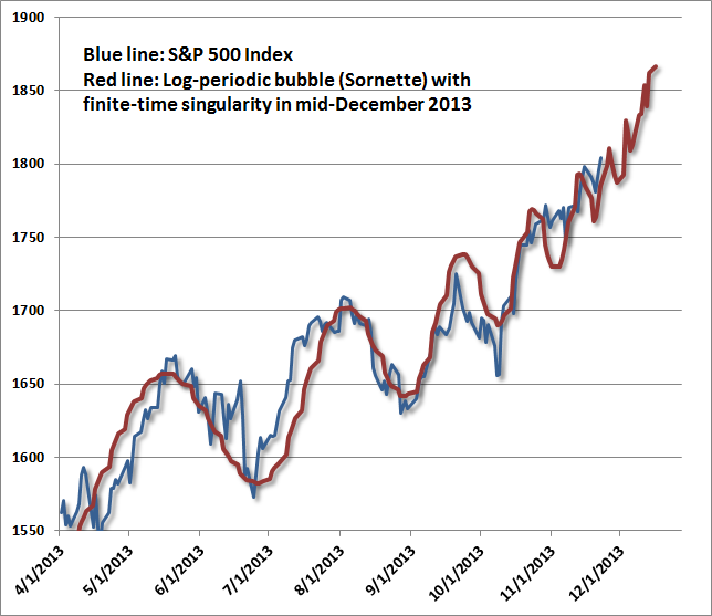
While I have no belief that markets follow any mathematical trajectory, the log-periodic pattern is interesting because it coincides with a kind of “signature” of increasing speculative urgency, seen in other market bubbles across history. The chart above spans the period from 2010 to the present. What’s equally unsettling is that this speculative behavior is beginning to appear “fractal” – that is, self-similar at diminishing time-scales. The chart below spans from April 2013 to the present. On this shorter time-scale, Sornette’s “finite time singularity” pulls a bit closer – to December 2013 rather than January 2014, but the fidelity to this pattern is almost creepy. The point of this exercise is emphatically not to lay out an explicit time path for prices, but rather to demonstrate the pattern of increasingly urgent speculation – the willingness to aggressively buy every dip in prices – that the Federal Reserve has provoked.
![]()
| |
via Zero Hedge http://feedproxy.google.com/~r/zerohedge/feed/~3/OSP_hGzqYsU/story01.htm Tyler Durden
Marc Faber: "We Are In A Gigantic Speculative Bubble"
“We have to be careful of these kind of exponentially rising markets,” chides Marc Faber, adding that he “sees no value in stocks.” Fearful of shorting, however, because “the bubble in all asset prices” can keep going due to the printing of money by world central banks, Faber explains to a blind Steve Liesman the difference between over-valuation and bubbles (as we noted here), warning that “future return expectations from stocks are now very low.”
Nope no bubble here…
Along with this pattern…
which has emerged with striking fidelity since 2010, we observe a variety of other features typically associated with dangerous extremes:
- unusually rich valuations on a wide variety of metrics that actually have a reliable correlation with subsequent market returns; margin debt at the highest level in history and representing 2.2% of GDP (eclipsed only briefly at the 2000 and 2007 market extremes);
- a blistering pace of initial public offerings – back to volumes last seen at the 2000 peak – featuring “shooters” that double on the first day of issue;
- confidence in the narrative that “this time is different” (in this case, the presumption of a fail-safe speculative backstop or “put option” from the Federal Reserve); lopsided bullish sentiment as the number of bearish advisors has plunged to just 15% and bulls rush to one side of the boat;
- record issuance of covenant-lite debt in the leveraged loan market (which is now spreading to Europe);
- and a well-defined syndrome of “overvalued, overbought, overbullish, rising-yield” conditions that has appeared exclusively at speculative market peaks – including (exhaustively) 1929, 1972, 1987, 2000, 2007, 2011 (before a market loss of nearly 20% that was truncated by investor faith in a new round of monetary easing), and at three points in 2013: February, May, and today (see A Textbook Pre-Crash Bubble).
Many of us in the financial world know these to be classic features of speculative peaks, but there is career risk in responding to them, so even those who view the situation with revulsion can’t seem to tear themselves away.
While I have no belief that markets follow any mathematical trajectory, the log-periodic pattern is interesting because it coincides with a kind of “signature” of increasing speculative urgency, seen in other market bubbles across history. The chart above spans the period from 2010 to the present. What’s equally unsettling is that this speculative behavior is beginning to appear “fractal” – that is, self-similar at diminishing time-scales. The chart below spans from April 2013 to the present. On this shorter time-scale, Sornette’s “finite time singularity” pulls a bit closer – to December 2013 rather than January 2014, but the fidelity to this pattern is almost creepy. The point of this exercise is emphatically not to lay out an explicit time path for prices, but rather to demonstrate the pattern of increasingly urgent speculation – the willingness to aggressively buy every dip in prices – that the Federal Reserve has provoked.
![]()
| |
via Zero Hedge http://feedproxy.google.com/~r/zerohedge/feed/~3/OSP_hGzqYsU/story01.htm Tyler Durden